
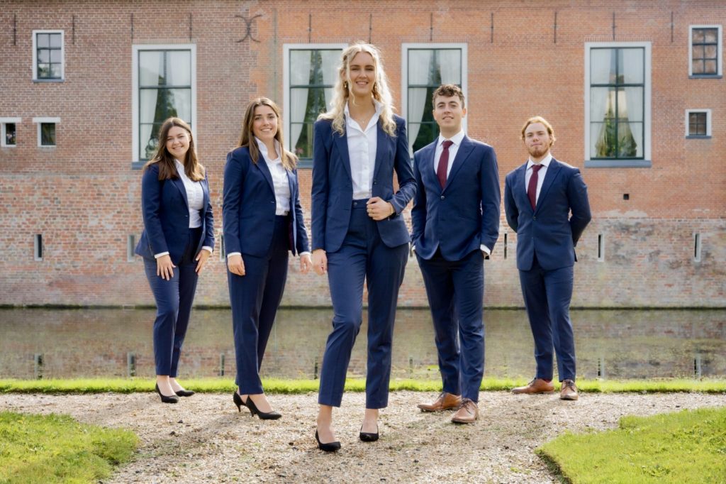
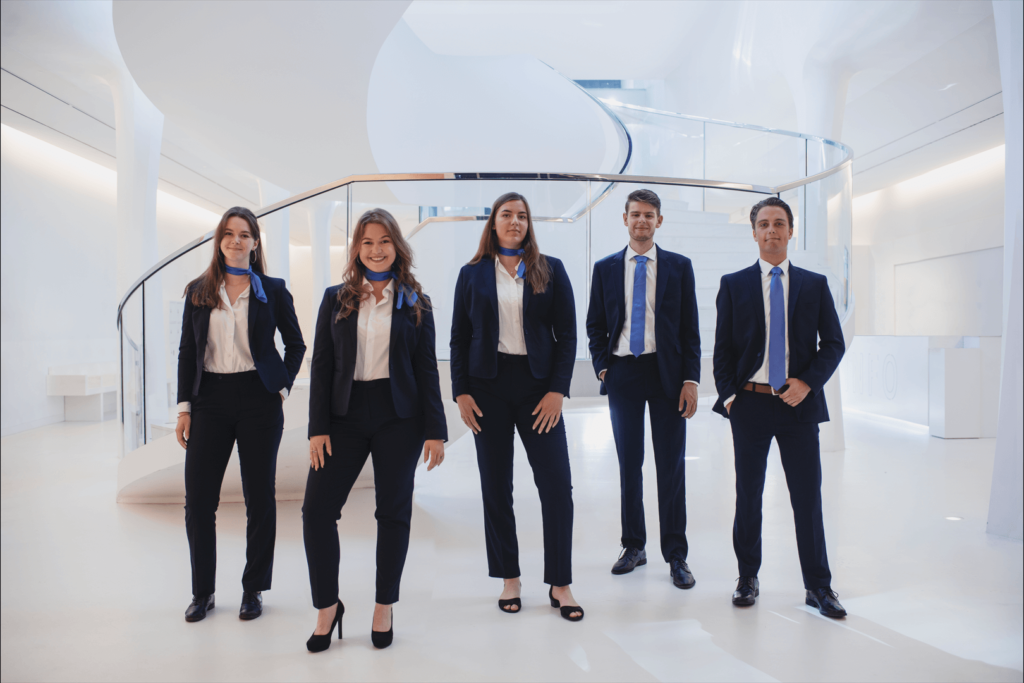
Board Picture Awards 2022
Content Warning: This article is created entirely in good fun and is not intended to offend anyone. Any criticism and jokes are aimed at the picture and not the people in them or the organisation they are part of.
It’s once again time for our annual Board Picture Awards, where we tear to shreds, roast over open fire and praise only the most deserving. This year we went over, judged and reviewed 85 pictures sent to us by the brave boards of Groningen’s Student Community. Some of them will send this review to all their family members and some will hide in shame, but only one will be declared the best of the best.
We would like to preface this year’s Board Picture Awards by giving major props to all the boards that sent in their pictures this year. Not only is it impossible for us to do this annual tradition without you guys, but this year the pictures were a significant improvement over previous ones.
The writers at SK are a team of world class experts in nothing, determined to put the Groninger student associations in their place, judging pictures they know very well they could not recreate in their dreams. Their obsessions include: shoes, dirty walls, vertical pictures, women who can’t wear a tie and balloons!
And now, Boards of Groningen, prepare to be judged!
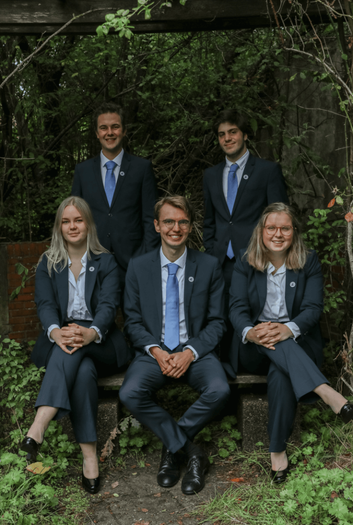
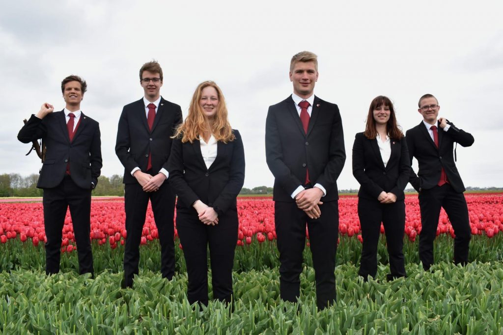
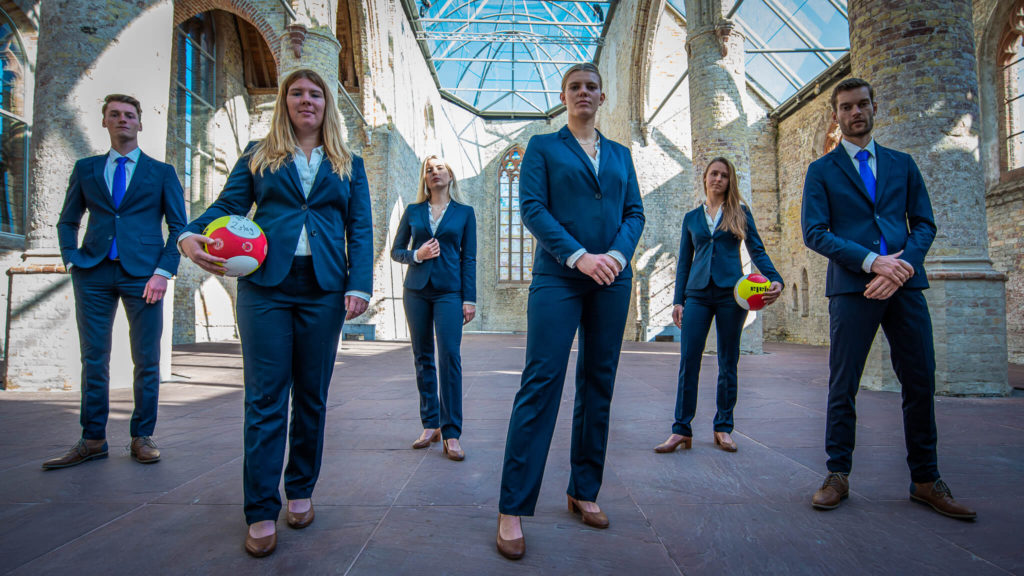
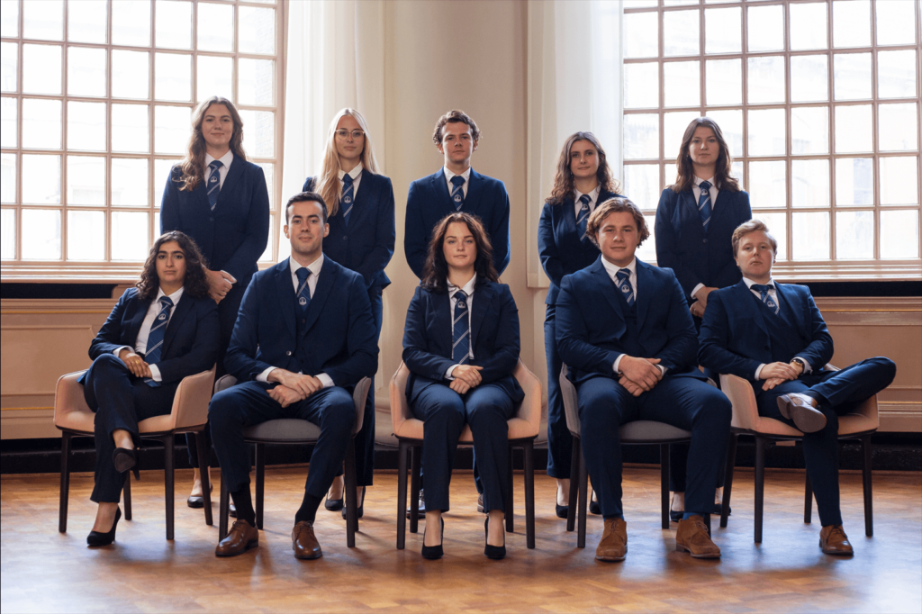
85. G.S.V.V. Kroton
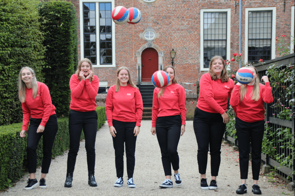
It is safe to say that if you take a board picture, all members should be visible. Forget two and a half men, right now we’re dealing with four and a half women! We’re just very curious about the thought process behind this one, did you just submit the wrong take or was it intentional? It looks like you took one picture and then just went with it. We’re seeing too many balls for a girls only board. Someone was bribed, or rather intimidated to accept this picture, and we will just not stand for this kind of abuse. The good thing is that the only way from here is up.
84. G.S.P.V. De NoordPole
It feels like you guys didn’t want to put much time into taking a board picture and just decided to use whichever serviceable Instagram post all three of you were in. It’s a nice picture, but it doesn’t really make sense as a board picture. Nothing about this says pole dancing either. Location is also a huge question mark. This entry just has us wondering: Why?
83. SKLO – Studentenkoepel voor Levensbeschouwelijke Organisaties
Was the smoking break nice? With the knowledge of what’s to come…Y’all have to stop with these dirty backgrounds… The setting is just not great and the overall effect is uninspiring to say the least. However, we appreciate the attempt at colour coordination. That’s always a plus.
82. Martinistam Groningen
This is the perfect example of a power walk epic fail. The quality is not great. The poses simply left us speechless… It looks like this was the first picture you took and you decided it was gonna be the last. You had a location with amazing views and so much potential, but your posing skills are just not it. We are very confused about the guy in the background, seriously, stop hiding your members everyone!
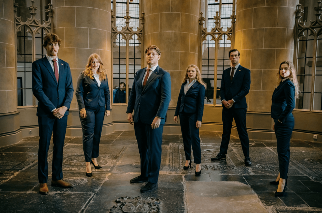
81. JOVD Groningen
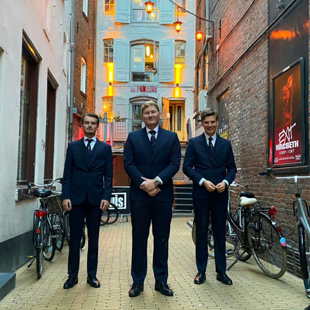
+1 for Pakhuis. The first thing that came to our minds when looking at this picture was bouncer vibes. Nice suits. This is a very Dutch picture with the bikes in the background. We know that Mark Rutte likes his bicycles, but that’s no reason to include it in your picture. The quality of the picture is not that good. Maybe more confident poses would have made you look more powerful and professional, which is what we want for a board picture.
80. SV Ilythia
We get the idea. You guys are an association for gynaecologists, hence the gender-reveal party. That doesn’t take away from the fact that balloons are just a no-go on board pictures. Just like your shoes, they look about as expensive as the plastic balloons themselves. Why this background? The good thing we noticed about your picture is that the gender-reveal isn’t causing a forest fire.
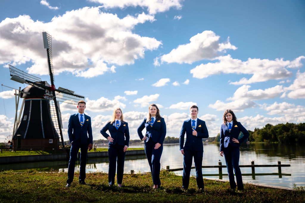
79. GSb
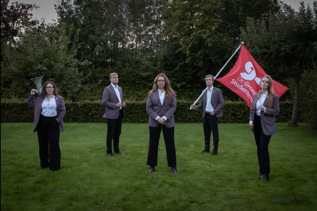
Very strong proletariat vibes. This picture is the embodiment of a lecture where the professor talks so slowly you cannot pay attention. Too plain, not much effort was put into it. Serious question, why are your feet disappearing into the grass? The lighting is bad and your flag should be more visible… You represent the voice of Groningen students, take it to the streets!
78. Cleopatra A.S.G.
Love, love, love the purple suits! However, if you’re going to make a statement like this, have everyone wear long pants / skirts because the shorts ruin the whole vibe. Also, the lighting is really bad, it makes everyone look pale. I get that you want the purple of the suits to pop, but it’s not an excuse for overexposing your picture. The composition is also a bit off, like why choose to cut people’s feet out of the picture? The suits really carried this whole thing on their shoulders.
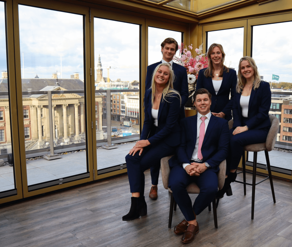
77. C.S.F.R. te Groningen
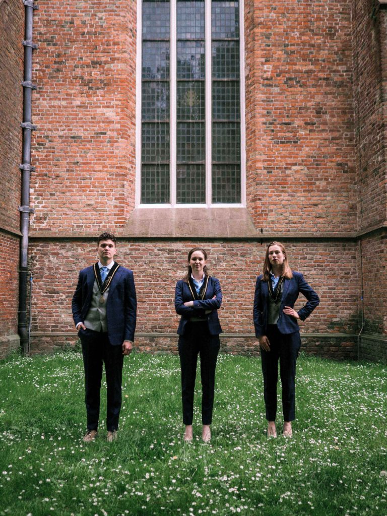
Let’s start with the fact that we, again, can’t tell whether the Board is wearing shoes or not! Other than that we should point out the obvious: don’t take your group pictures vertically. It doesn’t work and distracts from what should be the focus of the image: people, and is generally a waste of space. Here in particular, the Board feels incidental as the first thing we actually see is the window. Positives? We like the flowers and appreciate the symmetry. It’s not enough though to make up for the odd framing and way too much filter.
76. Sociëtas
Having in mind they look like a Walmart version of the Dutch royal family, shooting this on a phone camera is definitely on brand for them. They do look happy but deeply uncomfortable. The sitting positions are definitely bringing some awkward energy to the table… Bonus points for the matching shoes, however the dresses are just not it.
75. ROTC Zeilteam Groningen
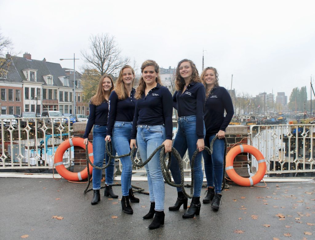
Time to introduce yet another SK-pet-peeve, the ongoing and deeply rooted hatred for Jeans, superseded only by our distaste for the vertical pictures and balloons (ONLY in this ranking, the SK does not condone any sort of prejudice against lumberjacks). This picture is so weird! What’s with that rope and the canals? We get that you’re trying to emulate the sailing vibes but this is just not it. We assume you have a boat, so use it!
74. Marug Conference
We see what they tried to do with the bouquet but let’s just say it did not really work for us. The attempt at choosing a nice location also failed. We are giving them the benefit of the doubt that this was taken in the Hotel and not the Vindicat building, but it would have looked so much better outside on the Grote Markt… Missed opportunity. They look like very happy salesmen and women but we are not interested in joining their pyramid scheme.
73. Financiële Studievereniging Groningen (FSG)
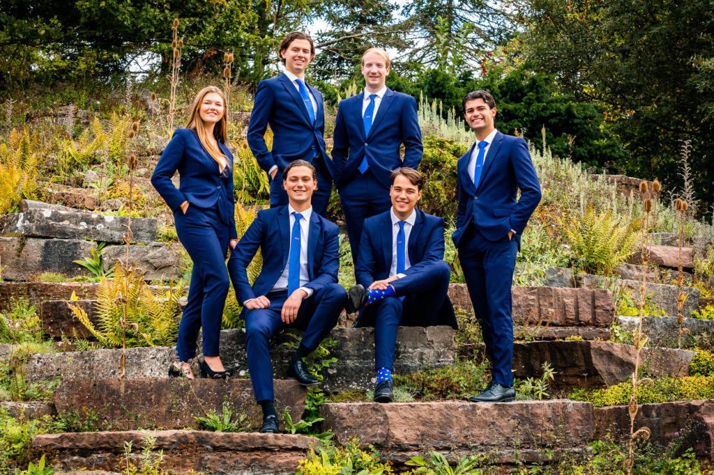
The sad thing about this picture is that you did everything right in a very wrong way. The blue suits look good, but they clash with the background. Composition is great, but the forest feels super random. It lowkey looks like you’re out straight of a business meeting about to go on a quest. You look very happy and that is a good thing, but it just feels kind of bland overall. Minus points for wearing distracting socks right in the middle.
72. Hanze Studentenbelangen Vereniging
This picture has good quality and lighting but the vibes are way off. The picture feels somewhat unnatural and heavily photoshopped. It’s almost like a picture of cardboard cutouts. The atmosphere kind of reminds us of the Uncanny Valley. Don’t push your board members so far back either, it makes it look like they’re less important and we don’t want that! We appreciate the effort of the orange accessories on the ties and the neck scarves though.
71. G.S.S.V. Squadraat
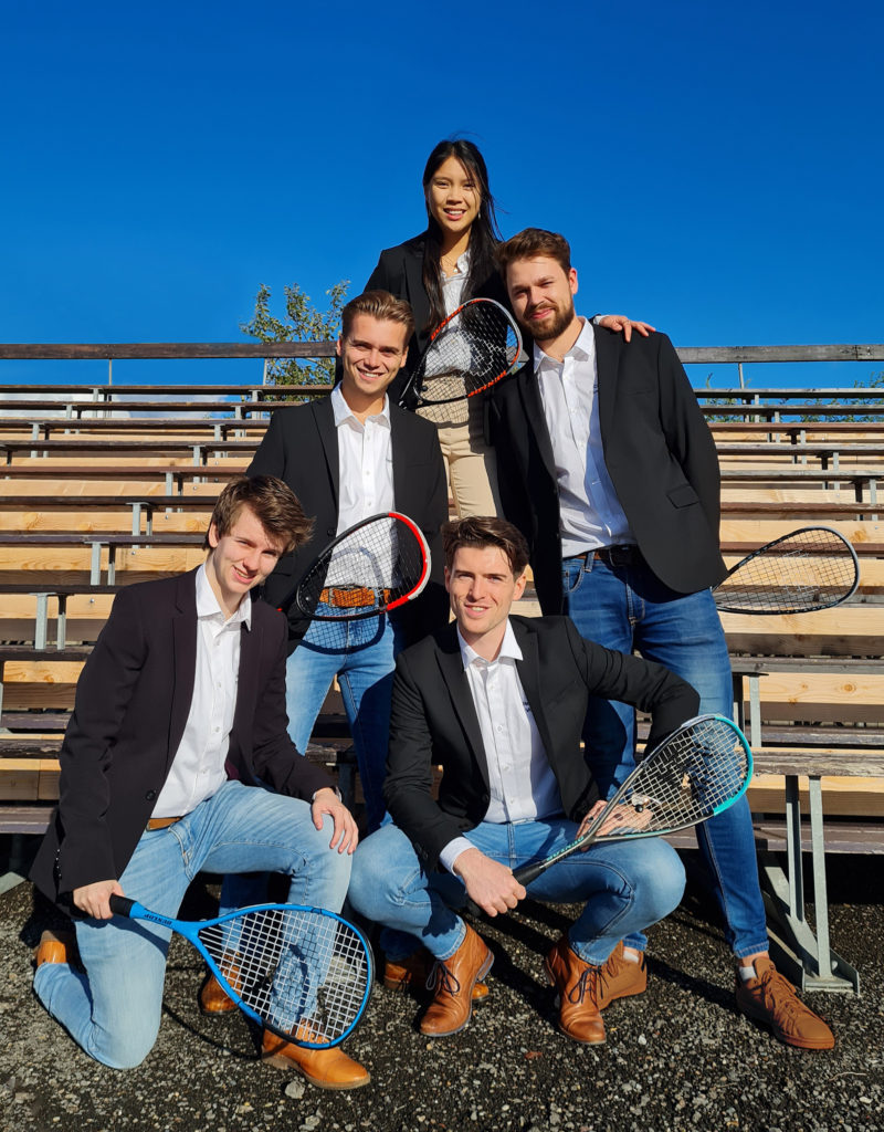
A lot is happening in this board picture. It looks like a fun picture for your association’s Instagram page, but not quite like a good board picture. You guys look great and the suits are good, but everyone seems to have opted for jeans while the person at the top is wearing something else. Be coordinated! The lighting also isn’t great, you guys are a little overexposed. At least all of them were granted rackets to hold and it makes the picture less awkward. And the matching shoes help it along too!
70. Esperia
Now, we are not trying to be mean, but there is something deeply offensive about this picture. We don’t really get it. In regards to the location: there is a fine line between an enchanted forest and the Jungle Book, and you’ve certainly crossed it. It’s like you asked for a fancy forest and someone said “we have a fancy forest at home”. I understand that you’re the European Studies association, but until now, we honestly didn’t know that Middle Earth was in Europe. However, the quality of the picture itself is quite nice.
69. ZaZa
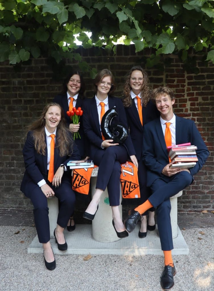
Too. Many. Props. There’s just too many of them! The fake tulips and the balloons are just not it. The image quality and the lighting are a bit on the low side. However, we do love the properly tied ties on the female members and admire the good energy. Points for the orange socks!
68. Popkoor Estrellas
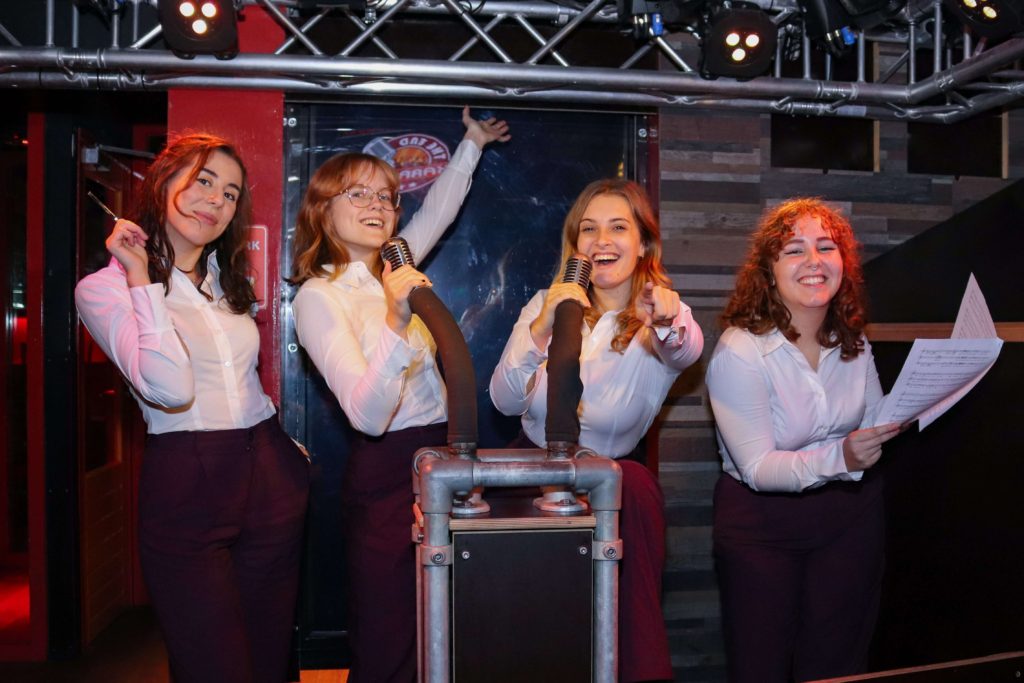
We love that you guys are having fun, but this is unfortunately not a very good picture. Your energy is on point, but the lighting is off and the picture quality isn’t great. It’s certainly on theme, so that is to be applauded. But if you’re going to take pictures at the karaoke bar, at least have the decency to book the private room! Also, what is the girl on the left holding? It looks a bit odd.
67. Studievereniging KIC
Ah my eyes! That pink is just… so much. The picture is overly edited. The faces look just like someone worked on them way too much in Photoshop. And the ties! In the name of Elle Woods, we just cannot focus on anything else. And the location… Are you in some kind of watch tower or windmill? What is this supposed to be? It’s nice that the chair is the only one in heels though, makes for a nice distinguishing feature. Did we mention the ties already?
66. G.S.S.V. Tjas
Quality is a key component when it comes to having a good picture – for some reason, the picture gets worse and worse when zooming in. While striking strong poses, the symmetry is a bit off, but perhaps a self-timer was used to take this picture. Then again, taking pictures with a phone doesn’t really excuse the fact that you have had this picture since May. Always plus points for tulips, because who doesn’t find tulips appealing to the eye? Admittedly, we do think the location could have been used just a bit better.
65. AEGEE-Groningen
We would like to appreciate that AEGEE has improved compared to last year. However, for a travel association we get a feeling that the only place the Board travels to is brunch. Picture feels a bit unimaginative and not well thought through. Onto nitpicking: we really could go without the photobombing canopy, that surely could have been avoided with better framing. Also shout-out to the member on the far-left and his hourglass shaped ankles. Is he wearing ankle-monitors? Not great, but keep on improving!
64. HMV Actis
Plus points for putting FC Groningen in the picture, but what are you doing there? Have you been hired by their marketing department? Overall, we think that the angle and lighting could have been a lot better. You guys look serious and committed, which makes the photo look professional. But we do find it quite boring. Better luck next time?
63. S.V. Fiscagio
The foreground elements are nice, but the background somewhat loses us. It’s very cold and there’s sets of random people behind you! The colours look a little flat which takes a lot of the life out of this image. Although you have clearly put some effort into this photo, it does kind of look like you just got out of an important conference and sat down for a quick picture before heading off. A different location and less desaturation would have certainly made you go up the ranking!
62. G.S.B.V. Tweeslag
One, two. No we’re not counting the board members, but the number of unnecessary balls in the picture. What were you guys thinking? There is a right way to incorporate props into your picture and then there’s the Tweeslag way. Next time either don’t wear suits or don’t have random balls, because if you combine them together it’s a recipe for disaster. The angle is not right, the light is not doing you any favours, and the composition is just overall boring. The location is great, however. And everyone’s shoes are also matching, so that’s always a plus!
61. G.S.A.V. Vitalis
Oh boy, this picture is just all over the place. From the mascot so far in the back, whom we’d mistaken for a trash bag, to the use of props (which is nice but why are you holding them like that?). The weird barren backdrop definitely does not give off the track and field vibes. You look less like the Olympic champions and more like the sponsors who had never even tried on the sports shoes they are selling but want to pose with some athletic equipment anyways. It’s not the worst, but also not the best.
60. Studievereniging Maslow
This is a real improvement over the last year, but the yellow and green do not work together. The open shoes created a lot of controversy as everyone had very different opinions, but we decided to let this one slide. The poses are nice and you get bonus points for looking happy. Nice quality, but we had to take some points for looking boring. Try something more exciting next year!
59. Studievereniging ODIOM
Boardception! A board in front of a board. We were able to guess the association by the picture, that’s a plus! The picture itself isn’t great however. Quality could have been better. Although we like the show of emotion, it’s giving us slightly creepy work place vibes. And if you’re going to use a prop (the chalkboard), then at least clean it a little beforehand, though the idea of adding a chalkboard as a background is actually nice. It looks authentic.
58. G.T.D. Bernoulli
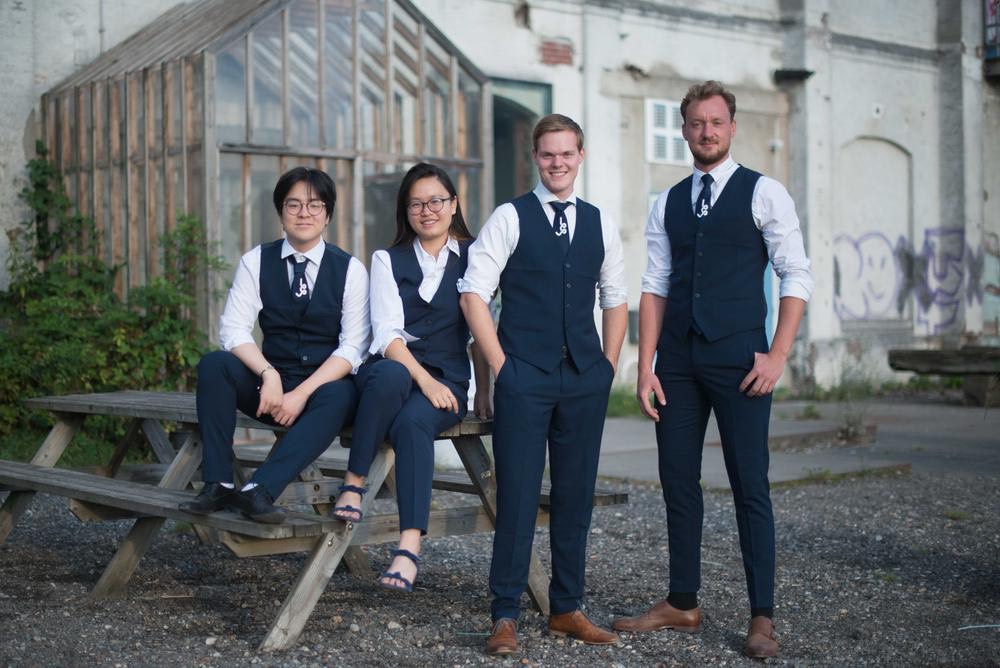
You guys made a smart move by putting on the vests – makes them different from other board pictures. It’s good to stand out in that way! For some reason, the only female was not given a tie to wear. That wasn’t too noticeable considering the quality of the picture, which is a bit off. The choice of scenery isn’t very strong either. Stop taking pictures in front of ugly buildings that look like they’ve been abandoned people!
57. G.S.B.V. Pugilice
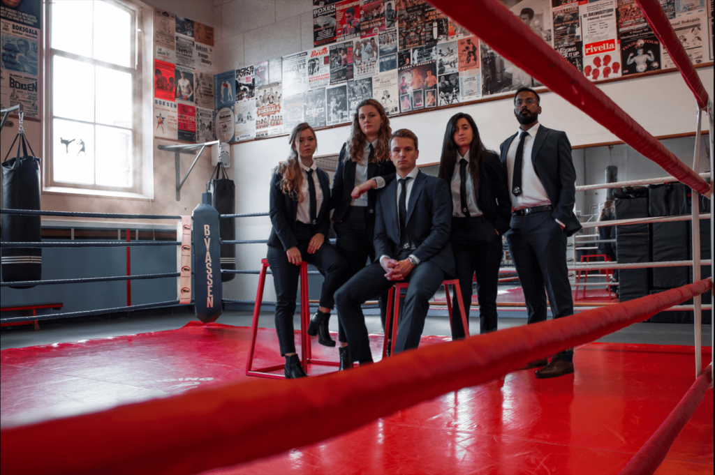
The angle and framing are quite interesting, but the lighting is a bit bad. You guys are looking way too dark. We do like the fact that you can tell right away what the association is about. The location is fantastic. The colours are nice but it would have been better if you had a red element in your outfits to kind of pull everything together. Image quality could use a bit of improvement too. Other than that, we’ve seen a lot worse.
56. T.F.V. ‘Professor Francken’
There is only one reason to devote so much focus to a chandelier: you are the cast of Phantom of the Opera and it is about to crash onto the stage! That’s it. Judging from the van creeping in the back, we presume that the setting is a parking lot filled with cars. That explains the unfortunate vertical frame, right? We will not even comment on the attempt in symmetry… On the positive note: we like the ties, love them on women. The quality is good, but we don’t need about half of this picture.
55. Progressief Rechten
We like your location. The harmony building looks great and serves as a suitable backdrop for this picture. Although you guys look wonderful, the outfits seem completely uncoordinated. The dress code must have been “wear quite literally anything that’s white with black pants.” We would have liked to see a little more coordination, especially in the shoe department (why aren’t they matching?!?). It’s definitely not a terrible picture (it’s nice and symmetrical), but it’s a little meh and doesn’t do justice to the surroundings!
54. Lijst STERK
Is this a class picture or a board picture? It feels like someone decided to go for Dark Academia but forgot the dark part and inserted bland instead. On the positive note you did a good job with the quality, lighting, and symmetry. This was probably a safe choice but maybe go for something a bit more pumpkin spice latte instead of vanilla milkshake next time!
53. SV Hestia
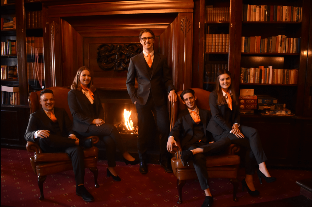
Compared to the previous entry, too Dark Academia, and therefore too 2019. The lighting isn’t great and the framing isn’t either. The idea is certainly there, but the execution is not. It is clear that you guys used long exposure (look at the fire) and that’s why it looks a bit moved and blurry. However, we want to give extra points for the cosiness. You give off the right vibe and look very inviting, which is awesome! But there’s room for improvement, so do better next year!
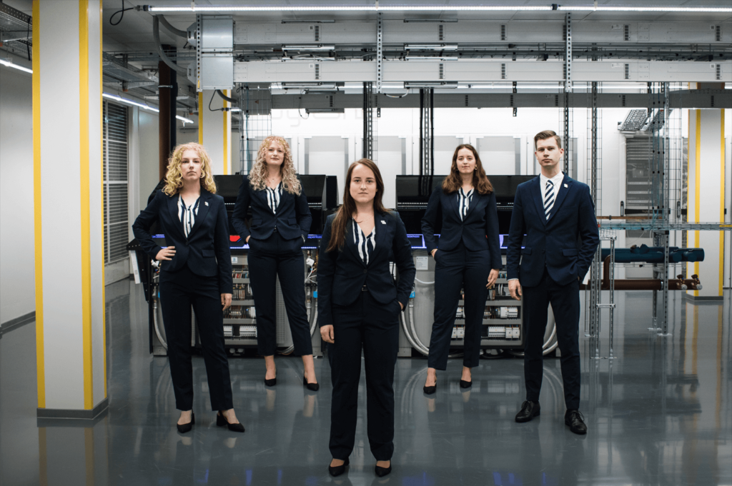
52. Navigators Studentenvereniging Groningen (NSG)
*Imperial March starts playing in the background*. Oh look, it’s just NSG taking their board picture. The location is very sketchy, like what is going all with the walls? We are all for power walk, but the style must match the substance. And now instead of getting warm and welcoming or serious and powerful, we’re getting very mixed feelings. But it might be just our dislike of rundown locations in every other picture. It’s nice that you have matching shoes, but we are still kind of torn about the open heels. The quality of the image is very good!
51. F.F.J. Bernlef
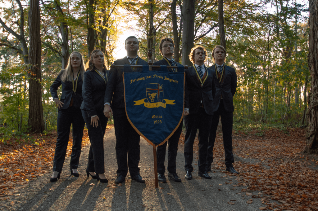
We very much like the idea, but the execution leaves a lot to be desired. For a start, it’s way too dark. Why haven’t you used any front lighting for this picture? It’s also kind of asymmetrical and the poses make you look a little awkward. Looking off-camera is nice for a change, but you should all be looking in the same direction. It would have added to your synergy as a board. Although the picture quality itself and the outfits are okay, we were expecting a lot more from you based on your entry from last year. The horses really were the MVP of your previous effort.
50. S.V. Villa ’96
The symmetry is on point and the lighting is quite nice. The composition is serviceable. The picture quality isn’t the best, but we’ve certainly seen a lot worse. We do question your choice of setting. The background is a bit unappealing. It doesn’t quite work for us, it’s just not very eye-catching. Why are you guys there? Apart from that, a solid board picture entry, just nothing special.
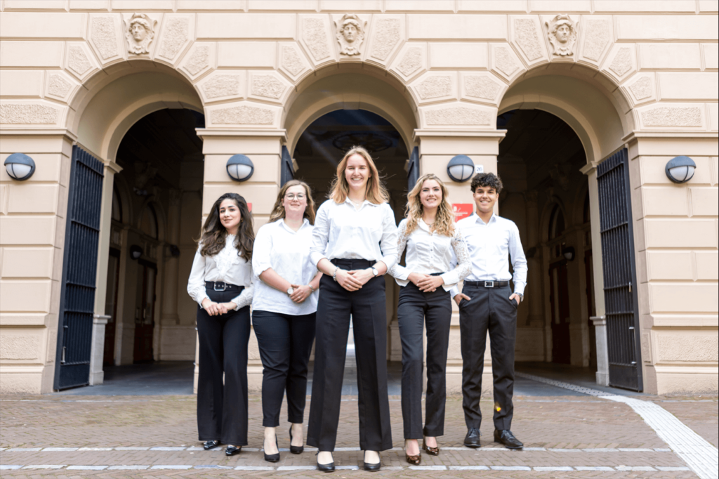
49. Studentengenootschap voor Onderneming en Recht

We get what you were trying to do. It’s a discount Versailles. But we’re not quite feeling it. The overall quality is quite good and you guys look great, there’s no denying that. But the bottom of the image is weirdly blurry for some reason. What’s up with the Minecraft grass? Did it want to remain anonymous? Your feet are disappearing into it. Sidenote, the smoke would indicate a new pope has been elected. Hurrah!
48. Stichting Studenten Activiteiten (SSA)
This picture sort of gives wrong vibes, in the sense that it leads you to believe that the activities you organise will send us to the hospital. Where is this? Why are you here? Why have you come to this location? The setting is just too weird for us to comprehend. You’ll certainly get bonus points for trying to match the shoes and for having nice poses. The picture’s quality and your board’s energy really saved you here.
47. G.S.F.V “Pharmaciae Sacrum”
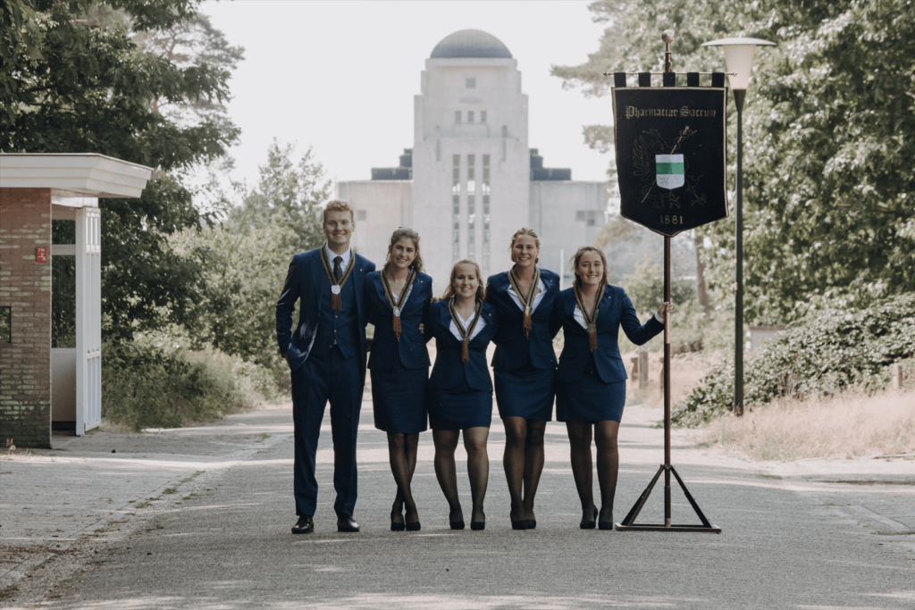
The picture is of great quality and your matching outfits are cool. A bit old-fashioned looking, but it’s good nonetheless. We have some big issues with the background, however. Not only are we not a big fan of the small structure on the left not being cropped out, what is this building behind you guys? Are these pharmacists marketing viagra? Because that is one phallic looking tower… And worst of all, it’s not even in Groningen. Your photographer did a good job in most respects, but the composition and choice of scenery really took you down some spots.
46. JFV
This picture is screaming “The Lion, the Witch, and the Wardrobe”. When are you guys taking us to Narnia! Even though you are a law association, you should be in jail for not having the background be symmetrical with your board! The matching poses are great, but we still think it’s very basic. The quality could have been better but we like the general symmetry and the evil vampire vibes. Please don’t drink our blood!
45. GLV Idun
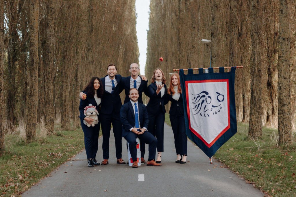
This picture generated mixed feelings – while the apple growing referencing is smart and well-thought out, it does raise the question of why only one person is looking at the apple. Seems like the location was so deserted, no one thought of bringing a chair, which results in the poor guy having to sit on paint cans. The mental support animal raised confusion, but apparently this is your mascot and it is very cute! The overall quality, composition, and colours of your picture are also good. You guys did an okay job!
44. LISA
Good background, +1 for using the Forum. You guys could be Mark Zuckerberg’s legal team. We love the power pose and the quality of the picture is very good. Saturation and contrast are perfect! You do look like underpaid actors a little bit. We understand your intentions with the serious bossy facial expressions, but maybe next time smile a bit so your picture is more appealing and inviting.
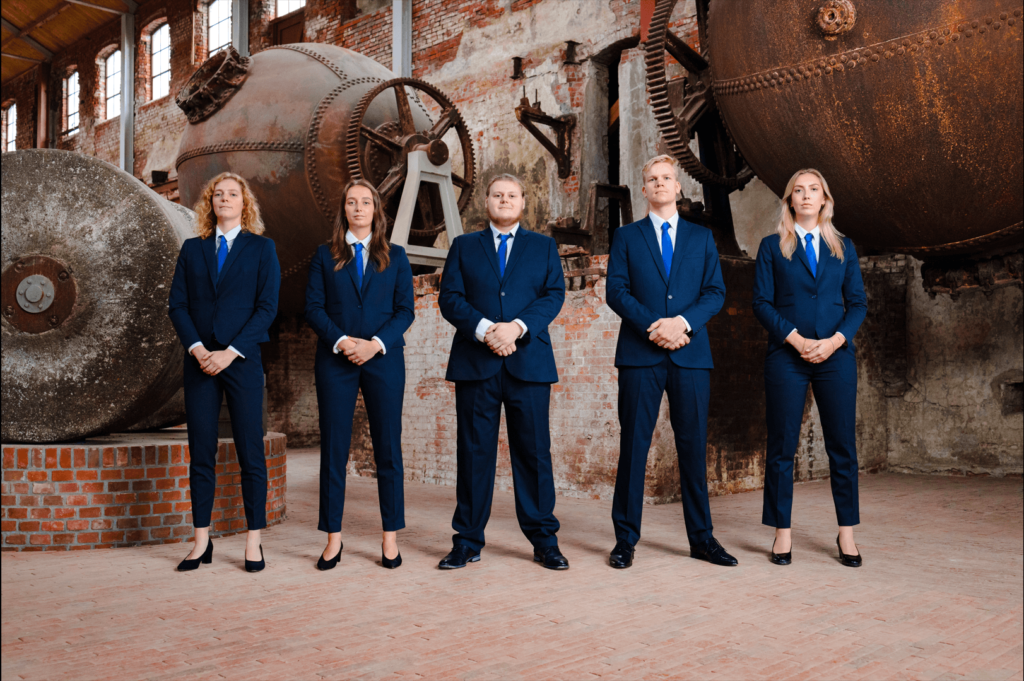
43. A.G.S.R. Gyas
Row row row your boat, gently down a run-down industrial building. But seriously we have to say that at this point the fact that every other Board picture is taking their pictures in run-down industrial buildings is just jarring. Who the heck wants to look at dirty, mouldy walls? Aside from that, the picture quality is obviously very good. The lighting, the colours, the composition, it’s a perfectly inoffensive picture, but the setting is overdone and unappealing. At least the blazers are matching the pipes.
42. EBF
A little disclaimer: it was the first picture we ranked so we could have been a bit harsh not knowing what’s to come. On the other hand, we were also more sober so we at least tried to be civilised. First of all, the picture makes it clear why these people study business and not arts. It’s not like there is anything necessarily wrong with it. It’s entirely fine and acceptable quality. The colours and background do their job. It might be a bit boring, but you’re businesspeople, it’s okay. We do appreciate the effort put into the coordinated shoes!
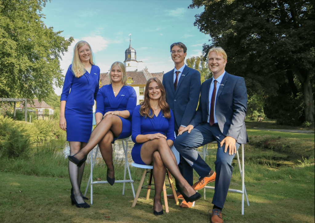
41. Stichting Geo Promotion
The lighting isn’t great, just get some curtains at this point! The vibe of the picture is making us think that at any minute one of you will ask if we want whipped cream with our frappuccino. The background is a bit weird, but we kind of like it. It works for us! You’re also getting extra points for the outfits and for the matching shoes. You’ve also managed to hide the ugly walls, otherwise, you would have probably gotten a slightly lower score.
40. G.S.V.V. Veracles
Definitely the best volleyball picture of the year, although granted the bar was not very high. We are still not sure about the whole ball-throwing idea, but at least it doesn’t feel completely random here. Probably the biggest offender is the vertical orientation, which we always prefer to avoid. And we would really like to know the story behind the bike. Not the best picture but at least an attempt in originality was there.
39. O.C.S.G., het Overleg Christelijke Studentenverenigingen Groningen
The point is to show off the board, not make them stay as far away from the picture as possible and show the ugly building in the background (which by the way, if you know where it is, makes the picture lose charm). You guys look very powerful, but you are just too far away to intimidate us. The outfits, symmetry, and picture quality are great, but you’ve really let yourself down by taking it from this far.
38. Civielrechtelijke vereniging Gerhardus Diephuis
For a picture where so much is going on in the background, distractingly so, we have surprising little to say. It would be nice if the background was a bit calmer, because the colours, lighting and posing are really great! You could be a bit less serious, to make yourself seem more approachable. Technically speaking, there’s very little wrong with this picture. We look forward to seeing what you do next year!
37. ESN Groningen
Nice lighting, nice posing, nice photobomber. Pro tip for next time, maybe Photoshop out any people in the background? Just a thought! Other than that, it kind of gives off Harry Potter vibes, so I guess 7 points to Ravenclaw? Honestly, there’s not much more to say about it, because it’s not that bad, it just doesn’t feel that appealing. Feels like the idea was there but the execution not so much. We would also prefer the ESN of all Board to be more approachable and less serious. The absence of George the Monkey was also deeply felt by our international writers.
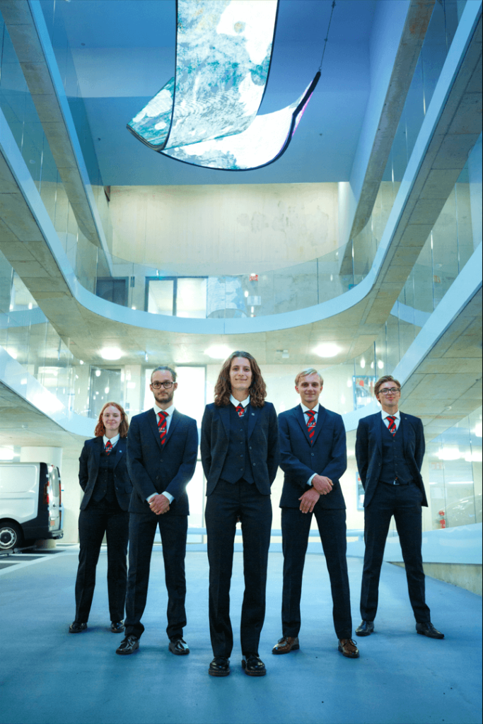
36. Unitas Studiosorum Groningana
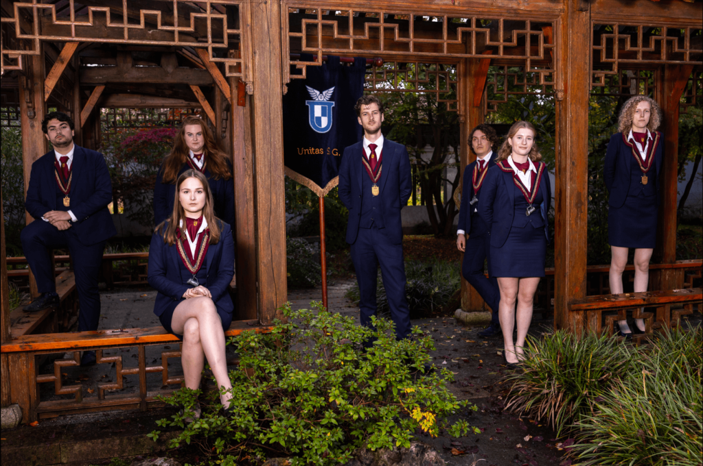
It’s in Haren, so it still counts as Groningent! It’s a very nice choice of setting. The colours are popping. And your outfits are great! The core concept of this picture is fantastic. But some of the members are pushed back a bit too far. They’re fading into the background. And so is your flag! Some small changes would have taken this from being a serviceable board picture to a great one.
35. S.V. Homerus
We like your symmetry and poses. The quality of the image is great and you guys look wonderful. The background is fine, but it’s a bit odd. And why is the image so desaturated? It really doesn’t do justice to the happiness and warmth that you’re clearly all evoking. You want your pictures to look full of life! It’s a good picture, but there’s definitely some room for improvement.
34. Atmos
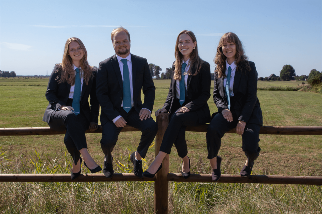
Country roads take me home. It’s nice to see something else besides the power-posing once in a while, but it’s far from great. You look very happy and inviting and the picture does give off the eco-friendly vibe. The location is great. In terms of the picture’s quality, it’s just okay. We see what you are going for, but just try to not have the sun behind you when you take the picture because the field is more visible than you are currently. That’s definitely not the point. But your custom ties are quite nice and it’s good that your female members are also wearing them!
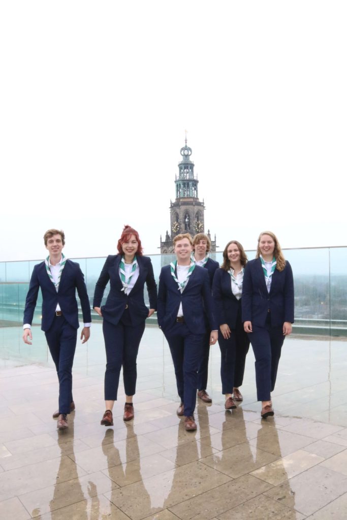
33. Studievereniging Facides Dione
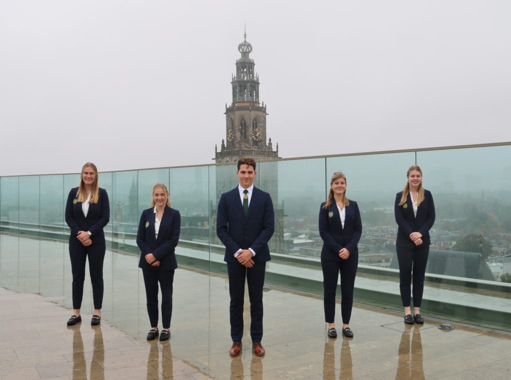
Out of all of the pictures that have been taken on the Forum roof, this is by far the best one. The Martini Tower is nicely centred and you can see a lot of the city. The shoes are matching and the composition is very symmetrical. Pro tip (and this goes for everyone who took a picture in the same spot): next time be more creative when you choose your location or at least make the most out of what you have. No one took advantage of the wet ground and it would have made for such a cool mirroring effect. Good picture nonetheless!
32. M.F.V. Panacea
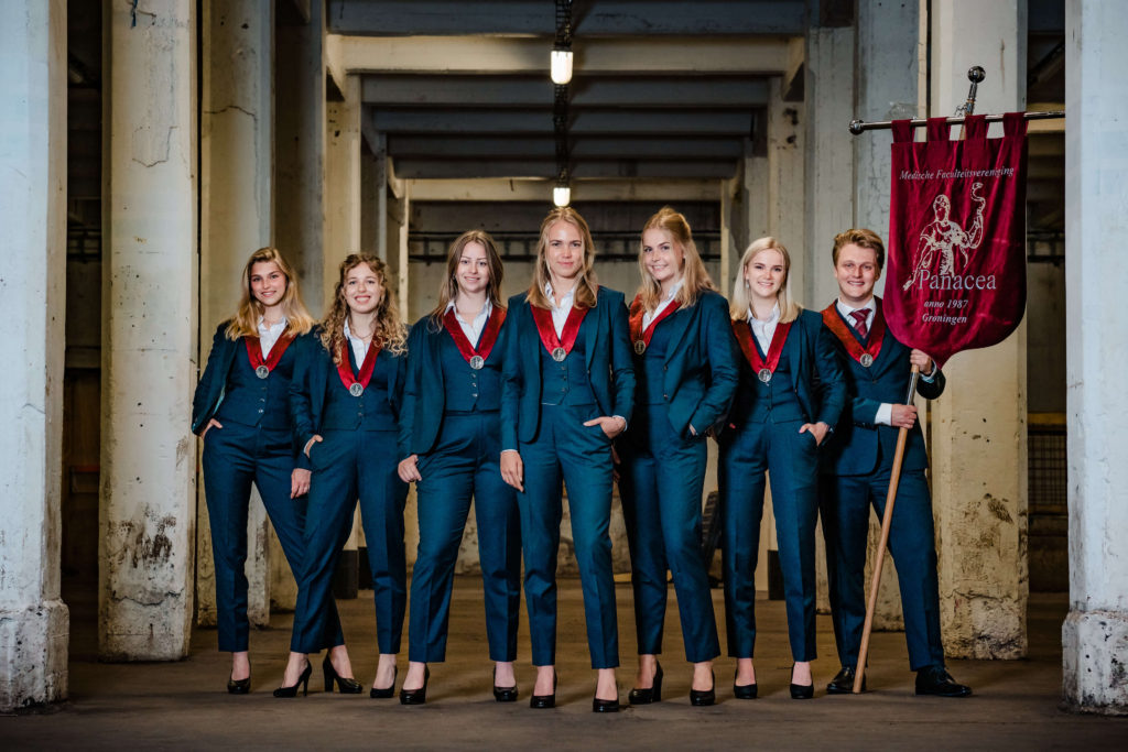
We have to say that the background of this picture does not look very medical. The dirty columns are a major no-no… they mess up the whole picture. We appreciate the matching shoes and the symmetry. You guys look fantastic in this lighting and the quality of the image is just great. We really like the confident girl power poses, bonus points for feminism. Your smiles are great. Good colour combination with the red and blue. Just choose a different location next time!
31. S.V. Linkit
We like the poses, as well as your outfits, and think it’s a nice, polished picture, but it doesn’t quite jive well with the background. The quality is good, but even then it seems a tiny bit oversaturated. It doesn’t make us feel anything. Why are you guys here? The background doesn’t scream technology as much as it does abandoned factories. On the whole, though, it’s a pretty good board picture, just nothing exceptional.
30. G.S.P.V. de Ramenlappers
All that sun and you still chose to be in the shadow. The background is really good, but it’s a bit over exposed and it distracts from the members of the board. The picture is very good quality, but it looks a little Photoshopped. We very much like your poses and the props (great choice for each of you to have a different coloured one!). Only real improvement here would be to focus a bit more on your board, as well as take it on a cloudier day so the light is more evenly distributed and there’s no weird shadows. Those are only minor issues, this is a great picture!
29. ASCI Groningen
The posing is great, powerful, professional, and just all in all top notch. But everything around it is just extremely cold and a bit random. We wouldn’t be ourselves if we didn’t point at our crown pet peeve this year: women not wearing ties. We seriously consider hosting a workshop for all femme-presenting Board Members in order to get ahead of this problem for next year. We want as much synergy as possible! However, technically speaking, this picture does nothing wrong. The lighting, composition, and quality are all as they should be. We just would have liked a different background!
28. Lijst Calimero
It has to be mentioned how incredibly well you all fit into the setting! Such pretty colours, people, and editing! The outfits are great and you guys look both happy and serious at the same time. However, it is a bit boring so we can’t rank it too high. It’s also dragged down a bit aesthetically speaking because of the shoe choices (no uniformity) But congratulations nevertheless, you made it well past the halfway point!
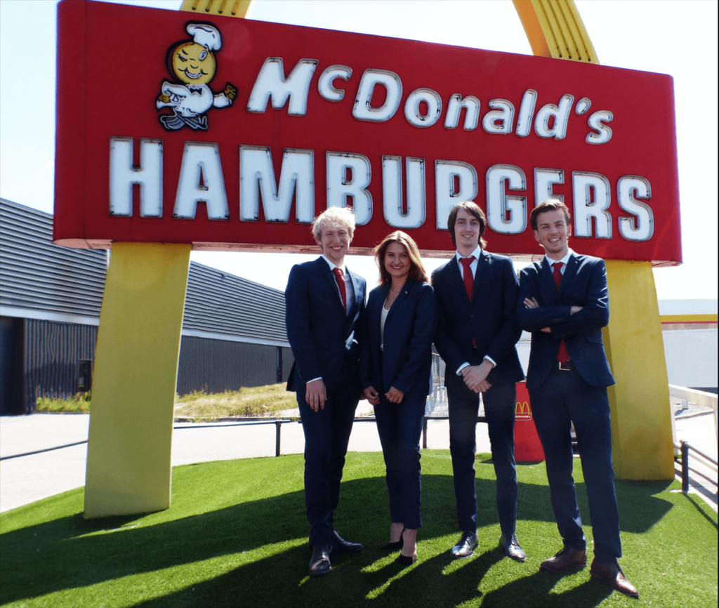
27. EBF Conference
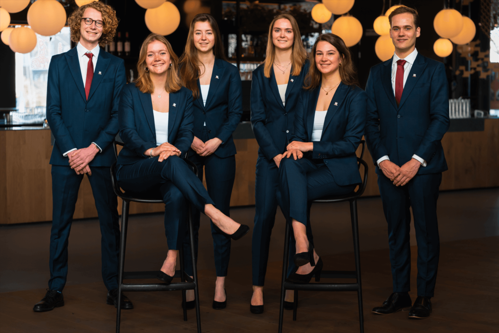
Why do you look like waiters at a very expensive party? The location is quite weird and the lamps in the background are distracting from the board. However, the lighting and composition are just perfect. We’re always in the business of giving away bonus points for good symmetry, which you certainly qualify for! The matching shoes are another plus. Good job!
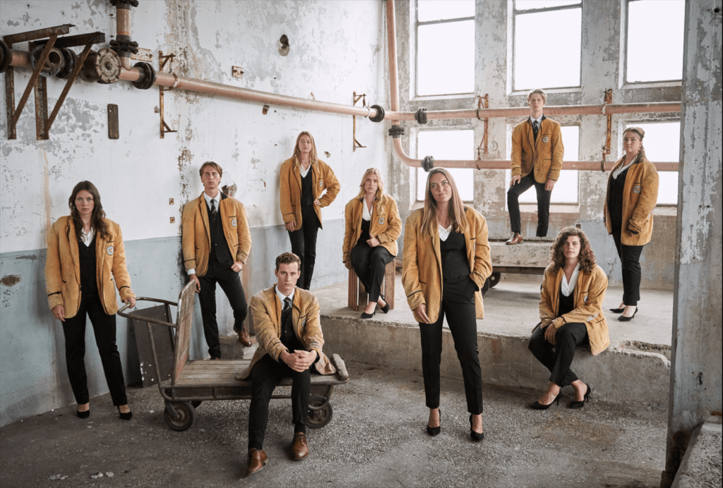
26. ACLO
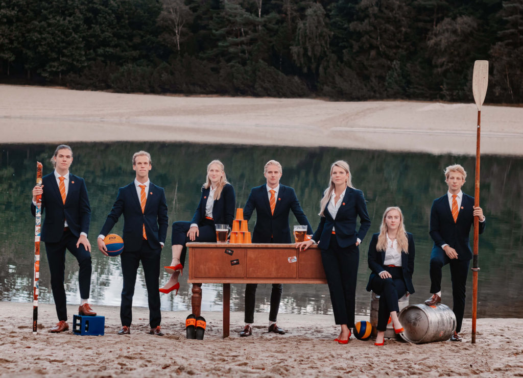
This is the winner of the Board Picture Awards of 2021, the defenders of the title. And they decided to emulate the Cullen Family? It’s a wonder they don’t sparkle. Like last year, your use of props is unrivalled, but there might be a bit too much going on this time around. In terms of colours and composition, once again Wes Anderson would be proud. But the shoes being more of a reddish orange isn’t great. It’s certainly not a bad picture, hence your ranking, but we were a little let down compared to last year.
25. Expedition Strategy
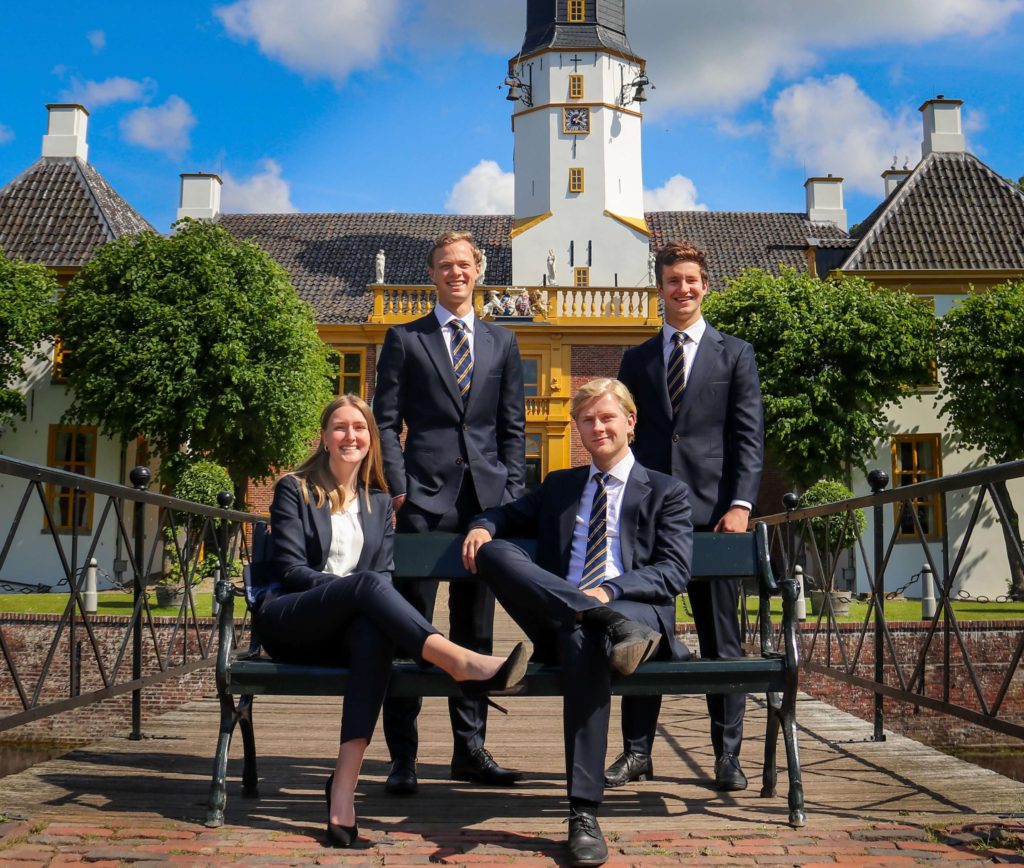
We have to give it to you, you managed to divide a whole association, as your picture raised very different opinions among the writers. Some said it’s a “boring picture for a boring organisation” while others defended the smart colour accents in the ties matching the yellow in the background. One thing though, why did you have to circumcise the tower? Do they make you pay extra for including the whole thing in the picture? Bonus points for carrying the bench to the middle of the bridge, because there is no way that is how you found it. Very good picture!
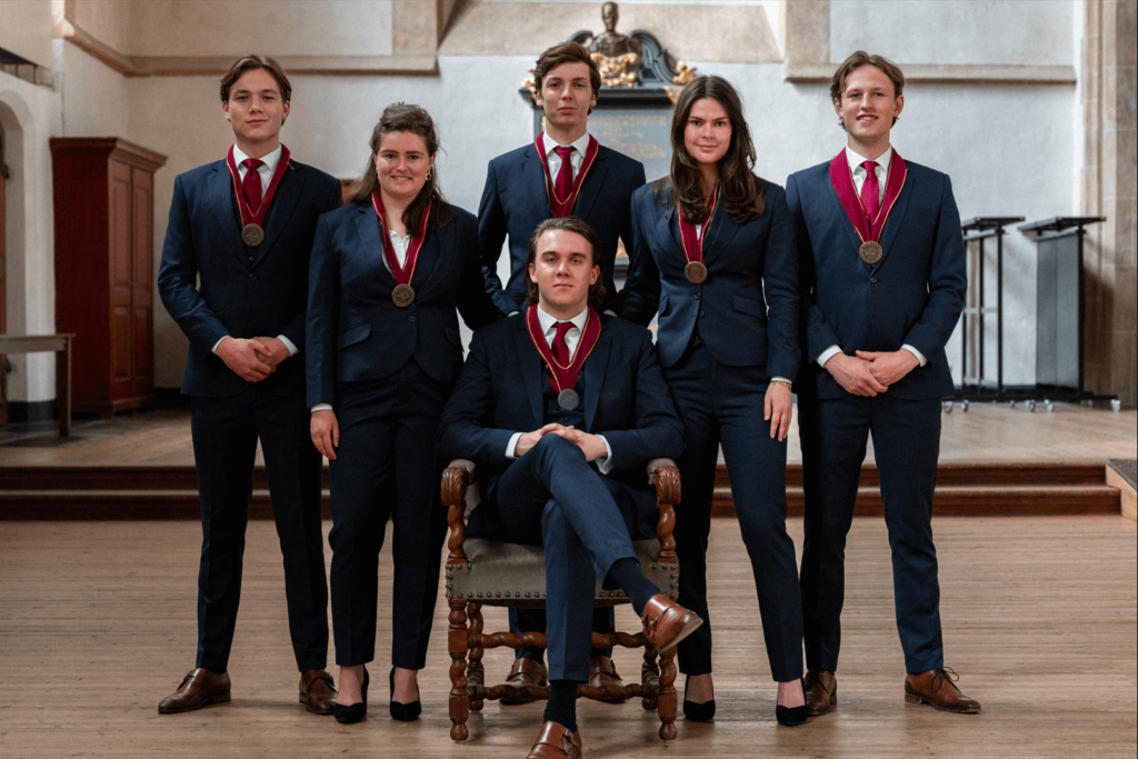
24. Sirius A
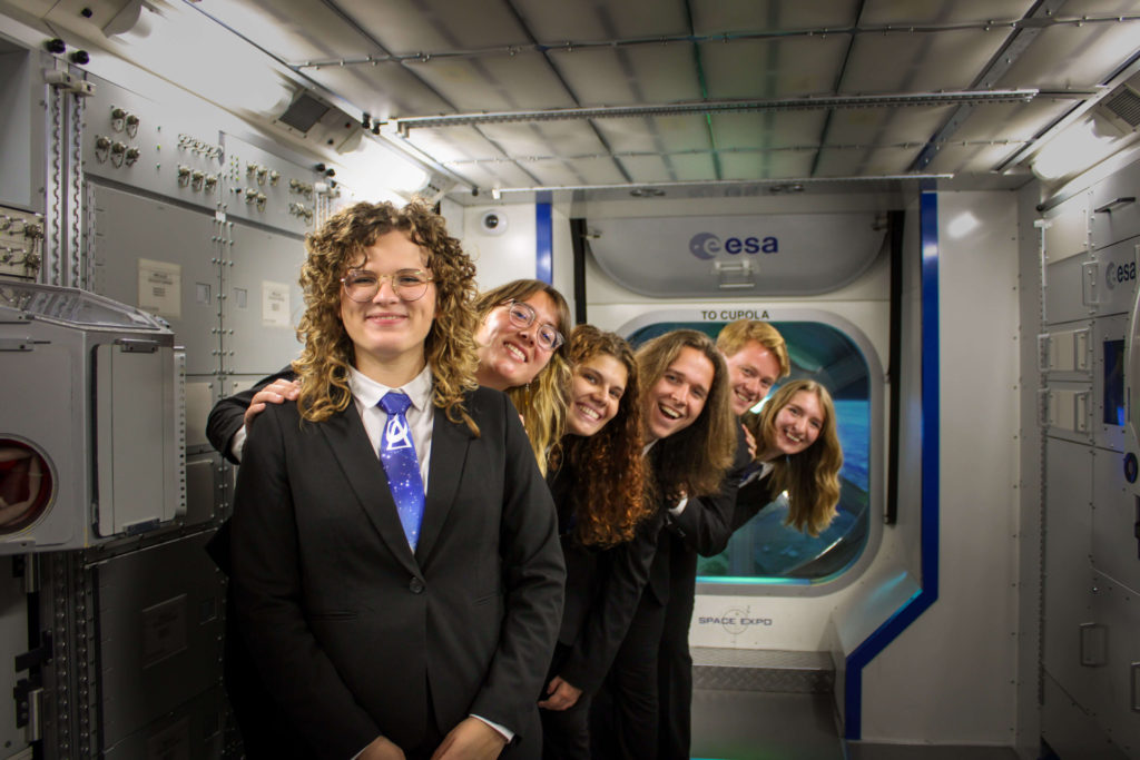
We really like the idea you’re going for. However, we will say the execution is a tiny bit off. Perhaps it would have been good for the heads to go down in height from the chairwoman onward. The setting and ties match the association. These are very nice details! We’re just a little sorry for the one board member in the back who is somewhat disappearing into the background. Besides that, this picture gives off the vibe of a poster for a sci-fi sitcom. Though that’s not really the point of a board picture, it does look like a sitcom we would be interested in watching!
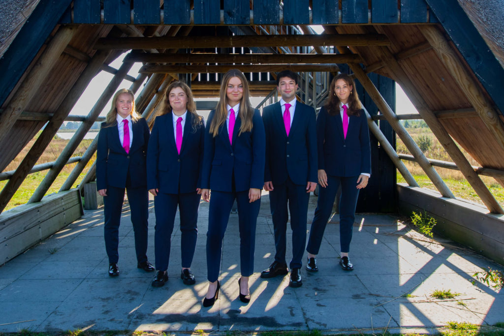
23. EPU
The more we look at it, the less sure we are. Is it bad? Is it good? Is it so bad it’s actually a masterpiece? Technically speaking, it’s horrible. The lighting, the distracting shadow on the ground, and the somewhat awkward posing. However, that being said, we definitely love how unbelievably on-brand it is. We respect EPU’s board for being proud of their own personal Donald Trump impersonators. Is the board’s positioning on the right meant as a metaphor for the state of American politics by any chance? Fantastic interpretation!
22. Faculty Association Ibn Battuta
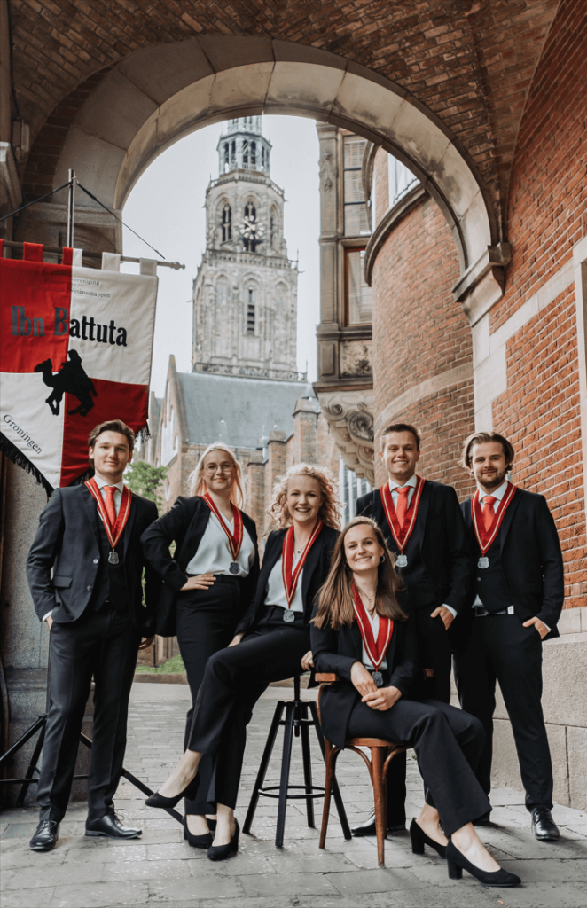
This picture hits the sweet spot of being right in the middle. It’s a little bit boring, but it more than does the job. It’s a really good board picture. The chairs make it a little cluttered, but you guys get bonus points for including the Martini Tower (which looks awesome in this picture by the way!). The flag is nice, and you guys are wearing great matching outfits. Overall, not the best picture, but it looks very warm and inviting!
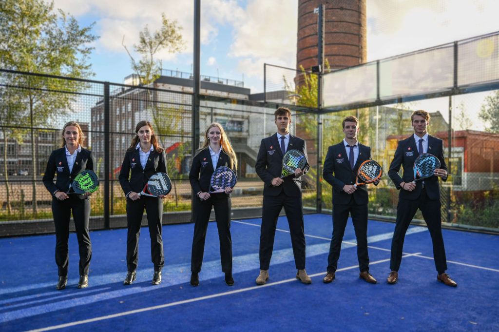
21. Tennisclub Albertus Magnus (TAM)
This is the best racket-related association picture we had this year. That just proves you don’t need to have the actual rackets to get a good board picture! The poses are very nice and powerful, the lighting is good, and the ties are on point (even though we would like to see the two girls wearing them as well). Very good job on this one and great use of the background. Fantastic symmetry, it’s just so visually appealing! However, we are left wondering what exactly has this building got to do with your association.
20. TBV Lugus
The setting isn’t particularly thrilling, but it makes sense and it’s shot from an especially flattering angle. We’re genuinely flabbergasted by how good it looks. This looks like it came straight from the factory’s promotional material in the best way possible. Admittedly, the picture is a bit boring. But the poses and outfits are very good. Good job!
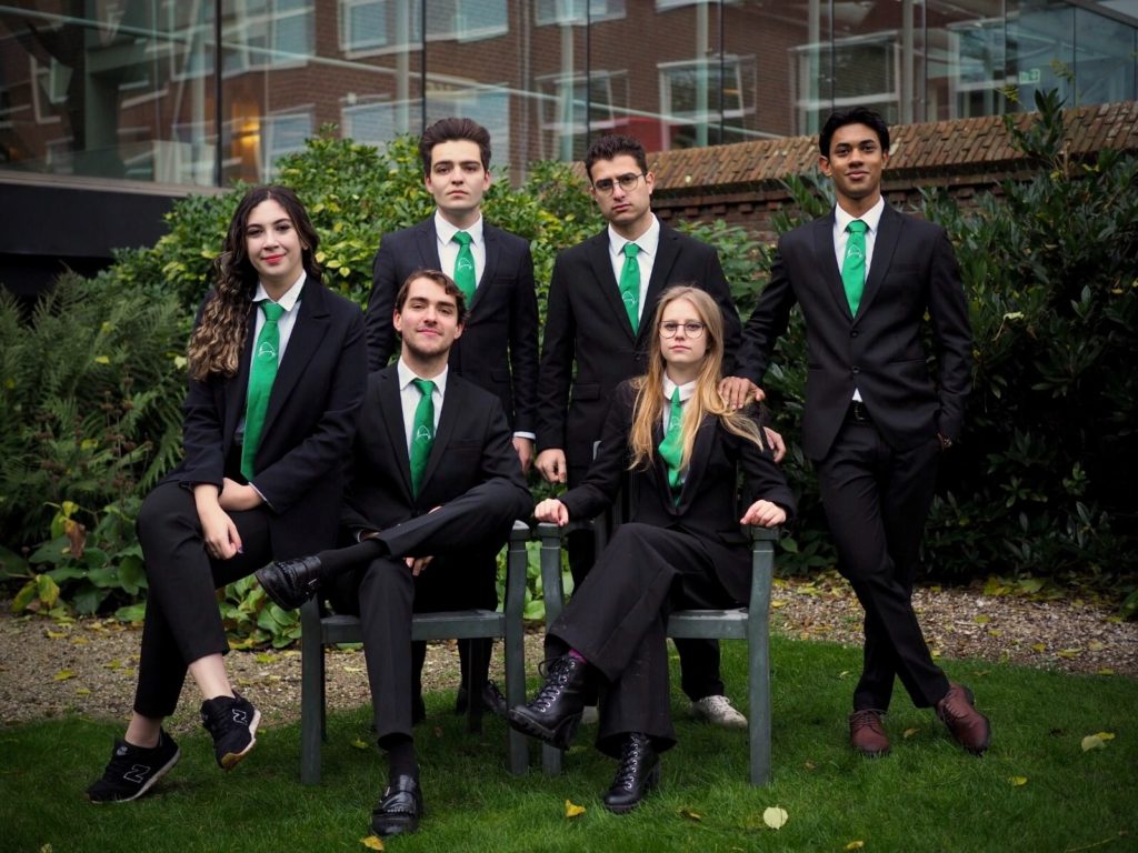
19. Ad Legem
Let’s start by saying that the quality of this picture is really great! The colours work particularly well (the green and orange are amazing!). We’re also big fans of the setting and your suits. Those smiles definitely stole our hearts. It’s a friendly board picture! However, we can’t help but notice that the guy on the right has a bit of a weird pose, while the left one is manspreading all over us. Objectively, this picture is good, but also a bit on the boring side.
18. Studievereniging TeMa
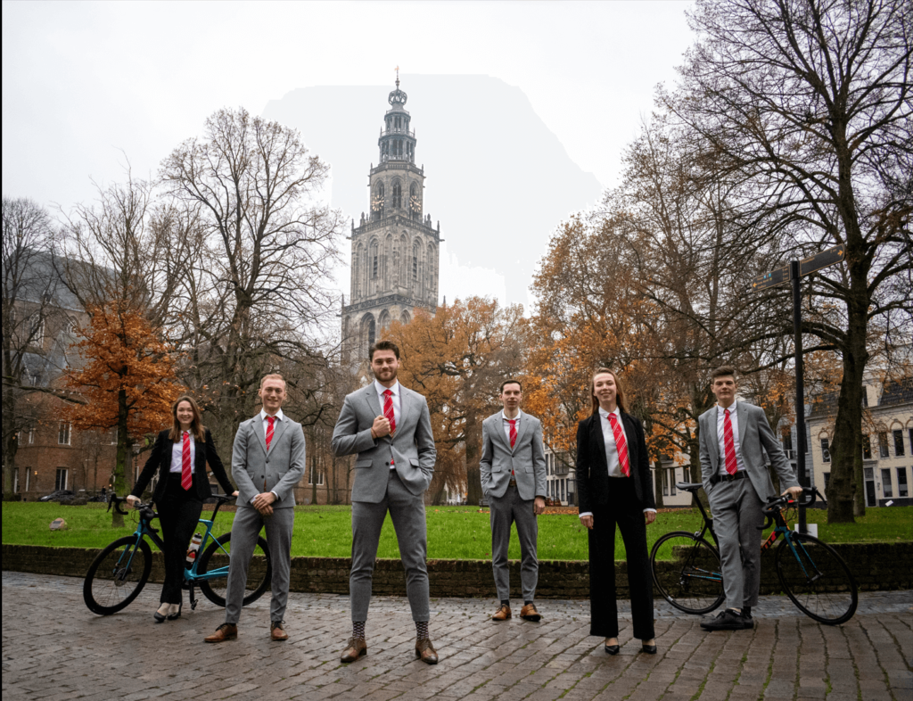
As always, we’re in love with the great symmetry. You guys are striking the same poses, and we are here for it. Additionally, we like the red and navy callback to your logo. You get an automatic +1 for including the Martini Tower and actually taking the picture in Groningen. The composition of the image with regards to how the tower is included is also very good. Compliments to your photographer. You could have done something a little more exciting, so we’re looking forward to seeing what you do next year!
17. De Chemische Binding
We love your effort and want you to improve. Maybe we should call it the Haren curse because it’s yet another botanical garden picture with the same issue: great idea but execution could be a bit better. The quality is very good, it’s symmetrical and definitely looks thought through. Tone down the saturation a bit next time. We love the Marie Curie in lab energy you give with your poses. However we can’t see one of your board member’s’ faces. We love that ALMOST everyone is wearing a tie. We’d prefer it to be everyone, but it does serve to distinguish the chair. The sunglasses are a bit weird. There’s definitely chemistry between you guys, but probably even more between the chair and the cameraman.
16. G.S.W.V. Tandje Hoger
While making excellent use of bikes in the picture, allowing two members to lean on something to make the posing less awkward, the picture has a very political “Vote for us!” feeling. It gives off 50 shades of grey vibes, but not in a problematic way, more like “it’s just a lot of grey” way. Posing could be improved and the Martini tower almost seems like the seventh member of the board! All in all, the quality is great and the setting really works. Good job everyone!
15. MESA
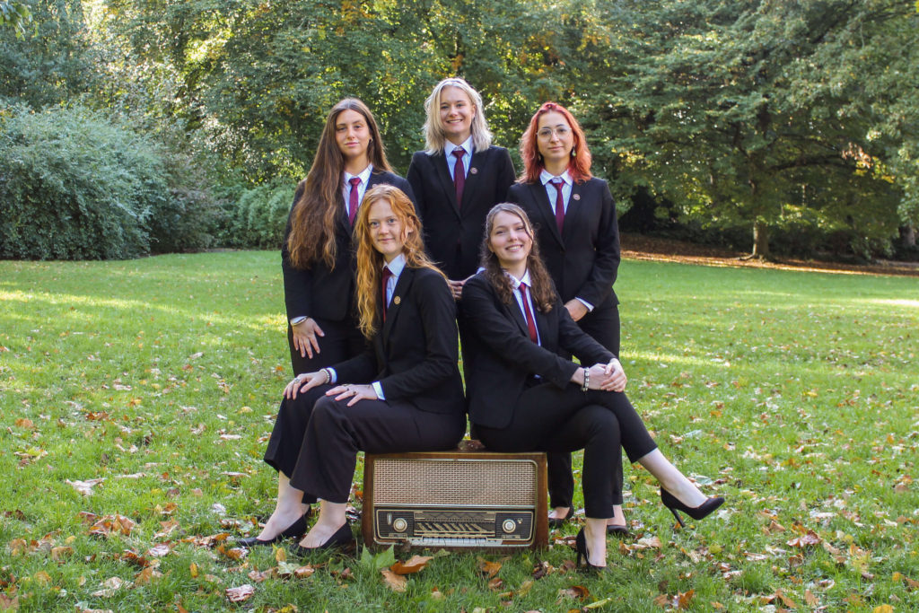
What we can all agree in this picture is that the diversity in hair looks amazing. It is a symmetrical picture, with the beautiful colours of the Noorderplantsoen. You give off really cool energy and the radio makes sense and gives structure to the picture. Maybe there could have been more elements that would help invoke Media Studies. We love the ties and the quality is good. It is very nice, a massive improvement from last year, but not perfect!
14. VIP
Warm and welcoming, although that might just be an effect of the great filter applied to the picture. The university building is very nicely incorporated and it’s a nice touch that the chair is sitting on an actual chair. It’s very well lit and the quality is just great and you guys look very professional. In fact, you guys really look like a bunch of VIPs *wink* *wink*.
13. G.S.Z. Mayday
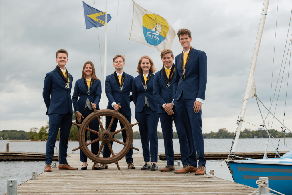
We would prefer to see the whole ship (maybe some pirate-inspired picture next year?) but at least you guys got your hands on the wheel! While all of you look very well put together, have matching outfits and are so full of joy, the positioning could be improved next time, to make the taller member not stand out so much. The sailors on a pier aesthetic of this picture is absolutely everything!
12. MARUG
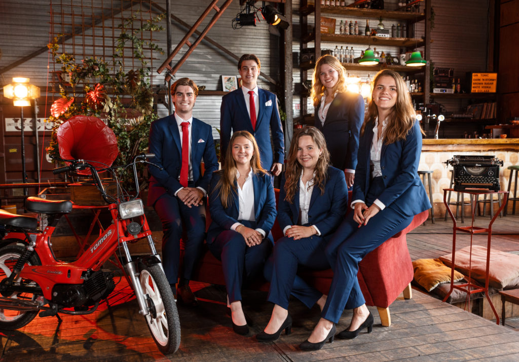
There is something about this picture that, unsurprising considering the association, screams marketing. We guessed it as soon as we saw it. Besides the fact that it is a really good picture, with vibrant colours of high quality it simply sends out from the rest, with its retro vibe straight out of a Coca Cola commercial. Granted it’s not perfect. The light in the back distracts a little from the picture. But fix that and we are sure that next year we will be truly amazed. Perhaps a top 10 spot, who knows!
11. Commotie
This picture is not quite symmetrical, but it still looks like it, which we very much enjoy. And if there is one thing we know from working at a student newspaper is that perception is more important than reality. The composition is pretty good and we do love the colour scheme. We also need to approve of the use of Forum as your setting. The picture does come off as being a little intense, so try and relax a little more in next year’s entry. Great job though!
10. S.V. Vedi
We think this picture is really quite artistic. Massive props to the photographer! The setting is absolutely fabulous. The colours and composition are perfect. The pink and green match your logo excellently. Most of all, you guys look really happy and comfortable. It definitely translates. Great poses. Vedi, vidi, vici!
9. Clio
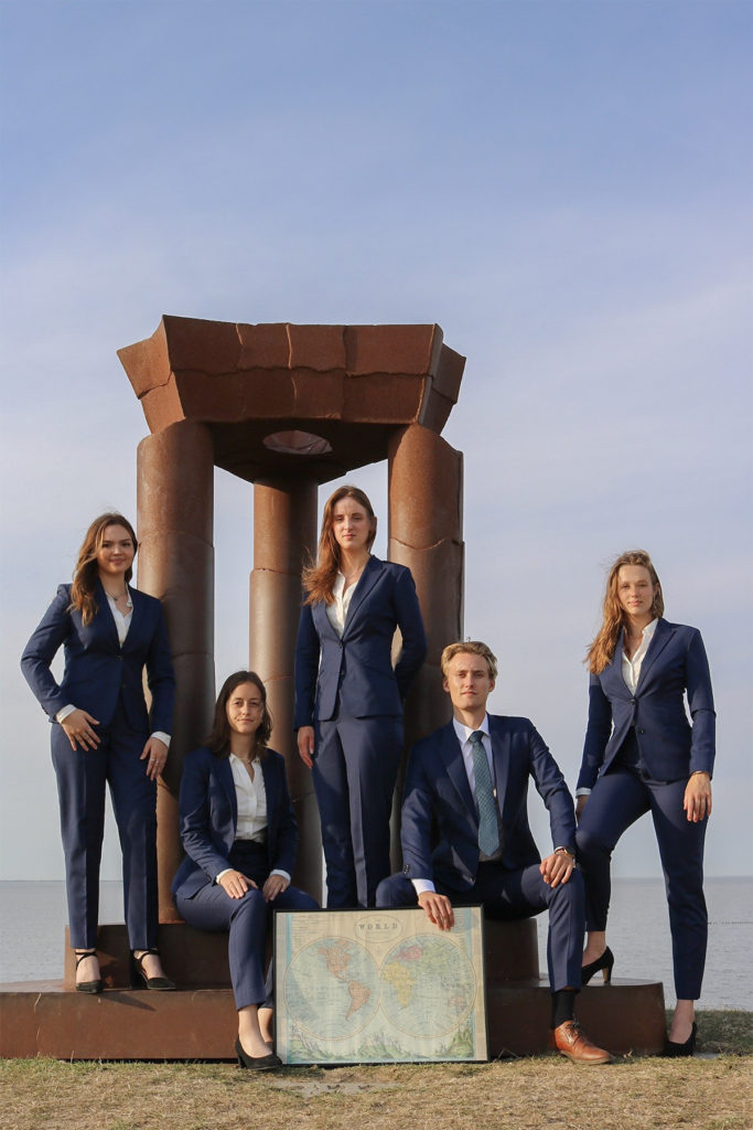
You guys look powerful! Confidence is oozing from this picture, with some much-appreciated girl power. This is also one of the very few pictures where we don’t mind the ‘TikTok’ aspect ratio. The choice of scenery is intriguing. We’re not quite sure where you guys are or what that thing behind you is supposed to be, but we’re enthralled nonetheless. The world map is a nice prop that fits the International Relations study. We’re left wondering only one thing: what kind of shoes is the girl in the middle wearing? We must know if they’re coordinated!
8. G.S.Z.V. De Golfbreker
This is just a peak Dutch picture, somewhat resembling an old Windows desktop, iif you permit a bit of pettiness. Besides being very Dutch it also wonderfully encompasses golf, which makes sense. A perfectly calculated out shot straight into the hole. The symmetry and the effort put into this location is worth our endless appreciation. Great job!.
7. G.S.R. ‘Aegir’
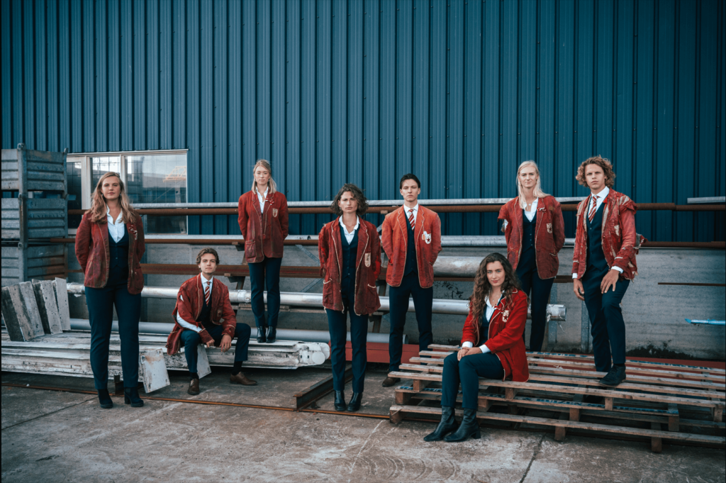
While your picture could easily be an amazing Indie pop album cover, the reasons behind ripped jackets were a point of heated debate. Could it have something to do with the ranks of people on the board? Or is it just to make us ask questions? Everyone had their opinions. Regardless, striking confident poses fits so well with the setting. We’re loving the colours and the artistic vibes. Good job, Aegir!
6. SV. Tapp
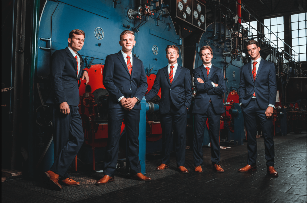
The quality of this picture is just fantastic. The background is great, the lighting is on point, the colours come through very well, and we like the general vibe. Your outfits (shoe coordination!) and poses come together in this really great picture. There isn’t really much more we can say. You guys look like you own the damn place.
5. G.S.W.V. SurfAce
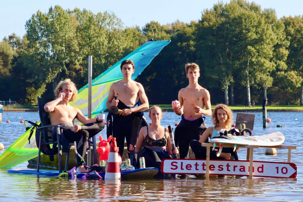
When looking for which association to join – this one is the right answer! Everything in the picture screams playfulness. It’s so bold! The fact you’re not wearing a suit, like most other boards, can be excused because you’re wearing a wetsuit. You guys are the exception because you make it look so damn cool. Subverting the conventions of a board picture for the sake of it means nothing, but you guys executed it so creatively. The props are absolutely fantastic, although we are incredibly scared about the laptop falling into the water… Amazing job!
4. G.S.K.V. Northside Barbell
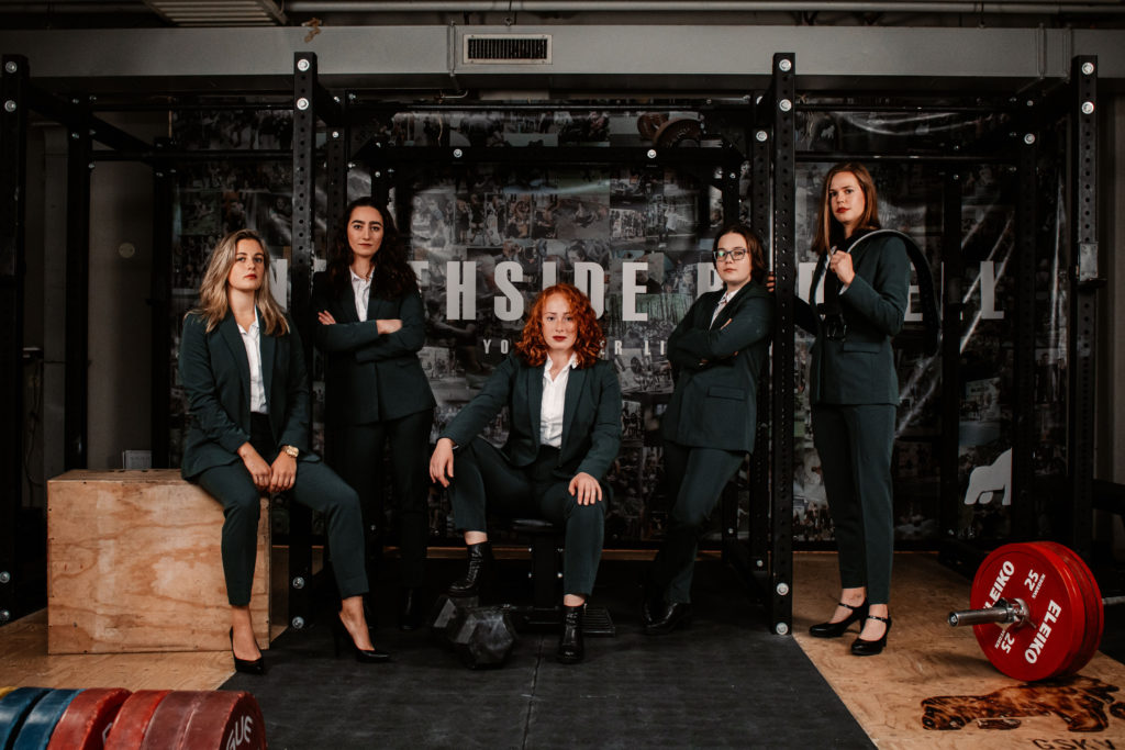
Two words: GIRL POWER. Everything about this picture is great! The powerful poses, the hair, the vibes, the colour scheme is just chef’s kiss. The attention to detail is remarkable and it just looks very cool overall. This is how a board picture should look like. Bonus points for the great hair and the truly badass vibes.
3. GSV Groningen
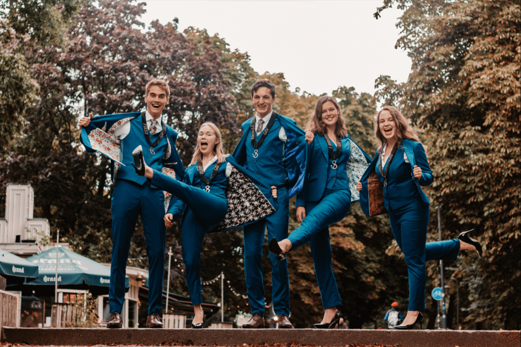
If there is one picture that gave us a true come to Jesus moment it’s this one. It’s dynamic, it’s fun, it’s in the Noorderplantsoen!! And the suits! Holly f*** are they amazing! We won’t even ask where you got money for personalising them. We just love the warmth and the energy you give off. You look very approachable and inviting. Awesome picture, let’s hang out together!
2. Groninger Studenten Toneel
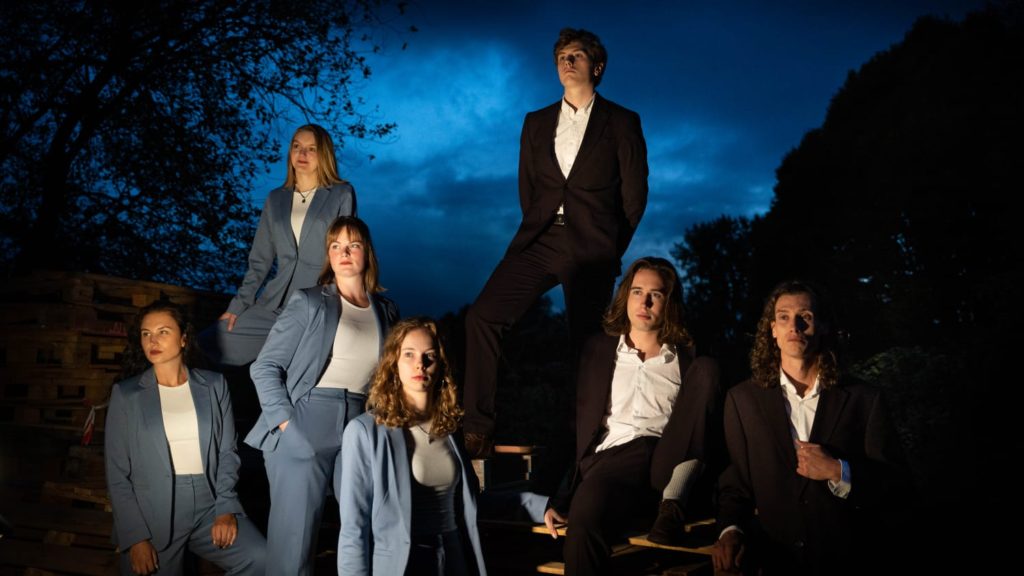
Wow. Wow, wow, wow. We are longing for creativity, style, distinctiveness… The Groninger Studententoneel has it all. This may even be the first picture taken in the night-time that we have ever judged. It’s giving us Teen Wolf vibes, in the best way! This picture emanates drama, very fitting for a theatre association. The expressions and poses are great. Also, the duality within the picture – dark versus light – make the entirety of it playful and give the picture character. In one word, stunning!
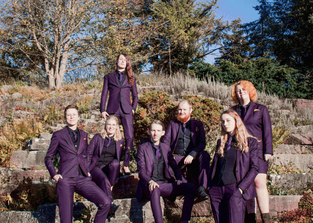
1.G.S.M.G Bragi
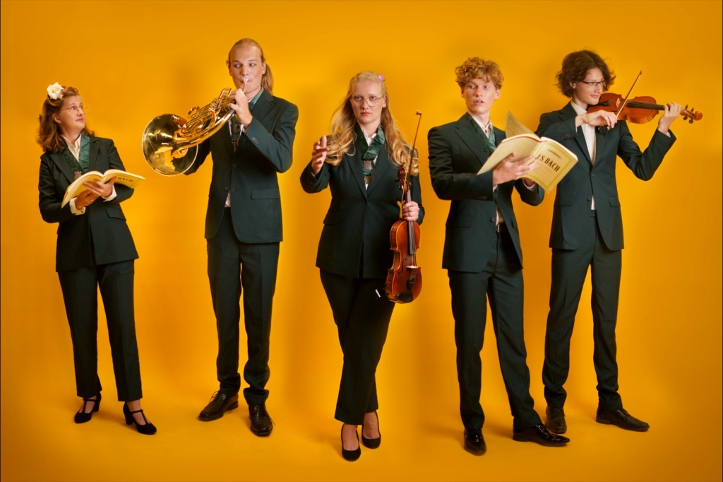
And drumroll please for the big winner this year! All we can say is congratulations to you for having the most visually pleasing board picture of 2022. You guys have certainly managed to make an orchestra and choir look cool, which should speak for itself. Everything about the picture is a 10/10, the colours, the poses, the props, the energy, everything is just gorgeous. You look powerful but not intimidating and you look like you’re having fun but still manage to look professional. Everyone else should take notes because this is how it’s done. One point of improvement though, we couldn’t help but notice that the two girls have different colored flowers in their hair, maybe next time try to colour coordinate better. But regardless of that, great job, you understood the assignment and went an extra mile. Congratulations!