
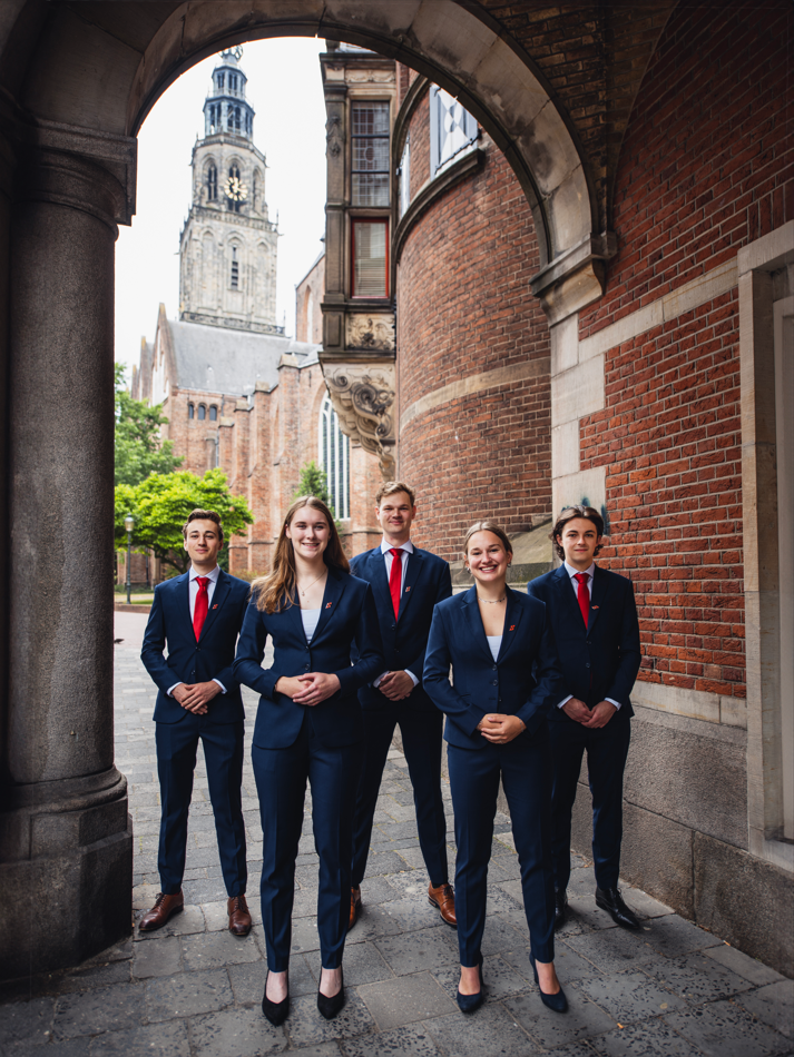
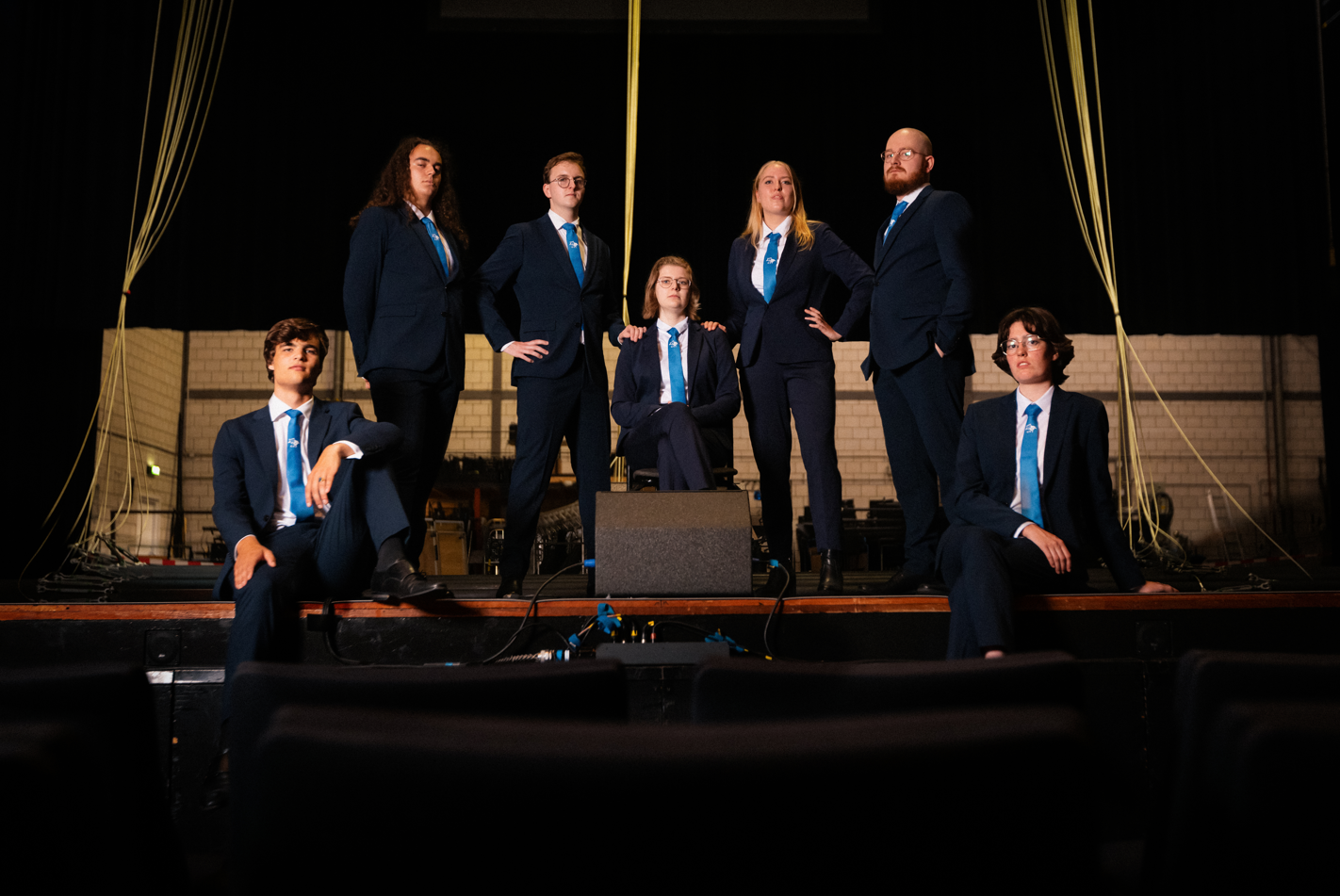
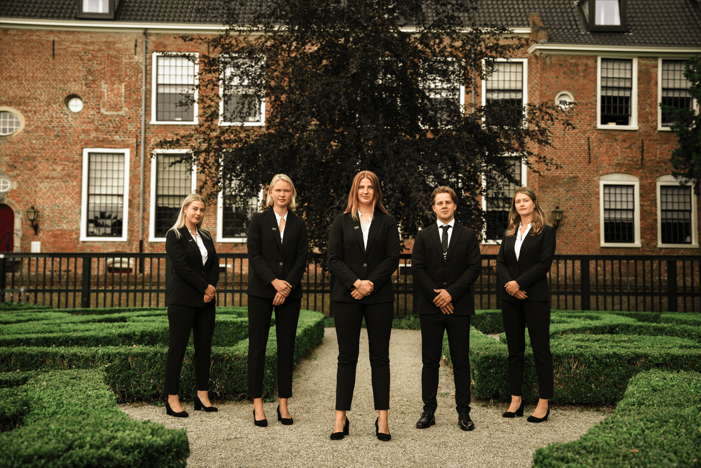
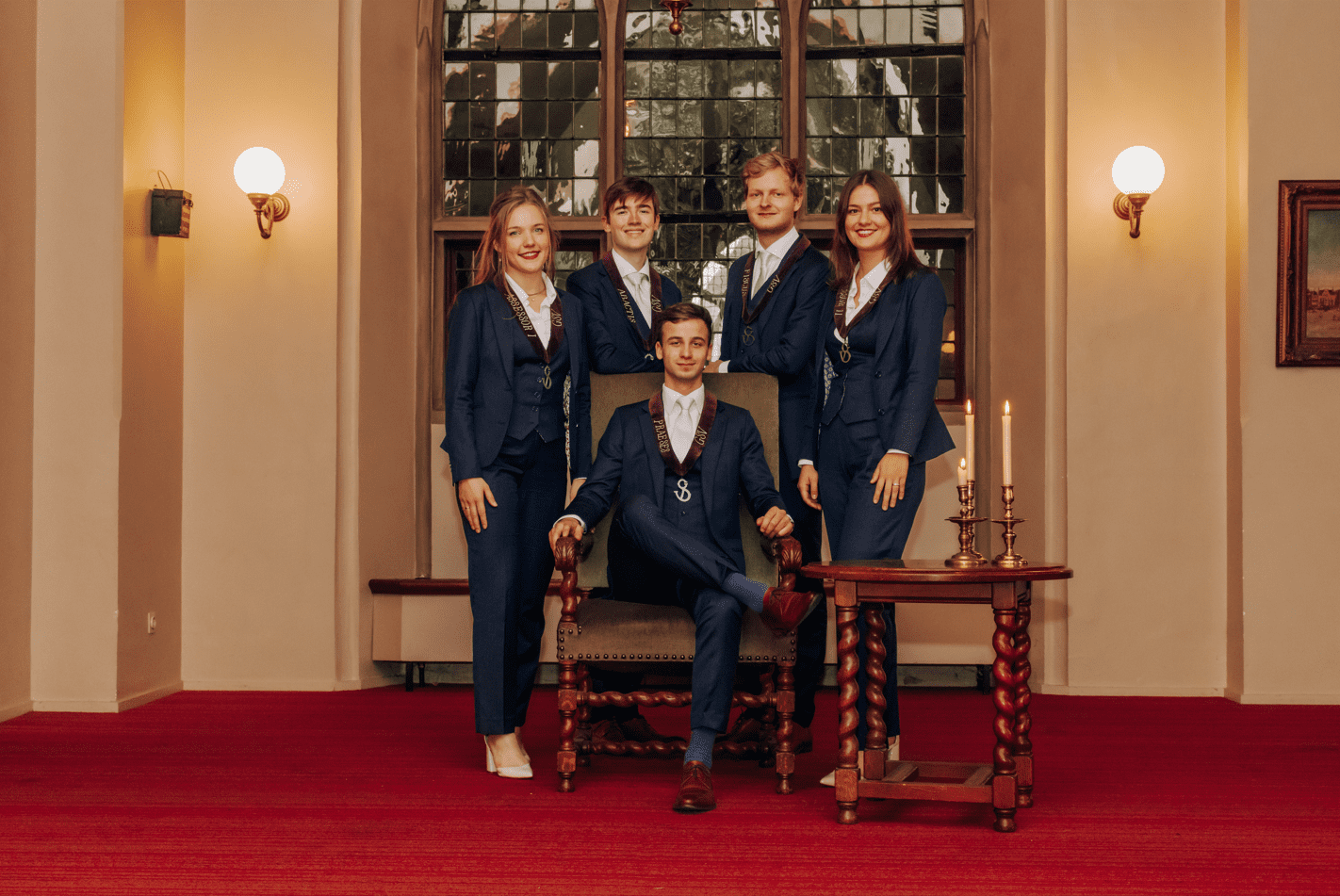
Board Picture Awards ’23-’24
Content warning: this article is created entirely in good fun and is not intended to offend anyone. Any criticism and jokes are aimed at the picture and not the people in them or the organization they are a part of.
Welcome to the annual Board Picture Awards! Over a series of meetings, the writers of SK met up to eat snacks, drink beer, and mercilessly tear apart a record-breaking number of well-meaning student associations who naively entered into this competition in the hopes of making the top spot. 99 of Groningen’s finest boards threw their hats in the ring, but only one may emerge victorious!
After many, many, many weeks, the results are finally in. Some of you will bask in the glory of making it to the upper echelons of our ranking due to your unparalleled creativity and execution, while others failed so spectacularly that it deserves its own kind of praise. Unfortunately, many stuck to the middle of the pack, submitting pictures so bland it makes Dutch ‘cuisine’ seem exciting.
The photographers behind these photos range from absolute masters of their craft, to hopeful amateurs trying their darndest, and a cardboard box someone used to balance their phone on. They are all united by having two things: fear of our judgment and better photography skills than all of SK’s writers combined.
We’d like to thank each and every one of the boards who submitted a picture this year, as we simply could not continue this tradition without you guys. Thank you for once again indulging in our playful banter!
Will anyone get offended by a roast they willingly signed up for?
Will the writers get over their visceral hatred for vertical pictures?
Will any picture be worse than two guys holding a fish?
All that and more in the Board Picture Awards of ’23-24!
Disclaimer: all of these pictures were compressed for the purposes of this article. If you would like to view them in their original quality, visit the respective association’s website.
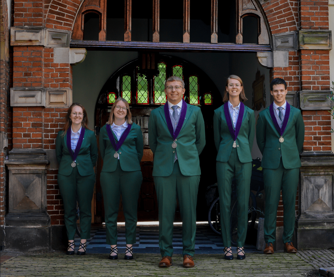
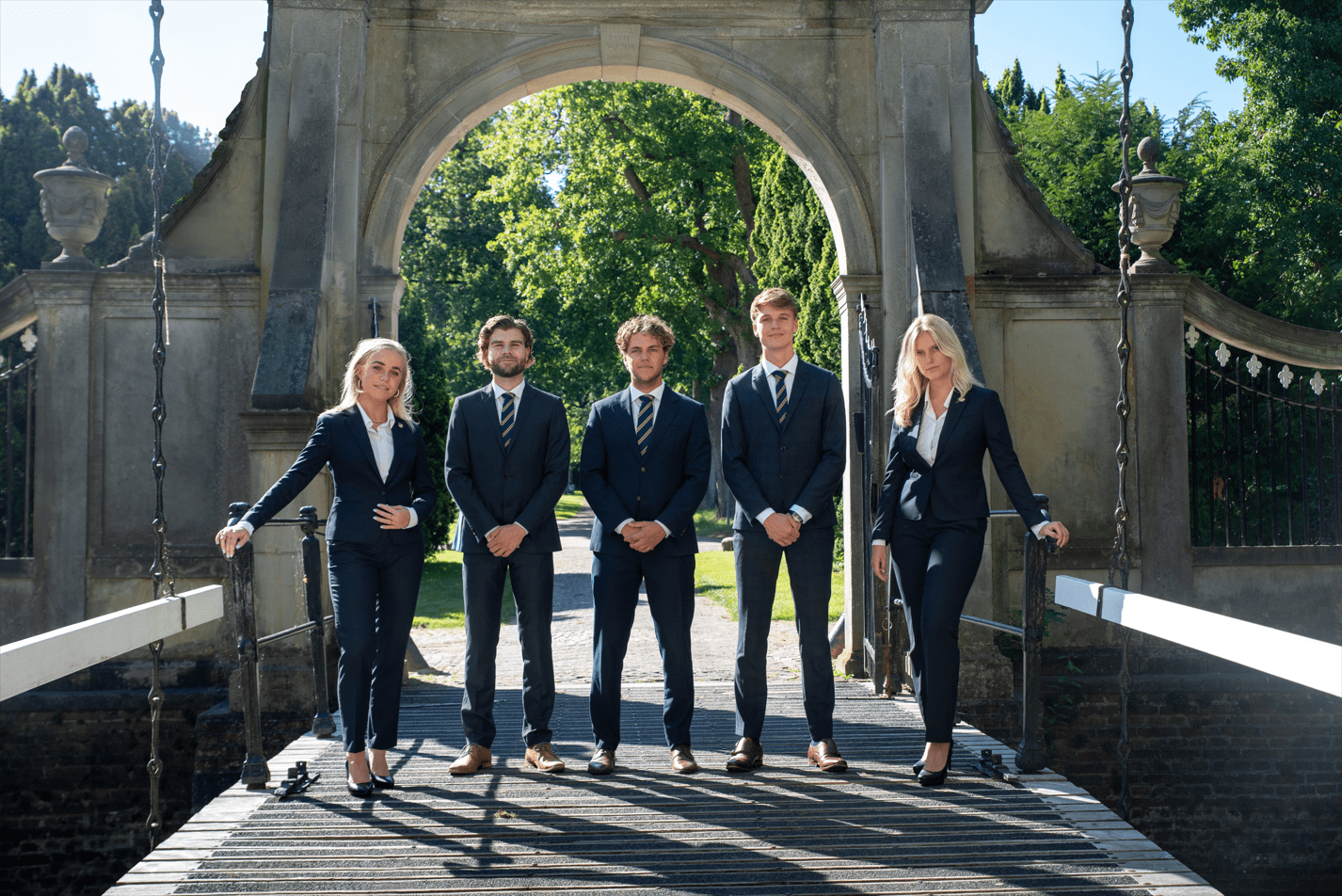
99. Vedi
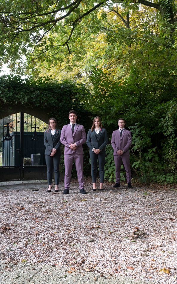
Guys, rumor has it that if you squint real hard, you might be able to find Vedi’s board in this picture! As far as we can tell, you look great, but the problem is we can barely see you. As dieticians-in-training, you seriously malnourished this picture. Unlucky for you, but we were still able to spot the guy on the right is wearing sneakers: real fashion faux pas for a board picture! Also, why are you at what looks like a cemetery? Is that where we’re headed if we follow your advice?
98. Zeilteam Rijksuniversiteit Groningen
Maybe you guys didn’t get the memo, but this is the ‘Board Picture Awards’. Not ‘random-tuesday-afternoon-selfie awards’. And let’s be honest, this picture would finish last even in that competition. To be fair, you do look like you are having fun and like your association would be nice to join, but for goodness’ sake, pose next to more than a quarter of a sailboat next time. And lose the jeans for more appropriate attire. As for the lighting, maybe the fact that everyone is squinting explains why no-one noticed how bad this picture is. At least we can see you?
97. Martinistam
We are fascinated by the dollar-store Thor’s hammer you’ve got. Mjölnir eat your heart out! Unfortunately, you guys didn’t quite manage to capture lightning in a bottle with this picture. Why are you guys camping out in an abandoned, back-alley-looking parking lot? Is this the shady factory where the girl scout cookies are made? Another vertical nightmare with way too much space in the top: crop it out! Props for the matching outfits though?
96. G.S.S.V. Squadraat
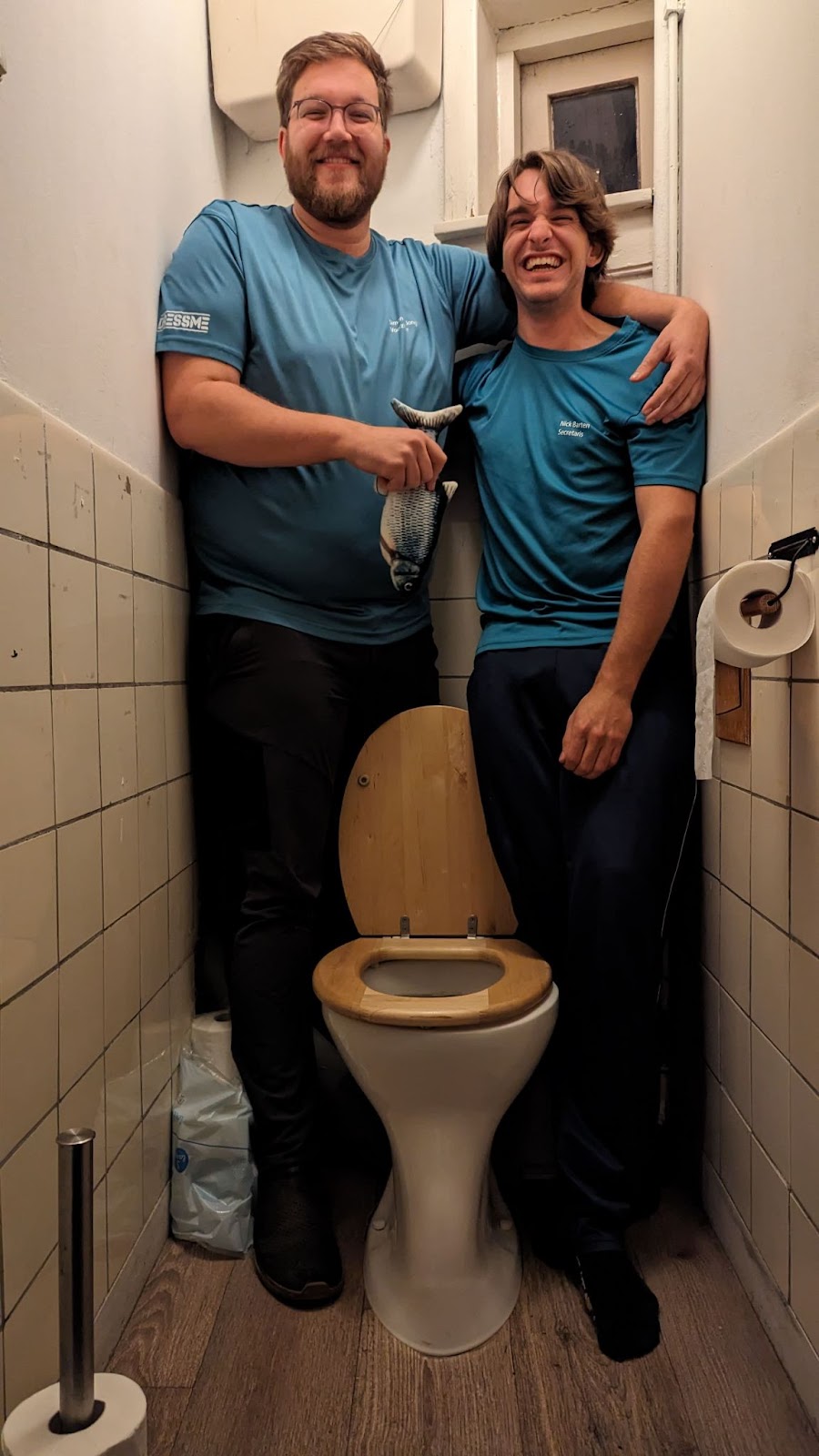
Absolutely fucking iconic. Why are we in a toilet? Are you guys the only members? What’s up with the fish? Is he your chairman? What is going on? This is the perfect example of a “so bad, it’s good” kind of board picture. We love the clear lack of effort paired with the sense of humor to have your association’s picture visually convey the word squash. We’re still going to rank you badly, but you’ve certainly won over our hearts. Can we hire the random box that took this picture for our own board pictures by any chance?
95. S.V. Homerus
*Yawn* Boring.
94. O.C.S.G.
An example of a board who has better board pictures on their website than the one they actually submitted! You guys look like you’re taking yourselves way too seriously, almost comically so, which is weird considering you had more joyous photos to choose from. This amounts to you not quite pulling off the power poses you were going for. The Madame Tussaud-lighting also makes it look like this is the cast announcement for a Twilight reboot. And we’d like some uniformity when it comes to wearing belts and having your jackets closed or open. Good location for a picture that certainly had potential, but you didn’t quite execute it well enough.
93. T.C. Veracket
Why on earth did you take this picture in your shed? And are we missing any sort of connection between your tennis association and pallets containing drawings of monkeys and giraffes? We also noticed you forgot to clean your shoes before taking the picture. And the glare from the windows in the background is yet another question mark. Why?
92. E Pluribus Unum
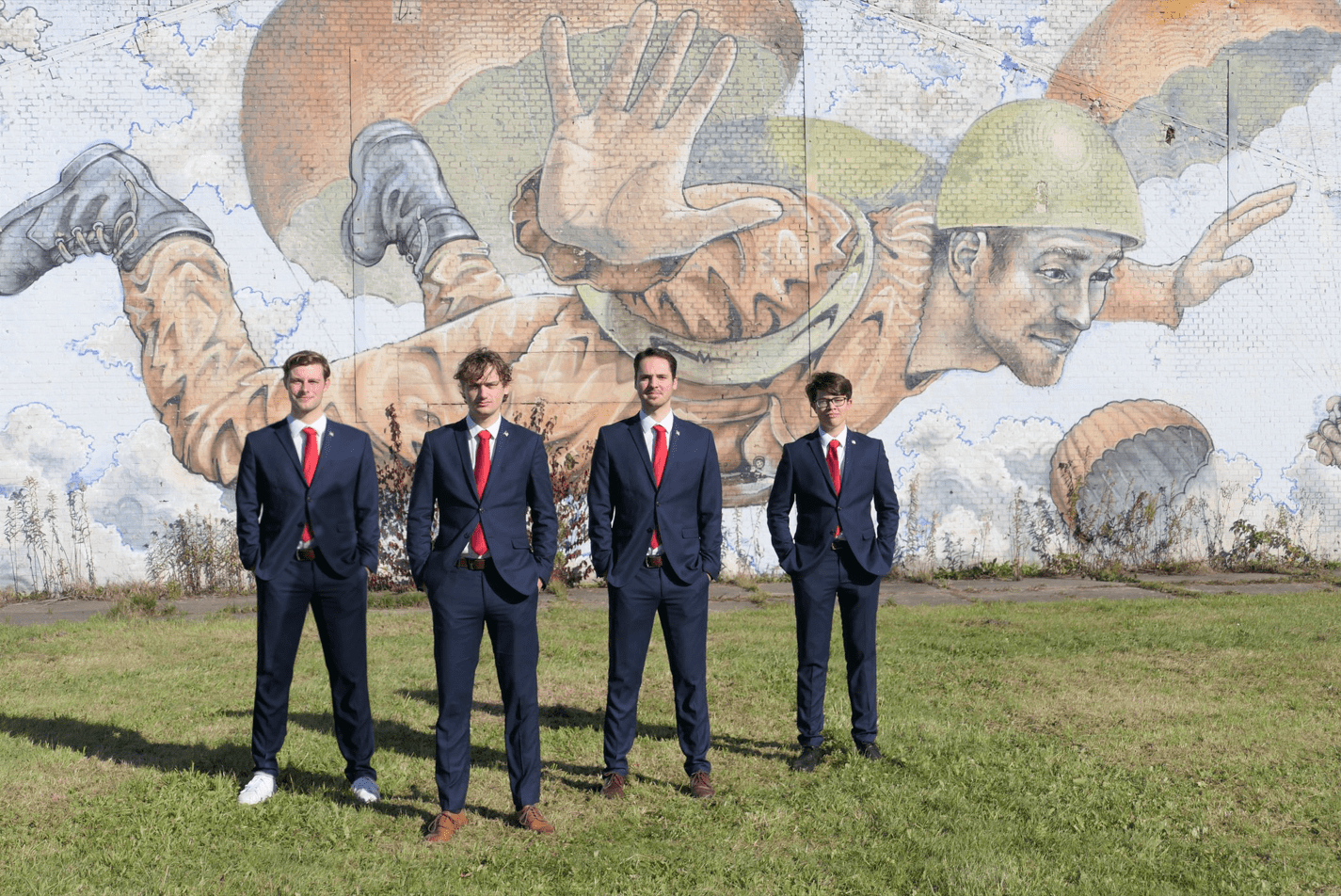
You thought no one would notice, but we did. The liberation of Groningen, (what the mural behind you is depicting), was accomplished by the 2nd Canadian Division. Though to be fair, what is more American than taking credit for a Canadian effort? Otherwise, the picture itself is as lazy as your location scouting. Or is the parachuting soldier meant to represent your fall from grace from last year’s awards? In which case, we appreciate the meta-commentary. Why are you not in the center? Why do your expressions range from mildly amused to “just returned from war”? We know America is a melting pot of culture, but you could have worn similar footwear. And please, please, tuck your ties in gentlemen!
91. SIB-Groningen
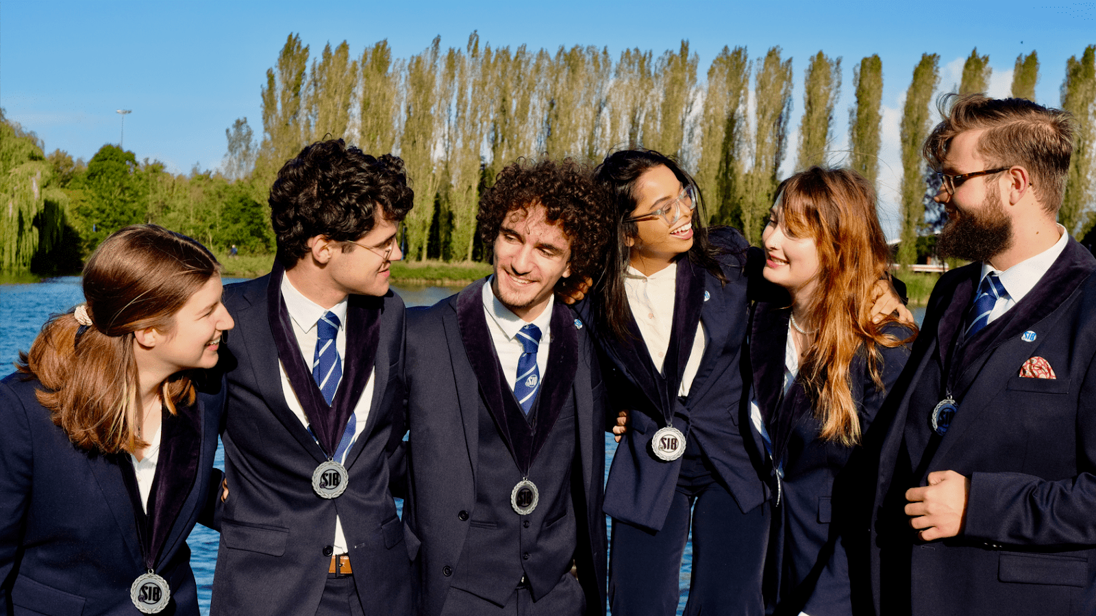
It’s cute that you all seem so happy to see each other, but we would like to see your faces too! The composition is rather weird and the girl with glasses looks like she’s awkwardly standing or being balanced on some kind of soapbox. One of the guys seems to have forgotten his vest: make sure to match your clothing! And next time use less HDR, the lake water looks like a chlorinated swimming pool this way. Also, we prefer the picture on your website. Maybe you should have submitted that instead?
90. Studievereniging Max L. Snijders
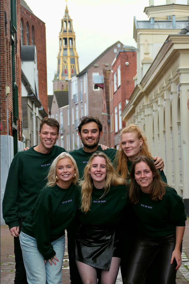
After seeing this, maybe you guys shouldn’t pursue a career in photojournalism. Although the matching sweatshirts are a nice showing of playfulness, they’re not quite professional. And then doing sorority squats in the leather jeans and skirt? Not big fans. Huge downvote as well for the picture being vertical, even if you wanted to include the golden tower (which didn’t even completely make the cut!). You seem a bit too happy and proud of this picture.
89. AEGEE-Groningen
POV: you’re an ant on the streets of Groningen. Why is the board looking down on us? Huge missed opportunity for this travel association not to take their board picture while on a trip. You’re likely the only ones who could get away with not featuring the city of Groningen. That being said, you could have made use of Groningen’s beautiful train station as a setting to get the “travel” theme across. The colors are nice, if a bit oversaturated, and you clearly went for the golden hour effect. Unfortunately, with the way the camera is positioned it also means that half of your faces are in the shade.
88. G.S.P.V. Parafrid
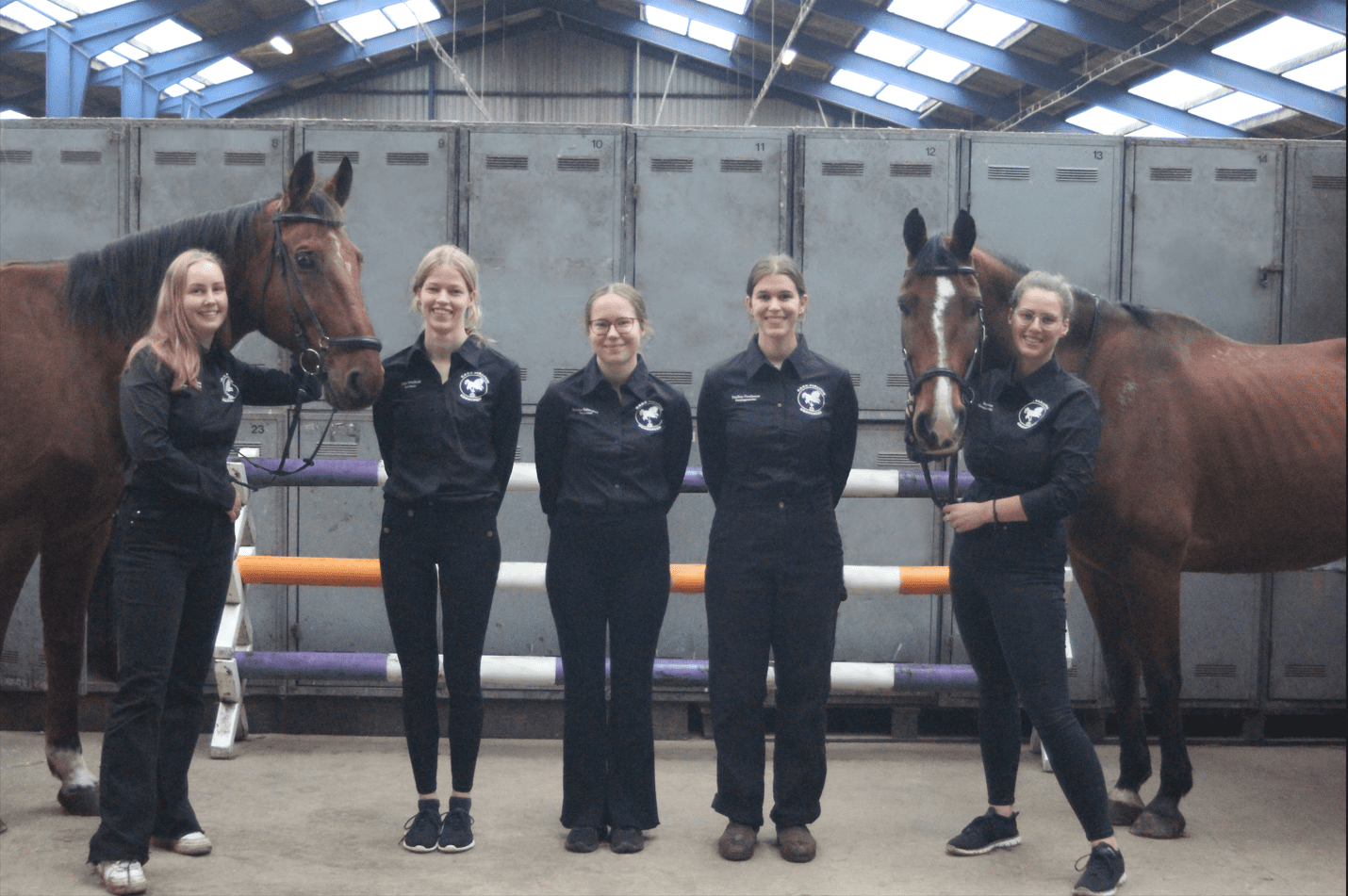
We love the horses! Are they part of the board? Because they should be! Glad to see you are on theme with the location, but why are you guys in front of the lockers of all places? You could have been much more creative and visually exciting with what you have: we want to see you riding those horses! Also, with those collars, y’all look like the waiters at a country-themed restaurant. Though, we imagine the owner wouldn’t want you wearing those dirty sneakers, but instead your expensive riding boots! The sneakers are also all different, just like your pants, so not great on coordination.
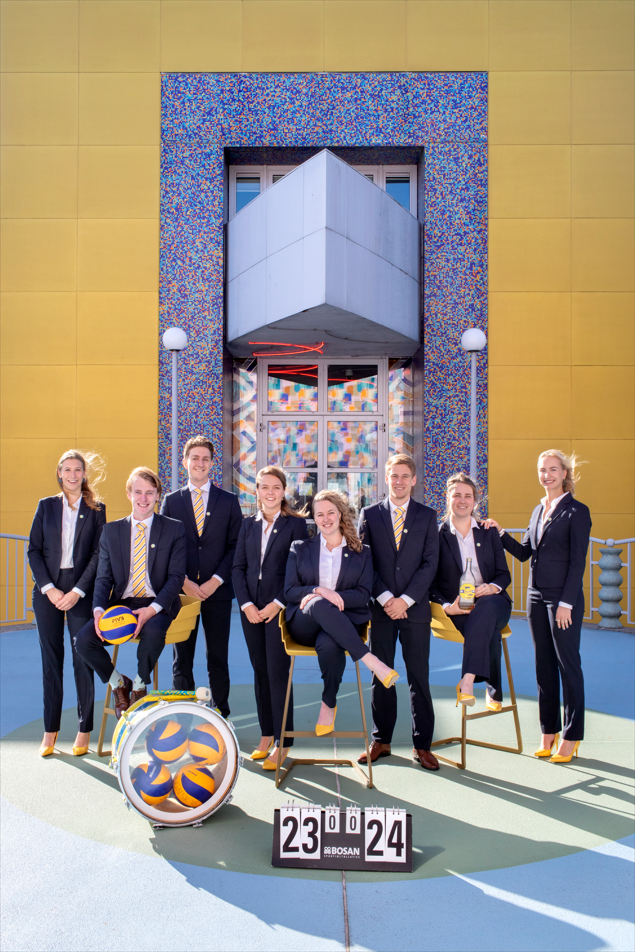
87. G.S.B.V. Tweeslag
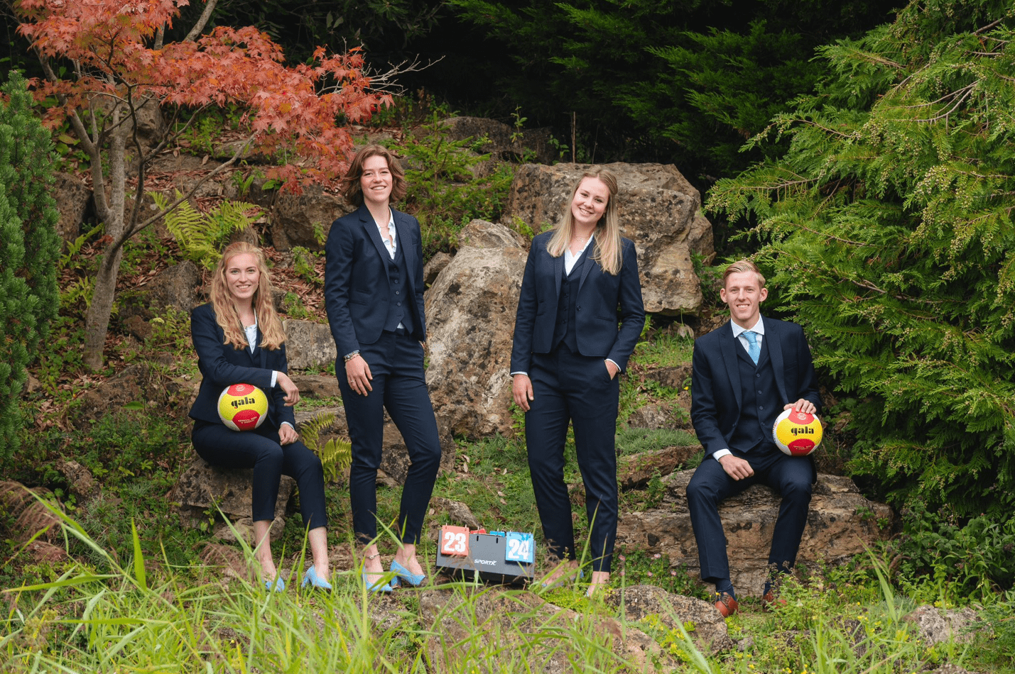
Wow, looks like you guys had a blast playing beach volleyball in the middle of the woods! The mismatched footwear and ill-fitting pants are also definitely making a statement. The props are good, but we know you could do much better. The score being 23-24 is a nice touch, but a shame that we can barely see it. Thematically, this picture is a bit all over the place and underwhelming, but hey, at least everyone seems to be having a laugh, us included.
86. Hanze marketing vereniging Actis
For a marketing association, we’d suggest increasing the budget for the visual side of your PR department. Your poses and attire exhibit professionalism, but the composition makes you look a little awkward. The guy on the left looks like he’s about to slip with his foot hanging over the stairs like that. And the image is slightly tilted to the right, while the arch in your background is partially cut off. Show off the entire arch! And where does this door behind you lead? To a gallery of better board pictures?
85. G.S.V.V. Veracles
*insert Spongebob MY EYES meme* Did you set off an H-bomb in the background before taking this picture? Not only does the editing blind us, it also makes this look like a Weasley family portrait. 60% of this picture is unnecessary: we don’t need to see meaningless run-of-the-mill Dutch buildings, showcase you! We’re fans of your outfits and you guys give off good vibes. Though we’re docking points for it being vertical.
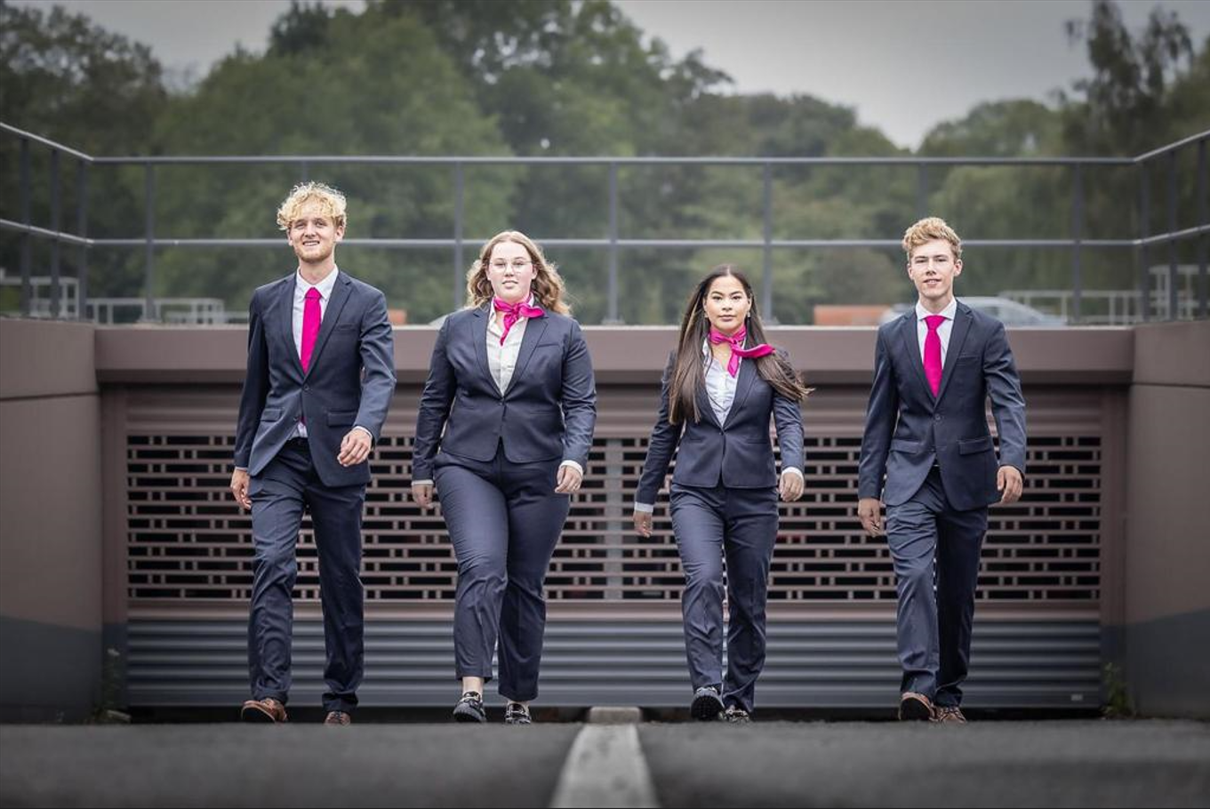
84. FSG
There’s a few things this picture needs, like a little less contrast and a lot less headroom, but more importantly – why do a power walk if it doesn’t look powerful? It’ll take an age to get wherever you’re going at this pace. Speaking of, it looks like y’all are headed to the bank to deposit a phat check. Or to pitch us bitcoin with a twenty percent commission on sales. There could’ve been a badass formation here, show us your leaders in front flanked by support, walking towards a pile of gold or something. Then we’d have some depth, at least. The image quality is nice, though, and you look quite professional. But again with the ties!
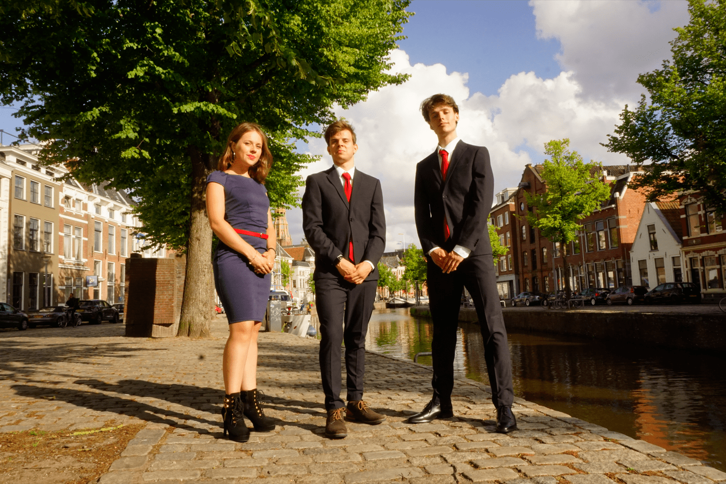
83. Studievereniging ASCI
So here’s a really good tip, something so obvious we never expected we had to spell out: don’t put an actual pile of shit in your picture?! Unfortunately, the rest of the picture is not much better. Why are you here? The area looks dreadfully depressing, and though the computer science props are nice, why did you go through all the effort to bring them HERE of all places?? Your poses look good, but it just doesn’t make up for this questionable choice of location. And the pile of shit. Let’s not forget about that.
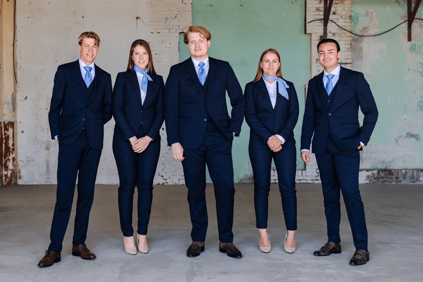
82. Studentengenootschap voor Onderneming & Recht (S.G.O.R.)
At first glance, the quality is fine. We like your suits and poses, but we wanted to know where the picture was taken. So, we did what we always do. We put on our Sherlock Holmes hats and tried to analyze the different clues in the background. Eventually, the neon wasteland at your feet gave it away: this picture must have been taken at Chernobyl! Or, whoever edited your picture got reeaaally carried away when saturating it. Considering how unhappy and uncomfortable you look, we think scenario one is more likely. It’s like you’re NPCs during an idle animation. Combining this with the fact that the tower of the beautiful building in the back has been cut off, this picture is average at best.
81. F.F.J. Bernlef
There’s so many things to like about this picture! The badass V formation and poses. The beautiful flag prop. The unique location. And the sophisticated outfits. Unfortunately, you seem to have taken this picture during a solar eclipse. Or utilized but a single candle for the lighting and called it a day? It completely spoils what could have been a very good picture. It’s like you poured gasoline all over great potential and then set it on fire. Although, had you done that, we’d actually be able to see something.
80. Maslow
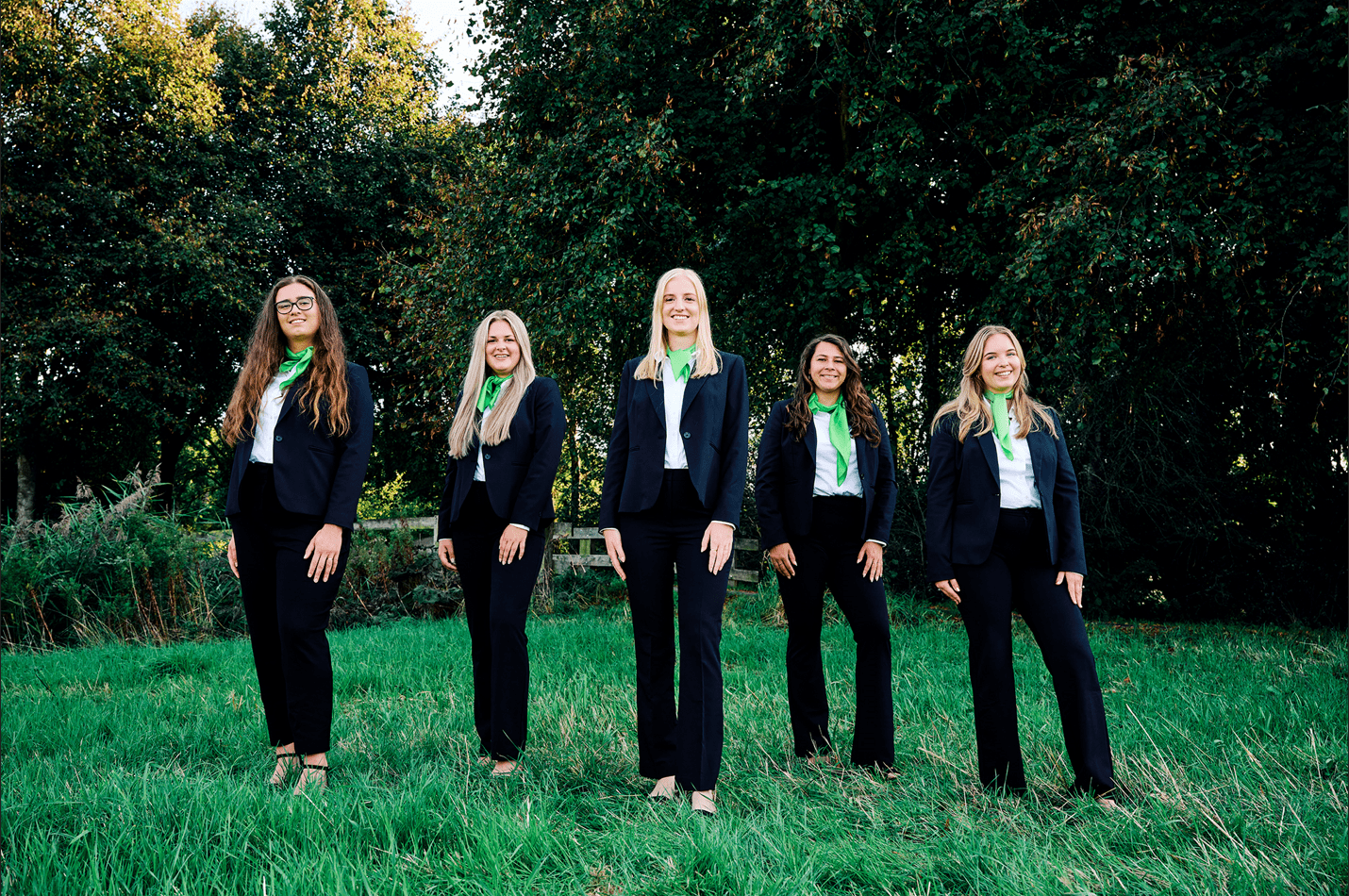
Fifty Shades of Green… And all of them are ugly? We’re as overwhelmed by the dissonant green tones as your shoes are by the unkempt grass. Girls, we can feel your heels sinking into the ground and it’s making us sad. Why didn’t you coordinate the way you tie your sashes? Is it because everyone is special in their own way? The rest of your outfits look great, your poses are professional enough, and you look like a nice bunch. Better luck next time?
79. Recruitment Days Groningen
Maybe it’s the overpowering grain or the just-not-right framing, but it feels like looking at the cast picture for an offbeat, inoffensive reality show about a group of bartenders. That might eat us someday… Also, don’t do vertical pictures, unless for a very good reason. There are leading lines right behind you which could have given it some nice symmetry, and the verticality MIGHT have made sense. But the image is framed like this wasn’t planned at all. The location is nice and colorful and, with better image quality, lighting, and framing, it could have looked special. Nice matching outfits, but was the camera too fast for you to close all of your suit jackets?
78. Stukafest
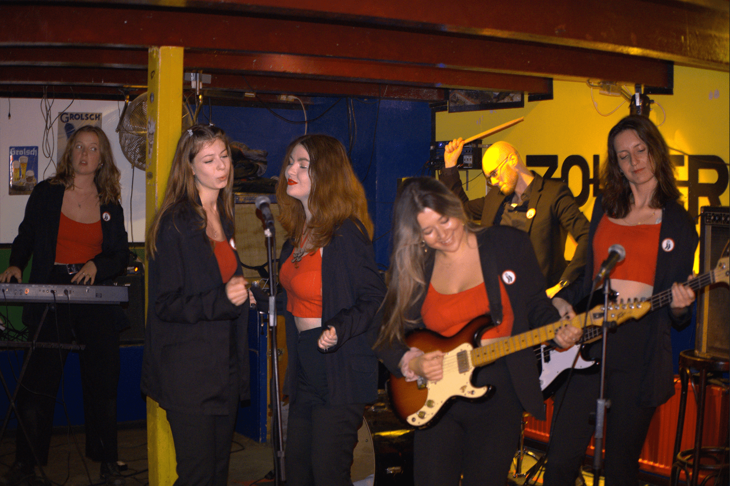
Great choice of location as Zolder is very much on theme for your association and the environment lends itself to a refreshingly relaxed and vibrant board picture. If only it wasn’t for the picture looking like it was taken in 2007 during a high school jam session in your parents’ garage… If you’re taking a picture that’s supposed to feel in-the-moment like this, you really have to nail the composition, focus, and lighting. Otherwise it’s just going to look like a picture you off-handedly took while at a gig, rather than a really kickass board picture. Nice idea, but subpar execution.
77. S.V. Linkit
We, of all people, know it is hard to be objective sometimes. There’s just situations where you can’t help but let your opinion shimmer through in the things you do, even in professional settings. Still, you must have really hated the person on the left to do him that dirty. Stick him in a red and white striped shirt and you’ve got a game of ‘where’s Waldo’ on your hands. We’re also not sure about the location you guys decided on. We see how it fits your association and it’s very unique, but the whole thing just looks too messy! The lamps, although beautiful, are adding what feels like a seventh source of light, all of which somehow does not reach your faces.
76. C.S.V. Ichthus Groningen
Shockingly, another Christian association took a picture at a church! The location is definitely pretty and on theme, but the framing and formatting of the photo leaves a lot to be desired. Symmetry is out of whack, almost like you only looked at the pictures once everyone had gone home. Not including the arch in full is a big no no! Although your board looks very professional and inviting, with nicely coordinated outfits, the picture appears rather carelessly taken. The cardinal sin is the not-quite-square aspect ratio, a telltale sign that this picture has been tampered with.
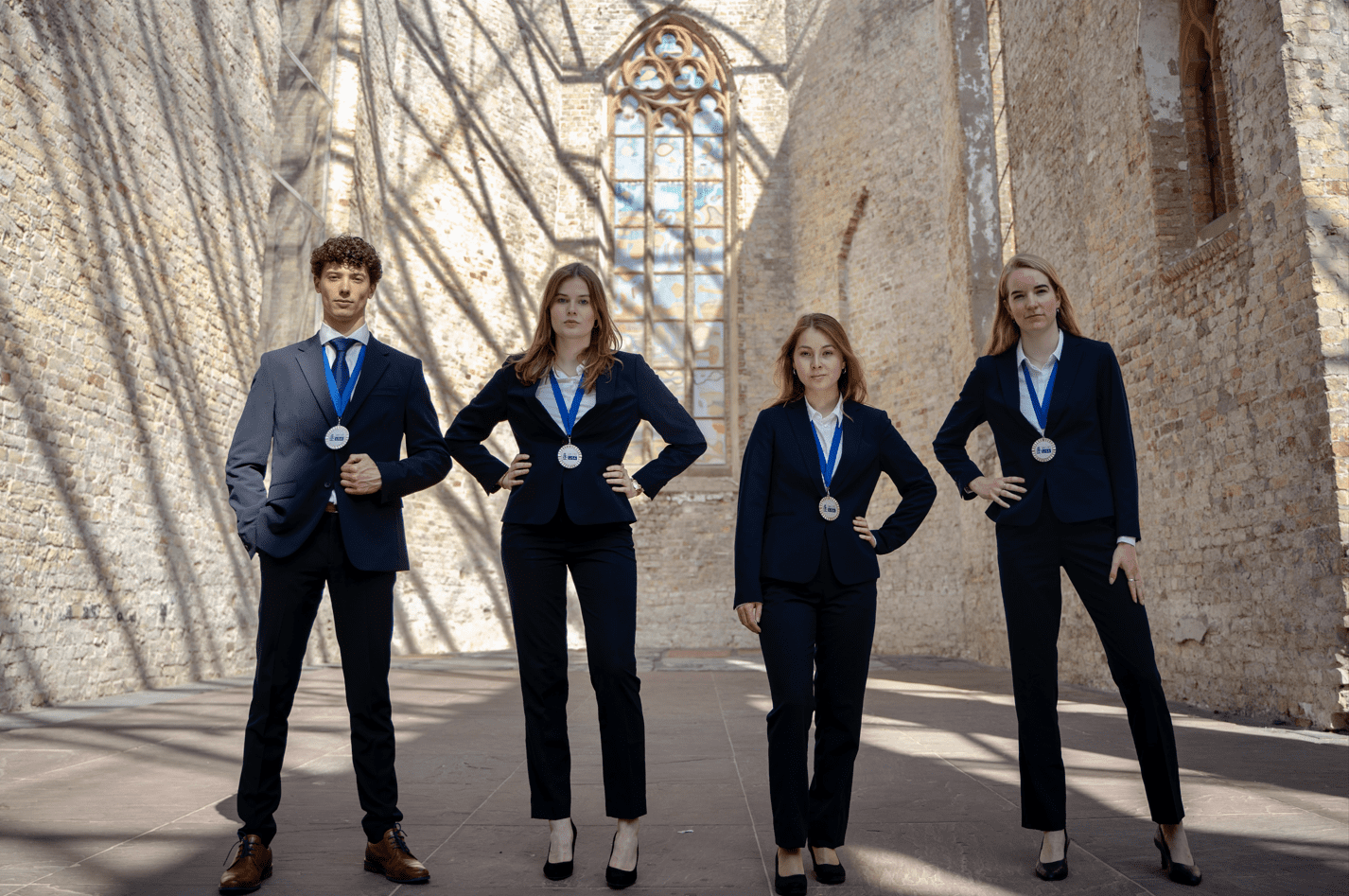
75. MESA
The record player is a nice touch, but showcase more media! An old newspaper, some television sets, a typewriter, a Walkman, a video game console. You guys are a Media Studies association, not Music Studies for goodness’ sake! Or is it because you got sponsored by Denver™? If you guys were going to take this at the Prinsentuin, why take it here of all places? With no sun and no point of focus you blend into the background. Maybe get some flowers for contrast next time? The overall professional look is also ruined by the presence of the sneakers.
74. Studievereniging Sociëtas
We are loving the smiles, but the lighting is not doing you any favors as we can hardly see them. While the location you’ve chosen is beautiful, you should spread out a little more. Make use of the space you have or you risk looking as squashed together as the Squadraat board. Also, the lack of colors make it look a bit lifeless. We would’ve loved to see more vibrant tones and some props wouldn’t hurt either.
73. Atmos
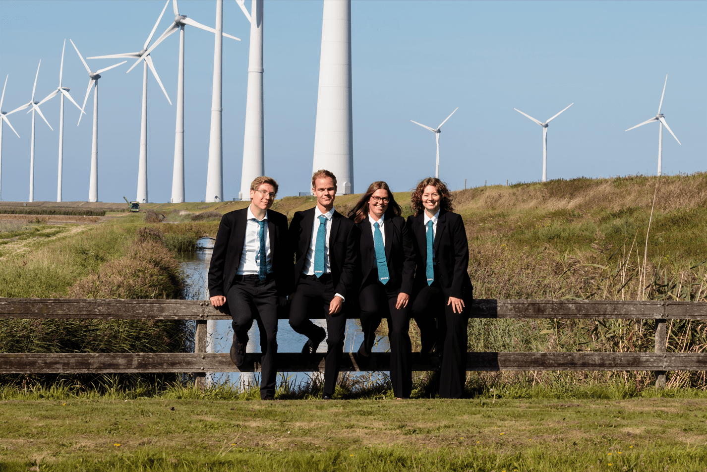
A pattern emerges here: Atmos clearly loves fences! An improvement over last year’s fence-sitting entry, since the inclusion of wind turbines absolutely makes sense for your association. The dialogue with the previous submission does not end there: while last year you had your backs to the sun, putting yourselves in the shade, this year your faces might be getting a bit too much UV. Unfortunately, the area is a bit uninspired, with dry grass and cropped-off wind turbines making for a less-than-stellar background.
72. Study Association TeMa
Once again, we are sad that a beautiful tower isn’t being granted the dignity to keep its head. Maybe if the Martini Tower was entirely visible, we would have hated the fact that this picture is vertical a little less Alas, it isn’t, so we hate it. We do love the pins, although it would’ve been better if everyone had them pinned on in the same way. Same goes for the shirts; very nice, but why are they buttoned differently? We do respect the one guy who somehow managed to manspread standing up though. Negativity aside, it’s not terrible, and you look good!
71. Groninger Studenten Toneel
A few things are certain in life, but it turns out that expecting artistic expression in the board picture of a theater association is not one of those. Looking back at your submission from last year, this wasn’t your best performance. Taking a picture on a stage is very on theme and the outfits of your main characters are matching, but we were looking forward to a little more drama. In a nutshell, we felt this lacked effort and a clear vision. Personally, we would not give you a standing ovation this time.
70. FSV Fysiek
Prinsenhof is a nice location and the matching outfits look professional, as do you. But it seems like whoever edited this photo set out to suck all of the life out of it. The colors look weird and it looks like you tuned up the sharpness and contrast way too much. Altogether, this picture is a bit of a snoozefest and feels rather soulless and stiff. Know any physiotherapists who could fix that?
69. GSV
The doctor’s been in touch and they’ve concluded that this picture suffers from filteritis, of which the most notable symptom is that the skin tone of the board members is matching the exact shade of the wall paint. The lighting makes the picture look extremely flat and one-dimensional. This lack of depth is particularly bad when you consider the board takes up a relatively small portion of the frame. Also, the chair needs but a cane and an eyepatch to seem like an actual Bond villain. Unfortunately the rest of the board does not deliver similarly notable vibes.
68. LISA
Patriarchy strikes again! A man standing in the spotlight, while the women are left in the dark… But seriously though, what’s up with this lighting? Not only does the shade provided by the walls mess with the picture, but the location is also rather confusing. What’s the link between IT law and a random church? Your power poses are on point though, as you’re practically oozing professionalism and authority. If this was taken anywhere else, with better lighting, you’d have a great picture. However, we do have some questions regarding the gentleman on the left invoking the spirit of the ‘Arthur’s fist’ meme? Why so tense?
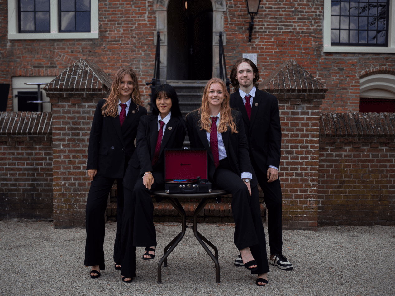
67. EBF Conference
The background is both distracting and dizzying, leaving anyone who looks at this picture feeling a little uneasy. The camera is also capturing you from an angle, not parallel to the wall, which we’re not big fans of because it shows off more of the ugly carpet beneath your feet this way. And what’s with the miniature skyline awkwardly displayed behind you? As far as we can see, it’s not even Groningen. You guys certainly look happy to be there together, though, showcasing a kind and respectable board with matching professional attire.
66. EBF Groningen
Nothing terrible about this picture. Nothing particularly interesting either. It’s the textbook definition of mediocre. The only thing truly exciting here is the painting. However, sadly for you, that’s because we hate the fact that you cut it in half! And the camera is placed slightly off-center (not in line with the angle of the couches). It makes the picture look half-assed, without much of a care about the composition. Also, it’s very unclear who the chair is.
65. De Chemische Binding
And the award for best family portrait goes to…De Chemische Binding! We appreciated the genuine simplicity in your photo, but it feels a little stilted and uninspired. You’re a chemistry and chemical engineering association, but there is none of that in your picture. The lighting is mediocre as some portions of your faces are overexposed. And we can feel the hidden discomfort of the girl on the right leaning onto her fingers, as well as the people in the back squatting on a rock. Next time, put on a lab coat or something?
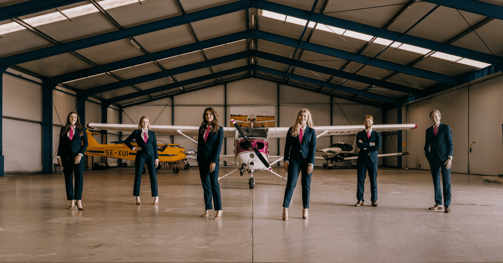
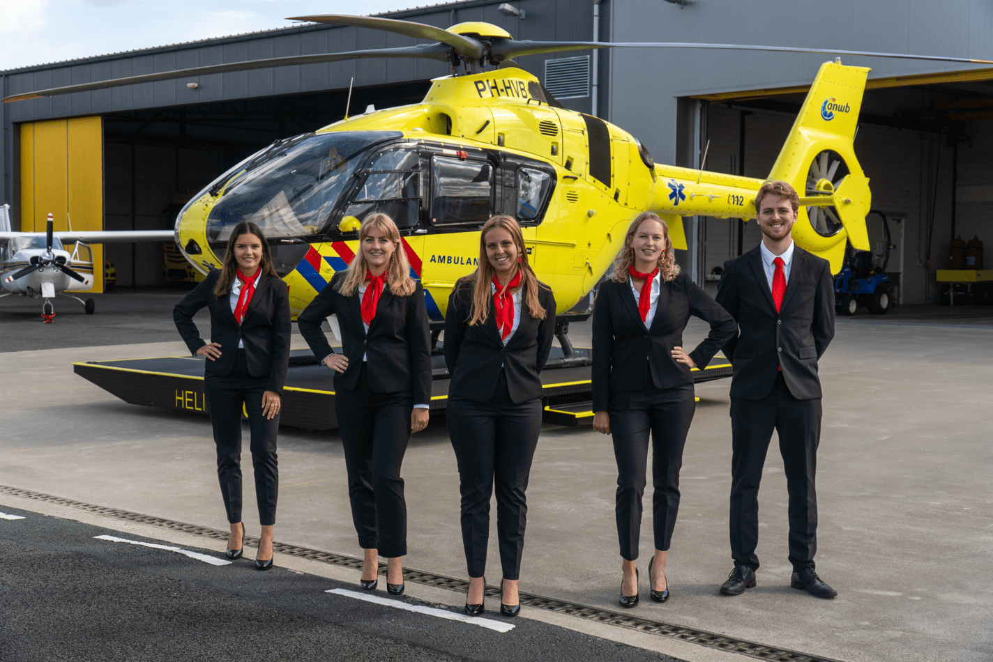
64. Tennisclub Albertus Magnus (TAM)
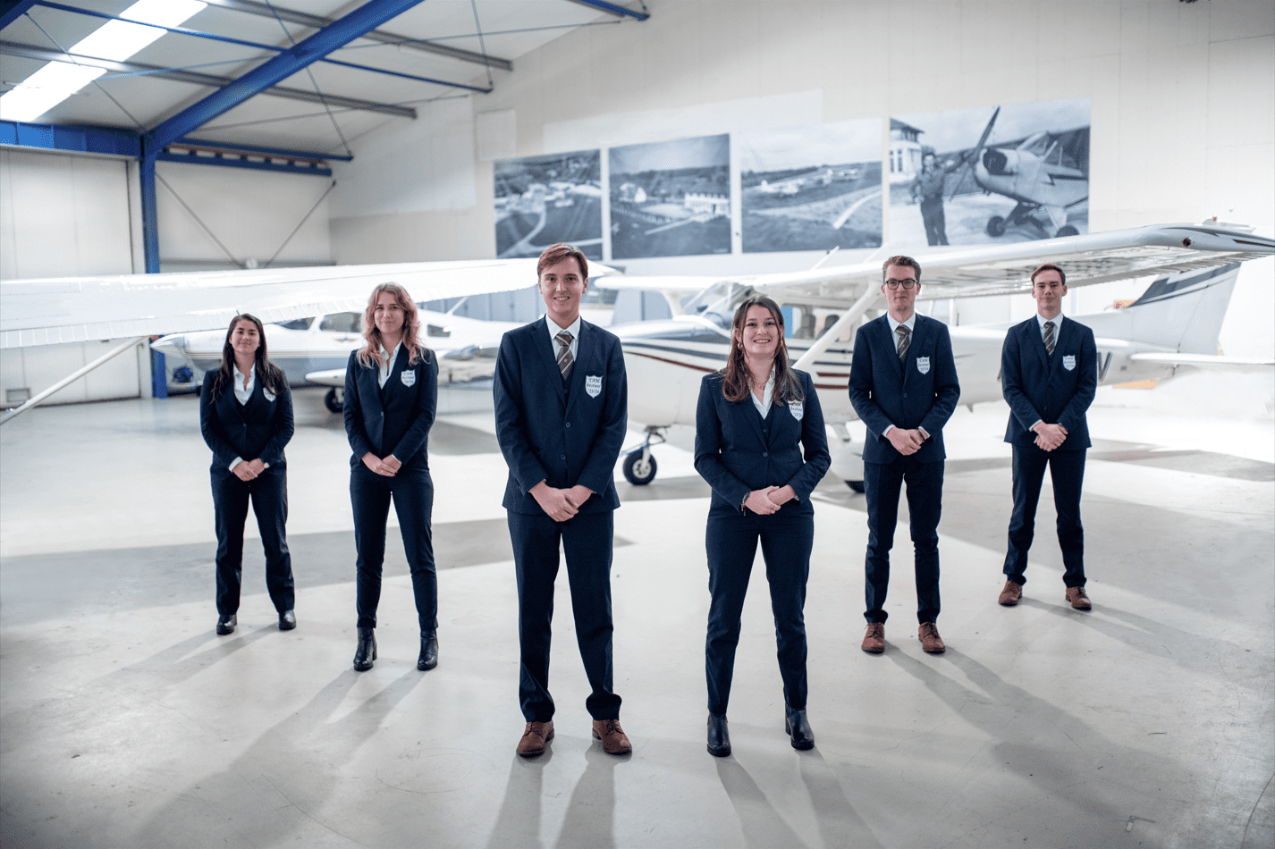
PSA: do not play tennis near any airplanes! Surprisingly, you guys are not the only association to make use of an aircraft hangar for their board picture this year. But why are you there? Where’s the tennis rackets? And you haven’t even displayed the airplanes in a particularly flattering manner, with one of them partially obscured by a wing from off-screen. We’re fans of the somewhat imposing shadows that crawl towards the camera, but the background is highly over-exposed and the people in the back are slightly out of focus. Bit of a head-scratcher.
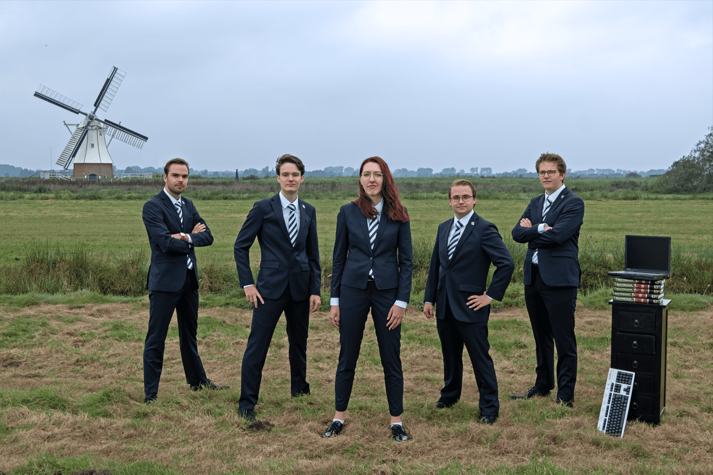
63. Studievereniging Versorium
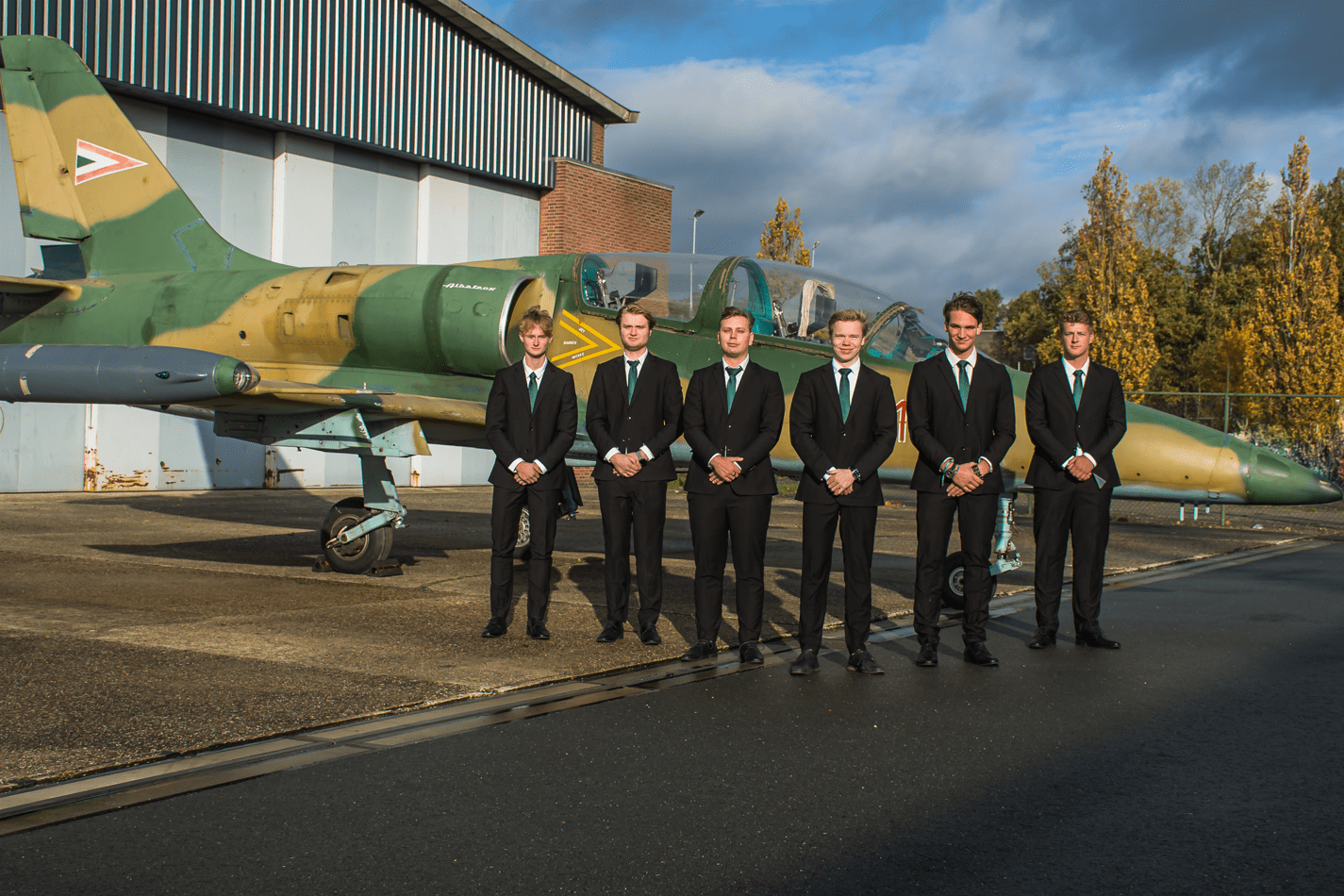
Aircraft Hangar 2: Electric Boogaloo. Did you guys just hitch a ride with TAM or something? Genuinely flabbergasted. You’re so awkwardly positioned in front of this vehicle that has, at best, a tenuous connection to your association. The blinding sunlight, leaving you squinting for your lives, almost makes it look like you’re being affected by G-force. All around, though, the picture is well-taken and in focus. And we appreciate the color-coordinated ties that match the plane’s paint job. However, it’s rather unimaginative and does not quite evoke electrical engineering in the way we’re looking for.
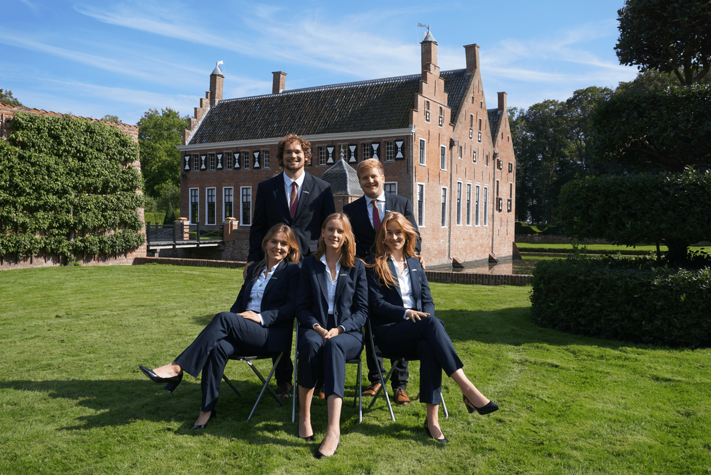
62. Villa ’96
Sometimes, we give a picture a low score without exactly knowing why. Sometimes, it just doesn’t feel right. Is it the asymmetry and the unfortunate cropping of an otherwise pretty background? Maybe the oversaturation, making the grass, suits, and ties look like plastic? Or because you look like you’re getting ready to head off to a GOP party conference? Who knows, perhaps it’s a combination of factors. It is a competent picture, but even the immense girl power coming from the chair is not quite enough to make up for a disappointing lack of creativity.
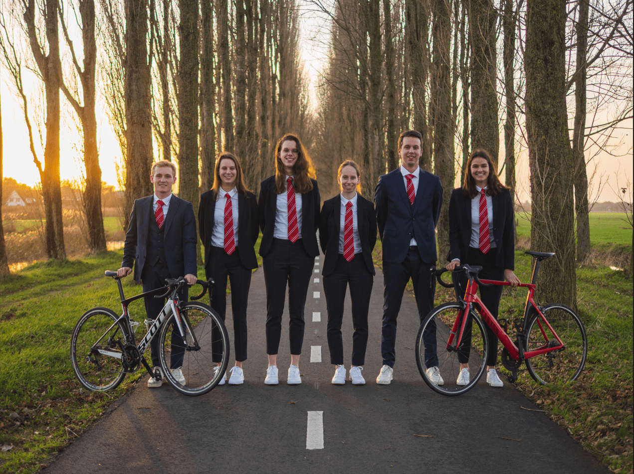
61. Le Baso
There are no words in the English language that quite encompass the magnitude of the power in your walk. It looks fantastic! Even your feet are aligned! It’s the kind of thing you would see in a superhero movie, where the gang of unlikely allies walks away from an explosion after saving the world. But you’re walking away from… a garage door? Oh. The background is terrible, such an anticlimax compared to how sick your power walks are. Bizarre juxtaposition. We do really appreciate the professional yet fashionable outfits, but the picture is also slightly overexposed.
60. N.S.G.
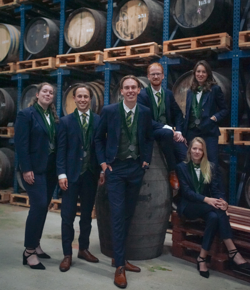
This image is really really grainy, giving it an almost unintentional but still rather horrible-looking vintage look. The outfits are great, maybe the best we’ve seen this year. But why did you choose to crop the picture like this? We think having it be properly landscape would have improved your score immensely. You also just about cut off part of the girl on the bottom right’s shoe. How very dare you! Glad to see you’re repping your association by standing in front of barrels containing (what we presume is) altar wine.
59. SV Ilythia
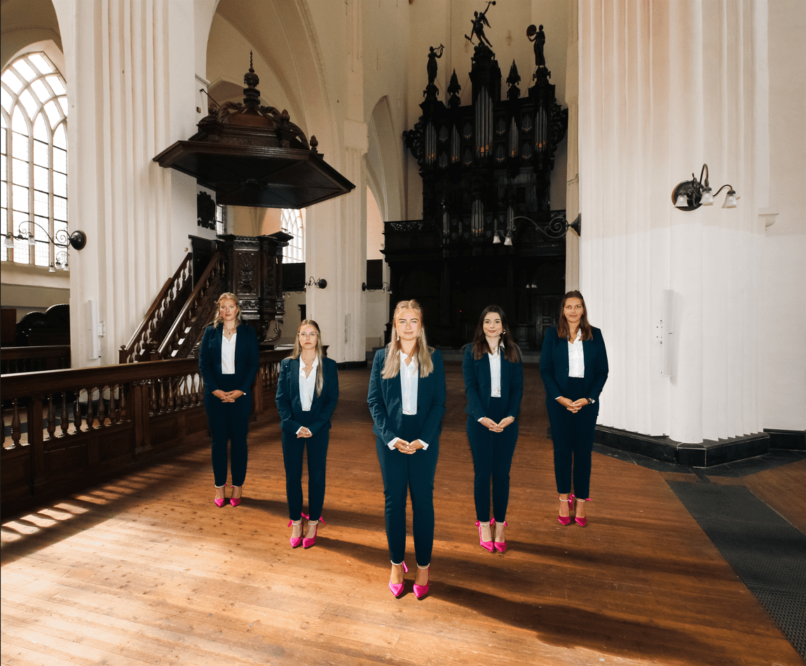
Barbie taught me I could be a midwife! Our eyes were immediately drawn to the matching pink shoes. The location is beautiful, but it doesn’t really seem to match your association in any way. We get that you guys wanted to show it off as much as possible, but the composition and layout leaves you looking rather small. The stiff, unnatural poses make you seem like cardboard cutouts, or to continue the Barbie analogy, like plastic dolls. It’s like you’ve been added in post. It’s certainly a massive improvement over last year’s balloon disaster, but still a bit boring.
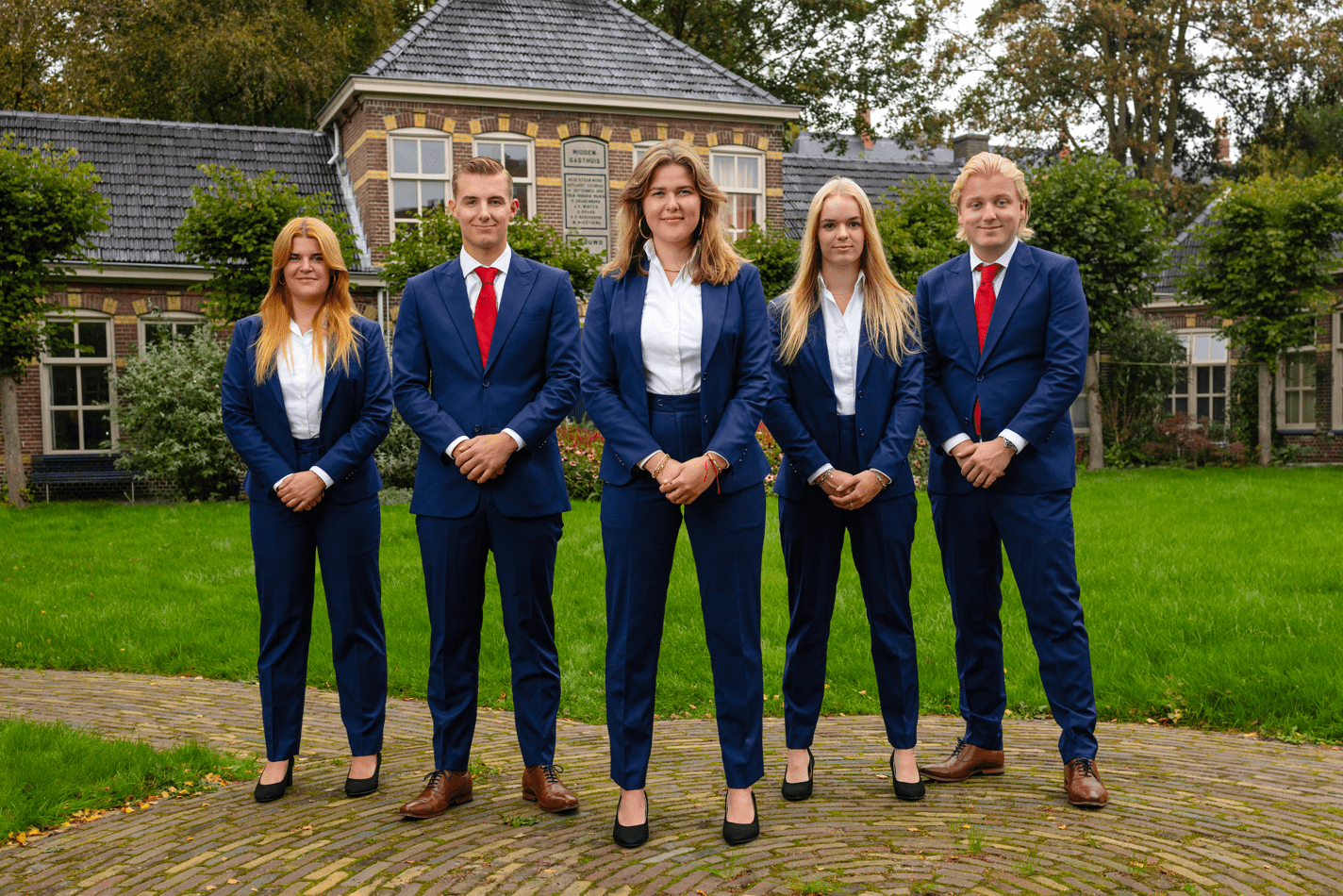
58. Civielrechtelijke vereniging Gerhardus Diephuis
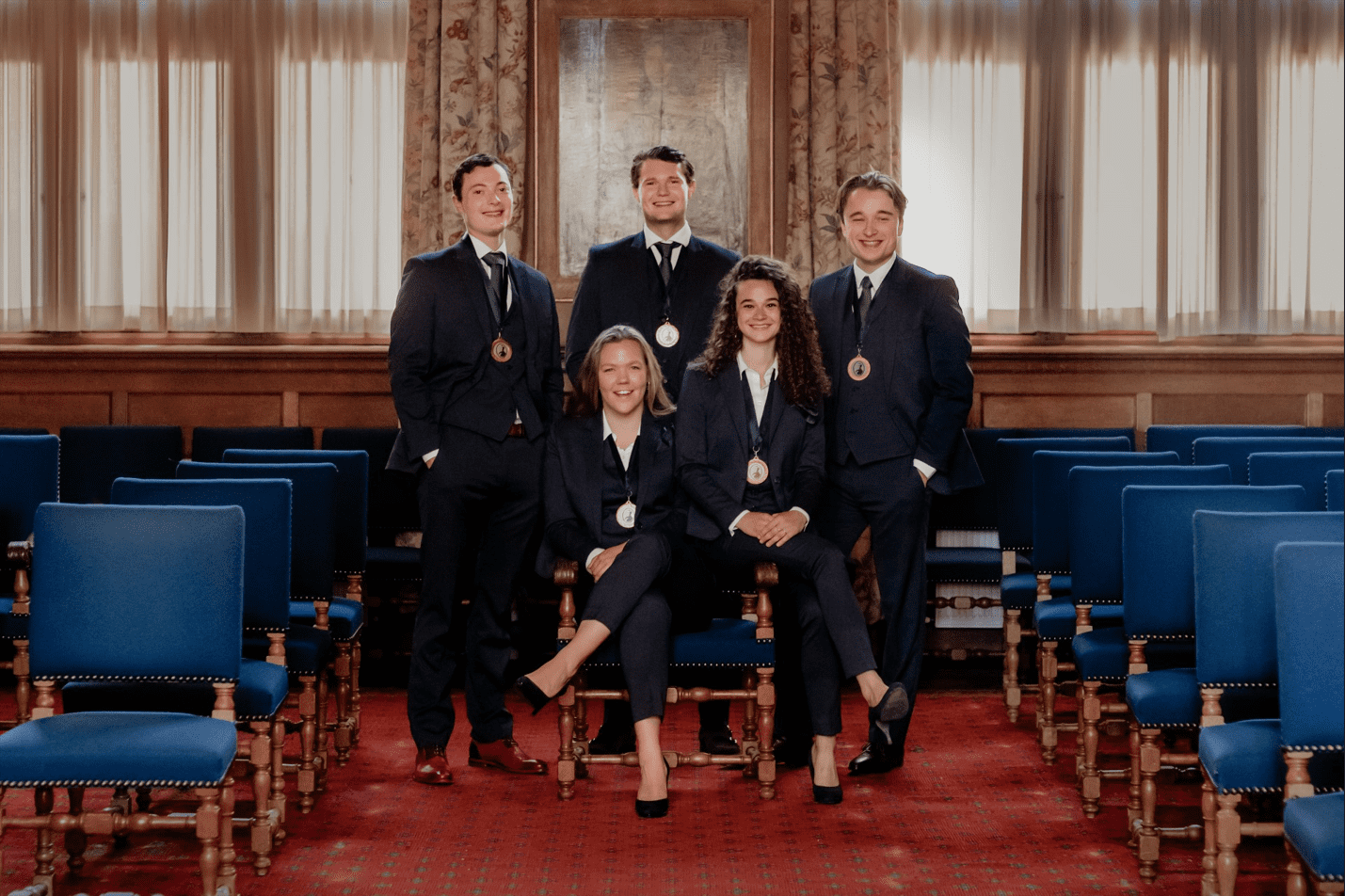
It’s getting harder to deal with ‘almost-great’ framing in these images. People, if you’re making something that is supposed to look symmetrical, make it symmetrical. So much effort, yet it looks unbalanced all the same. We do love the energy of this one, as if the camera man told a vaguely funny and wholesome joke. It doesn’t betray the fact that you seem to be in a random municipality building, and outside the door are a lovely couple waiting to get married. Overall, the picture is nice and mostly inoffensive. Yes, this is code for boring. And your shoes don’t match.
57. VESTING
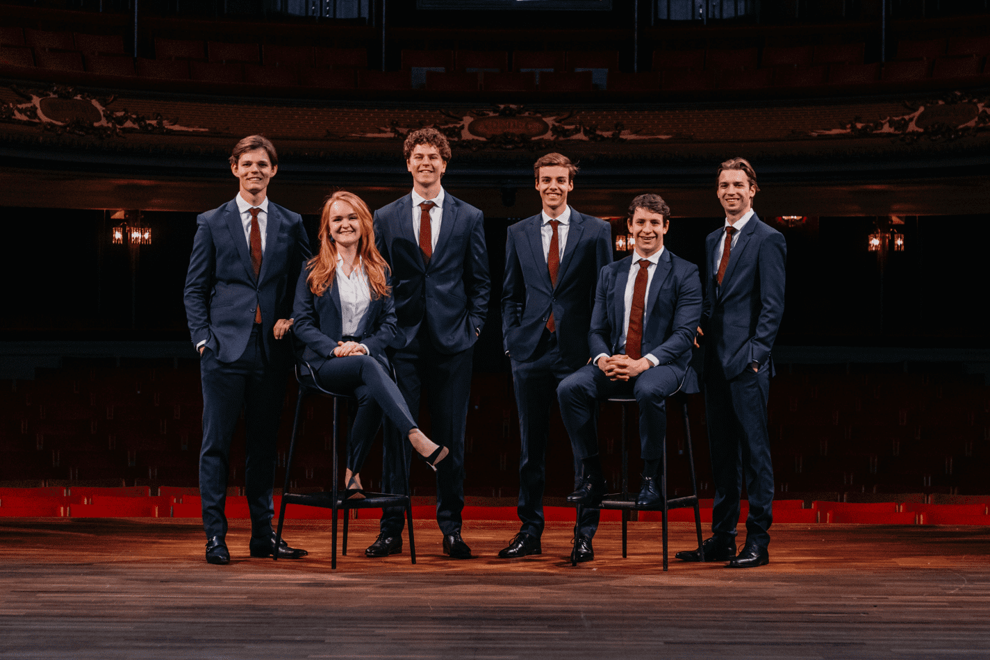
Following the likes of Bill Gates, Adam Driver, and Monica Lewinski, you guys look like you’re about to give us a Ted Talk! Is that why you’re in some theater somewhere? Questionable choice of location. But we’ll give it to you: you sure look like a respectable board and we love the matching outfits and shoes. We’ll probably fall asleep halfway through your presentation, but the picture is okay.
56. Groninger Fiscale Eenheid
You guys look happy, almost as delighted as we were when we saw this picture wasn’t taken vertically. This entry certainly outdoes TeMa’s attempt at the same concept, but we’re still a little underwhelmed. For starters, the Martini Tower isn’t entirely visible and the shoes do not match. Also, while the backlighting that clearly separates the board from the background with the Martini Tower has a cool effect, it also gives you a sort of halo that makes you look photoshopped in.
55. Study Association Esperia
You guys look professional, your outfits are fine, you look happy, and we like your poses. Good location, although a bit messy. But it’s just not very visually attractive! Nothing particularly jumps out in this picture, and although that means that you didn’t do anything terrible, it also means that there is nothing fun for us to write about. You mostly lost points in the creativity department. A bland review of a bland picture.
54. Studievereniging KIC
A third victim has been felled by the aviation industry, which seems intent on bribing people in Groningen to include planes in their board pictures. It takes serious mental gymnastics to argue this communicates communication. Weirdly, though, the airplane matches the ties, which is impressive, so kudos for that. But the plane shouldn’t be there in the first place! You guys are also too spaced out, posing with a glorified prop more so than taking an actual board photo. And that’s a shame because you look professional and the quality is fine. Unfortunately, we won’t be flying with Barbie airlines in the future.
53. Ibn Battuta
Absolutely heavenly! Not because it’s amazing, but because the lighting makes it look like you died and went to heaven… For a vertical picture, we suppose it could be worse. The location is nice, your outfits are matching, there are no mismatched socks or ties peeking out, and a globe is definitely a nice touch given the theme of your association. Aaaaand that’s about it for the positives. Unfortunately, like many others, this picture suffers from acute blandness, which is not helped by the IKEA-chic table.
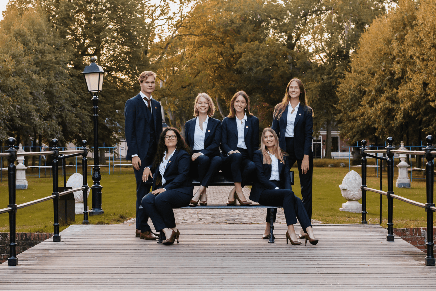
52. SV Ergasia
A decent picture, with a cool location, and a solid plan that is executed quite well. Simple, but effective, in principle. Unfortunately, it feels a little rushed. The board should step a little closer to fill out more of the frame, the camera is slightly tilted, and the ties should not be peeping out from under the jackets. The colors are quite decent and the lighting is pretty good, given that taking pictures outside is generally more challenging. We appreciate the location you picked, since Nieuwekerk is one of the nicest spots in the city, but hope you try a little harder next year.
51. SV Cover
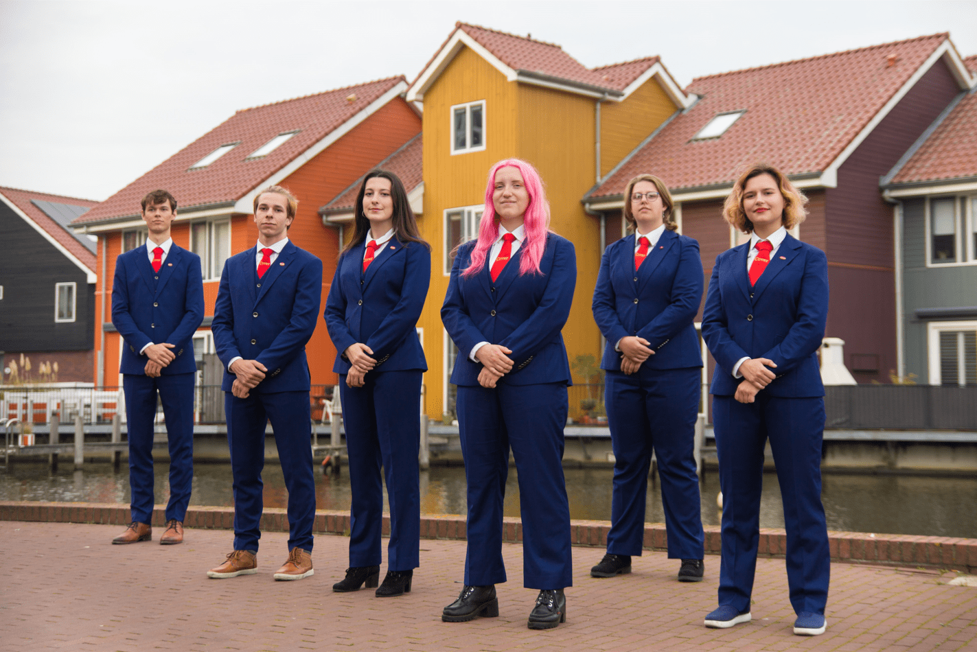
Reitdiep serves as a fantastic, colorful, and cute background for this picture. And the pink hair for the chair is an absolute win. We also love that this formation has you standing at an angle and leaves your heads somewhat level to one another. Unfortunately, the guy on the left is not quite facing the same way and he’s out of focus, throwing the whole thing off. Your outfits look great on you, but coordinate the shoes too next time, please!
50. Landelijke Econometristendag 2024
What is up with people taking board pictures in abandoned, broken-down factory buildings? What is this obsession with ‘dilapidated chic’? We get the contrast you’re trying to convey between the background and your lovely, matching attire and professional-but-inviting smiles. But it’s just not a very nice location, though you certainly succeed much more at this than many of the others who’ve tried it. Well done, in that respect.
49. C.S.F.R. Groningen – Yir’at ‘Adonay
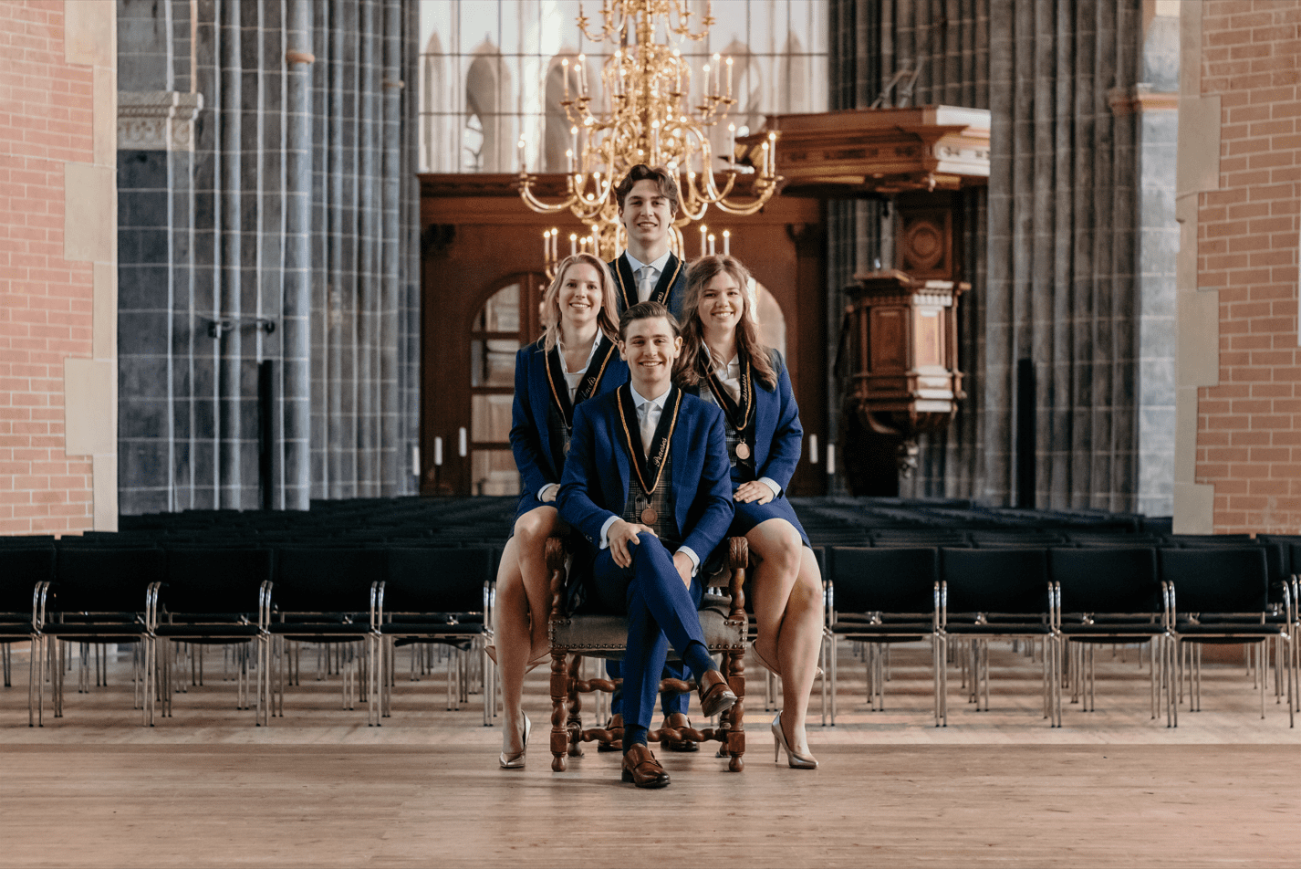
For a space this large, it was absolutely not necessary to huddle up like this! And why are your feet hooked behind your legs like that? It’s like you guys don’t want to be noticed in your own board picture, taking up as little space as possible. Don’t hide yourselves, because this picture is both competently shot and features a very pretty background with an even prettier chandelier. Though it is a little bit unimaginative and we’re almost convinced that (gasp) this would have worked better as a vertical picture.The symmetry is just a little bit off but the overall location is nice.
48. Stichting Studenten Activiteiten
Technically, a very nice photo. The image is clear, well-composed and brightly coloured. It’s an accomplishment that it looks so good with the gray sky taking up half of it, so whatever lighting setup you used here works great. While the image is framed well, we yearn for that perfect alignment you were so close to making. For one, it’s a little bit far away, so you are somewhat lost in the distance. With so much of this huge background included, you’ve made yourselves very small and almost like you’re the nepo-offspring of whoever owns the office it looks like you’re in.
47. Study Association Clio
Look, there’s really nothing to hate about this, except for maybe the shrubbery. It’s professional, the poses and symmetry are good, the location is fine. Nothing really caught our eye, until…. What is going on with the girl’s pants on the bottom left?!? We did some Sherlock Holmes shit again: if you zoom in, there’s a triangular bit of greenery, as well as what looks like part of her pants to the right. Did you guys cut together two pictures? Was there a compression error? We demand answers!
46. JFV Groningen
This is a great example of a near-perfectly-taken picture that just has nothing to say for itself, leaving us with nothing to say about it. You exude professionalism and absolutely nailed the lighting. However, it’s a little bit like vanilla ice cream. It’s hard to find someone who doesn’t like it, but even harder to find someone who’d put this at number one. We’re okay with putting it at number 46, though?
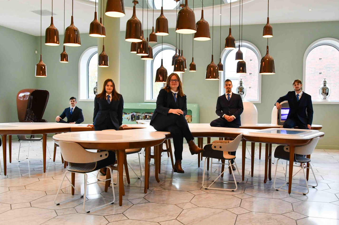
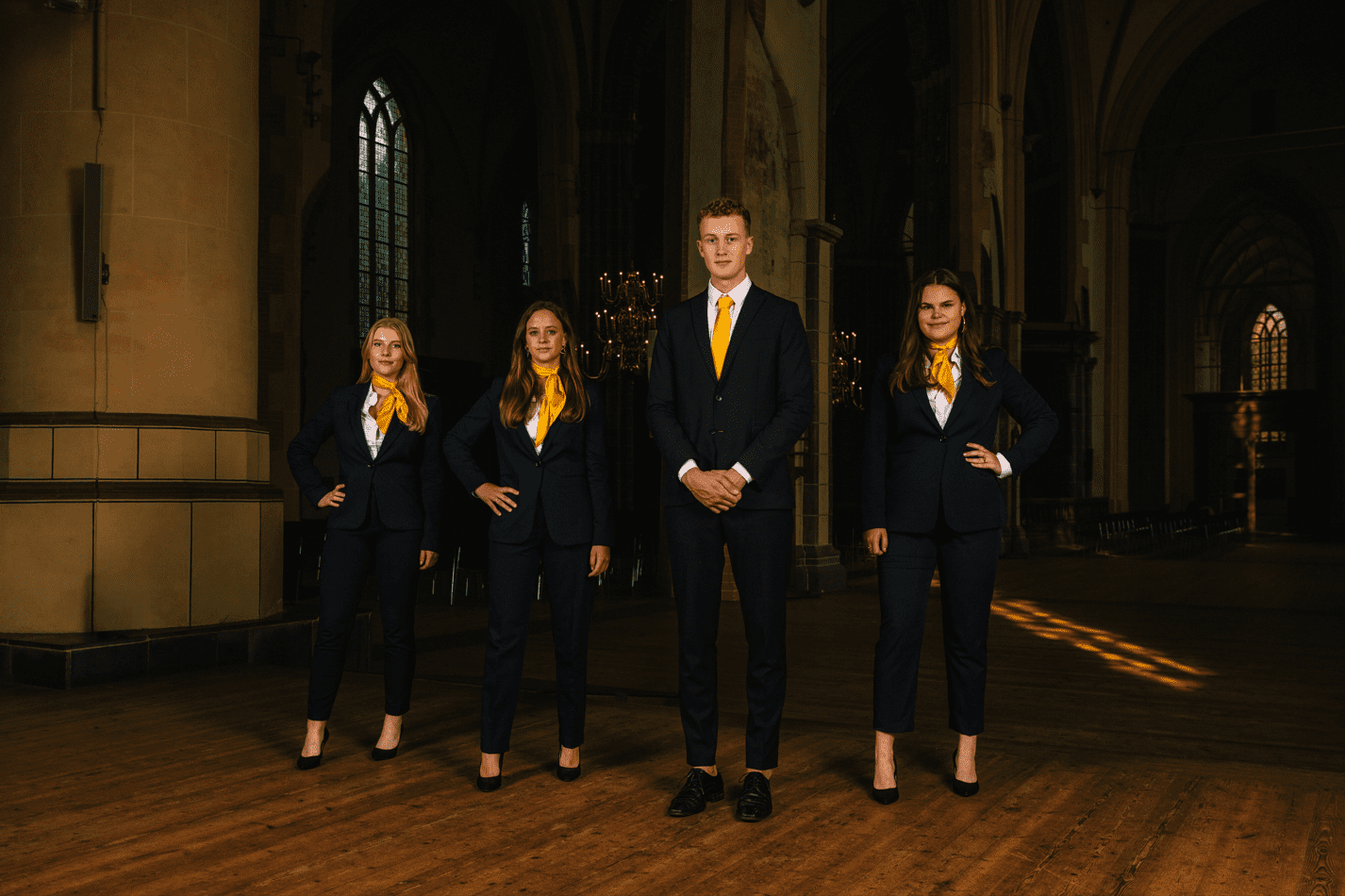
45. Centraal Uitvoeringsorgaan voor de Studentenorganisaties (CUOS)
*Cue the horns* It looks like we’ve been graced by the royal family themselves! The wardrobe leading to Narnia in the back is also very nice, even if you cut it off slightly. This picture’s composition is fine, with the matching outfits and poses being spot on. However, we were cringing at the carpet that looks like a grandma’s napkin not being perfectly centered.
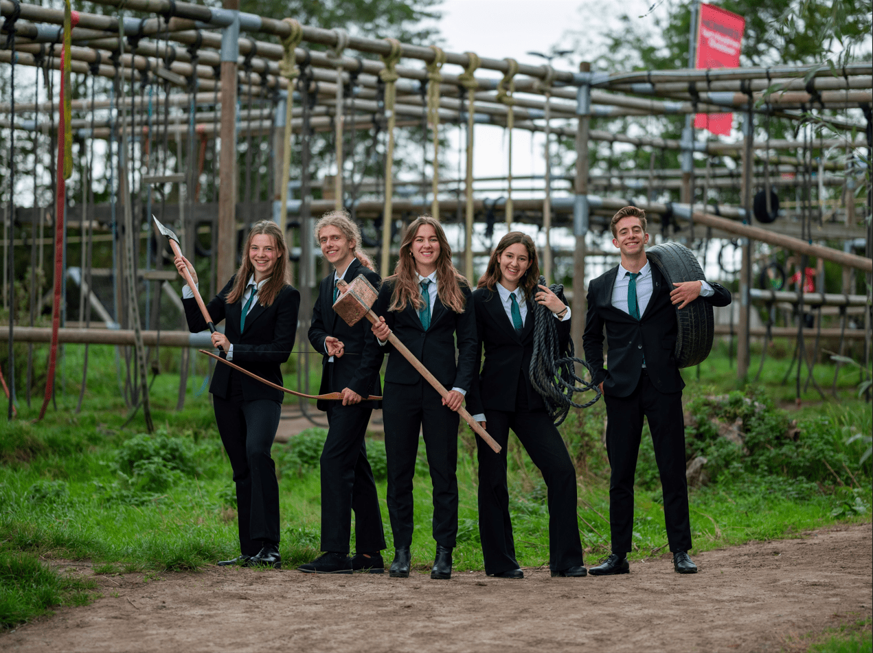
44. G.S.A.V. Vitalis
Seriously, not a good image purely in terms of how it looks. There’s both too much empty space and not enough to contain whatever ancient weaponry you’re carrying, the colors are bland and the lighting is awful. The props all give it a lot of character though, and it is just a fun collection of stuff to look at. The stuffed mascot is also a cute addition and really the star of the show. There’s nothing in the picture to actively hate, but there’s also nothing winning us over. Except Nike-eggman. All hail!
43. G.S.V.V. Donitas
Although we are fundamentally against taking vertical board pictures, this almost makes it work. Had you positioned yourself closer to the camera and worked a little bit more on symmetry and formation, this could have been a smash. We’re loving the props and the Groninger Museum works stylistically as the backdrop, even if not entirely thematically appropriate. There’s a lot going on in this picture, but props to you for the windswept smiles. Also, shoutout to the girl on the right who looks like a proud mom. Very wholesome!
42. S.V. Cura
Thank goodness, finally, an aircraft that is actually on theme! Of all the vehicles we’ve seen this year, this one by far makes the most sense as you’re a nursing association. We would have loved it more if one of the propellers wasn’t slightly cut off, but that’s a minor nitpick. We also think you could have utilized this massive prop in a more imaginative fashion. Right now, it almost looks like an ad for Transavia, so maybe tone down the flight attendant energy. Kudos for the matching earrings in different shades of red, nice detail!
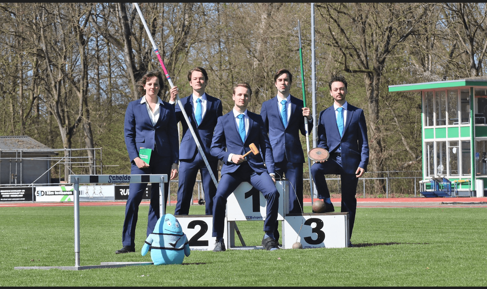
41. Studievereniging Mesacosa
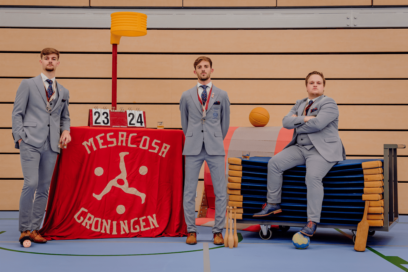
Look, we know that we can be a bit harsh sometimes, but there is no need to look that angry. After all, you did a fine job! The composition and props are good, showcasing a nice variety of sports equipment. A basketball, a floorball, glasses of whiskey… wait, what? That doesn’t seem very healthy, or sportslike. Were you guys drunk when you decided to put those there? Also, due to the top-down, uniform lighting in the gymnasium, this picture has no depth and gives everything the same amount of light. As a result, your skin tone matches the background. Bring your own lighting equipment people!
40. T.M.F.V. Archigenes
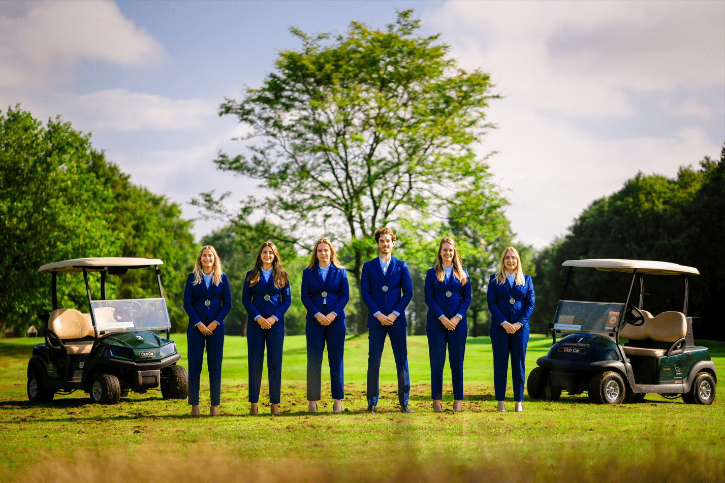
Why the fuck are there golf carts? It genuinely baffled us to see you posing next to them, in what we’re sure is the hilliest part of the Netherlands, a golf course. Has it got anything to do with the average wage of a dentist? That’s why you can afford a “lux” hobby like golf? We’re also concerned about the fact that you guys wore high heels on grass. Looks like you uprooted all of the grass and dirt by getting in your spot for this picture. Even though the location is surreal, at least you all know how to coordinate. The outfits and the poses match and the quality of the picture is stunning (except for the poor oversaturation!).
39. Sirius A
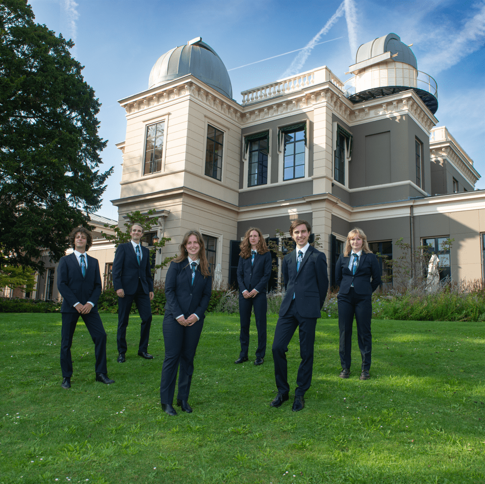
Why did you guys have to go all the way to Leiden when there’s a perfectly good telescope to be proud of in Groningen? You guys are definitely still on theme and the background is genuinely stunning, but we feel it overshadows everything else (figuratively and literally). Also, the chair might as well not be in this picture. Why is she all the way in the back? Great job capturing this beautiful observatory on a rare day of sunshine in the Netherlands, but we needed you to stand out more!
38. GHD Ubbo Emmius
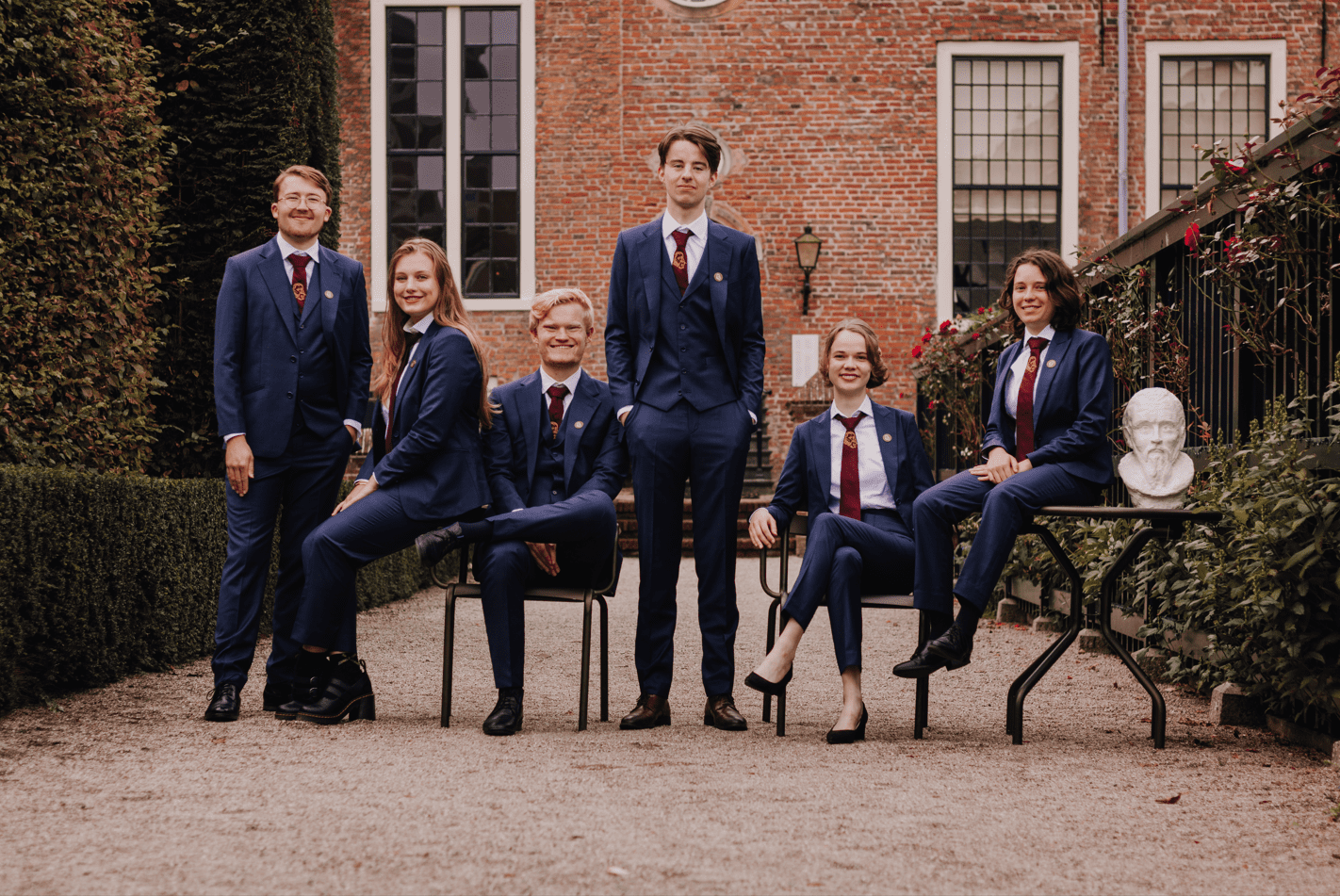
First of all, we appreciate the inclusion of the bust of your namesake, Ubbo Emmius, in the picture. It’s a nice touch and ties in neatly with you as a history-oriented association, fitting in so well that it almost looks like a seventh member of the board! You nailed the lighting and quality and you chose a great location. However, an expert on tie etiquette should’ve been consulted, as well as someone to tell you what to do with your hands while a picture is being taken! A little bland for our taste.
37. VIP, Study Association Psychology Groningen
Y’all look like the cast of a Hallmark movie! It’s nice to see people happy, well, except for the guy on the left: men should smile more! And the only tie in the picture is unfortunately tied rather messily. The lighting, colors, and composition are good, and we highly appreciate the shoes matching across the board (as well as the pins!). Good job! However, we’re not huge fans of the location, nor does anything else in the picture scream “psychology”. We’re not asking you to pose in front of a chaise longue à la Freud, but have a little fun!
36. Expedition Strategy
Did you bribe the Dutch weather gods to provide this sunny day? Otherwise, you guys got incredibly lucky with this phenomenal-looking background. The beautiful location, too, really works a treat, acting as a gateway into some kind of secret magical garden. We do have some qualms with your outfits, as unfortunately your shoes are all different, and the guy on the right seems to have a checkered suit. The background is also not captured entirely symmetrically. And some poses are rather awkward, with the girl on the left taking the top prize. All in all, the photo is good, but could have used a bit more creativity.
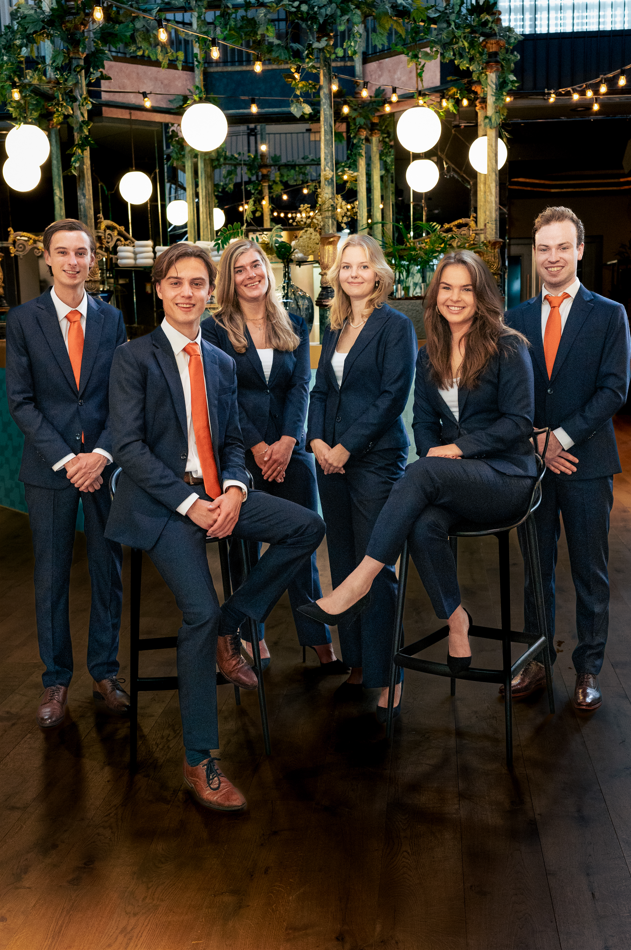
35. MARUG Conference
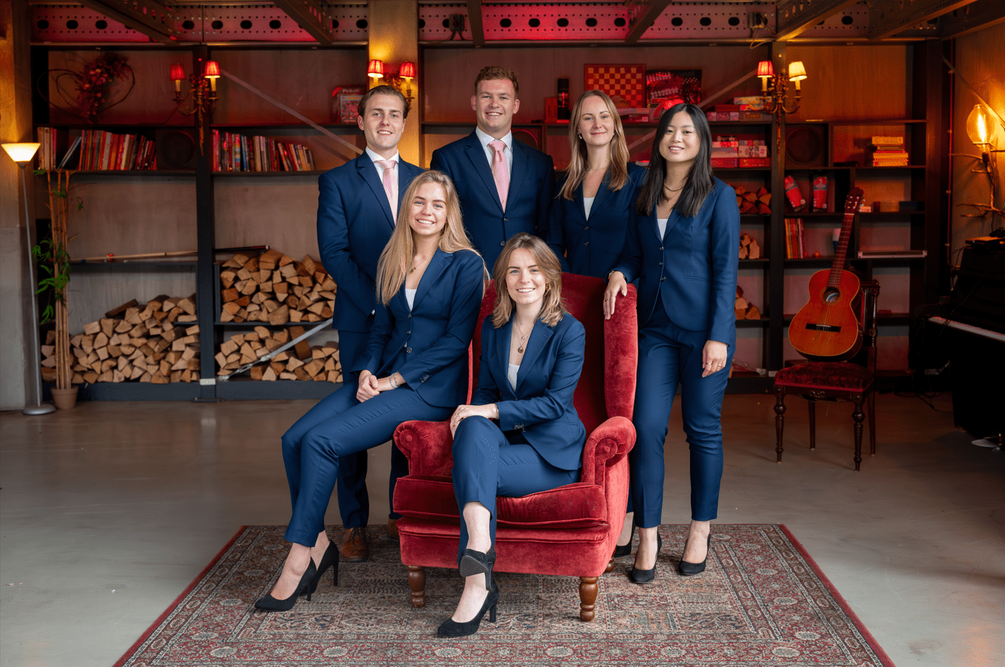
You wanted the guitar to be there so bad, you even gave it a chair? Why? Regardless, with this high-quality photo, taken in a location that looks like a cozy ass community center, you more than make up for the confusion. We’re big fans of the red color scheme and ambience (the lamps, the chair, the carpet), but do wonder why you didn’t go for pink instead, as that is your organization’s primary color. That being said, the picture is well-composed and everyone looks great!
34. G.S.B.V. De Groene Uilen-Moestasj
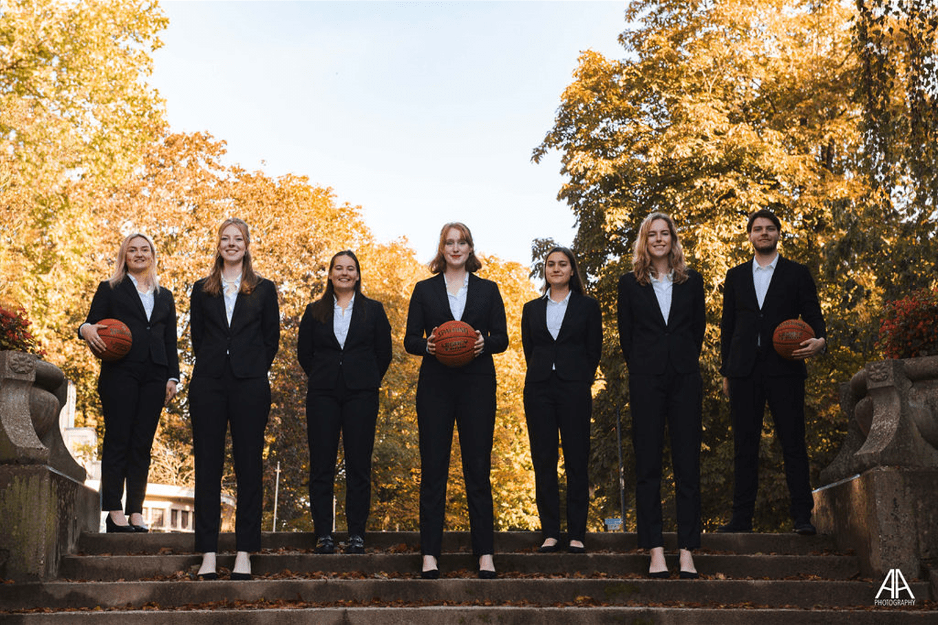
We get that you want to credit your photographer, and that’s great, but a watermark on the picture? In the spirit of Simon Cowell, it’s a NO from us. In terms of the photo itself, we think the contrast is too high and the background seems overexposed, while most of the board seems underlit. We do appreciate the inclusion of basketballs, but it’s the bare minimum when you’re a basketball association. You caught Noorderplantsoen at a nice time of year, with exceptionally great weather for autumn. The leaves make for a nice color palette in combination with the basketballs. Overall, a good picture!
33. G.S.W.V. SurfAce
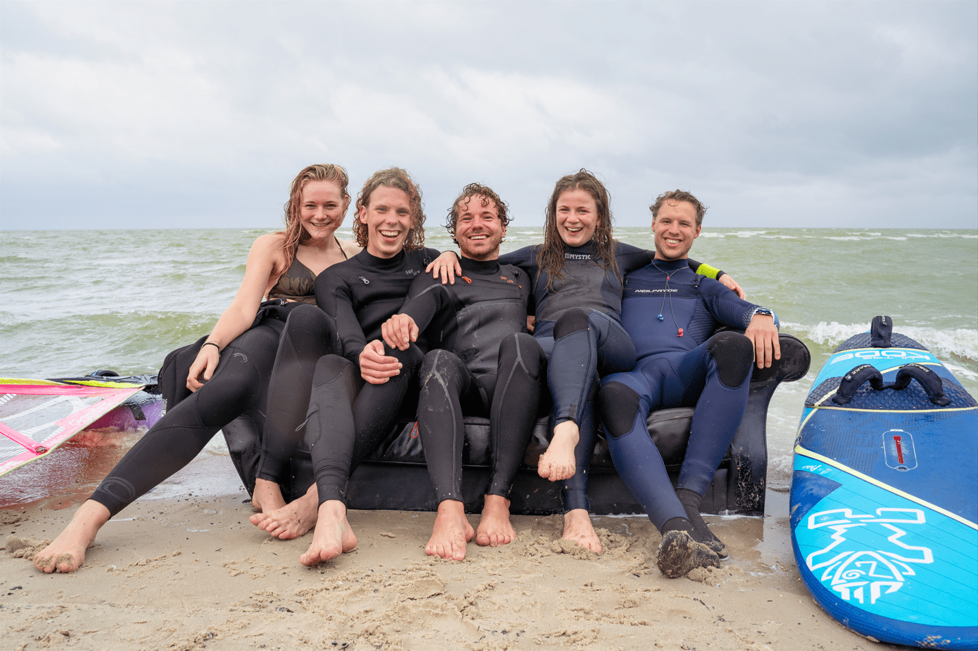
If the TV show Friends was set at sea. The North Sea to be exact! You guys look like you’re having a great time and would be fun to hang out with. We like the choice of location and the inclusion of props. However, they are all positioned rather badly. Like the surfboard and the windsurfing equipment on either side, which are mostly out of frame. It seems like an after-thought. Color, composition, and lighting also aren’t great, but you’ve won us over with the creativity and cheerfulness!
32. G.F.S.V. “Pharmaciae Sacrum”
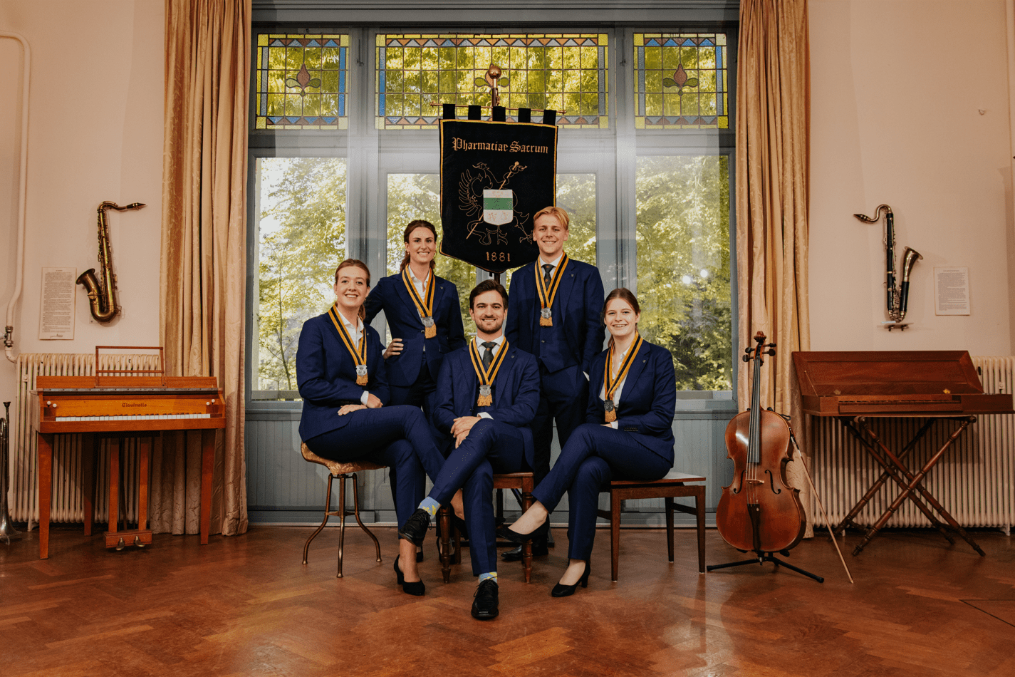
If we walk into a pharmacy and the pharmacist starts playing a mean sax solo, we’d probably check if we were in the right building. You should have thought the same when taking this picture. What are you doing in a room full of musical instruments? Instead of pharmaceuticals, you look like you’re about to prescribe us piano lessons for our ailments. However, the quality and composition of this picture are stellar. The background is adorned perfectly for a music-oriented association. A colorful and well-executed feast for the eyes that unfortunately leaves us with a lot of questions.
31. Equilibrium
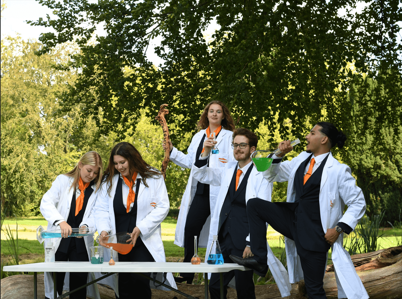
This picture is so fun! The poses, the energy, we want in! Have we seen better chemistry-themed pictures over the years? Sure, but we have definitely seen a lot worse. It’s always nice when you get out of the lab and touch some grass! However, the composition is a bit off, leaving you with too much headroom and not enough legs. The props are a bit obvious and their use is not particularly imaginative. Also, what’s up with that branch you’re holding? It doesn’t even properly show off your association’s name and we only noticed it upon a second look. Nice balance of the professional with the laid back, though. Good job!
30. G.T.D. Bernoulli
Matching outfits, matching shoes, and even matching hair and smiles. This picture has good vibes only, so much so that we want to be a part of this association! The picture is warm and welcoming without compromising your professionalism in the slightest, which is not only hard to do but also shatters the stereotype of science people being cold and calculating. We do wish you’d have been more calculating when it came to composition, lighting, and framing. The picture does not have a particularly strong concept, nor does it look like much thought went into it.
29. STUFF
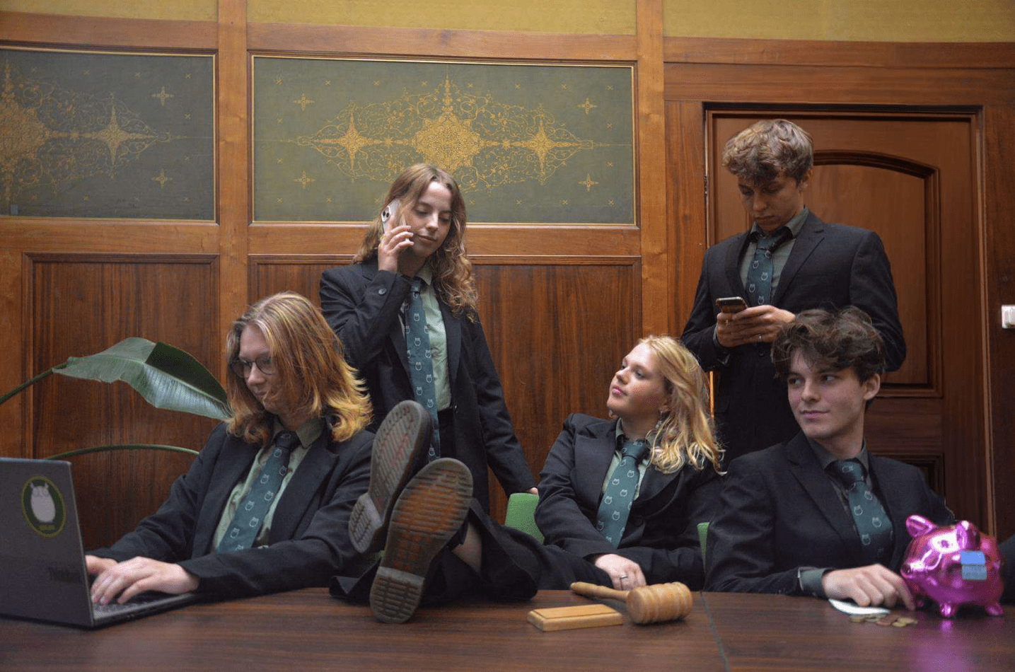
This was another one of those controversial pictures, receiving equal parts praise and criticism and driving a wedge between SK’s members. One faction considered it preposterous to take a call and put your feet on the desk while taking a board picture (a very grainy, underlit one at that). Others viewed this as a breath of fresh air from the usual stuck-up, dull, and predictable entries. We’re suckers for creativity, so we really appreciate that you visually conveyed the roles of the different members of your board using props. In terms of quality, this picture seems to be taken at a time when Plato was alive and kicking, but your outfits and a certain je ne sais quoi really pull it together.
28. MARUG
This photo encapsulates the feel of a marketing department perfectly. You sell yourselves much better than most other marketing associations. The colors pop, even if oversaturated, but that falls in line with the spirit of marketing. The environment looks cool, with the picture capturing a lot of depth, but the more you look at it, you start noticing some negatives. The glare emanating from the window gives half of the board an almost bleached look. Also, did you use a smoke machine? Did you not see the sign on the right?
27. A.G.S.R. Gyas
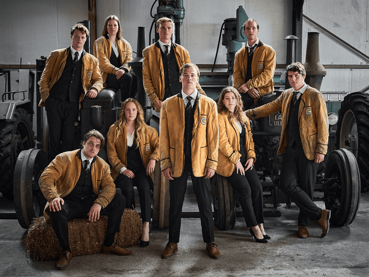
First of all, what are you guys doing sitting in front of a tractor? And what’s with the hay? This doesn’t convey you’re a rowing association at all, more like you’re campaigning for the BBB! We want to see some rowing equipment (see Aegir’s picture)! Other than that, on a technical level (lighting, composition, focus), you guys did an exceptional job. The yellow really pops and your outfits certainly showcase unity, but the poses are a little awkward and you seem somewhat distressed.
26. GLV Idun
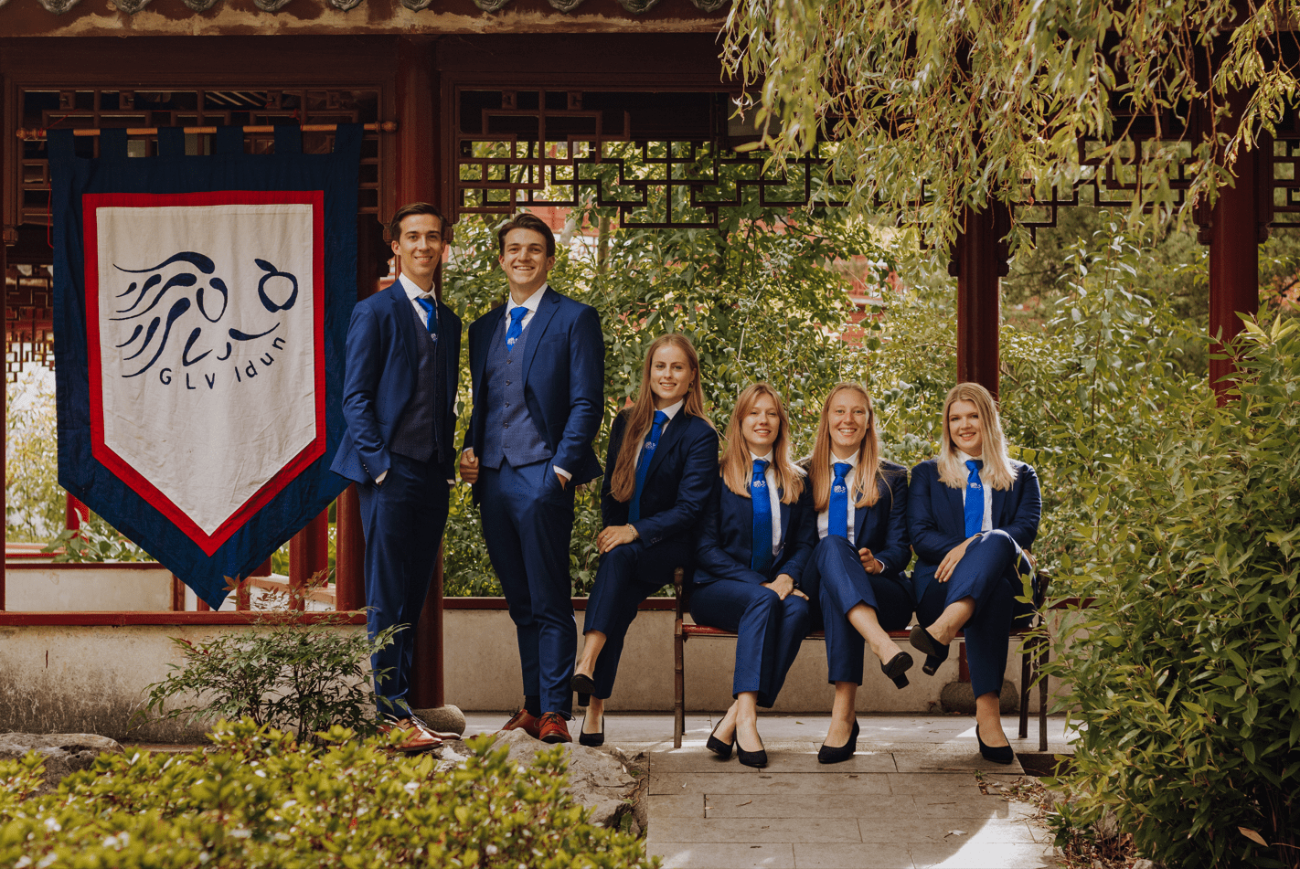
Where did your mascot go?! The hedgehog must return! It would bring some excitement to what is a relatively inoffensive yet slightly boring board picture. We appreciate the soothing greenery of the botanical garden, which fits thematically with your association. The picture is well-framed and the depth gives us a lot to look at, including some really fashionable outfits and props. What throws us off, though, is the fact that your flag was given more dignity than the girl who is uncomfortably positioned on an armrest she could slide off of at any second. Also, sitting all the girls down sets feminism back at least a couple decades.
25. G.S.B.V. Pugilice
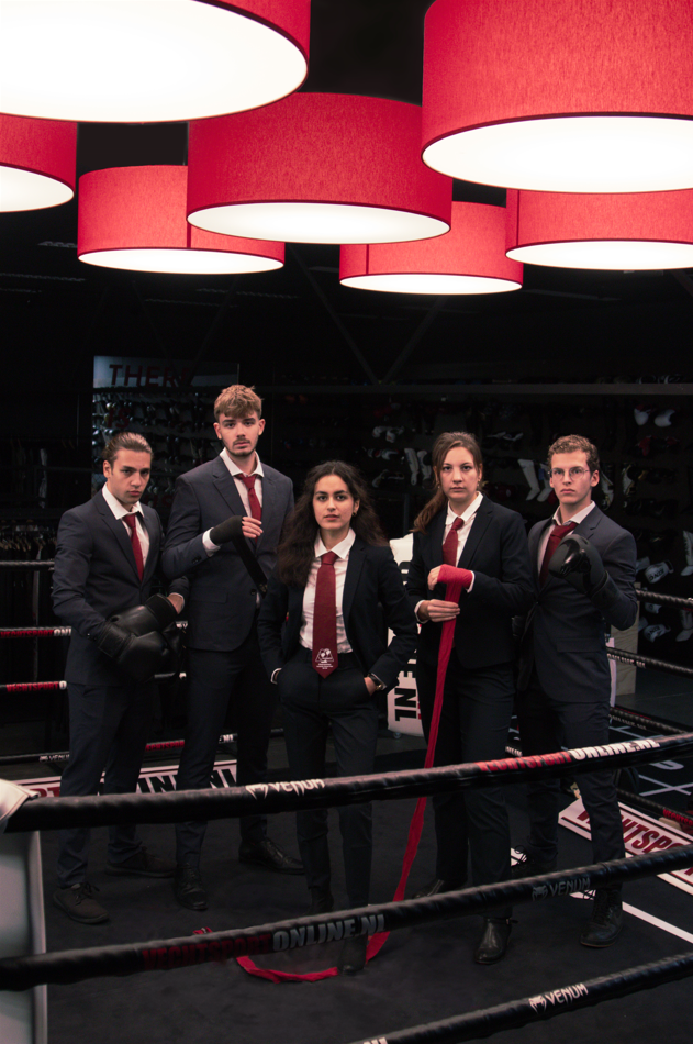
Damn, we’re almost too intimidated to scold you for using a vertical picture. And the inclusion of the red lamps is almost enough to justify it. Almost. Nonetheless, you look really cool. Though the picture is just a tad too dark, it actually kind of fits the vibe, and the use of color is fantastic. The photo is perfectly on theme and it proves instilling fear definitely works when you want a higher grade on something! Seriously though, good job.
24. GLiTCH Study Association
This picture has absolutely divided the room and if it was up to some it would have been way higher. On the one hand, you’re bringing the drama (watch and learn GST!), great lighting, and a chair who is definitely plotting to get us hooked on some cryptoscam! On the other, it relies solely on its immaculate vibes. The location is essentially just a black void. And we’re also in dire need of some video game-related props (you had endless options!). The outfits aren’t exactly professional either, but we can accept that as an artistic choice.
23. G.S.Z.V. De Golfbreker
Wow, what a location! The art piece hanging from the ceiling, which looks almost like a wave, is a real eye-catcher. The picture also oozes confidence, the lighting is perfect, and you guys look like true world champion swimmers. Unfortunately, you are so far from the camera that we barely noticed you before zooming in. You guys get completely lost in this location that appears to have been slightly more of a liability than an asset. Next time, make the picture more about you!
22. TBV Lugus
Sweet, sweet symmetry. The further you zoom in, the more impressive this composition is. Everyone is where they need to be, and you stand out beautifully from a complex and interesting background. Perfect symmetry is not a requirement, but when an image is trying to achieve it, this is the standard they should be setting. The industrial aesthetic suits your organization well. Props for the outfits. Otherwise, it’s a tad boring. The background shouldn’t be the focus. And the biggest issue we have here is your hands; why are they not posed the same?
21. Lijst Student Erkend
This might be the perfect professional board photo! The outfits, poses, and background are all exquisite, with the blueish gray of the walls complementing your attire very well. Technically speaking, this picture is flawless, succeeding in capturing what might be the biggest board of Groningen. Unfortunately, it’s also a little on the boring side. Nothing to hate, just rather dull and stale. It doesn’t really excite us.
20. SV Hestia
Wow, you’ve managed to find the grayest background in all of Groningen, and you still made it work! It looks like a mixture between an abandoned parking garage and an underground missile silo. We’re intrigued! We love the usage of colors. Your ties matching the lights coming from what looks like sci-fi Stonehenge is honestly fantastic. Your suits look great too, but maybe the person on the left should have calmed his tie down a little (it looks a bit too happy to be there!). Minor point of critique: the guy in the back should have been standing on the right, to spread you guys out more across the picture.
19. SV Tapp
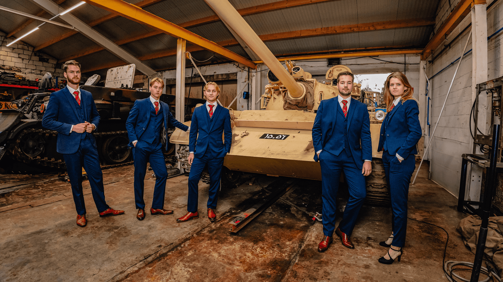
Boom! You guys really just rolled into the Board Picture Awards with a pair of tanks, thematically appropriate and such a power move! This picture is very high quality, allowing for some of the colors (namely your matching suits and shoes) to really stand out. However, we would have liked for the barrel of the tank to have been captured in its entirety. It feels really strange having it extend out of frame like that. The rest of this garage also looks a bit messy, like you could have put more thought into your background.
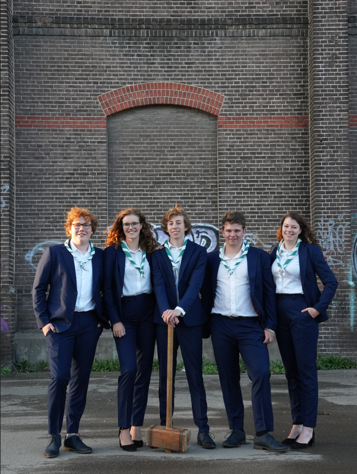
18. T.F.V. ‘Professor Francken’
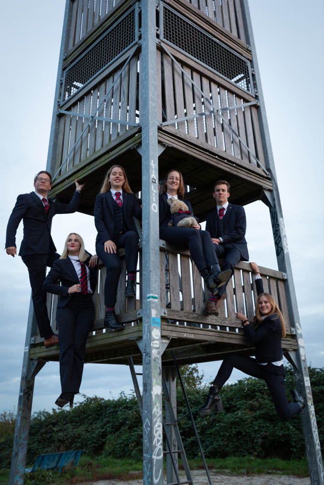
Here at SK, we tend to penalize vertical pictures, as most of the time they just do not work. HOWEVER. If you were hellbent on making your picture vertical, this is how you do it. It’s just a really fun picture both in concept and execution. Love the gravity-defying nonchalance of the girl on the left. Still not sure how she does it, but we appreciate how easy she makes it look. Shout out to the mascot in the matching suit. Sure there are some things to nitpick like the mismatched socks or the slightly awkward posing of the right-most board member, but you did a great job!
17. Stichting KEI
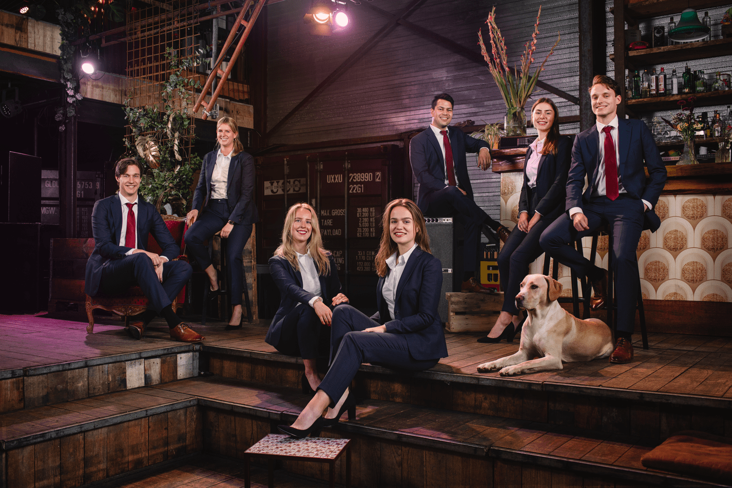
We really dig the vibe of this picture: it’s perfectly professional yet you carry yourselves in a very laid-back manner. The composition and lighting contribute to this picture’s incredibly cozy atmosphere, where the colors really pop. We couldn’t help but notice the slightly-out-of-place stool in the front, though. But let’s not ignore the canine in the room…We’re a little divided when it comes to that good boy. Some of us believe that, unless the dog is actually part of the board, trying to divert our attention with its cuteness could be considered cheating. Others were simply too distracted to have an opinion on the matter. Either way, good picture!
16. G.S.W.V. Tandje Hoger
Such a cute picture! It looks like you guys just finished a lovely cycling trip through the quaint Dutch countryside. It’s a great way of showcasing your association. Did you also cycle between the guy on the right’s legs, or is he just standing like that for fun? Regardless, the colors are very nice, the lighting is pretty, and the outfits match, mostly… The best the guys could do was a pair of off-white shoes that have dirt on them? Next time, coordinate better!
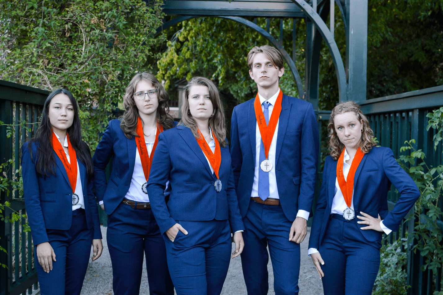
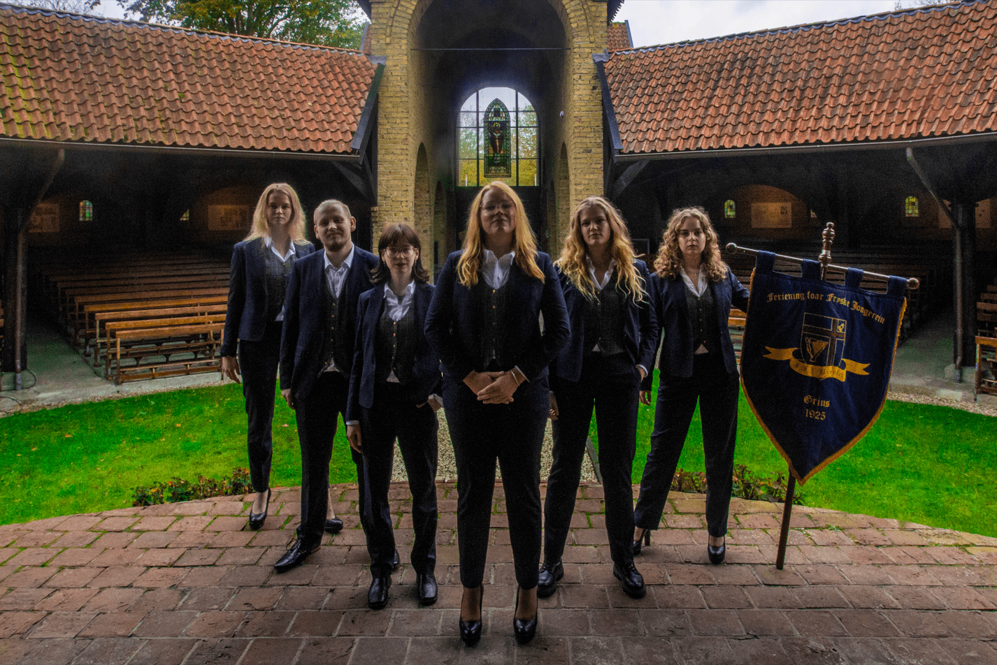
15. Studievereniging Ad Legem
Wow, the law students did a better job at taking a picture in a church than any of the Christian associations this year! We were amazed by this magnificent, shadowy background and the dramatic and perfectly-executed lighting that matches the colors of your scarfs and tie. You’re like some kind of medieval sorority that’s going to buy up our land. Unfortunately, we’re getting more ‘business’ or ‘christianity’ from it than ‘law’ association.
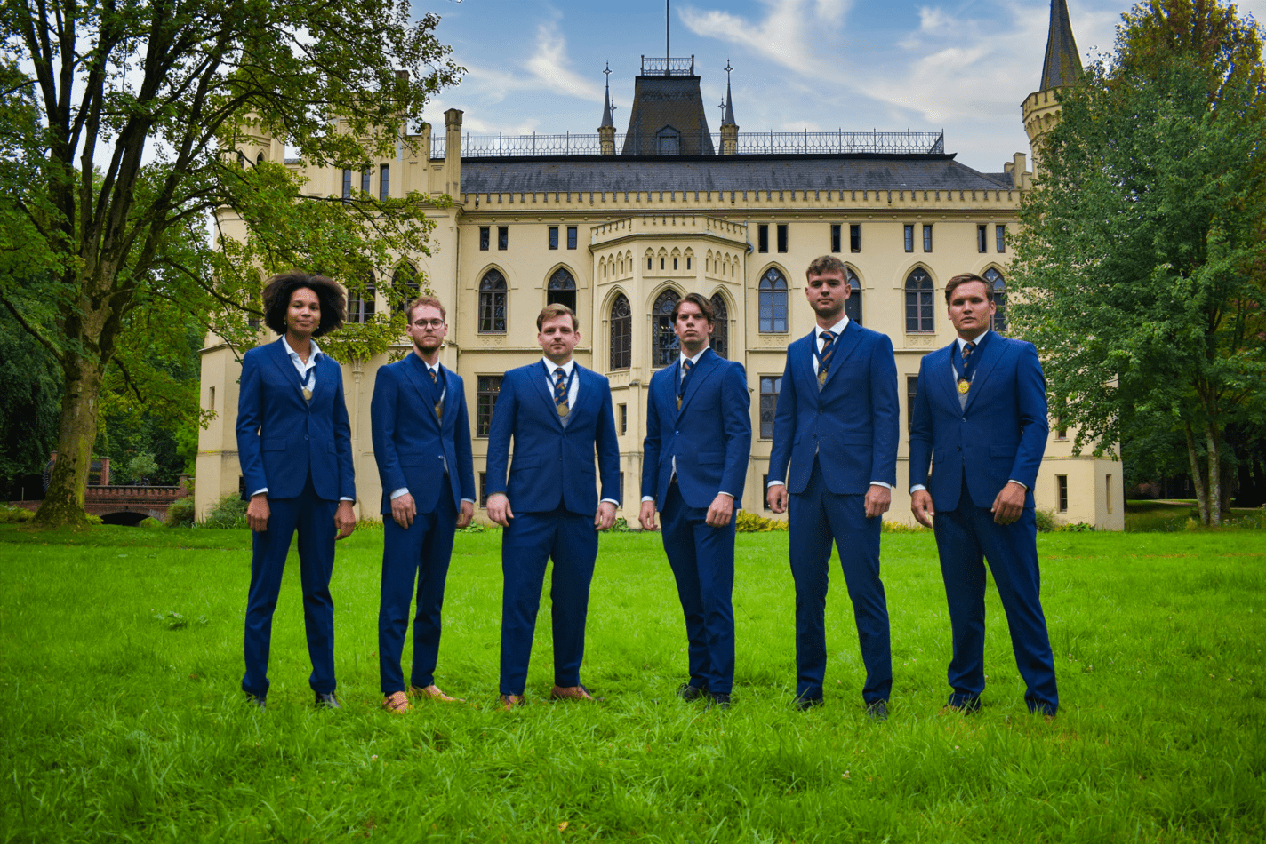
14. M.F.V. Panacea
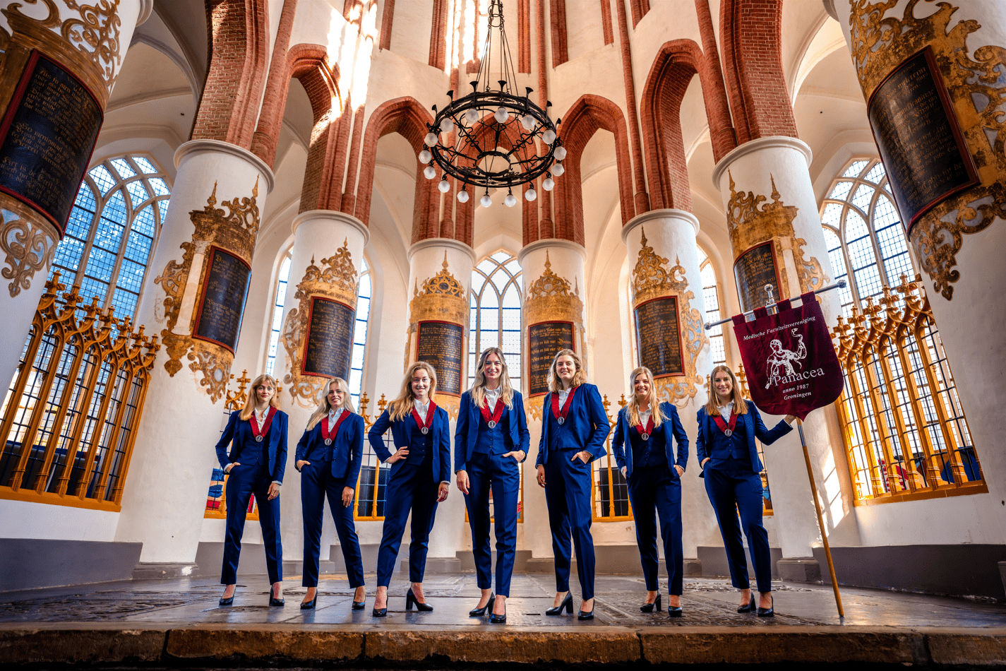
What an incredible location! Simply stunning. It is a little overwhelming, however. It distracts from the rest of the picture, which is heightened by the angle and distance between you and the camera. The board, which in this case looks phenomenal, sporting matching outfits, fantastic poses, and the Panacea banner, should be front and center! If it were the Background Awards, you definitely would have taken the cake, especially with that chandelier looming from above.
13. S.V. Check
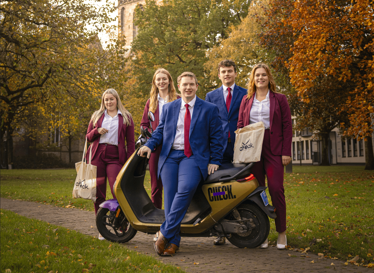
Holy shit, you made accountants look approachable and fun! We love the inclusion of the Check scooter, as it’s both comical and creative, albeit a little literal. If only it had the same color scheme as your association, then this would have been pure perfection. Also, you must have taken this picture on the same day as De Groene Uilen-Moestasj because the autumnal background looks phenomenal. We do think the tote bags are a bit tacky, but the lighting and composition makes us forget all about that.
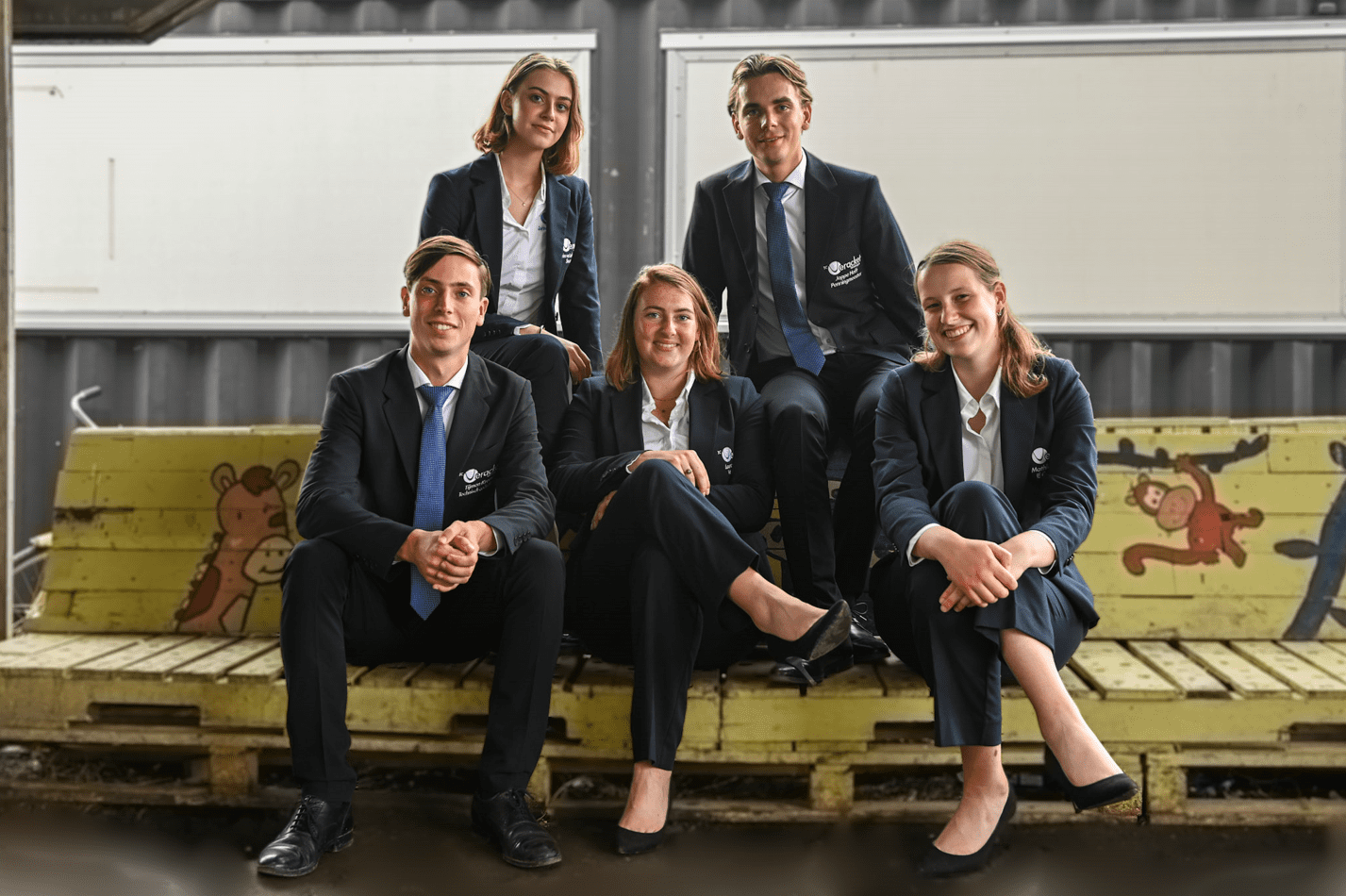
12. G.S.R. ‘Aegir’
Look at those traditional crimson jackets pregnant with stories to tell! It’s homeless haute couture! Props for actually taking your picture at the rowing club! It works thematically and the natural lighting from the ceiling windows is very flattering and well-utilized. All of your smiles are perfectly in focus and you guys are spread out well within the frame, but we do question the inclusion of the pallets. Not sure about their added value.
11. G.S.P.V. de Ramenlappers
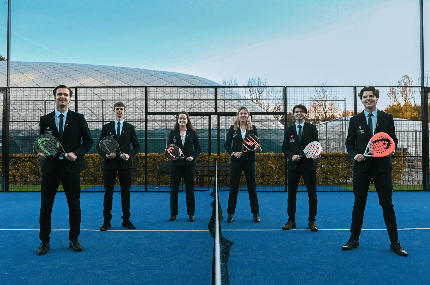
You guys served up a great board picture! Using the white lines and the netting to create two distinct sections of the image is a stroke of genius. A good idea, a shot well taken, and colors that really pop. Now come the nitpicks; we would’ve preferred it if your heads didn’t stick out above the railings in the background. And, for once, sneakers would have been the perfect pairing with your suits, rather than these mismatched shoes. It could also do with being a little less rigid. Tennis is fun, after all, throw some green balls all around the court and give us a little bit of chaos. That said, this picture hits that spot in our brains that makes us go ‘noice’.
10. Northside Barbell
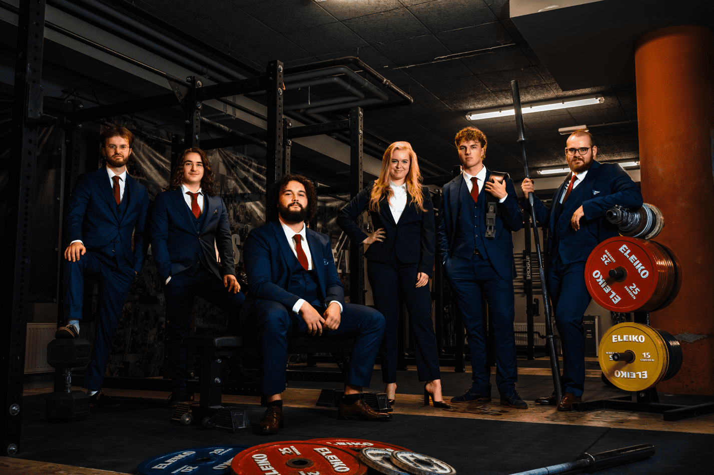
Last year’s board set the bar very high, but you guys certainly pulled your weight! The props are both thematically appropriate and well-utilized to frame the picture. Rather than stealing the show, they work to lift the board up and accentuate your power! You deserve praise for not falling for the trap of using only indoor lighting and instead bringing your own equipment. Technically brilliant, but next time, make sure the suits match. With this black suit, the treasurer really blends into the background, which we imagine is unintentional.
9. Hanze Studentenbelangen Vereniging (HSV)
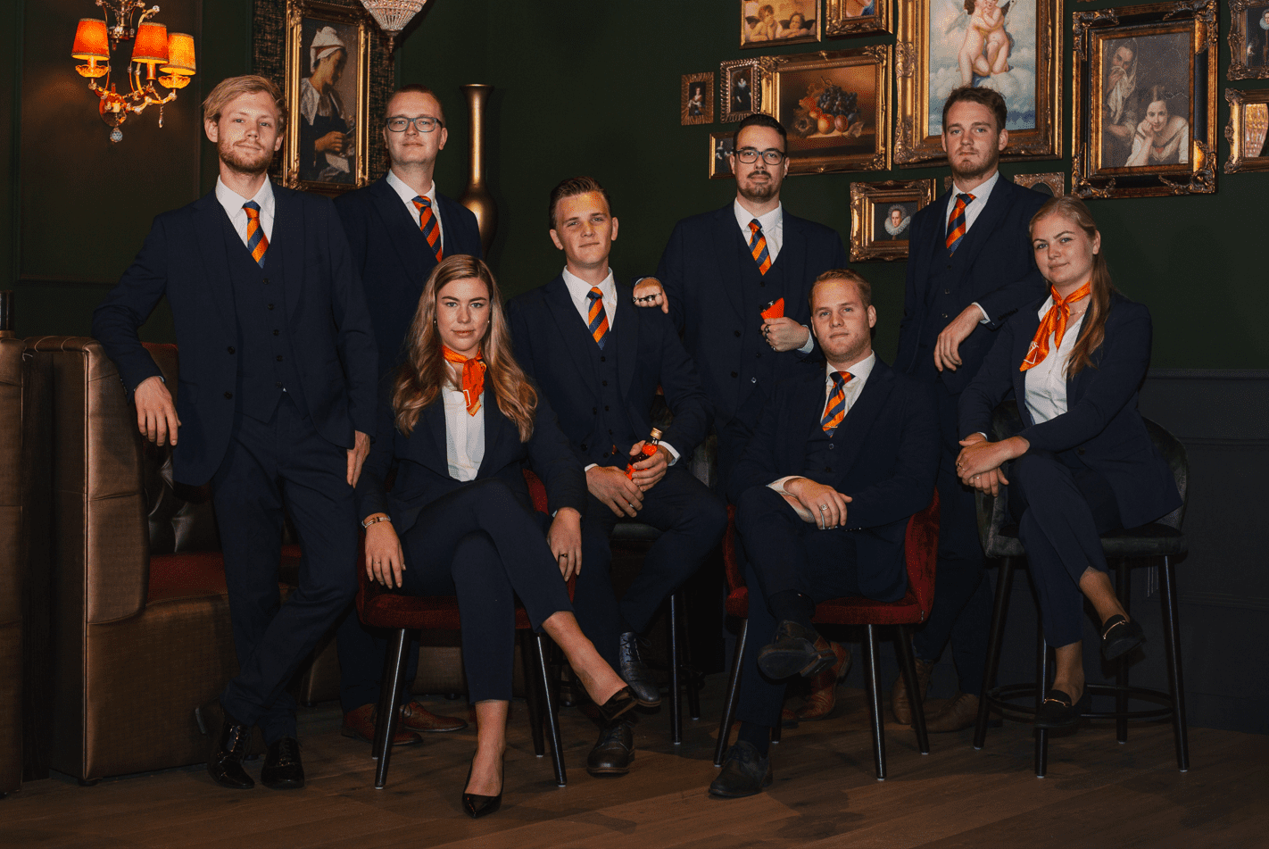
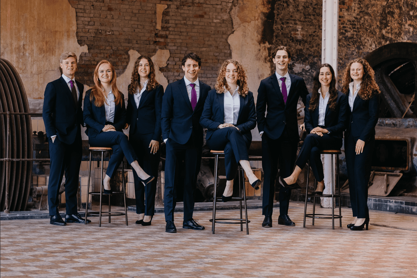
Damn, whatever you’re selling, we’re buying. You successfully lobbied your way to 9th place. About as professional as they come. The lighting, the framing, and tone. It feels like a warm cozy room where you’re going to tell us of ancient wonders and simpler times. This is also a good example of where you can cut off paintings (take notes, EBF!). It hints at continuity instead of laziness, and suggests a deep history behind you, while also creating some real depth. We don’t mind that there’s a random flask in someone’s hand, but why does it seem like someone else is preparing for a street fight with brass knuckles for insurance? Matching shoes would have been nice, too, and there’s a little too much empty space considering the artwork behind you.
8. Simon van der Aa
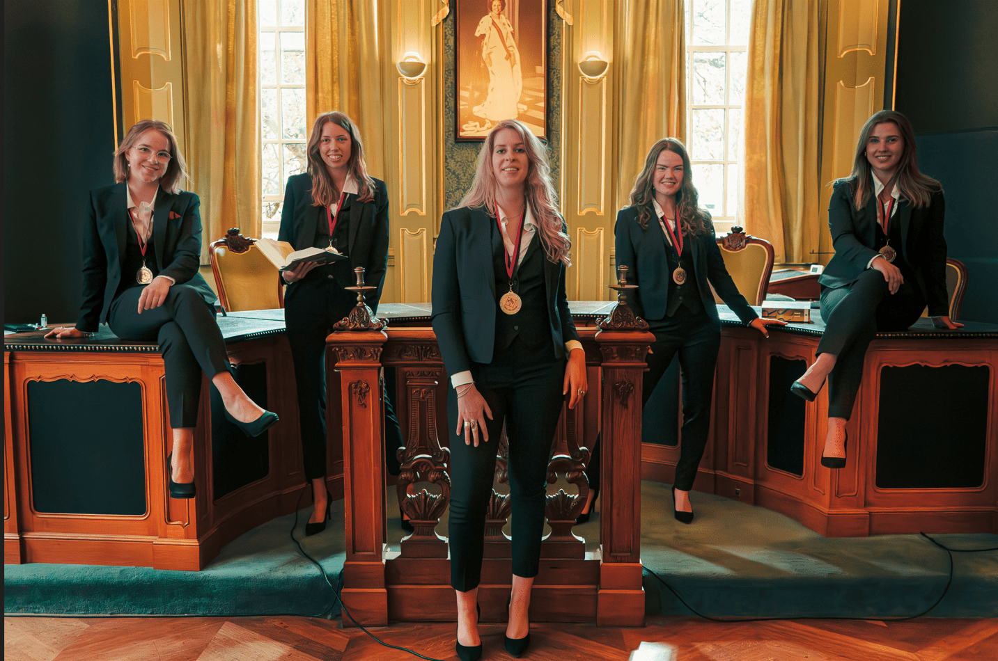
THE LAW IS FEMALE! We feel empowered just looking at this photo, even if a woman was cut short, literally, by cropping part of the Queen Beatrix picture. Not only do you all look fantastic, but the composition of the photo itself is phenomenal! The location is perfect and you all look like you belong there. No one’s out of place! Even the outfits match the color of the room! Love the medallions! The books are good props, but is that nose spray on the left side of the table? Clear it before the picture is taken!
7. ODIOM
Research shows multiple SK members would trust their children with the ODIOM board! This picture gives us very good energy, a clear improvement over last year’s creepy workplace vibes. And we love how the camera is positioned between these bushes, giving us the feeling like we’re peering into a fairytale-like garden. The red colors look fantastic on all of you, and the background you’ve chosen is perfect. Lighting and contrast are absolutely on point. Great job!
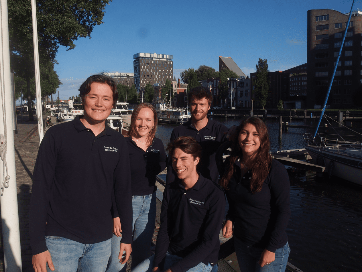
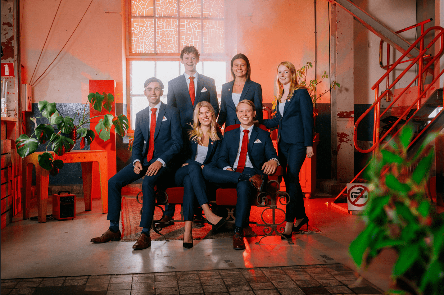
6. ESN Groningen
This is by far the best use of the Martini Tower this year. It’s perfectly-framed in the background and left out of focus so as to not take away from the board (take notes, Sirius A!), yet at the same time it looks stunning emerging from behind the trees. We are also happy to see that you took our feedback to heart and after last year’s unapproachable and downright threatening picture, opted for a more relaxed and friendly look. Much more suitable for an association that focuses on welcoming newly arrived students to Groningen. A technically brilliant picture!
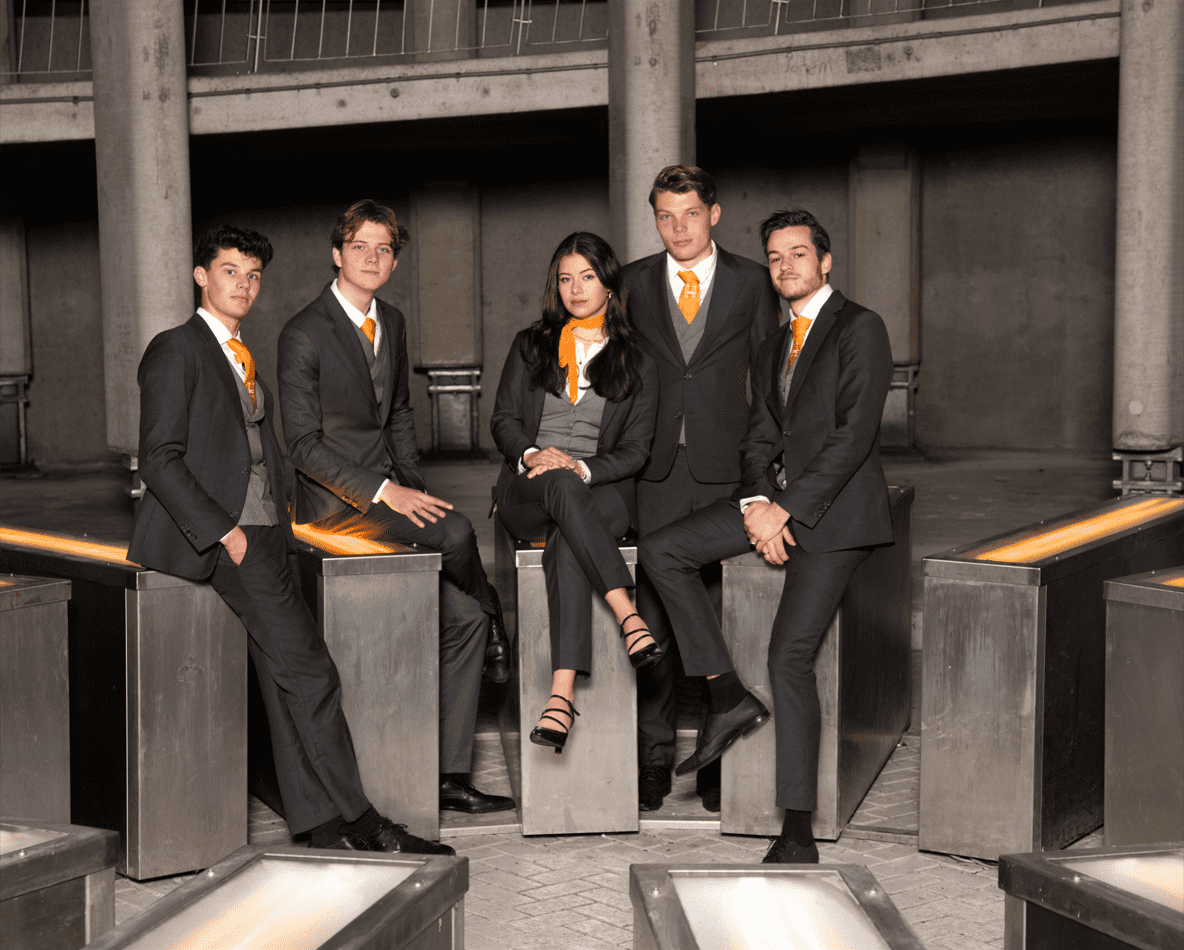
5. ACLO Studentensport
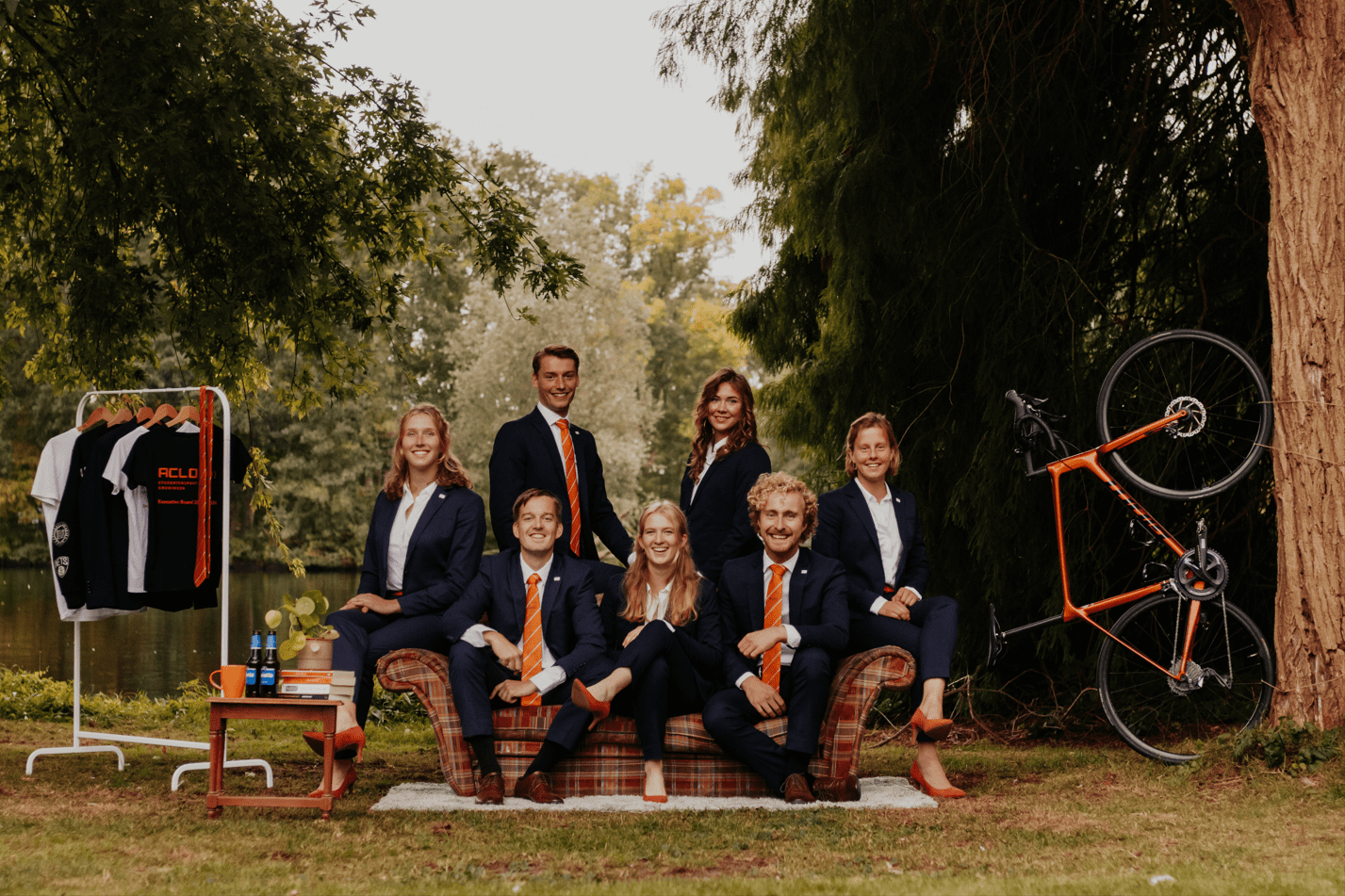
ACLO is hands-down the most consistent at taking great board pictures. We can always count on you guys to go above and beyond to make them look visually stunning and unique. The props are obviously great, giving the picture a warm and cozy feel in combination with your characteristically orange color scheme. It’s a little questionable whether it is entirely on theme, beyond the inclusion of the bike unceremoniously strapped to a tree, but you look so inviting and kind that we’re willing to overlook that.
4. G.S.Z. Mayday
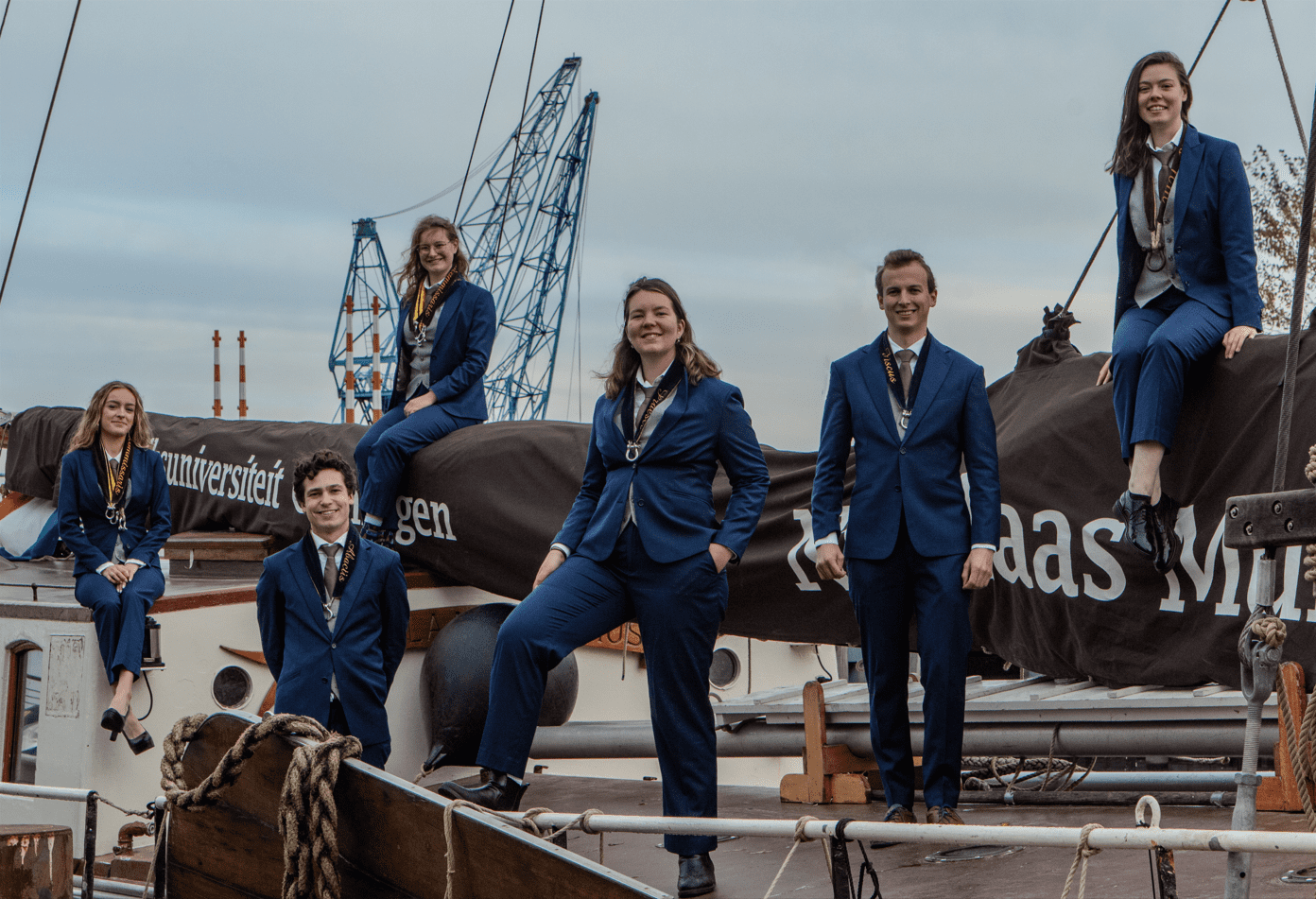
Batten down the hatches and hoist the mizzen mast, this picture is a shot across the bow to any sailing association. This is how it’s done. It draws us back to a life at sea we never had. The staging is great and there’s a lot for a busy eye to look at. The colors are a sure win, and we would trust any one of you to sail us across the seven seas based on your poses alone. Maybe a nice sunset could have improved this, and we are torn whether the crane in the background hurts or helps. But little nitpicks for a strong, professional, visually interesting image. Yar har, fiddle de dee! G.S.Z made a damn good picture.
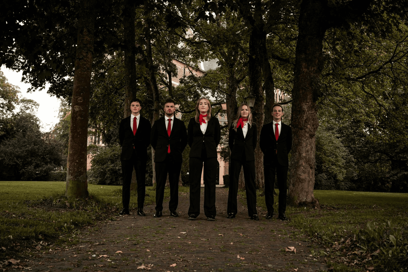
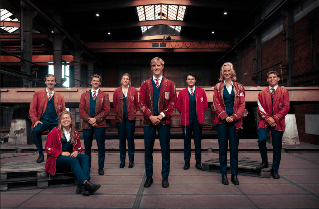
3. G.S.S.V. Moddervet
We volunteer as tributes! We’d follow Ms. Thor at the front into any war, especially the Hunger Games. We trust you all to show us not just how to survive, but to thrive. The composition of the photo is gorgeous, with great lighting and a nice focus on the people. The background is slightly out of focus, masterfully drawing attention to your great outfits and exciting props. Seems like you guys know how to have a good time, so let us step into this picture and join y’all!
2. Usva
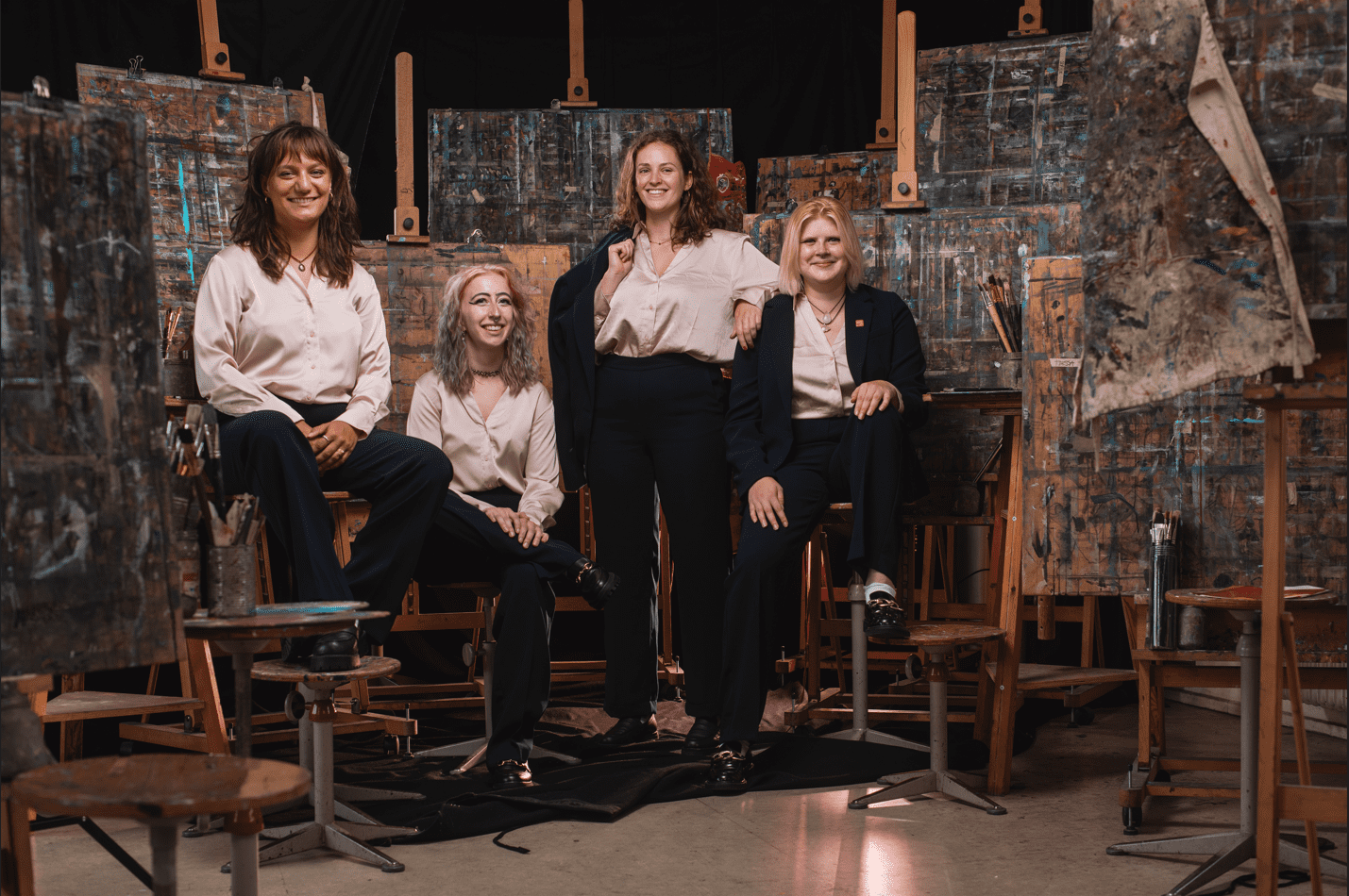
This is a true piece of art! With this amount of props, you run the risk of making it feel chaotic and unfocused. Instead, the easels work to your advantage, putting you at the center of attention. It’s a brilliant concept with impeccable execution, where everything from the framing, to the lighting, and the color composition have been decided on with skill and intention.The photo is thematically cohesive and gives the audience a good idea of what USVA is, working just as well to promote the culture center. You’ve done a great job balancing professional and laid-back, making the association appear reliable and inviting.
1. G.S.M.G. Bragi
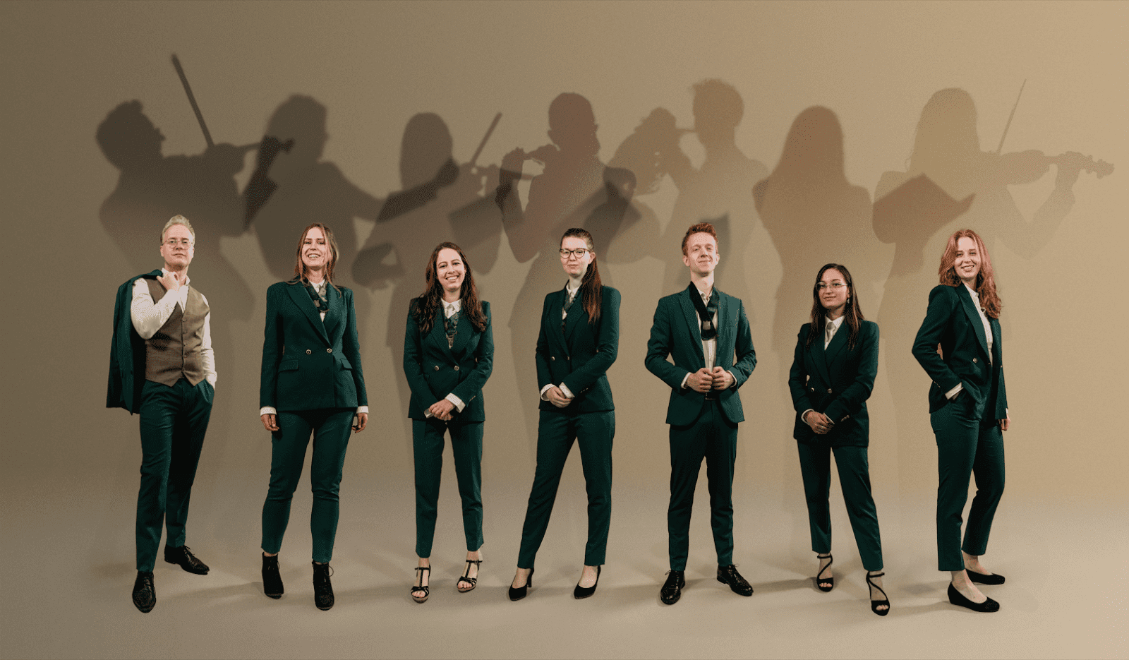
*cue the trumpets*
Lo and behold, the defender of the title! Last year, Bragi delivered a technically perfect picture that grabbed your attention and did not let go. It was dramatic, colorful and exemplary in every way. This year the board decided to go for something a bit more toned-down and yet, dare we say, it’s braver than the last. It is easy to make a picture stand out with vibrant colors and theatrical poses. However, it is much more difficult to achieve the same result with a more muted and mature concept. These shadowy specters of the beautifully-dressed board members, playing their respective instruments, give this spiritual successor to last year’s entry a certain pizzazz, while allowing it to remain classy and professional. Bragi has that air of creativity and originality that we look for at SK. You absolutely owned it, congratulations on extending your reign!