Board Picture Awards 2021
2021 has been a year of ups and downs. One of the ups for us every year is getting to judge the board pictures. Something about getting together in a group to judge other people is just fun. This year, we received 67 pictures. Much like last year, there were highs and there were lows. Of course, this is all in good fun, every organisation here is of importance to the students of Groningen!
68. SV Siduri
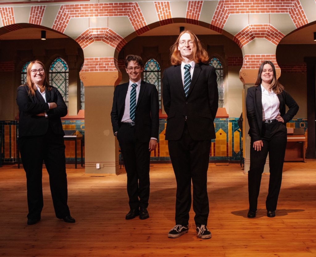
We’re so so so sorry, but this is a no from us. At least you look happy? You seem like nice people, but also like you’re about to challenge us to a Pokemon duel. Posing is not good, it looks messy. Please don’t wear dirty Vans while taking a board picture. Wouldn’t recommend.
Grade: 1
67. SGOR
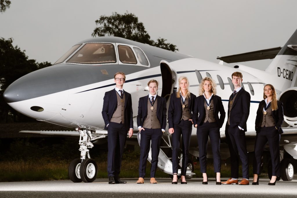
Unfortunately we aren’t inclined to board the SGOR-Airline. Why is everyone standing at the right side of the picture? We can’t take this seriously. Meme-worthy, that’s for sure.
Grade : 1.5
66. Fysiotherapeutische studievereniging Fysiek
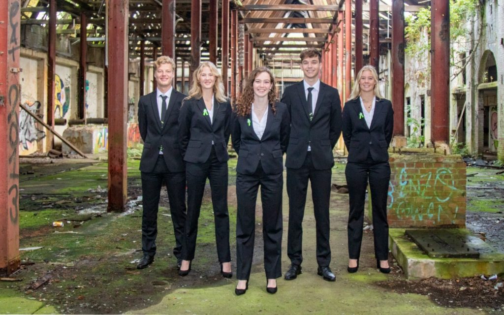
A nice try, but unfortunately the contrast between the sharp-looking suits and the rather messy, wild environment gives this picture a starkly contrasting feel… Did you guys get kicked out of the place you were supposed to take the picture and decided because of that to do it in an alley real quick? We are not really feeling the vibe.
Grade: 2.3
65. GSZV De Golfbreker
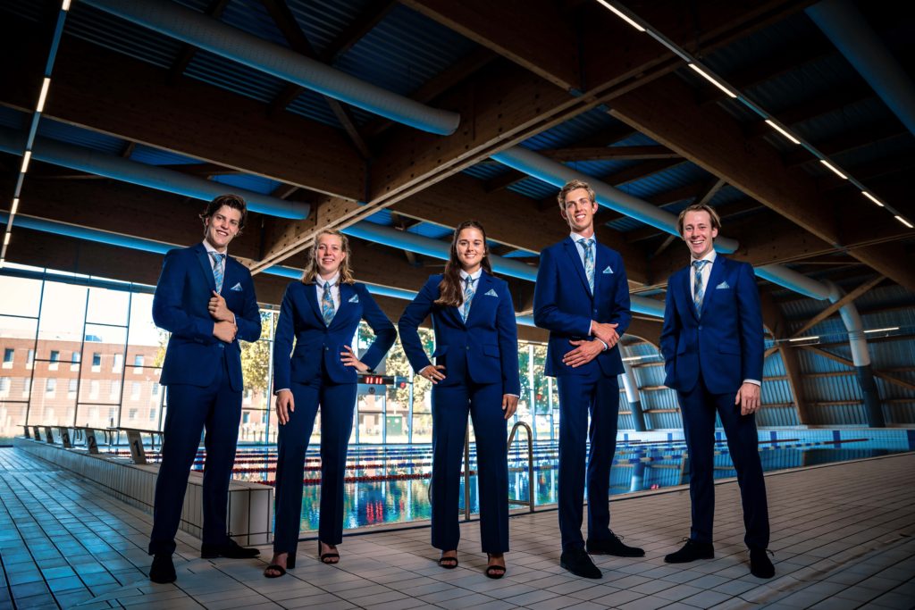
It looks like you’ve been photoshopped in? You look like you were superimposed on a stock picture of a swimming pool. We like the pocket squares and you look really happy to be there though, so we appreciate that!
Grade: 2.5
64. TW!ST
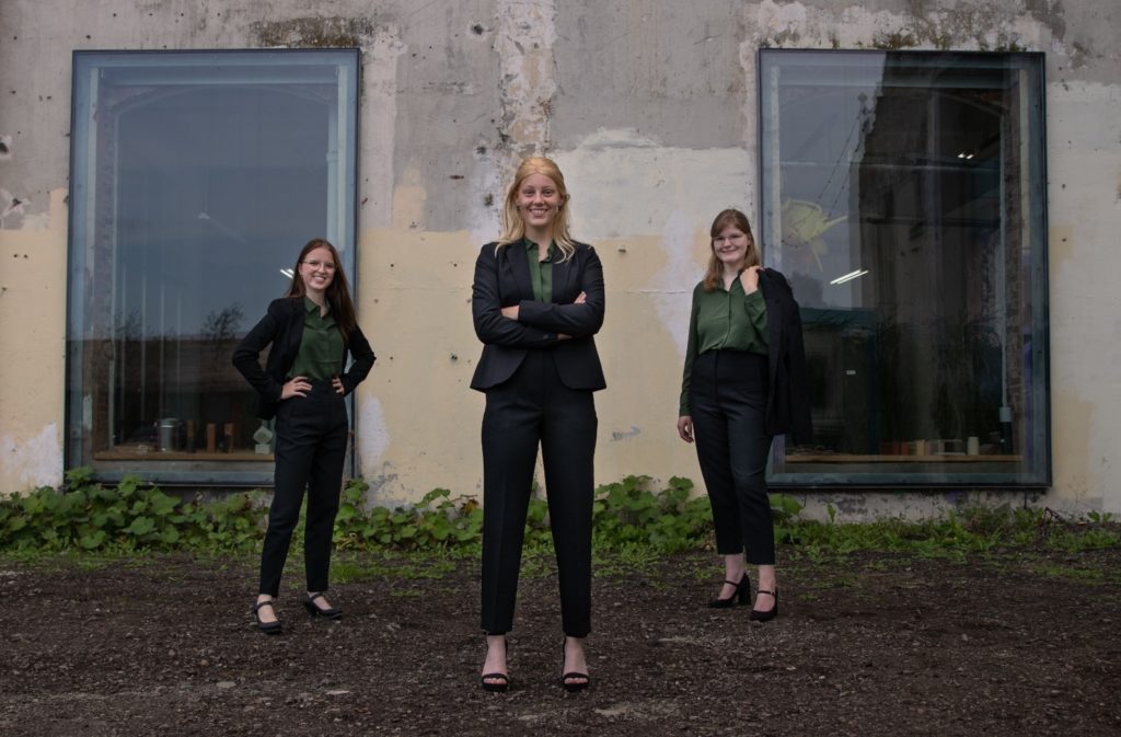
TW!ST decided to take their board picture in Chernobyl this year. Props for the bravery, but watch out for the radiation. The composition is nice. A little too casual with the jacket over the shoulder on the right. The weeds make it look bad, you deserve better looking plants in the background.
Grade : 3
63. SV Maslow
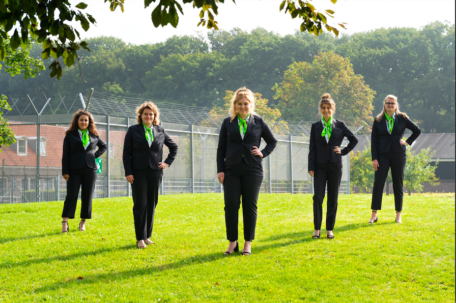
The saturation of the color of the grass makes this picture hard to look at, almost as if it was deep-fried. Are you in front of a prison? Feels weird for a social work association.
Grade : 3.2
62. GSMG Bragi
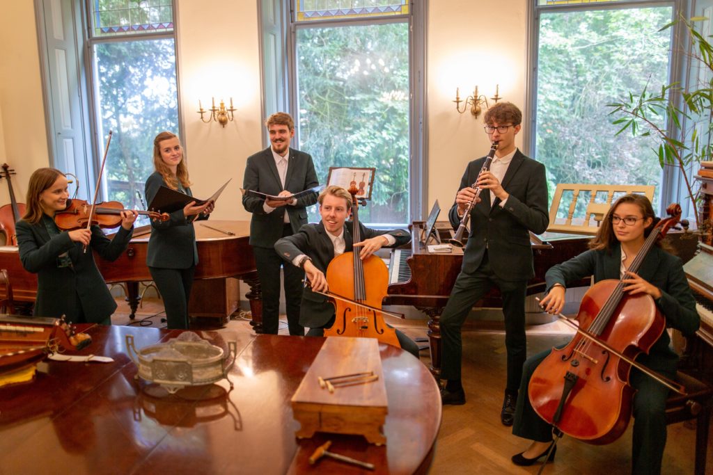
Is that Chinese take-out on the table or something? Looks like you asked the waiter to take a picture. Took us a while to realize there’s a piano in the front. We’d rather see you guys laying on the piano than whatever it is that’s going on here. The more we see it, the more we don’t like it.
Grade: 3.3
61. SOG
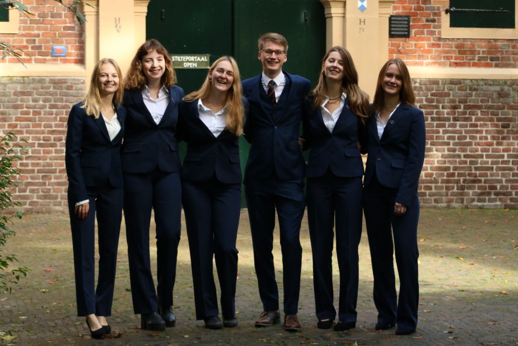
You guys look genuinely happy to be there, which is always a plus. The background is a big meh.
Grade : 3.7
60. Martinistam
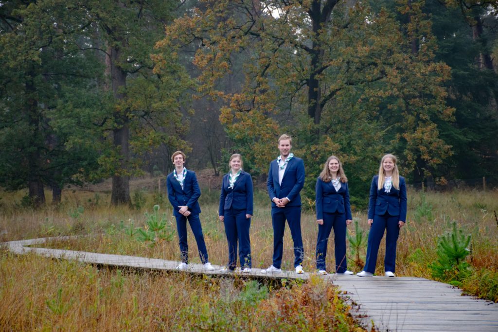
Kind of like a family photo, looks like you’re going for a walk in the woods and will get soft serve ice cream after. Without sprinkles, can’t have anything too crazy… Guy on the left is leaning off the edge. The location is alright, definitely more unique and nice autumn colors, but nothing special. Why is everyone standing so far away? Was your photographer scary?
Grade : 3.7
59. GSV
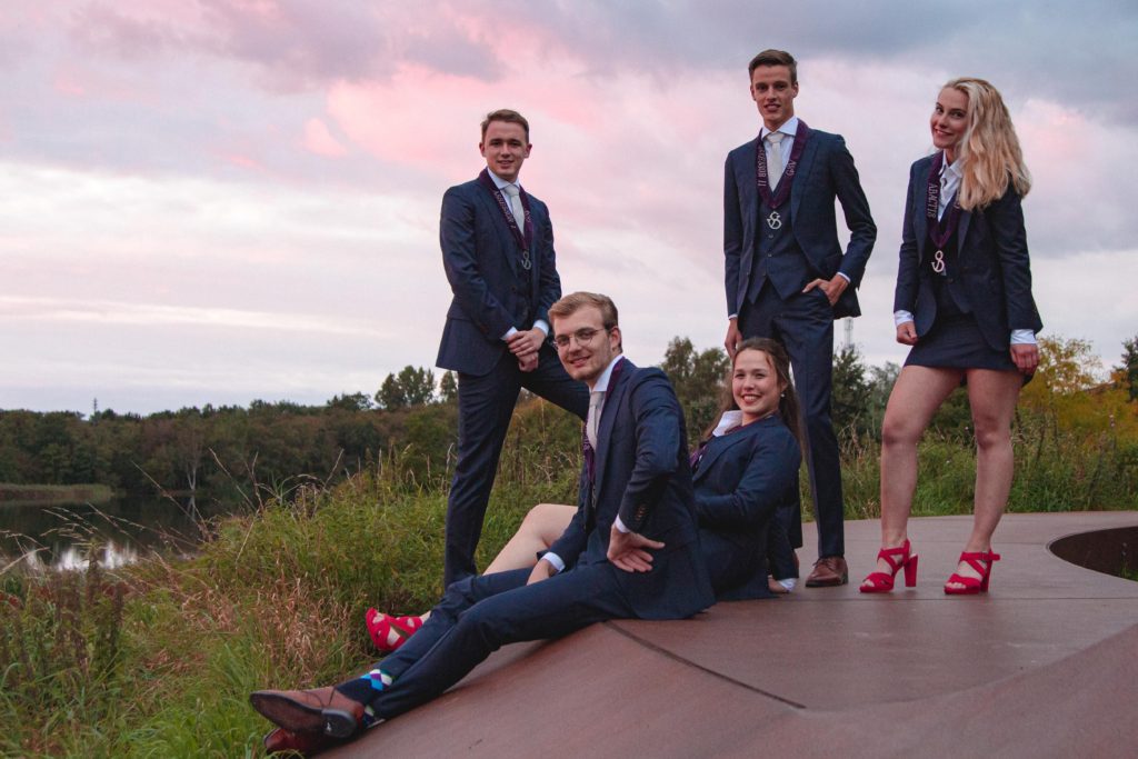
Location is very nice! It looks like the guys on the ground are sitting on each other? Not a big fan of the shoes. At least you tried? The picture is nice, it just looks scrambled.
Grade : 3,7
58. Esperia
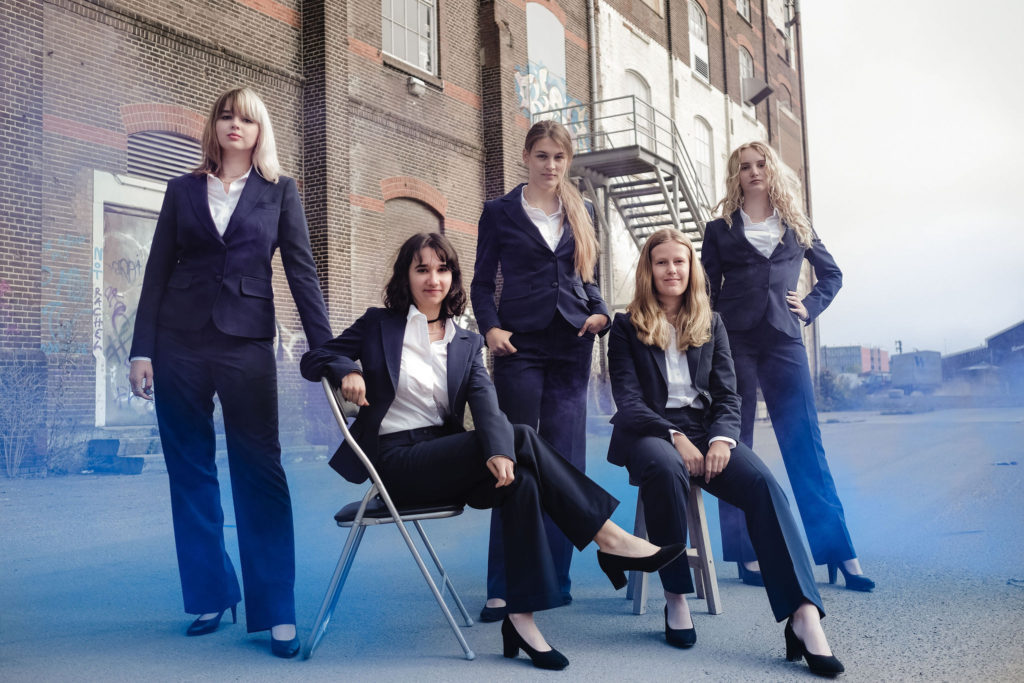
It’s unclear if the blue-coloured hue is the result of some sort of gas or photo editing, which makes it quite confusing. It does make the photo stand out, but unfortunately it doesn’t work.
Grade : 4
57. SV Ilythia
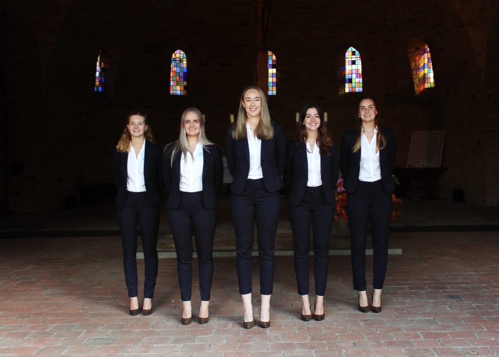
The contrast between the very dark background and the brightly lit foreground gives the faces an uncanny valley glow, and the horizon is slightly off-kilter. Points added however for the composition and coordinated outfits.
Grade : 4
56. Le Baso
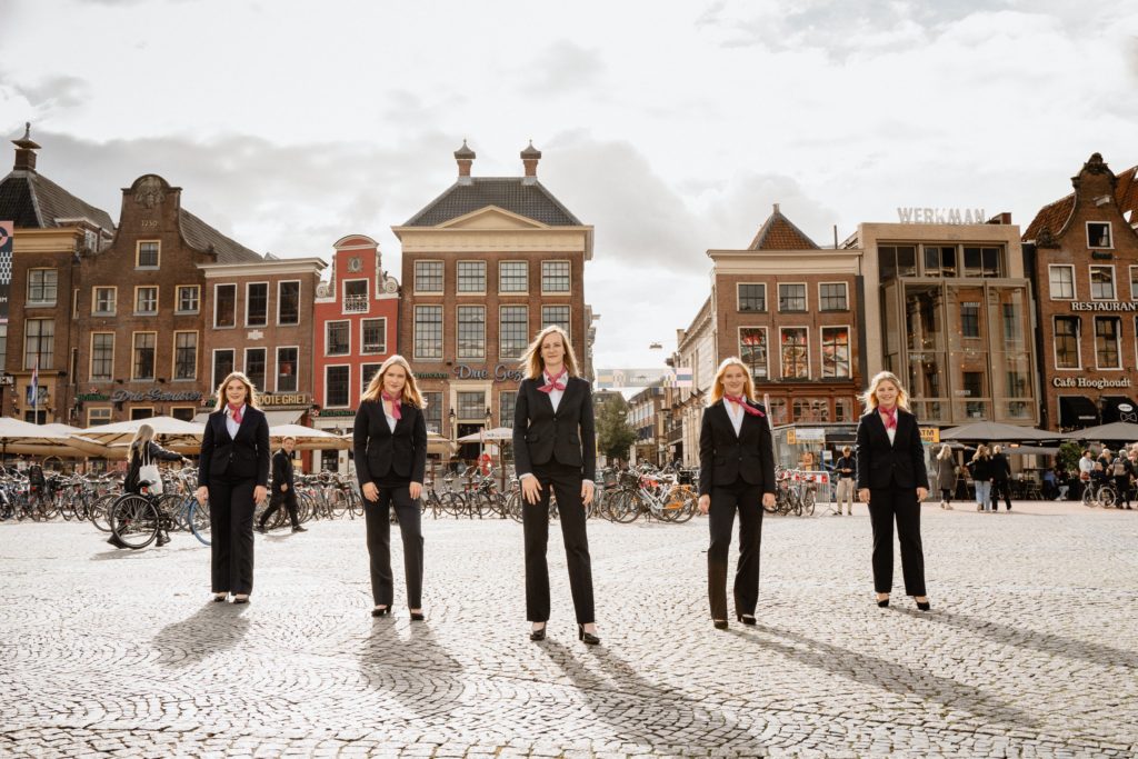
Off-center so the gap in the buildings looks weird, the location is meh. There is potential but it is unfulfilled. The people in the background make it look bad.
Grade : 4
55. GSVV The Knickerbockers
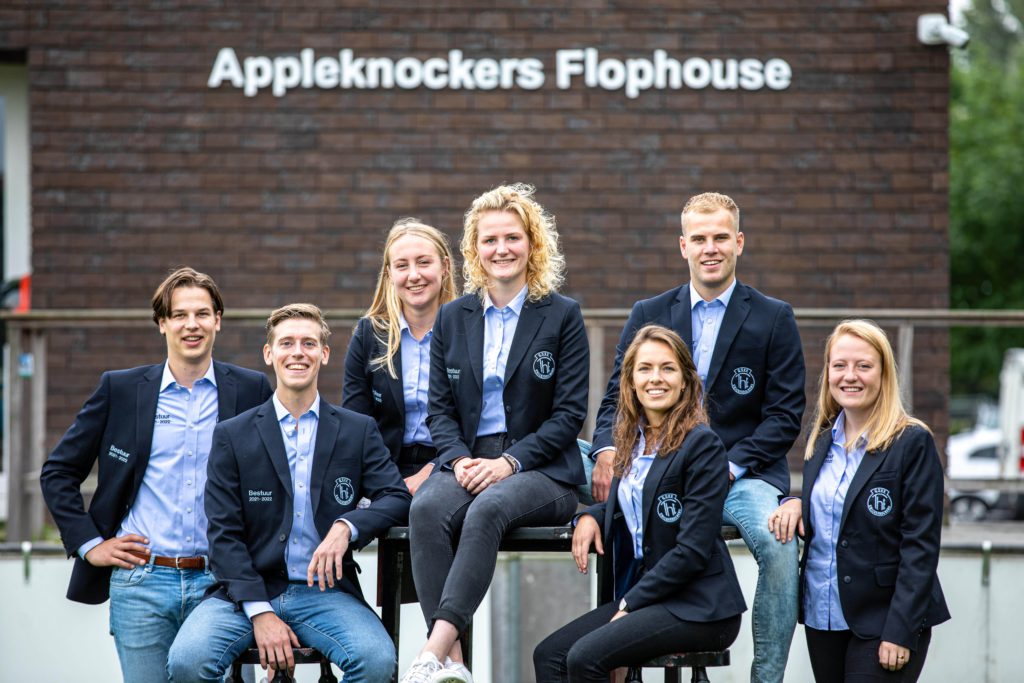
The appleknockers flophouse is distracting, what does it mean? It makes us think of appelflaps. The picture is cut-off at the bottom, kind of bland because of the jeans. You look happy though, and it is better than previous pictures.
Grade : 4
54. Groninger Studentenbond
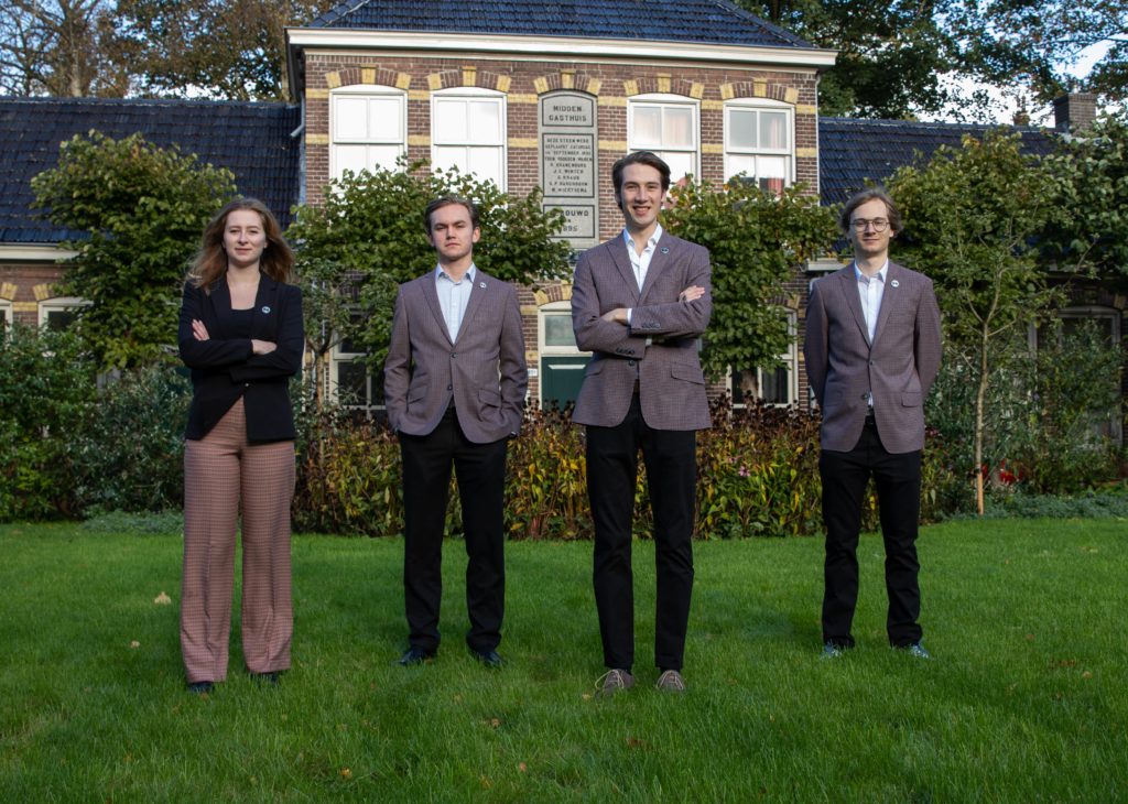
The location of the house is nice, but it isn’t framed well. The composition could’ve been better too: maybe coordinated outfits or putting the woman in front. It looks like it’s freezing outside and you can’t wait to get back inside. Please do, you guys look like you could use a cup of hot chocolate.
Grade : 4.1
53. GSPV Parafrid
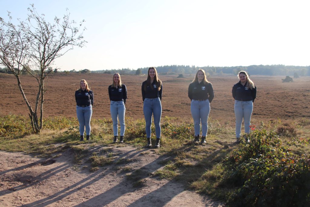
Where are the horses? We do like the skinny jeans. Composition is slightly off center, the lighting is bad. We do like the idea of the background, it just doesn’t seem to work in this picture. Next time, a little less mud and a little more grass. And horses.
Grade : 4.2
52. TFV Professor Francken
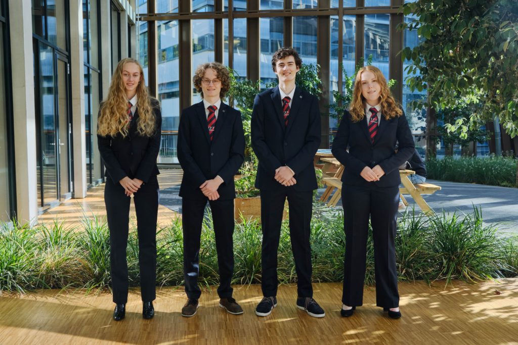
You look fresh out of high school, like the “you know I had to do it to ’em” meme. Could have done more to make it physics-y, because right now it gives Harry Potter herbology vibes. Suits are looking sharp though, and good lighting.
Grade : 4.2
51. SV Vedi
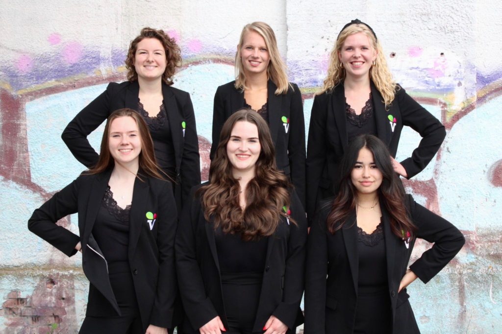
Not great lighting or quality, bad exposure. Looks like a class picture, you don’t really look like a board. We appreciate the symmetry on the arms. Love the girlboss pose.
Grade : 4.5
50. ASCI
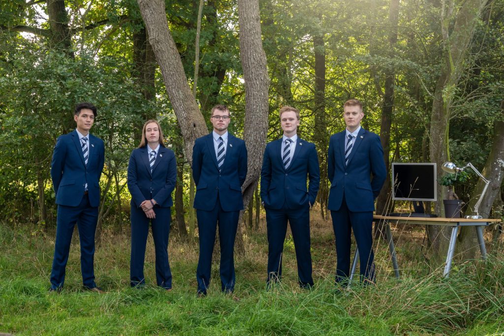
Hand position is out of balance. You did bring Ikea into the woods, which is nice. We like that there’s a lot of plants but that’s about it.
Grade : 4.5
49. JOVD
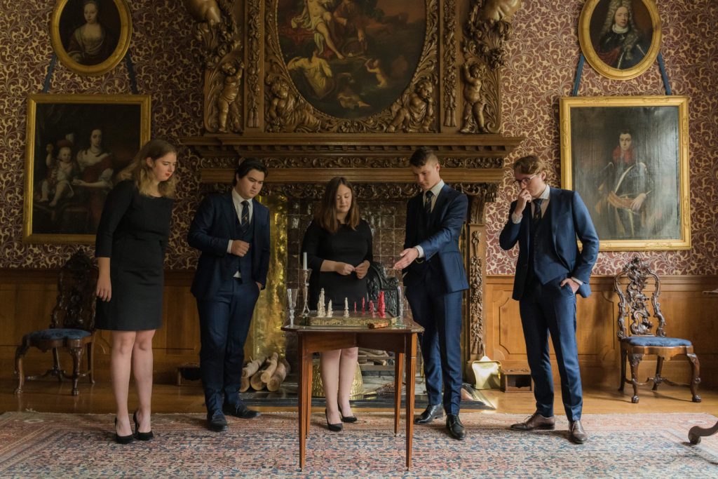
While the background of the picture is nice, we are a bit confused by the composition. It is a decent idea, but executed badly. We cannot see any of your faces completely as you’re all focusing on the chessboard. You relied too much on the props. Stop sniffing your fingers.
Grade : 4.5
48. HCSA
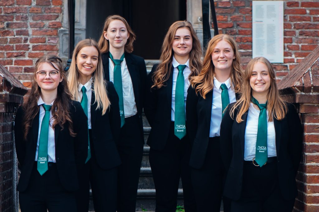
We don’t hate it. You look happy and it is a good quality picture, but it is very much middle of the pack. Tie etiquette is slightly off though.
Grade : 4.7
47. Clio
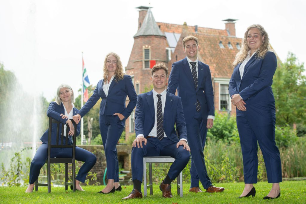
Could have passed if you toned down the exposure. You’re kind of vibing though, and we appreciate it. The guy in the middle is especially vibing. It’s okay but not enough.
Grade : 5
46. FSG
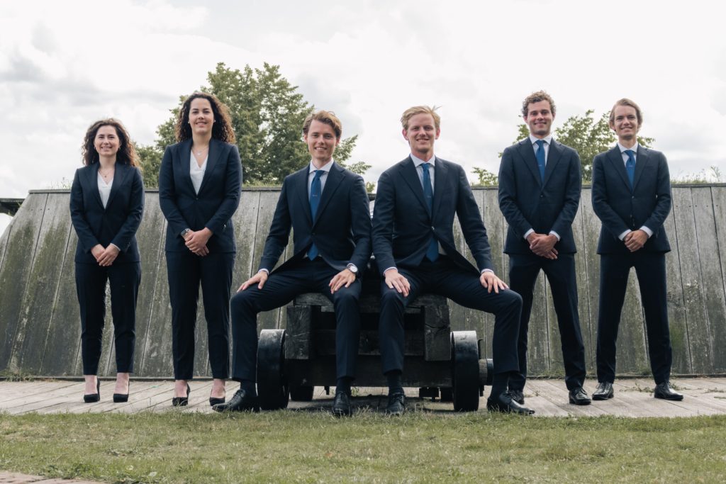
Why are you guys sitting on a cannon? Manspreading is taking over. Overexposed as well. Also, what’s in the background? We are confused. We would’ve loved to see raining money, since you guys are finance people.
Grade : 5
45. VESTING
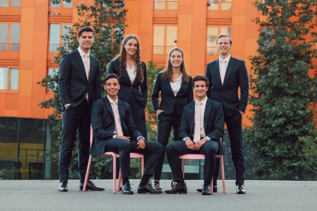
The lighting is nice and you guys look good, but there’s something missing we can’t quite put our finger on. A little more pop was needed.
Grade : 5.5
44. Pro Geo
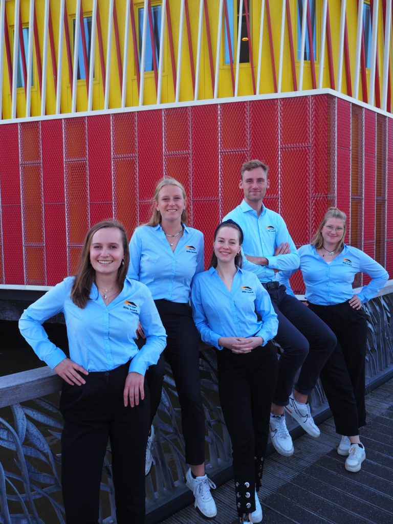
Too casual, not awful but not special. Quality is okay, colours are a bit too strongly contrasting but it does pop. You look happy to be here. Next time choose a better location?
Grade: 5.5
43. Simon van der Aa
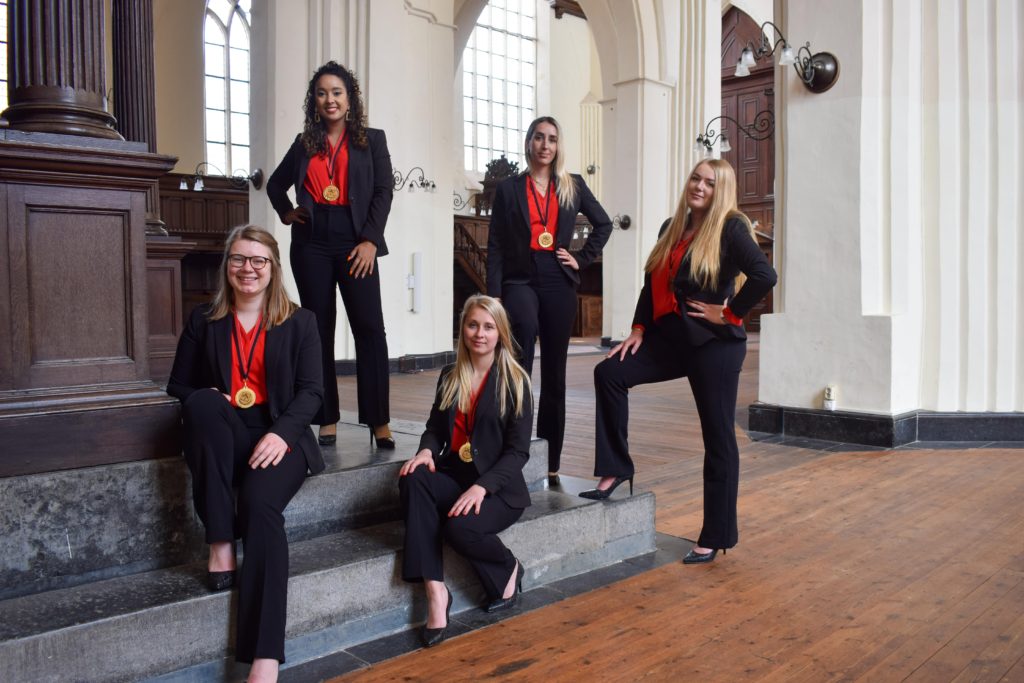
You have a decent location but you could have found a better spot in the church. It’s okay, but nothing special. It’s kinda bland. It’s like having an AVG’tje (potatoes, meat and vegetables) for dinner. It’ll do the trick, we’re just missing the spices.
Grade: 5.5
42. Dices
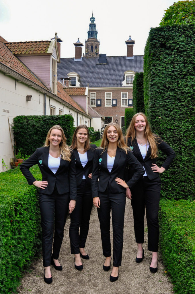
Almost looks like the picture was taken mid-walk through a maze. You guys vibe well with the bushes. It’s okay.
Grade: 5.7
41. GHD Ubbo Emmius
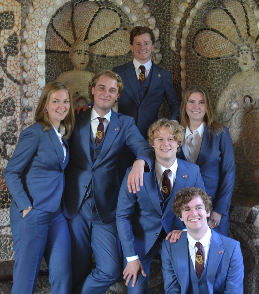
Why is the chairman not centered? The location is historical, which we like. The composition makes it look like a family photo.
Grade: 5.8
40. Ibn Battuta
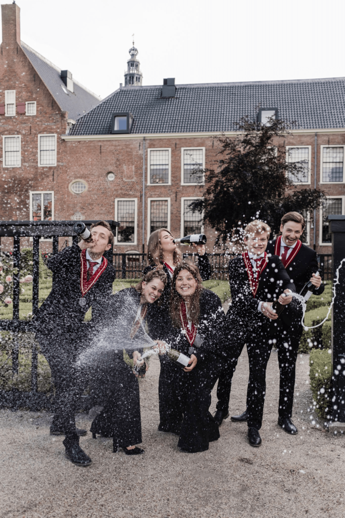
You have nice suits. We can’t really identify anyone, which is a shame. But it is fun and creative. It does look like an alcohol association. We love and hate it at the same time, a lot of divided opinions. We also have questions. How many takes did you guys do? How many bottles of champagne were opened and finished?
Grade: 5.9
39. SV Fiscagio
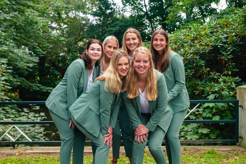
It looks like a 21-dinner picture. It’s the Dutch girl pose. We would drink prosecco with you guys though. Why are you guys squeezed so tightly together. Suits in itself are nice, it’s just a little bit of a green overload.
Grade: 5.9
38. MESA
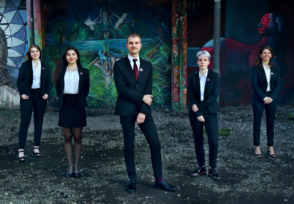
Two of you fell before taking the picture and are now holding your shoulders. +1 for the zombie version of Clifford the red dog. Judging this picture broke Studentenkrant in two: the pros and the antis. Your grade was the result of a hard-driven compromise.
Grade: 6
37. GTD Bernoulli
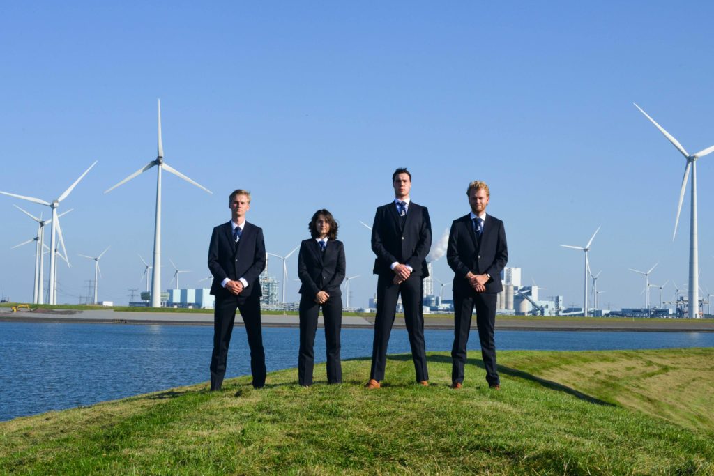
Looks like a Weezer album cover. We quite like it. The setting is a plus, it’s quite creative. The subjects are quite far away from the camera however. You look intimidating but not scary.
Grade: 6
36. CSFR
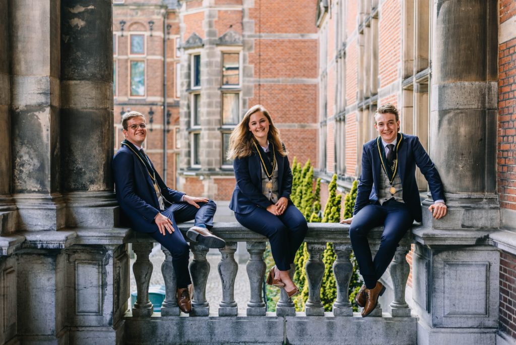
Good lighting, you look happy. Location is alright, could be a lot worse. Kinda cliché, but you get away with it. Kind of looks like a picture of a show where too many laughing tracks are played.
Grade: 6
35. Foundation Geo Promotion
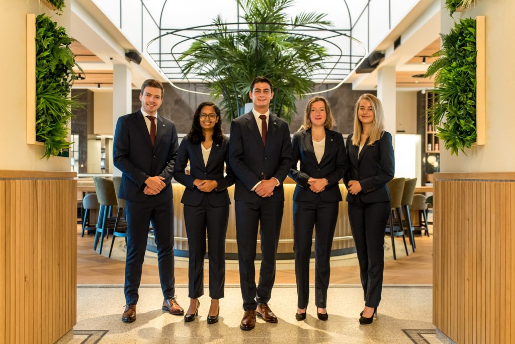
Hello good sir, may I take your order? Would you like a chardonnay with that? We feel server vibes. You know I had to do it to em pose. Looks like it’s taken in a hotel lobby. Very welcoming but feels too polished.
Grade: 6.1
34. VIP
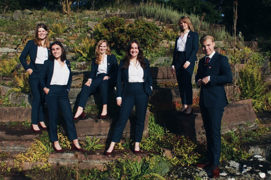
We like the background and the use of colors. Posing is a little awkward, same with the hands. We love the color of the suits!
Grade: 6.2
33. GSVV Veracles
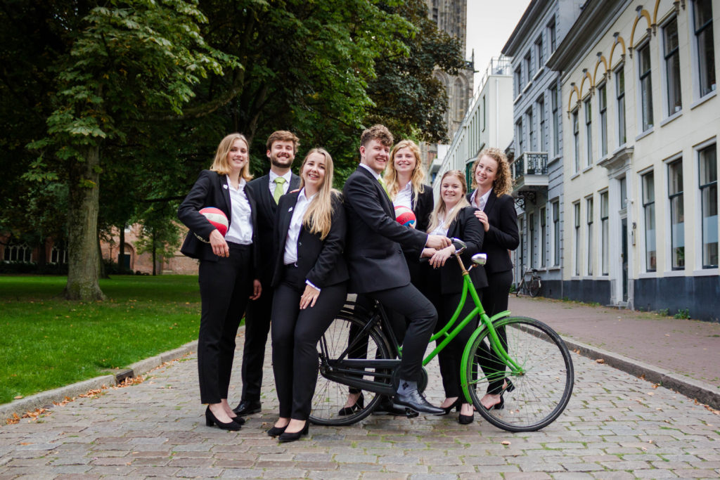
Looks like a picture of a friend group on vacation, which fits a volleyball association. You look genuinely happy as well, all in all this pic gives off good vibes. Can we join in for a volleyball match sometime soon?
Grade: 6.3
32. AGSR Gyas
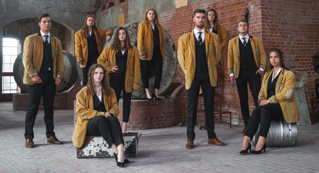
Composition is alright, kind of too many people, the girl in the back is hard to see. We do like the use of colors and the rustic background. Looking serious can work in a board picture, but some of you look even a little sad to be there. Are you guys okay?
Grade: 6.4
31. Civielrechtelijke vereniging Gerhardus Diephuis
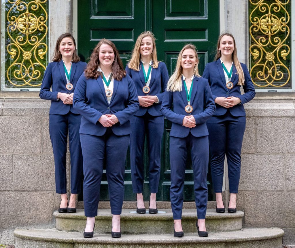
You look like you’re about to do it to us. Very symmetrical, we like the green motif. Nothing special, but it is a nice picture.
Grade: 6.4
30. GFSV Pharmaciae Sacrum
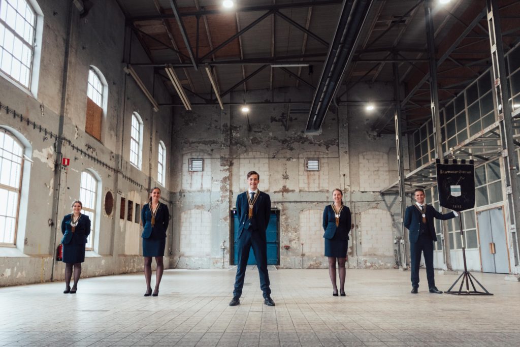
We love the standard-bearer, nice composition and good lighting, Nice filter too. Slight minus for the dilapidated wall on the background which clashes with the overall clean, light look of the picture.
Grade: 6.5
29. SV Cura
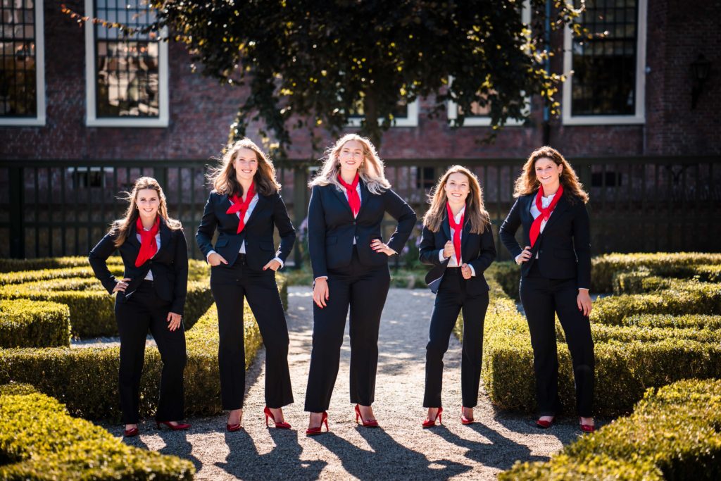
The wind is working very well on this picture, we also love the pumps & neckties, good poses. It’s a professional picture, we like it!
Grade: 6.5
28. TMFV Archigenes
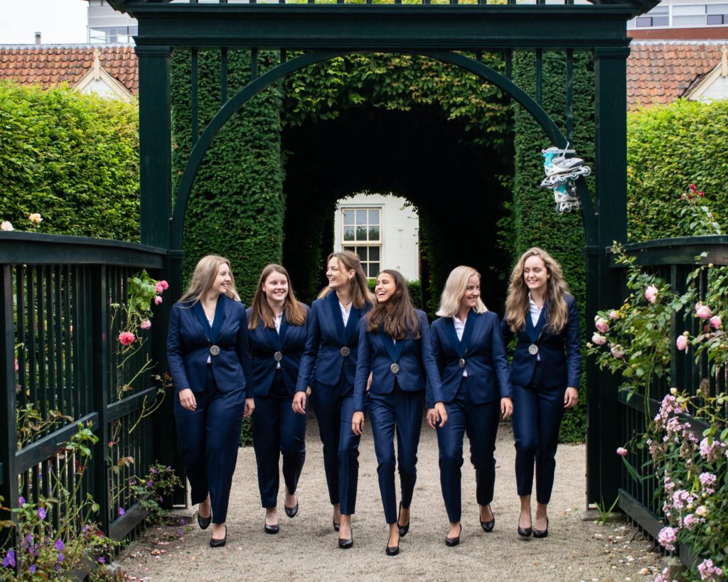
Sex and the City vibes, very girl boss. The walking makes it look more dynamic. It’s well edited, good location, just a little cliché. Why are there roller skates bound on the gate? It’s different, which we like.
Grade: 6.5
27. GSVV Donitas
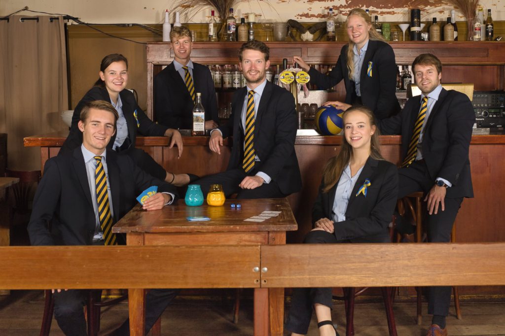
Not a fan of the bar background. The composition is alright and feels homely, but there is not much special. We like the volleyball ties. The card game threw us off a little bit.
Grade: 6.7
26. OCSG
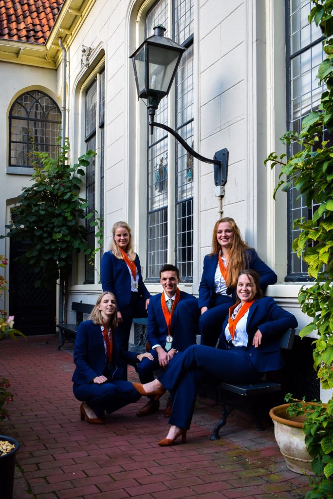
The lighting is a bit off, the shadows are too dark. We like the location; the building and the greenery are nice as well. The composition is alright. Not a big fan of the portrait frame.
Grade: 6.7
25. Hanze Studentenbelangen Vereniging
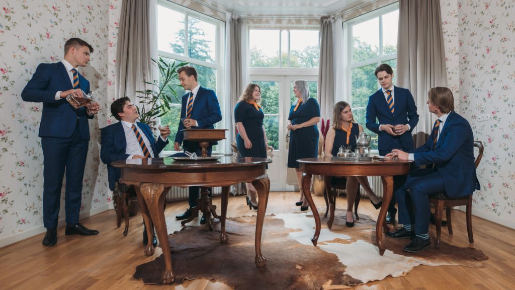
We’re getting theatre vibes. It’s kinda funny. Please let the cow on the ground live next time. Looks like a grandma’s house, but it works for the vibe you’re going for. We approve of the whisky pouring.
Grade: 6.8
24. HMV Actis
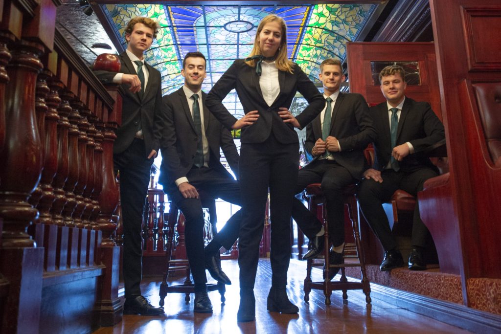
Interesting lighting, nice stained glass. Good angle and composition. We like the power pose. You look smug, strong Judgment Day vibes in the Drie. Can we go to heaven? Please?
Grade: 7
23. Groninger Studenten Toneel
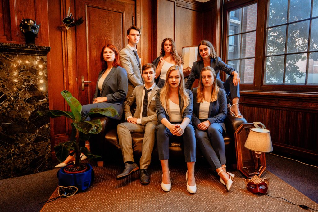
Kind of looks like a family portrait infused with House Anubis vibes. Nice colors, the masks are okay. We like the colors of the suits, lovely grey-blue. Overall it looks nice, it’s just not enough to end up at the top.
Grade: 7
22. EBF
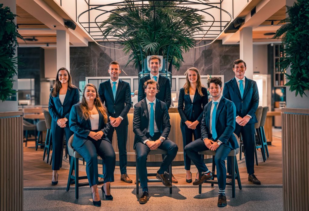
Same background as Geo Promotion. Composition, quality and the symmetry make this a pretty decent board photo. The colors also really pop.
Grade: 7
21. Groninger Fiscale Eenheid
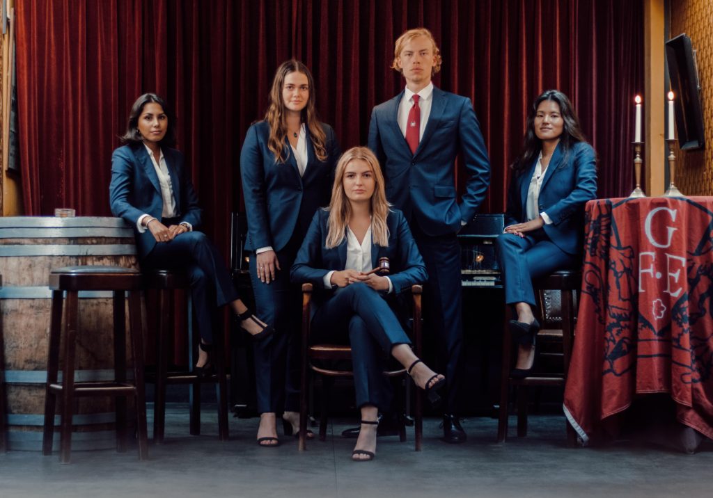
The dark shadow spots are a bit too dark. The composition is good and the color scheme is nice and warm. Not very original but it’s a good quality photo.
Grade: 7
20. Ad Legem
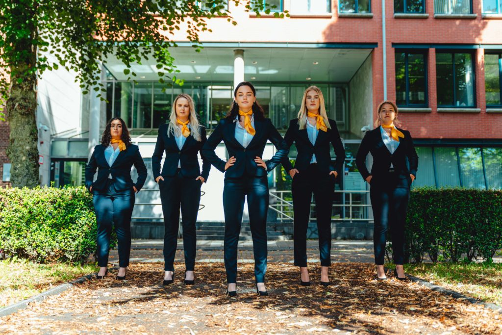
Power poses, yes! The neckties have a nice popping colour. It’s good quality. Even the placing of the hands are coordinated. Background could use some work. You guys could be the next Charlies’ Angels, that’s for sure.
Grade: 7.2
19. EPU
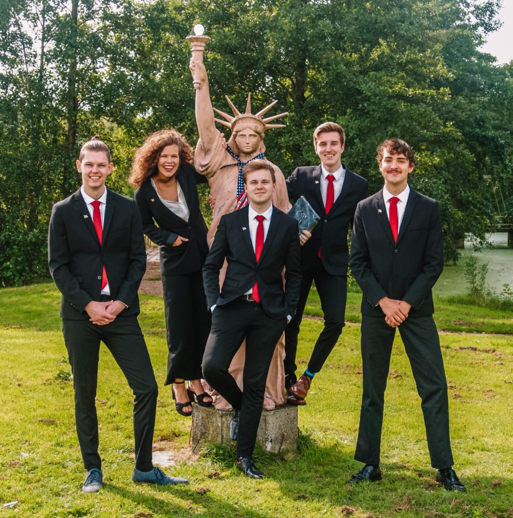
When board pictures come around it’s always nice to have the statue of Liberty lying around. It’s a cool, creative picture. Good quality as well, with a nice filter. The red ties are a good look. We appreciate the effort and we can clearly see what your study is. America first, can the Studentenkrant be second?
Grade: 7.4
18. LISA
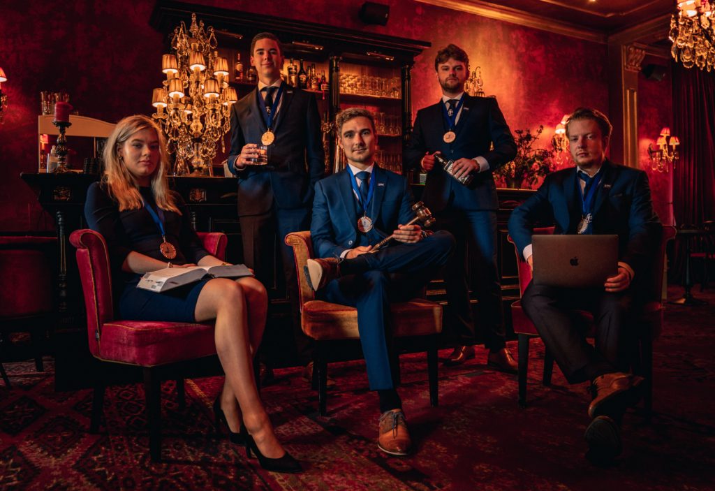
It feels like we are invited to a lawyers office for a 50 Shades of Grey reenactment. Good mood lighting, combined with the filter makes for a very warm vibe. Everyone’s holding something relevant to the law profession as well.
Grade: 7.5
17. Stukafest
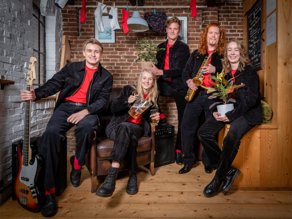
Like the velvet jackets, good quality, different from last year, we like the socks as well. All around a cool photo. There was a debate among the beer drinkers over whether points should be detracted for Heineken. Eventually we decided not to do that. Quite a good picture!
Grade: 7.5
16. Societas
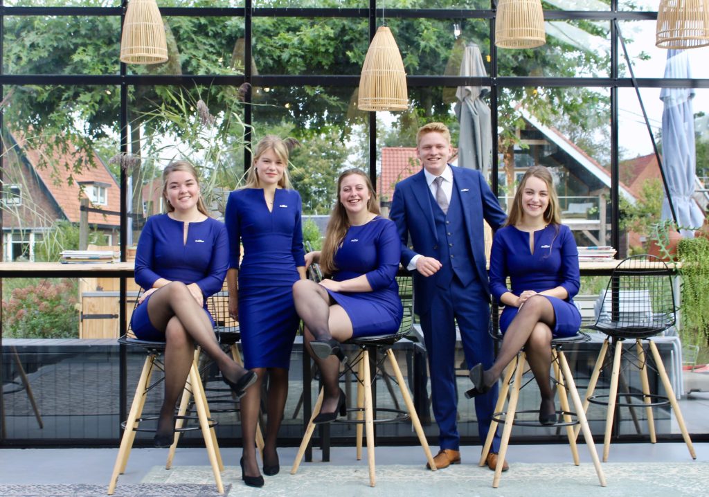
Great lighting, very natural and comfortable. Looks like a professional KLM commercial, which we like. Interesting background as well. You guys know how to take a good picture!
Grade: 7.5
15. ESN Groningen
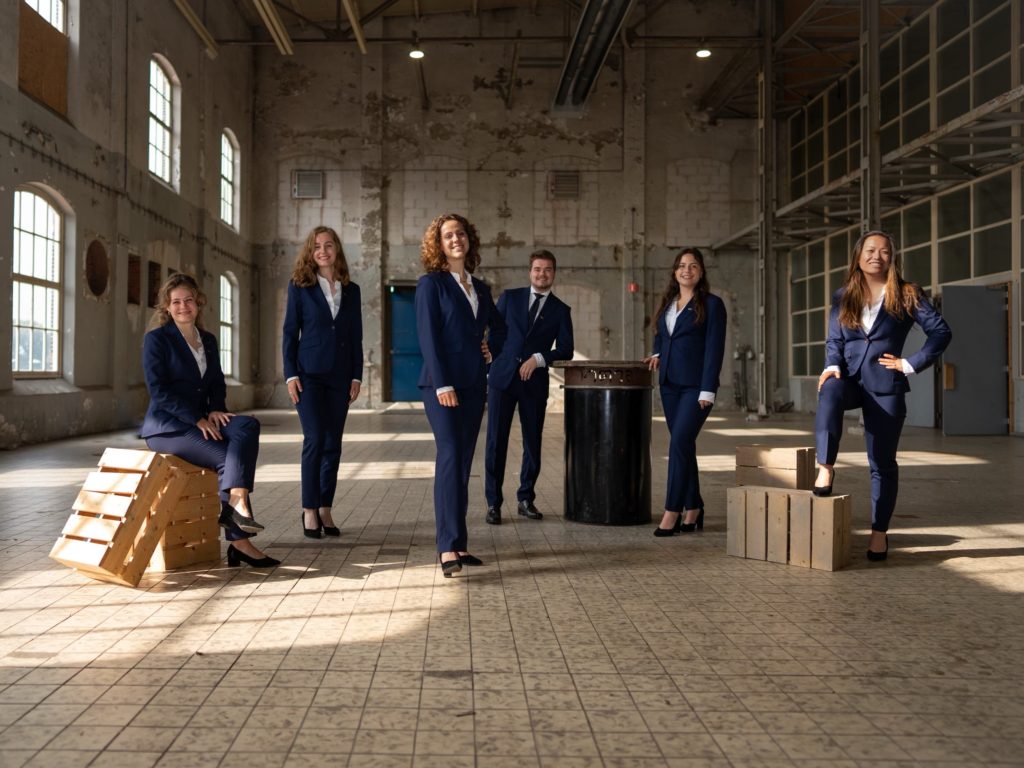
Clear power pose on the right. We have been traumatised by this location, since it’s been overused in a lot of board pictures. You did choose a good spot and composition, along with good lighting, making it seem more natural. Good quality picture.
Grade: 7.6
14. ZaZa
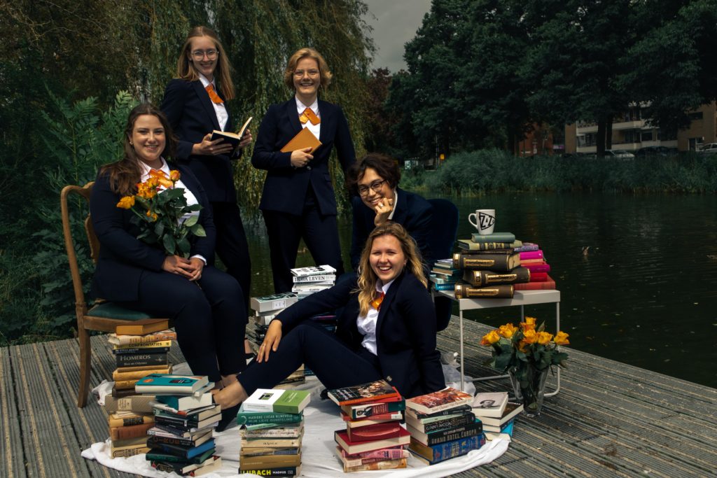
This is a very sweet picture, everyone is smiling, the location looks good and the books are a nice touch. This is also where our head editor Sophie fell into the water one time. Now you know.
Grade: 7.7
13. SV Gente
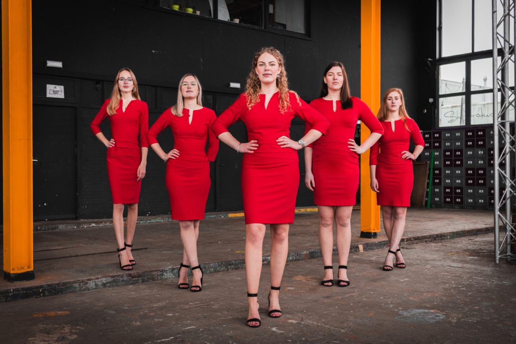
We like the dresses and the power poses. The lighting is alright, the contrast is a bit too strong. The arms are symmetrical which is nice. The location is interesting.
Grade: 7.8
12. SV Villa’96
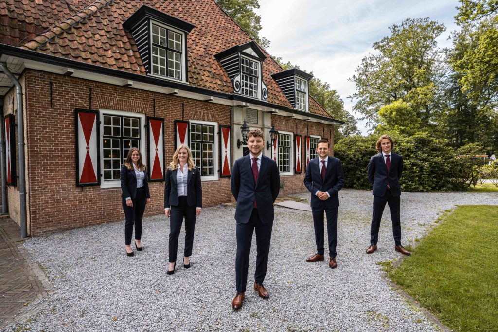
Could’ve been a little more zoomed in. But we like it! It’s dynamic. We have a soft spot for this kind of farm houses. It also looks like you’re selling us the house. Honestly, we’d buy it.
Grade: 7.8
11. Tweeslag
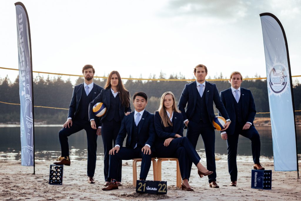
The lighting is a bit too overexposed, but it is not too distracting. We gave extra points for the Bavaria crate. The props give a nice framing, but could have been a bit more centered. You look like you can play a mean game of beach volleyball and like you can drink all of our writers under the table.
Grade: 7.9
10. USVA
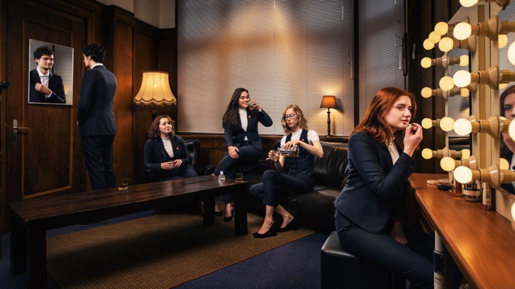
Very good quality picture. Almost too good, perhaps too polished. It looks like it could be an ad for the next season of Riverdale. Everyone has a pose and prop, which is nice for the composition, but the props seem a bit meaningless. The eye catching the lens through the mirror is a nice touch, but looks photoshopped. Overall the picture has a weirdly empty, almost surreal vibe to it.
Grade: 8
9. GLV Idun
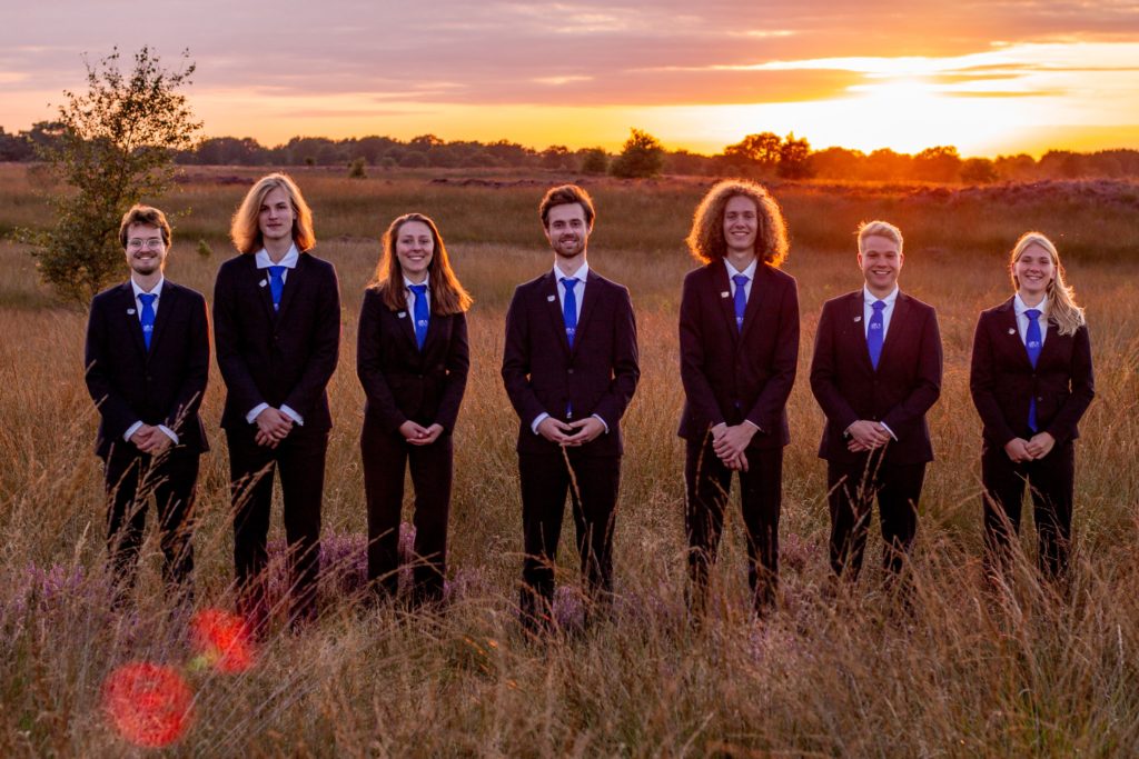
This picture tried to convince us to go to bible camp and recite the biology handbook together. The sunset in the background is beautiful, and the lighting is *chef’s kiss*. Props to the photographer, the photography skills are through the roof, amazing!
Grade: 8
8. GSFV Drs. Vijfje
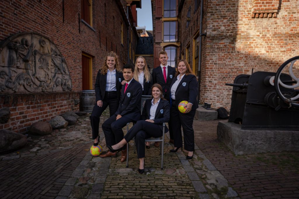
Unique location, we haven’t seen it before. Everything draws you right into the focal point: the board. The color and lighting are good and you look happy. Props to your photographer!
Grade: 8.1
7. SV Check
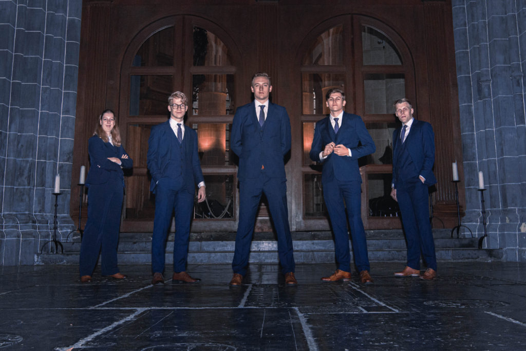
We’re getting Peaky Blinders vibes, looks kind of dangerous. Such smug faces. Outfits are looking sharp. The suits match the background color really nicely. We love it!
Grade: 8.1
6. Squadraat
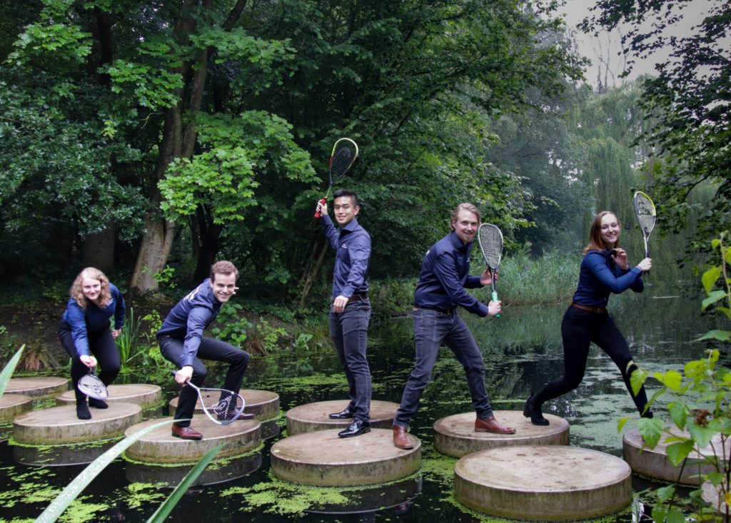
Lighting could be better. Overall, very good. It tells a story, monkey to human to tennis player evolution. Good movement, good setting. Very creative.
Grade: 8,6
5. SVTapp
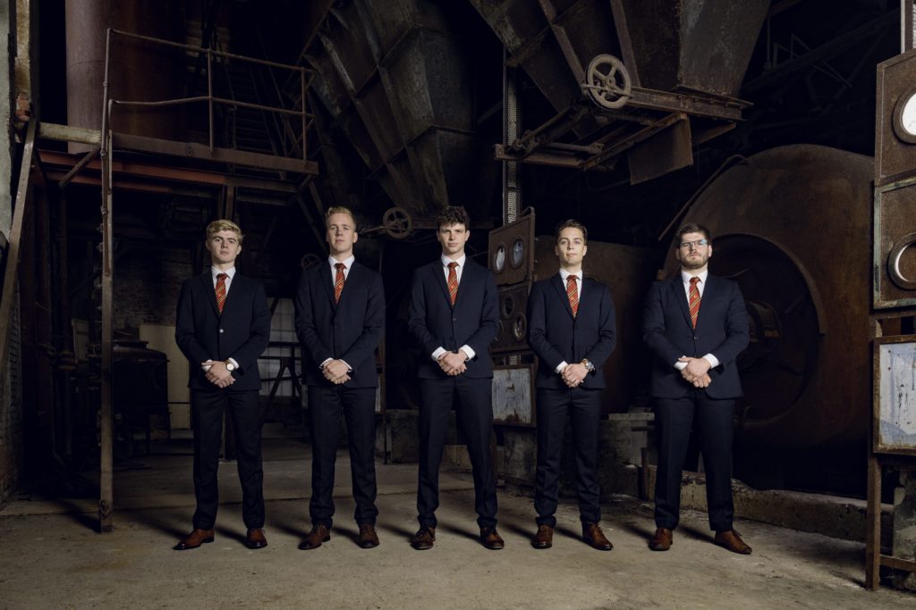
Everything is on point; from the poses to the suits, the rustic background is also great. We really do like this! You look good. Therefore it’s inevitable for you guys to get a high score, well done!
Grade: 8,7
4. JFV
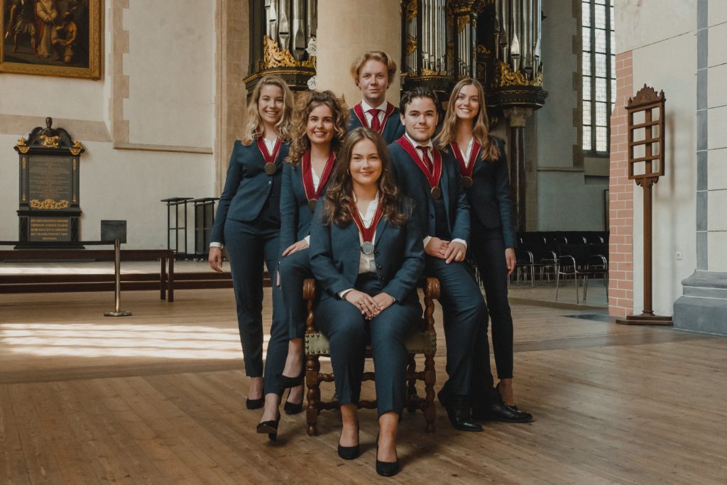
We trust all of you to defend us against manslaughter. It looks like a renaissance picture, very royal. Warm faces and warm colors: the suits perfectly match the colour vibe. Great composition too. This is what the Board Picture Awards were made for, a joy to look at, greatness overall.
Grade: 9.5
3. FFJ Bernlef
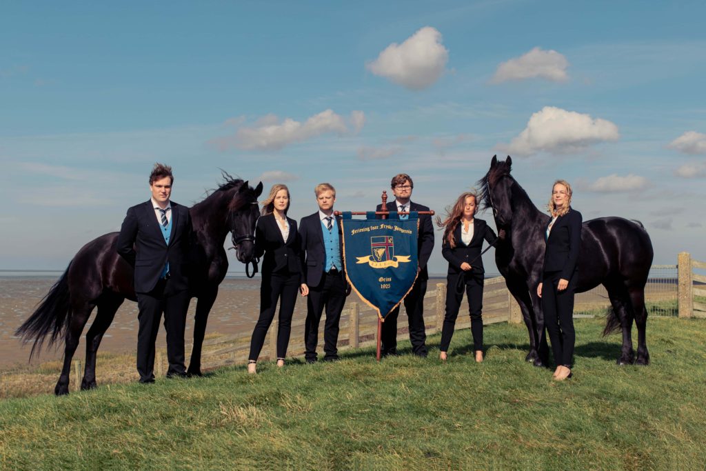
Yes! It’s amazing. Even the horses pose nicely, so majestic! Also, the sky looks like a Dutch painting. Even the clouds look perfect.
Grade: 9.8
2. Navigators Studentenvereniging
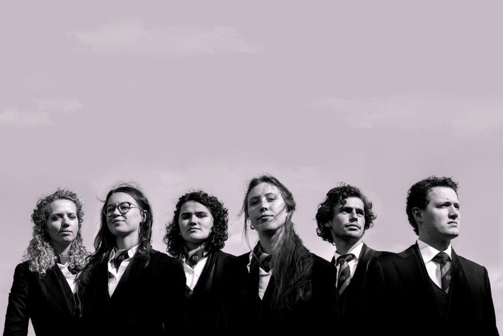
Album cover look. Very artsy. You guys took a risk and it paid off! The black and white works too. Makes us think of Reservoir Dogs, which is a huge compliment. Props to the photographer as well!
Grade: 9.9
1. ACLO
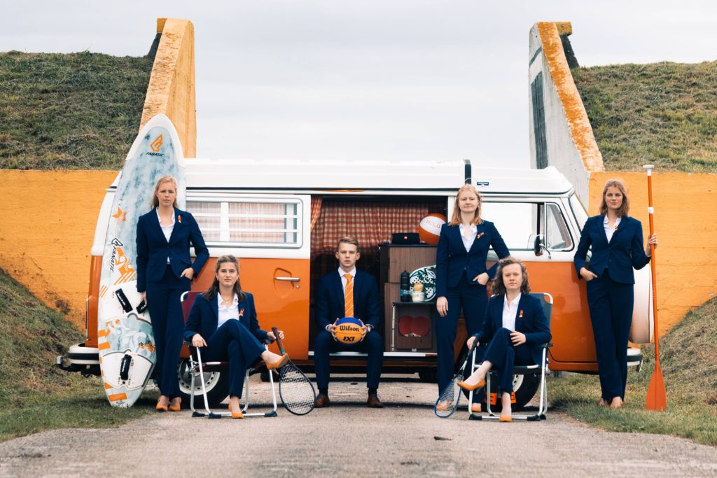
We have a winner. Complementary colors with the orange and blue, really nice! We really like it and we’re getting Wes Anderson vibes. Sports are incorporated in the picture, in a natural way. Also, where can we hire the van? We’re fans.
Grade: 10

