
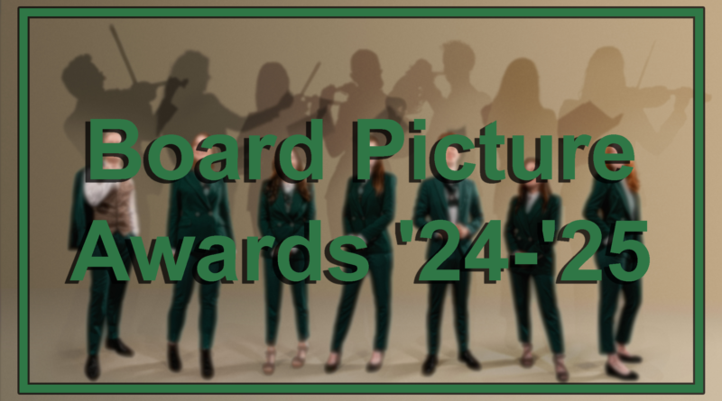
Board Picture Awards ’24-’25
Content warning: this article is created entirely in good fun and is not intended to offend anyone. Any criticism and jokes are aimed at the picture and not the people in them or the organization they are a part of.
Welcome to the annual Board Picture Awards! Over the last few months, the writing team of SK has been carefully deliberating, channeling the likes of Mario Testino and Annie Leibovitz, and poring over the minutiae of this year’s well-meaning submissions. A total of 91 board pictures, sent in by Groningen’s finest student associations, have been laid before us, from the subpar to the sublime, but only one can reign supreme and claim the top spot!
This year’s crop of pictures truly runs the gamut, including both pictorial variety and diverse casts of characters. We had photogenic pigeons, poorly-cropped structures and landmarks, wooden gavels, various balls for sports, numerous bodies of water, and attempts so bad they wouldn’t even be worthy of an Instagram post. We watched all of them parade across our screens in fear, awe, occasional disgust, and mild disappointment.
Some of you fell from grace, giving us pictures poorly lit at levels previously thought impossible, while others soared to greater heights, going where no one has gone before and setting the bar for what a board picture should look like. We saw you traveling around the great city of Groningen, as well as venturing across the country, with one board going as far as a traditional American diner all the way in Rosendaal.
After careful consideration, heated arguments, and unexpected unanimity over what could easily have been LinkedIn profile pics, the results are finally here. Surprise, bewilderment, schadenfreude and joy – we wouldn’t have gone through such a wild roller coaster of emotions if not for you all submitting your pictures for our caustic examination. For that, we’d like to thank each and every one of you wholeheartedly!
Will any picture be able to overcome the overwhelming gray hues of Dutch weather?
Will anyone show us parts of the Hortus that we have yet to see?
Will we find out who Groningen’s next cutest stuffed animal mascot is?
All that and more in the Board Picture Awards of ’24-25!
Disclaimer: all of these pictures were compressed for the purposes of this article. If you would like to view them in their original quality, visit the respective association’s website.
Special thanks to Bragi and their photographer Ruben Verkerk for letting us use their winning picture from last year’s edition.
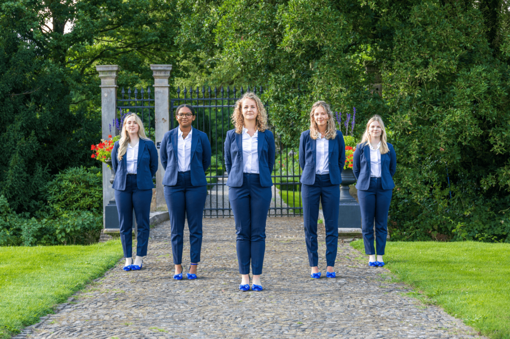
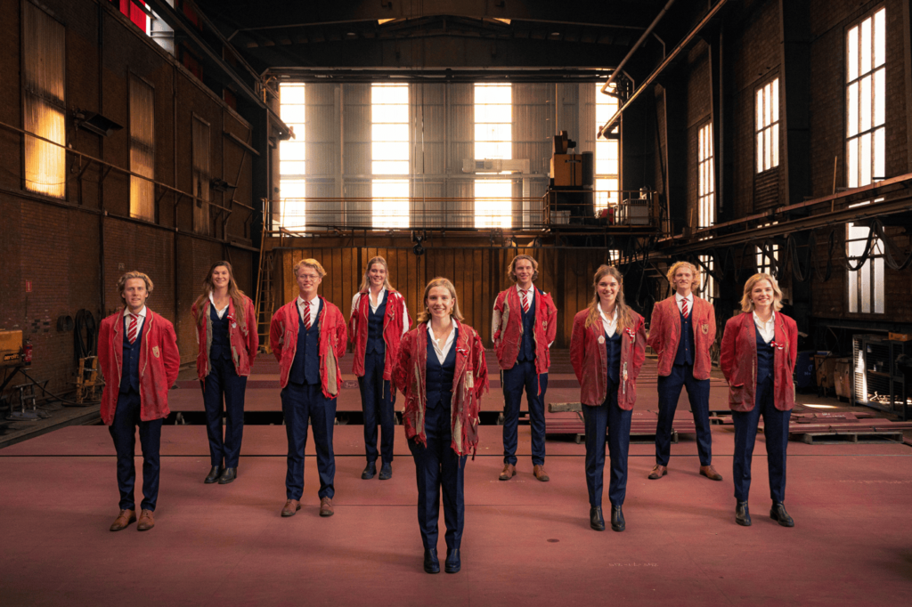
Race of the Classics Team Groningen (91)
Slow and steady wins the race, but you guys just opted for incompetent and boring instead. This year’s entry should have stayed in your Instagram drafts. It’s as banal and dry as the dead leaves on the ground around you without any of that autumnal charm. We appreciate that, as a sailing association, you included some boats behind you, but why are you blocking the view rather than putting them in the spotlight? That way, we’d be spared your abominable outfits. We’re obviously not fans of vertical pictures either, or the 0.5 zoom, but please, for the love of all that is good, enough with the jeans! This wardrobe should go the way of the Titanic, a slow and torturous descent into the abyss. Honestly, we weren’t quite sure whether this was the worst picture or one of the worst pictures we’ve received. We chose the former. Why did you send this to us?
Max L. Snijders (90)

Taken moments before ritual slaughter! Your intimidating smiles combined with the flash makes it look as if this is leaked footage from a trail cam, exposing your cult-like occupation of the NOS news studio. We are almost too scared to even place you guys so low. You are fortunately standing in the media capital of the Netherlands, which is a great touch, though not enough to save you (or your victims). Although this would have done numbers in 2005 on Myspace, it fails in almost every aspect as a 2025 board picture (lighting and blocking to name a couple), except for the background. May your photojournalist friends forgive you for this.
ODIOM (89)

Now I am become Terrible Lighting, the destroyer of good board pictures. No, but seriously, why does it look like you’re in New Mexico and Oppenheimer just tested an atomic bomb behind you? It’s kind of got the washed-out quality of a dusty old Christmas picture that’s been at the bottom of a box for years and decayed over time. We do appreciate the different poses (left guy is serving Edward Cullen in Twilight), the overall vibe you’re projecting, and you matching your association’s colors with the Hortus garden’s red pillars. However, your clothes all seem extremely ill-fitting, the shrubbery is utilized incredily poorly, and it’s an overall disservice to an otherwise great location.
G.T.D. Bernoulli (88)

This picture is all kinds of terrible. If this was us, we wouldn’t just go for a second take, we’d overhaul the entire thing. It’s amateurish, rushed, and seems about as detached from being a board picture as Zernike is from the city center. Also, it would have been a good call to take your picture in front of the Bernoulliborg instead. The raven in the background acts like a harbinger of doom, prophesying your downfall, so you should have taken his advice and gone elsewhere! We reckon you could chemically engineer some moonshine for yourselves after this and you’ll be alright, though.
Studiosi Mobilae (87)

If this was a dream, it would be a multicolor nightmare! We wouldn’t be surprised if Hadassah Emmerich, the artist behind the street art you’re misusing, is in the market for lawyers right now. This looks creatively bad! The bright colours and the cool patterns do not save this picture from disaster. And why are we under a bridge? Were you that embarrassed you had to hide away from society? Sneakers with suits, unbuttoned shirts, frightful posture, and those torture-device chairs? Not the best way to introduce yourself as physiotherapists. And the girl in the middle? Blink twice if you need some help. One thing’s for sure — if we need a physio, we wouldn’t be consulting you.
Lijst Student Erkend (86)

STERK, huh? Well, it does give us politics, but in the worst way. The energy here screams “last-minute group project,” and the mismatched shoes are a clear sign of a serious lack of planning. And this setting… What is happening? The mirror, the curtains, the chairs, the painting — pure chaos. Also, what’s behind that frame? What are you hiding?? Dilapidation is not the vibe you want from a student faction. The mirror behind you is messing with our minds and it’s impossible to discern what the hierarchy of the board is — who is the chair? This is the world’s most awkward class picture, and no one looks like they know what they’re doing.
SV Commotie (85)

Apparently being an association for communication students is not always a guarantee of a well-articulated concept. In fact, it doesn’t really convey anything at all. Where is the Martini Tower that you were so proud of including? Instead, we are given only a glimpse of the Martini Church and … ah, right, Vindicat. The background adds nothing, except a hint of chaos and unprofessionalism, drawing our eyes to the striking azure plumage of that moped driver. There is also a lack of communication within the board: you didn’t even manage to look in the same direction! Lastly: the contrast between the pitch-black suits and the gravel is a very communicative punch in the eye.
Groninger Studentenbond (84)

What student union do we contact when we’ve been victimized by GSb’s terrible board pictures? One good picture, it’s all we’re asking! You look so incredibly proud to have chosen the graffiti wall on Curaçaostraat. Too bad we can’t even see it… And even if we did, the fact that you tried to tie it to the Dutch government’s budget cuts in your description is an outrageous stretch, an insult to our intelligence even. I mean you are a student union for Pete’s sake! Bring out your flags, climb a barricade, and take a stand! We want some old-fashioned daadkracht!
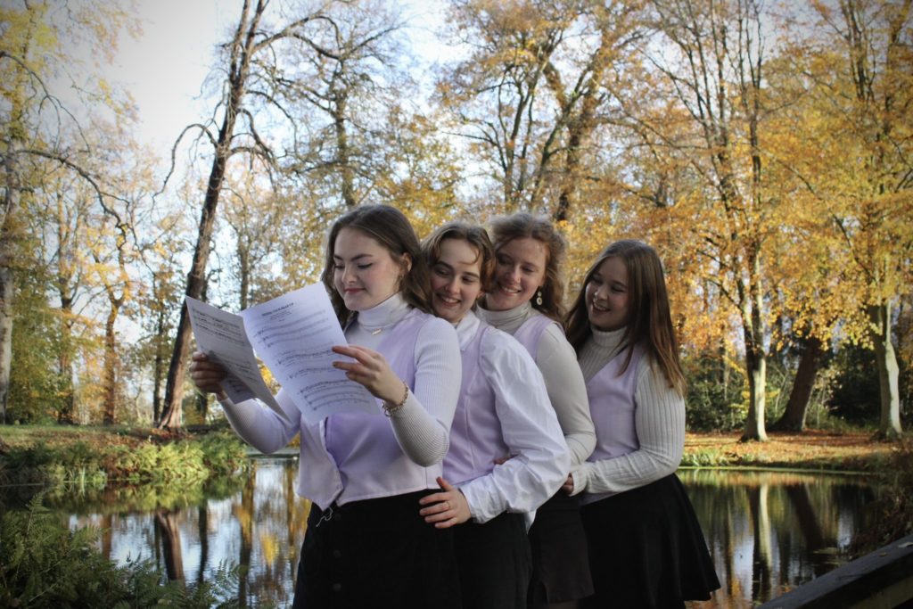
C.S.G. Gica (83)

A student choir, but make it… miserable. We get it, you chose the Forum to show off one of Groningen’s prettier sights – how original. Here’s the thing: you picked the grossest day imaginable: it’s cloudy, almost desolate, and you’ve put a blurry Martini Tower center stage. Yeah, not exactly a postcard moment. Credit where it’s due – the earrings? Slay. That shirt? Fantastic. The accessories are real eyecatchers, we’ll give you that. But only three of you are looking directly at the camera. And the view you’re so proud of? Tragically underwhelming. Up the effort!
G.S.V.V. The Knickerbockers (82)

Red card for playing football in jeans! A baffling choice to have this horrible gradient of ugly. It’s a visual identity crisis, and the shoes are abysmally uncoordinated. No unity, no strategy, just a jarring mix that screams: “we got dressed in the dark.” The poses? Unforgivable. A tragic mix of forced coolness and a tinge of awkwardness. The only saving grace here is the football itself and the pitch which at least reminds us what association this is. Then there’s the sky, reminiscent of an endless void. Dramatic? Yes. Intentional? We hope not. Ultimately, this picture isn’t a full-scale disaster. Better luck next time – maybe try dressing like a team?
Bulgarian Society Groningen (81)

This is a lovely picture… if it had been for a housing advertisement. Are you looking for a new roommate? You guys look happy, confident, and fun to hang out with – is that the image of Bulgaria you’re trying to portray? Because nothing else about this looks like a board picture for an association like yours. For your clothing, the outfits are well-matched, very Instagram-feed worthy. But since when are the colours of the Bulgarian flag beige, black and denim-blue? For next time, please, don’t use an iPhone to take the picture. Or at the very least, take it off of 0.5 zoom.
Amnesty International Student Group Groningen (80)

This entry and its description inflicted serious psychic damage on us all. You told us Delacroix’s Liberty Leading The People “could have” inspired your board picture. Is that your way of excusing how it doesn’t evoke anything relating to the original? A nice idea that required something classy, something that evokes liberty, something powerful and sure of itself. Instead, it’s more in line with the misguided chaos of Coppola’s disasterpiece Megalopolis. The flag also looks like a part of a failed knighting ceremony, performed in the middle of nowhere in some lost Monty Python sketch.
AEGEE-Groningen (79)

Sheesh, we don’t want to travel here at all. Nevermind the United States, the Dutch government should tighten their travel advice on people going to Groningen based on this picture… As a student association focused on organizing trips, you have the perfect excuse to venture outside of this city and pick any picturesque location you can think of. Instead, you took a picture of the worst part of an iconic landmark (the train station) with some of the grossest steps in all of Groningen. And come on guys, one of you also clearly wasn’t in on the dress code for some reason. Ouch. The ties matching with the flowers is a nice detail, but that’s really all there is to say. Do better next time!
G.S.B.V. Tweeslag (78)

Oh my god, we’re so sorry. Who made you do this? Your faces suggest that someone abducted you from the ever-cloudy Netherlands and brought you to some sketchy beach to let you sizzle in the sand against your will. We’d like to offer you a pair of sunglasses as an antidote to your pain. The lighting’s got your skin looking the same color as the beach. Did you use a Nokia GSM 235 to take this picture? The possibilities here were as infinite as the grains of sand beneath your feet, yet here we find you standing in a vague semi-circle, balls on either side, with the potential of the shadows wasted and the net left abandoned. Usually we’d applaud you utilizing a location that’s on-theme, but you did very little with it. Shai-Hulud downvotes this.
G.S.W.V. Tandje Hoger (77)

You’re the student cycling association and somehow Vijfje, a futsal club, did a better job at using a bike than you did. You just cycled around Groningen, got lost, took a five-minute break to take this picture, and called it a day. It looks completely unrehearsed and empty. The inclusion of a watermark for a picture this bland and uneventful is wild. Actually, it does look like the middle guy’s full of helium and you’re trying to prevent him from flying away, which gave us a light chuckle. What a missed opportunity. This picture needs some performance-enhancing drugs.
ESN Groningen (76)

Did you sedate the Stadsschouwburg before circumcising it? This iconic building deserves to be presented in all of its Neo-Renaissance glory! Last year, you had a similar idea in regards to composition and blocking, and it worked to perfection. Here? It’s crammed. It feels like you tried to copy last year’s appeal but without understanding why it worked. Low effort. Disappointing. You have a big budget – use it! The lighting? Fine. The outfits? Boring. You guys look happy and inviting, which fits the association’s vibe, but the rest of the image makes us sad. Next time, please respect the Stadsschouwburg.
G.S.P.V de Ramenlappers (75)

When the lighting makes you look like The Simpsons, it’s time to start rethinking your choices in life. An abandoned church repurposed for padel tennis is an intriguing venue, if not for the poor execution and it not being in Groningen. You put a lot of thought into composing this, but it’s just not the one, chief. We like the elements in isolation – the outfits, the scattered balls, the purple lights – but they just don’t come together very well. The colour combo hurts our poor eyes and while it’s a cool location, it really rides that line between sacrilegious and why-bother.
G.S.F.V. Drs. Vijfje (74)

How can we start this review talking about anything other than the bike? Why is it there? It actually matches your colors, but was this intentional? Why is it standing upright like it’s the seventh member of your board? A truly vexing inclusion. We are in equal measures intrigued and repelled by it. Anyway, this is a serviceable picture, though it leaves a lot to be desired. There’s certainly some odd choices, like the background, flip-flops, glass, beer crate, illegible crest, and the unforgivable offence of the guys’ shoes not really fitting with the girls.’ It’s not terrible, and you all seem genuinely happy to be a part of it – which is questionable, but hey, good for you!
T.C. Veracket (73)

The world’s your oyster and here we find you: sat on a stoop by this old building with your tennis rackets and balls. Out of all of the places you could have gone to, why are you huddled in front of this Lilliputian red door? Are you waiting for Alice to let you into Wonderland? Sadly, there isn’t a hint of wonder about this picture and there is not much else to say about it. If only you had put as much effort into setting up the picture, as you did with arranging your balls into a pyramid. The detailed logos on your lapels are neat, but we are upset with the girls for leaving their ties at home.
G.S.B.V. De Groene Uilen-Moestasj (72)

You’re the only basketball association in Groningen and you’ve got just one basketball prop? Take us to the court and shower us in them! The only positive is that the ball seems to match the colors of the surroundings, yet that doesn’t mitigate the primary offense – the vertical framing. Terrible. So much headroom, it feels like a group of NBA players was supposed to replace you. The background isn’t helping either – the tower isn’t framed correctly and the arch isn’t directly above you. On top of that, the photo is painfully overexposed and your feet are cut off – you guys have matching shoes, so why are you hiding them?!
Studentenkoepel Levensbeschouwelijke Organisaties (71)

‘Take the damn picture already,’ one of you uttered just before the camera went *click.* A fight had broken out only moments prior, but none of you really remember who started it and why. All you know is that it escalated, objects were thrown, and time is running out, so you’re glad to have gotten the picture over with. Everyone will now go their separate ways, citing irreconcilable differences in court. Sorry, but this picture is so unbelievably, painfully bland that we had to invent a scenario that would keep us at least somewhat engaged. Nice colors, location, and outfits, but you’re all just standing/sitting there, aimlessly, without any props but with an ocean of empty space. The lone chair in the back made us all very sad. Why isn’t anyone sitting there?
Sociëtas (70)

What happens in Groningen, stays in Groningen… unless you decide to leave your association’s homebase and give us Friesland’s Hidden Gems instead for some reason? Why have you brought us out here? You’ve done this beautiful church extremely dirty. The way the sunlight hits the limestone bricks, if not for the terrible exposure, could have worked out quite well, but instead is taxing on the eyes. In contrast, we can’t even see your faces due to how underlit you guys are. That being said, you’ve got great outfits, matching shoes, and the windows are casting some very interesting shadows. It’s just underwhelming.
S.V. Linkit (69)

It’s like if Coolidge’s Dogs Playing Poker painting depicted frat bros instead. Minus the whimsy, plus four severed heads with collars and ties intensely staring at us as they float around in the vacuum of space. We’re honestly kind of unsure how to feel about this picture. It’s deeply unsettling and mysterious, but we kind of dig the threatening, standoffish vibe we’re getting from you. The person on the right looks about as lost as we are. It doesn’t really work as a board picture at all, more like a trust fund baby’s first Instagram post. Are you guys sponsored by [REDACTED BOURBON BRAND], by any chance?
ZaZa (68)

Possibly the most Dutch image that has ever existed. Kudos for the accomplishment! Your vibes are strong and this would be an okay picture for an airport hallway inviting people to the country. Even the dreary grey weather, robbing you of your vitamin D and depressing as it looks on camera, fits here as it is representative of the Netherlands. It’s a shame you probably got your suits all wet on the ride home. Your natural charisma and charm can only carry you guys so far, though. The image itself is a bit of a mess; blurry, awkwardly framed, and just not good. Great vibes, get a tripod next time.
S.V. Versorium (67)

*Yawn* Boring. At least the ties tie into the picture’s green color palette?
Sirius A (66)

In the 1500s, Copernicus was working with only his eyes and a pen and figured out the Earth rotates on its axis. What’s your excuse? This should be a much better picture than it is, but it’s not. You’re hitting a lot of good points: you’re on the roof of the Blaauw observatory, posing right next to the Gratama telescope. It’s dull and dirty, though, as well as the railing looking old and the sky constipated. Really, the world, colorless and somber, was working against you on that day. And yet, good news, everyone, you fought against the odds, brightening up the photo like your association’s namesake, one smile and nebular tie at a time.
Recruitment Days 2024 (65)

Recruitment Days: an exciting event, full of opportunities. The photo? Less so. This year’s venue is great and it makes perfect sense to showcase it. The problem is you picked this spot. There are far better places inside, where the energy of the event will actually come to life. Then there’s the composition. An attempt at symmetry, perhaps, but it’s not quite working. The group feels oddly spaced like everyone just stood wherever they happened to land. And why are you so far away? It’s not a disaster, but it’s definitely underwhelming. Next time, a little more coordination, presence, and enthusiasm; this is about career opportunities, whereas you look like you’re about to take our bags to our rooms for us.
S.V. Homerus (64)

You look like you’re about to make us an offer that we’d be more likely to table for consideration at a later date, rather than one we can’t refuse. While the background exudes the fading aristocratic splendor of a Sicillian family that comes from old money, the painfully average framing and phone-camera quality of it does not do it justice. Perhaps it was meant to look effortless, but it simply lacks effort; the feet being cut off at the bottom is a clear testament to that. It’s a decent attempt that would soar to much greater heights if refined. Our qualms have nothing to do with the members of your group – a distinguished set of entrepreneurs donning some adequately elegant attire. In other words: it’s not personal. It’s strictly business.
Stichting Geo Promotion (63)

Verticality is a sin, an unforgivable one. However, you guys look great! No ties – that is a solid choice, it makes you look more friendly yet still professional. But why this spot? The whole setting has a bit of Get Out energy; the old-fashioned room, the hideous curtains, and those massive blue windows that don’t match the warm tones of the interior. It all screams “you shouldn’t be here.” The perspective of the photo is making your feet look ginormous. That said, the picture itself is high quality – the photographer did a great job. For an association focused on urban spaces, though, you’d think you’d be better at location scouting than settling for your granddad’s hunting cabin.
G.S.K.V. Released (62)

It is a bold choice that you decided to dress as waiters and yet not serve. And if you had, it still looks like it would be a pretty half-baked dish. We liked the boards on either side, we’ll give you that. We also liked the shell necklace on that one girl, and wished you were all wearing one. The weather’s not horrendous, but that does not justify the overbearing negative space at the top that is weighing this picture down. Does the chair normally kitesurf holding a gavel? Honestly, a picture of them doing just that would’ve been a better choice than what you gave us here.
S.V. Exploratio (61)
A Midsommar twist on Medical Imaging. The lighting is a pure mystery given it’s both daytime and evening at once. The natural light on the forest, straight out of Pride and Prejudice, is magical. The lighting on you? DISASTER! Though we like the halo effect you’ve got, we can’t make out your faces with this horrendous backlighting. Also… radioactive grass? Maybe it’s on-theme given what you study: a happy accident, really. However, the real stars of the show are your hair. Glossy, luscious, almost too good. If you’re recruiting, just say the word. Join us, and you too shall have perfect hair (at the cost of one limb).
E Pluribus Unum (60)

We can do it! – but, really, can you? It’s easy to tell that there were a lot of good ideas behind this picture, but the result is disappointingly lackluster. The American diner was a very good choice, but you’d think after traveling for 4.5 hours to get to it, you’d put a little more effort into framing it nicely and infusing it with some creativity. Considering the travel time, you might as well have flown to America and brought us even more authenticity! Maybe there you’d be able to figure out for us who the hell RITA is?
Groninger Studenten Toneel (GST) (59)

A good board picture, a good board picture, my kingdom for a good board picture! Although you’re oozing confidence and drama, we were really expecting more from you. The picture feels like an unfinished idea – an early rehearsal without all the bits and bobs of a full production. You’re all positively glowing as a result of the lighting, but the wardrobe isn’t at all cohesive. Mad Men, Peaky Blinders, Suits, what are you going for? The thought is there, but someone really should have sat down and reworked the script. No encore, please.
Simon van der Aa (58)

In the matter of The People of the City of Groningen vs. Simon van der Aa, we would like to submit some evidence regarding a serious missed opportunity. Members of the jury, direct your attention towards exhibit A: a phone-quality picture, with awkward poses, set in front of barren white walls and towering windows that feel more bureaucratic than dramatic. While the props certainly had promise, they look less like a deliberate choice and more like a happy coincidence. The real crime here, though, is making someone in heels climb up on that bench. If you had played up the legal drama vibes – books in hand and prominently displaying that ominous robe – this solid concept could have been a winning case, you just needed a stronger argument!
U.C. Face Off (57)

Guys, we did some investigating and we suspect that some of you may have been exposed to something called cryptococcus fagisuga. We think this insect, which secretes a wool-like wax onto tree bark, may be the cause of the bits of white pollen (or bird shit) that covers some of your suits. As of yet, we cannot account for the mystery liquid that stained your ties, but we’ll get back to you on that one! Anyways, aside from our diagnosis, this is a nicely framed picture in the beautiful Prinsentuin, with you sporting some matching outfits and welcoming smiles. A nice game of floorball could’ve brought some action to this picture. Now we are left to wonder what the hell a floorball even looks like.
Ichthus Groningen (56)

Picking Prinsentuin is always a good choice, but you’re playing it painfully safe. It’s elevated by the symmetry and the lines, but brought down by the fact that you look like you’re off your mark by about two seconds. All a bit boring, nothing exceptional. Those skin-tone shoes stand out for all the wrong reasons, not at all jelling with the rest. However, let’s take a moment to appreciate the chair, who looks so unbelievably proud, as if he is about to make a dad joke and he knows it’s a good one. That’s great energy! Next time, to improve upon your ranking, we suggest asking St. Veronica, patron of photography, for some assistance.
Civielrechtelijke vereniging Gerhardus Diephuis (55)

Did you take a wrong turn? This picture doesn’t scream “justice and order” nearly as much as it does “lost in the woods.” You’re a synchronized, well-dressed troupe in a location that is simultaneously magical and ominous, but the lighting… Hello? Between the shadows and the slightly haunted expressions, we’re getting “overworked lawyers deep in an existential crisis.” It’s a strong effort, but maybe next time, pick a backdrop that says “civil law powerhouse” instead of “nature retreat chicanery.”
VIP, Studievereniging Psychologie Groningen (54)

You aimed for “fresh possibilities” and “self-discovery,” but gave us gray sewage water instead. While it doesn’t really evoke psychology, this would have been a bland picture for an association of people who just enjoy standing in front of large bodies of water too. It kind of just makes us feel empty, which does tickle the psyche. However, there is nothing psychologically profound about the blonde guy awkwardly squashed between the other board members, except maybe to symbolize us being caught between a rock and a hard place trying to determine where to put this picture. We adore the dramatic lighting and poses, it makes you really pop, but we would still encourage you to “embrace change” and strongly “highlight the importance of hope and renewal” for your next board picture.
G.S.V.V. Veracles (53)

What fever dream led you here? Our leading theory is you were on a volleyball court before stumbling into an interdimensional portal at the moment the image was taken. But really, why here? You’ve taken a nice picture, well-framed with some nice balanced lighting and rich colour, complete with some of the Netherlands’ signature murky water. It is very, very green, which we understand is your thing, but it seems so disconnected from a volleyball association. Serious props for trying; you’ve made a very competent image and your photographer can be proud. In the future, give us a little more of yourselves than the colour green.
Studievereniging ASCI (52)

Information Science – the science of sitting in front of cookbooks? We’re not even entirely sure what you guys do, but we love the concept. The use of retro tech is a brilliant idea, evoking a warm feeling of nostalgia. Shoutout to the treasurer for being totally engrossed in the dual activities of holding up a phone and flicking through your financial records. The execution is a bit of a let-down, however. You botched the lighting, resulting in a grainy mess. The bottom half of this picture is information that we wish we had never received. Into our archive of mediocre board pictures this goes…
Hellenic Student Association Groningen (51)

If there was ever a picture that would invoke the wrath of an envious Aphrodite, this would be it. It takes a group of really charismatic people to make verticality and asymmetry work, and you’ve effortlessly managed that. Your confidence is basically oozing right off the screen. If we’re being honest, though, the picture itself isn’t anything special. It’s no great feat to huddle up in an alleyway like this. We certainly appreciate your piano-key color-coordinated outfits that stand out from the identical suits we’re used to, but they do not add a distinct Cypriot or Greek melody to this picture. A little more meraki would go a long way!
O.C.S.G. (50)

Based on the medals around your necks, it looks like you’ve just won something, so congratulations! It’s definitely not this competition, though. The church you’re holed up in must have offered better spots than a back-corner bench with paint peeling off the wall. The coordinated poses are cute, the matching outfits are great, and you look approachable enough for us to accept your flyers. Guy on the left; great choice of socks! Although this submission is not outright terrible, there’s pictures on your own website that look far better than this one.
G.S.Z.V. De Golfbreker (49)

This picture sports an indisputably beautiful backdrop, on a surprisingly gorgeous day in Groningen, and you’ve captured it from an angle that works perfectly where you are still clearly front and center. On the other hand, while the colors do stand out, in line with your mannequin-esque poses and seemingly artificially-blurred background, it all looks very unnatural and stilted. It’s an uncanny feeling that isn’t helped by the fact that you, as a swimming association, are standing in front of a body of water that people aren’t supposed to swim in. By giving us open-toe heels instead of swimming attire and props, you sacrificed your creativity for a fashion faux pas!
J.B.S.V. Dorknoper (48)

The definition of wasted potential! You’re working with a very chic, professional, almost regal backdrop, as well as some truly dynamic light shining in from the left. It just seems like you’re not quite using the space effectively. The way you’re positioned in this picture doesn’t really show any signs of creativity, nor does it help that the guy on the right feels awkwardly out-of-place here. There is also a clear lack of initiative shown by not incorporating the mirror in an imaginative way. The inclusion of the gavel is the start of the right idea, but you’re still quite far removed from fully reaching for it. Go harder!
TBV Lugus (47)

You guys decided to travel to a really interesting, almost dystopian-looking place; what does that say about the state of engineering? The picture is just too bright and you seemingly haven’t figured out how to pose for one yet. It’s too far away and the blustery wind seems to be distracting you from what you’re doing. We’re not sure if it was intentional, but the colours of the image look fantastic, you really cut through the background and the bleak day in a way that makes our eyes happy. We definitely appreciate the professionalism and effort – we just wanted more. We’d like to think of some quips and light-hearted jabs, but you’ve just not given us much to work with. Better luck next time!
F.F.J. Bernlef (46)

A Frissian student association taking their picture in Friesland — daring today, aren’t we, Bernlef? You really thought you could just pose anywhere in Friesland, stick your little flag on a pole in the ground, and call it a day? There’s so many inconsistencies: from the hand poses, to the single opened jacket, to the mismatched shoes and single pair of clogs… If you’re going to offend us, might as well go all the way. Oh wait, you did, by adding that hideous patch of grass at the bottom, saturated to the high heavens, and the result of which borders on toxic. The rest of the background though, admittedly, is really quite beautiful, as is the breathtaking lighting.
SV KIC (45)

The Suikerunie has never looked worse, but we kind of dig the vibe. The grungy, run-down factory and the bright pink elements in your outfits bring a nice, playful contrast to this picture. Unfortunately, here too there does seem to be some miscommunication within the board. Only one of you seems to have brought a pink light with them, while the other four left theirs at home. It’s made the girl on the left look like she’s powering up and about to throw down like it’s Dragon Ball Z, which isn’t necessarily a bad thing. Decent, but we wanted more drama!
Study Association Clio (44)

Your lovely smiles and the way you carry yourselves are a testament to your excellent organizational skills. We could use your charisma and expertise during this tumultuous period in history, but for tips on photography we will likely go elsewhere. The verticality, which leaves you with worlds of headroom, is somewhat salvaged by this wonderfully tall, green forest. It also means that you are pretty far away and, as a result, it took us longer than usual (a minimum of two seconds) to notice your lack of matching shoes (gasp). How very dare you!
GSSV Moddervet (43)

At risk of being on the receiving end of your chairwoman’s rage-fueled hammer swings, we are a little disappointed by this year’s Moddervet effort! Though we appreciate the sentiment of taking this picture at Reitdiep as you guys come here to cool down and relax, we’d expect to see a little more of it than you just standing in front of a nondescript bush that could quite frankly be anywhere in the Netherlands. The gorgeous golden-hour lighting paired with a series of thematic accessories did garner you a lot of points. And the baker boy flat cap’s a real standout! Peaky Blinders eat your heart out! You’ve brought just the right energy, now it’s time to match it with the right background!
Study Association Esperia (42)

You’re a European Languages and Cultures association, but this photo was lost in translation. We love the outdoors setting and rich verdant palette, but you should have embraced the greenery more fully! A more dynamic pose or even being playfully hidden behind the bushes, would have added some much-needed personality. The suits are solid, the shoes match, but the wavy, unstructured look of the collars takes away from an otherwise polished style. A technically sound submission, but the details let it down. A great location, a well-dressed group, but without the right composition, it just doesn’t speak to us.
LISA, Law and ICT Student’s Association (41)

The first all-female board in LISA’s history – Elle Woods would be proud! The angle that has you looking down on us paired with these confident power poses makes you look both intimidating and judgemental, but we’re totally okay with it! The only downside is the fact that it looks rather bleak and depressing. This dimly-lit environment complete with dirt and mold on the floor has us wondering if you went and visited J.K. Rowling’s house. It’s lacking a pop of color, something to liven it up a bit, especially when you have something to celebrate!
Study Association IK (40)

Chaplin, Dalí, Mercury, and now: an IK board member. That incredible mustache is telling us a thousand stories. The dark academia goal has definitely been reached as we can see the vision, but it’s not particularly well-executed, especially with the modern architecture of the Forum not fitting the prompt. The low angle is inspired, with you striking very dynamic poses in these immaculate outfits, but you cropped it a little weirdly. Armchair guy is giving us “main character of a bully-to-lover Wattpad story” vibes though, which we love. Hermione Granger and Draco Malfoy fan-fiction perhaps? The overall aesthetic does channel a bit of Slytherin if their house colors were burgundy and black, but the mystique is broken a little bit by the guy on the right smiling. Nice try!
Facides Dione (39)

Did you guys also take a wrong turn? This is Assen. You’re about 25 km away from your homebase, but why? The background is an inspired choice and truly quite beautiful, though, but we seriously dislike the way you’ve chosen to frame it. You’re really not making the most of it. The flash also makes you look rather shiny and sweaty – like you just ran a marathon. The browns and greens look phenomenal together, but we’re a little puzzled as to why the lone girl is dressed in gray. For the purposes of this picture, putting the chair in a gray suit, or the two people in front, would have made more sense. Now, we’re getting mixed signals about the constitutional order.
Medische Faculteitsvereniging Panacea (38)

Well, if you’re sure, better be Gryffindor! You’ll be keeping us alive one day, so we’ll keep the roasting light. The suits are sharp, the quality is crisp, and your flag ties it all together. The backdrop is also stunning, but once you zero in on this picture, the cracks start to show. You look like you’re not quite sure what to do with your limbs, possibly indicating that you’ve got a case of LEGO hand and Barbie foot. The overall poses are also a bold experiment in asymmetry that’s not quite paying off. And let’s not even start on the collars – was there a collective agreement to rebel against proper folding? Still, good effort!
Martinistam (37)

Inside you there are two wolves. Unfortunately, neither of them are photographers. In spite of the picture’s mediocre quality, you’ve definitely nailed the scouting vibe, coming equipped with a nice collection of props and infectious energy to boot. The background does not quite match your enthusiasm for the outdoors, though. We expected something a little more adventurous – hide in a forest, climb a tree, put those survival skills to the test! The random phallic building in the back is also a minor distraction, drawing our attention away from your pioneering structure adorned by a joyous gaggle of scouts.
Bétastuf (36)

It is separated by gender and all the women are sitting – that one’s for whoever submitted the picture on Bétastuf’s behalf. We couldn’t resist. All joking aside, we adore this angle and concept! This unique way of splitting the image up into two halves is genuinely brilliant. A great find that really shakes up how we think people should be positioned for board pictures. We do wish that creativity extended a little further into things like set-dressing, to represent your association a little more literally and physically, and that you matched your shoes beyond just their colors. While you all look very chill, divided in a way that is totally not a gender-related piece of commentary, we do find the shadowy doppelgangers of the guys in the very back somewhat disturbing…
G.S.W.V. SurfAce (35)

We are in love with the “you wouldn’t download a car” font you’ve got for your association’s name! The inflatable unicorn bearing two Hawaiian lei necklaces is a close second, drawing our gaze away from your ironically deflated faces. It’s like a bad weather day where you drink your final beers as you sink into the mire. It’s not quite time yet for your trip to Davy Jones’ locker, though, so cheer up! You do always surprise us with your commitment and creativity, seeing as the chaos of your props is quite charming, even though you appear to be sponsored by Bosch. Technically the image isn’t anything to put a message in a bottle home for, perhaps taking it at sunset could have propelled it higher.
Studentengenootschap voor Onderneming & Recht (S.G.O.R.) (34)

Are you guys pretending to be Batman? Is that why you’re encased in darkness? This is another great photo that is seriously let down by poor lighting! It’s a board picture: we want to be able to see you! It’s particularly egregious when you factor in that everything else, both visually speaking and in terms of these wonderful outfits, is kind of perfect. Although you are certainly not the first to choose Fraeylemaborg, you have captured it in a unique way, not going for the traditional more symmetrical angle. Aside from that, though, there is nothing quite out-of-the-box happening. We enjoy how cuddly you all seem with one another, but the picture itself is lacking something extra, a certain je ne sais quoi, a little something to spice it up a little, resulting in you not really telling much of a story here.
Groninger Fiscale Eenheid (GFE) (33)

A wholly average picture, as dry and boring as a document filled with tax-related statutory law. The image itself is good, with some great lighting and sublime colours. The touch of blur in the background makes you stand out all the clearer. It’s a very classy affair. But do you own the bar? It certainly seems the case, gauging from your comfortable smiles, your freedom of chair-placement, and the name reminding us of a law firm. Overall, it’s nice and professional, and you’ve managed to take it at the perfect time. It just doesn’t do too much for us outside of that. Maybe we’re just jealous of the wealth you all exude. We hope you pay your taxes!
EBF Groningen (32)

This is the kind of picture that could be slapped onto a corporate brochure with the caption “Innovation. Leadership. Synergy.” and no one would question it. Perhaps the most professional picture of this year’s batch, doing a fantastic job at representing your faculty. There’s matching shoes, nothing to complain about in terms of the lighting, but where’s the personality? You played it a bit too safe. The setting’s got all the charm of an open-plan office where small talk about weekend plans is mandatory and the highlight of the week is Taco Tuesday. Next time, maybe a little less corporate stock photo, a little more liveliness and character.
STUFF (31)

With this picture you’ve brought us classic 19th-century philosopher realness. We can 100% imagine this meeting dissolving into a hazy competition of smoking, snogging, talking about talking about talking, hooting, and drinking maniacally into the night until everyone’s passed out. We particularly liked the wine glasses denoting how high each member ranks in hierarchy, though if you hadn’t pointed that out we might’ve missed it due to the mess that’s cluttering up the table. Yet even this untidiness looks well-thought out and adds to the look. We also appreciate the unique angle, though it comes across a bit as Instagram chic, and ultimately might have been a cop-out to keep your suit pants and shoes from matching.
Hanze Studentenbelangen Vereniging (30)

We no longer grade pictures, but you guys are a solid 7 across the board. Background, adherence to theme, professionalism, overall quality of the image – all of it is a 7/10. You’re all very poised and neat, almost too much so. You’re supposed to be advocating for the proletariat, so why are you giving out such intense bourgeois vibes? The neck-scarves in particular seem very nouveau-riche, but you get away with those because they make you look like flight attendants (a blue-collar profession). The same quality that raises you to a 7 also keeps you from straying any higher: well-executed, generic formality, brought down by a lack of creativity.
Juridische Faculteitsvereniging Groningen (29)

Listing the photographer as ‘anonymous’ makes us think you’re hiding from something, but what for? Is it some sort of witness protection program? This is nothing to be embarrassed about! The solemn aura of the Martini Church grounds this image with a certain sense of gravitas, giving off an almost haunted feeling. The dark colors (complemented by your outfits) are encased in dramatic natural lighting and have a mysterious energy. There were several opportunities for the picture to be improved, though, mostly down to the somewhat discordant framing and poses. The sliver of chandelier at the top gives us a taste of what could have been, imbuing it with an additional dose of drama if not for the awkward cropping. More is more!
G.S.A.V. Vitalis (28)

Barbapapa, my beloved! Mascots are a major plus, especially when they carry as much nostalgia as this cute guy. We appreciate the inclusion of this childhood icon, but we are a little afraid of the legal repercussions of such copyright infringement… We are also left bewildered at the identity of the mysterious little creature hanging from the hurdle. How does this cursed doll fit in? Alternatively, the athletics track is a perfect setting, the blue-red contrast is complemented by your suits, and you’ve featured some nice props to boot. The vignette filter isn’t really doing it for us though and your poses look a little like the picture was taken under duress. The angle is not unflattering, but what if you had a crowd behind you? That would be legendary!
T.F.V. ‘Professor Francken’ (27)

Putting the chair on a chair on a table? ᴵᶜᵒⁿᶦᶜ. With her being so far back, it’s kind of giving Honey, I Shrunk The Chair, defying the laws of nature with this strange warped perspective. We are big fans of the unique setting and its atmospheric blue tones, but the lighting is a matter of controversy. While your upper bodies are perfectly lit, the rest of you is being swallowed up, like a black hole spawned beneath your feet. It does certainly add to the drama, but the angle and composition also leave too much negative space. Now, let’s not ignore the tiny bunny mascot under the chair! Yes, we spotted it and, yes, it is adorable, but why hide it? It deserves an honorary degree in physics!
Study Association TeMa (26)

Fresh, like a nice piece of toast! It has the warm hues of a perfectly-baked sourdough, the rays of sun covering it like it’s been smoothed over with butter, while the brick wall acts as a nice bronze crust framing it. Take some well-balanced blocking, friendly faces, and coordinated outfits, put it all together and you’ve got yourself a nice board picture! It would have been ideal if you didn’t hack off the top of the Martini Tower, but we’ll let it slide. After initial inspection, this picture rose through the ranks like a well-leavened loaf!
GSV (25)

We ask organizations to use thematic props in their submission ad nauseam – and finally, our prayers have been answered! Not only have you selected a diverse set of sacral items, you’ve brought them to an incredibly quaint corner of the Netherlands. We appreciate the composition of bold oranges, deep blues, and reverent purples, reflected in the vibrant outfits, velvet tablecloth, and venerable neck ribbons. Aside from that, though, this kind of looks like an ad for job vacancies, and we’re not really rushing to apply. We’re getting the vibes that you were going for a candid picture, but it turned out looking stilted and weirdly corporate, like you’re part of a division where your boss says you’re all equals/family but he’s 60 years old and you have to convert endless Word documents into PDFs for him.
S.V. Ergasia (24)

We’d like to file a complaint…because your clear home run is hampered by poor saturation and an ill-advised vignette filter! It’s like you cranked up the HDR to 100 and forgot to check the results. Otherwise this definitely fits the HR profile; professional, but trying to keep it fun and trendy. The background is absolutely magnificent, with this gorgeous building overlooked by a threatening sky that adds a touch of drama, and you’ve done an exquisite job at framing it correctly. Bonus points for the boarding school vibes, but next time, dial down the HDR overdose.
HCSA (23)

This picture has major Dead Poets Society vibes, but with an exclusive, “you can’t sit with us” energy. And we can respect that – you’re Honours students after all… You look bold, mysterious, and unapproachable, but with an unavoidable allure. So much so, that it almost feels like an interrogation, or the early stages of a Slytherin hazing incident. The poor lighting lets you down and also kind of screams low-budget horror movie. It’s all pretty unnerving, but in a good way. We can’t stop staring. Maybe the mystery of your missing feet, cropped off at the bottom, is the draw. Did your socks not match or is it something more sinister?
MESA (22)

This feels like the pilot episode of High School Musical: The Media Studies Edition, and honestly, we’d watch it! A high-contrast red color palette (going as far as the matching nail polish), minimal yet effective, and an equally limited but diverse array of relevant props. The curtains frame this picture very well, even if they don’t quite reach the ground, which bothers us a little bit. And that couch… it looks like it has lived. Though it’s no extraordinarily ambitious feat of photography, you all look so inviting and down-to-earth that we’d love to boot up the Wii and hop on Mario Kart with you!
SSA (21)

For anyone wondering how to best use the Hortus botanical garden, take notes! You’ve done a remarkable job capturing both of the parabolic pagoda roofs in the fore- and background. The latter consists of warm hues in the form of the strong red paint and yellow-tinted leaves, while the former is accented with colder tones by virtue of your light-blue outfits. We do wish you guys were standing in more dynamic poses and we are a little puzzled by your peculiar lack of shadows. Are you vampires or is this the byproduct of the eternally-cloudy skies that Groningen’s accustomed to?
GLV Idun (20)

Where. Is. The. Hedgehog?!? For two years in a row now, you’ve deprived yourselves and us of the joy that this plush animal mascot brings to all of our lives. You may have abandoned it, but we have certainly not forgotten. It is the biggest loss we’ve felt since Robin Williams. And yet, this picture is still brimming with a love of life that we’d expect from a life sciences association. You used this enchanting part of Prinsentuin really well, paired with the lovely blue banner sporting your logo. There are some minor dress code concerns and the out-of-focus plants encroaching from the right are a little distracting, but all in all a great picture. Seriously, though, we miss the hedgehog!
VESTING (19)

VESTING’s econometrists can be seen here lounging at the same company restaurant where EBF spends their Falafel Fridays. It’s yet another technically brilliant, well-staged, visually fantastic picture, but ultimately kind of soulless. Nobody feigns enthusiasm better than those posing for corporate marketing material! At the same time, though, this picture certainly evokes more human qualities through your wide smiles and the splashes of color and gorgeous light. Money might not buy happiness, but it’ll certainly get you a pretty great board picture, as evidenced by your submission.
MARUG (18)

A glimpse into MARUG’s evil lair, where they concoct their nefarious marketing strategies and schemes. It’s almost like a location out of The Last Of Us, reclaimed by nature and, curiously, also by you. Dilapidated walls, dusty carpets, and unruly indoor vegetation, all of which make up the Bohemian character of this setting. It has a lived-in vibe, while also a hint of artifice, which is very on-brand. The Christmassy combination of the red and green hues are a very complementary pair, enriched by the soft ambient lighting. While the various attributes (most of all the lifesize logo) are a nice inclusion, we do think we’d like a little more focus on the board through either cropping or zooming.
FSG (17)

That’s wild! You guys are at the same place where EBF has their Waffle Wednesdays! This slots right into the series of images we’ve received that are visually perfect but inevitably quite hollow. We can start a collage of corporate student associations that hit the mark in terms of their professionalism, but don’t make us feel anything. The autumnal colors are genuinely stunning and give off a warm and cozy vibe, the setting looks suspiciously perfect, and the staging looks absolutely effortless. We’d like a more creative take on a financial study association, but there is a calm subtlety about this picture that we admire and a level of plasticity that is quietly appealing.
A.G.S.R. Gyas (16)

When the bombs fall, we are coming straight to your HQ to hide in your underground bunker. It looks as though you guys are already prepped for the apocalypse, and some prep you have done! The image is honestly a bombshell and despite a fairly serious tone you have done something special here. There’s depth in your positioning that could reach the Mariana trench, and your jackets evoke a stormy night as you pull from the embers of your pipes and tell us tales of the seven seas from your forefathers. Seriously, abandoned IKEA chic looks great on camera, and while we did question how it fits your association, we wouldn’t want anyone else to row us to safety through the broken canals of our post-apocalyptic future.
ACLO Studentensport (15)

Beware of the plastic reptilian beast beneath, lest your feet fall prey to its hunger! This picture has certainly sated ours, as the dressing room concept is executed excellently, honoring your tradition of having a well-thought-out curation of props. The split-complementary scheme of striking reds and oranges against a palette of greens really brings out your association’s trademark hues. There are some issues with the coordination of your suit jackets – if you’re going to diverge, lean further into the chaos by having someone with their jacket over their shoulder, which would’ve fit the theme. The single boxing glove has us questioning if the other was forgotten rather than intentionally left out. With a bit more attention to balance and a stronger background, this could have been an absolute winner!
G.S.P.V. Parafrid (14)
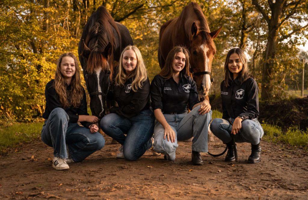
*Cue a song by Ilse Delange* The horses win our hearts every time. At this point, we want to steal them away from you and ride off into the sunset, but we just like you guys too much! This truly is the pinnacle of horse-girlhood. We love it! The picture is absolutely gorgeous, with some incredibly well-balanced lighting, and the jeans work wonders for you cowgirlies, so go for it! However, we would have liked to see a pair of matching riding shoes for each of you. And next time, we challenge you to put some cowboy hats on the horses. In any case, great picture, well done!
SV Ilythia (13)
For once, a student board that actually respects symmetry – well, almost. The two on each end seem to have interpreted “stand in formation” a little differently, but hey, close enough. The background is full of vibrant colors, crisp, clean, and honestly, a great choice. “Trust us, we’ve got this,” is the message we’re getting, which is exactly what we want from the people who’ll be delivering future generations. The matching blue shoes? A tradition at this point and we respect the commitment. It all works really well, even though we wouldn’t really recommend giving birth outdoors. Overall, a lovely, well-coordinated photo. Just promise us you’ll be this organized when the real work begins!
SV Cover (12)
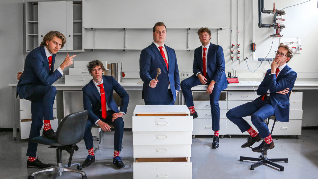
The meaning of this picture is about as cryptic as C++. In fact, where is the computer science? Is the gavel a commentary on the fact that AI’s entrenchment in modern society requires us to enact new laws, or is it just because the guy is the chair? Aside from that, though, this picture rocks! You made the best out of a relatively bland background with your dynamic poses, solemn expressions, and color-coordinated socks and ties that match elements of the background. The vibes are immaculate, something that AI has yet to properly replicate!
Stichting KEI (11)
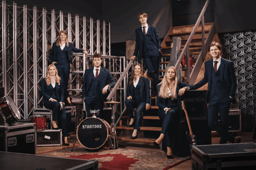
A backstage pass to technical excellence. Right off the bat, it’s clear: you put in the work and every element is thought through. The carefully arranged props of musical equipment, the different levels of elevation, and the varied poses – the picture’s standout composition makes it all fit together like an incredibly well-rehearsed performance. Chef’s kiss. Is it the most exciting photo? Not really. But it’s polished, professional, and a solid 8 across the board. Just really well executed. Good job!
G.F.S.V. “Pharmaciae Sacrum” (10)
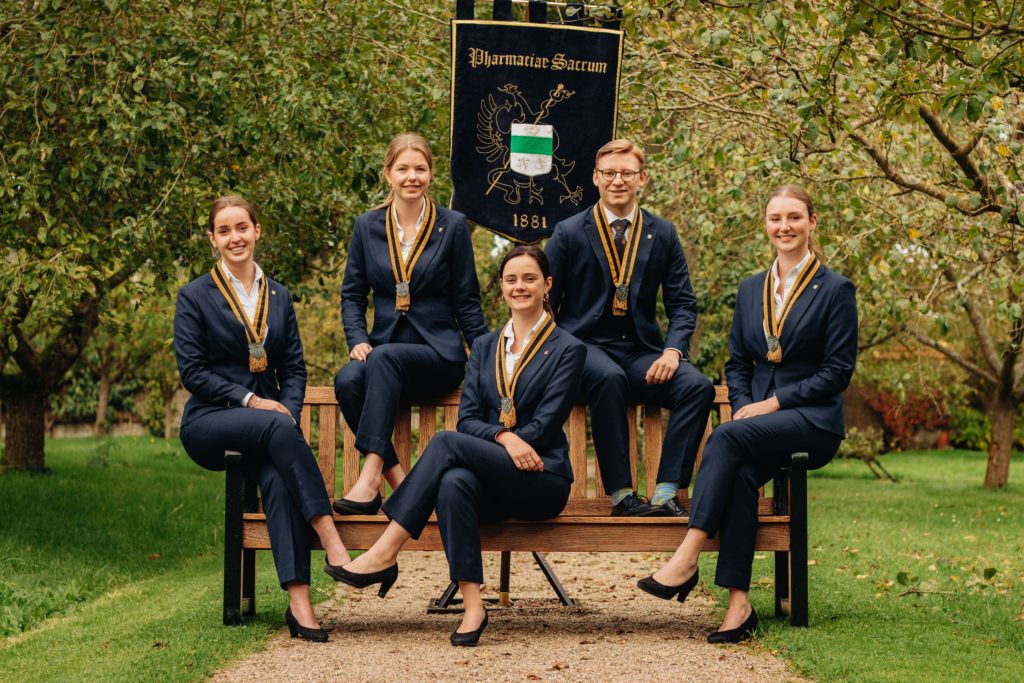
You’re blocking the way! Gandalf and Frodo are about to rock up behind you like it’s the beginning of The Fellowship of the Ring. It’s like the setting of a gorgeous fairytale wedding, but instead you’re getting married to science. The happy little trees, the stellar outfits, the colorful harmony between the mint-green background and your yellow regalia. It all works. A great showing of symmetry, but tiny nitpick: the pretty Pharmaciae Sacrum banner is a little lopsided. And your treasurer’s socks throw us for a bit of a loop. All in all, it’s a strong and stylish effort. Just a little fine-tuning, and it would be near perfect!
G.S.R. ‘Aegir’ (9)
Ahoy! Who did you pillage and plunder to get these battered old coats? We’re getting less rowing association and more Pirates: The Musical from this, but that’s okay! As long as you don’t loose the Kraken on us, we’re admirers of this fantastic setting, where the light streams through the windows and adds real depth and ambiance. The composition tells a story, like a performance is about to begin. As do the jackets, which might not be for everyone but they’re a unique touch that fits the vibe entirely. They add personality and make the photo feel even more cohesive because they match the floor. The symmetry is so close to being perfect. Just a small shift here and there and it would have been flawless. Even with that, it’s still a beautiful shot.
Popkoor Estrellas (8)
“Awwww” – all of us said in unison upon seeing this picture. Can we please be a part of your cozy four-person conga line? You’re truly hitting all the right notes and you’ve successfully struck a chord with our distinguished panel of judges. You’ve given us a rare example of a picture which looks much better in practice than it sounds like in theory. We appreciate that you went with such an unusual pose and played it by ear. The warm background enriched by natural auburn sunlight is beautiful, if a bit unambitious, but we’re all in for your K-pop-meets-country-Taylor-Swift energy.
Atmos (7)
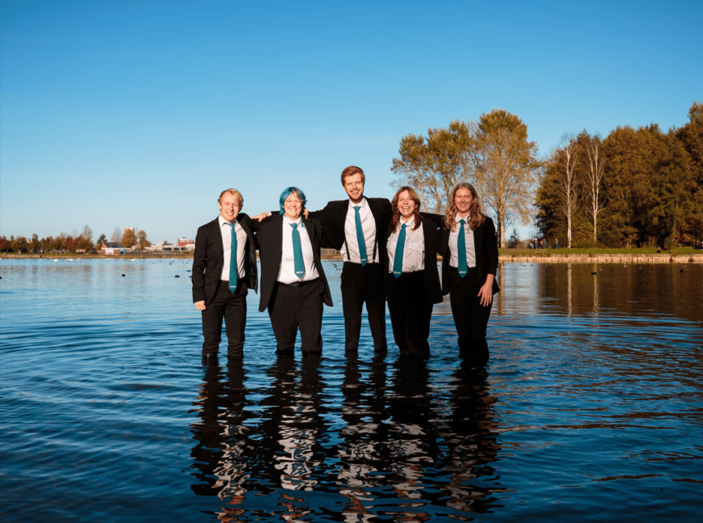
Salutations, Board Water! Simple but effective, weird but intriguing, questionable but iconic. This photo is everything a board picture should be — creative, committed, and getting a message across. Stepping into a near-freezing Hoornse Plas in November just to stay on theme? That’s next-level dedication. The framing of the water and the sky is also phenomenal, with the strip of land on the horizon splitting the picture in two and these blurry reflections making up the bottom half of the picture. We’d join your association based on this submission alone. Commitment like this deserves an award — or a warm towel.
De Chemische Binding (6)
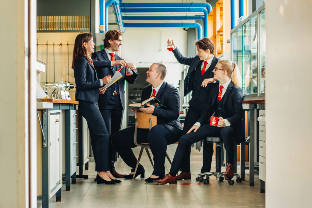
For posing inside a building that’s riddled with asbestos, not only do you look alive and well, but seem to be thriving! The many shapes and lines carefully guiding the eye through the different elements add a filter of originality to an otherwise candid-looking photo, coming across as surprisingly well-choreographed, almost like a still from a Wes Anderson film. Not only did you make the subpar background look good, you made it pop, and added your own creative touch through details like the vial in the person’s hand also appearing on the mug, and the bursts of red sprinkled harmoniously across the picture, tying together the untidy features into a purified distillation, and keeping the authentic look. Bravo, De Chemische Binding!
Centraal Uitvoeringsorgaan voor de Studentenorganisaties (CUOS) (5)
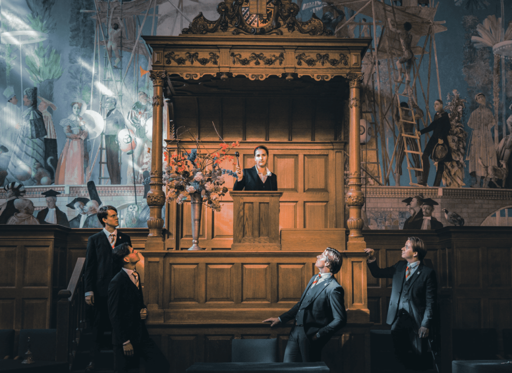
To dismantle any claims of favouritism: we are not being nice just because you give us subsidy money. This Renaissance picture is a payment in and of itself! It’s like something out of a Caravaggio painting – the lighting, the colors, the atmosphere. Who knew a bunch of accountants would be so bold as to go behind the podium reserved exclusively for the professors, and make themselves known to the world! Sure, we could complain about the lack of symmetry, the rest of the board members blending in a bit too much with the background, or the shot being a bit too zoomed out. But like… why would we? This is absolutely beautiful.
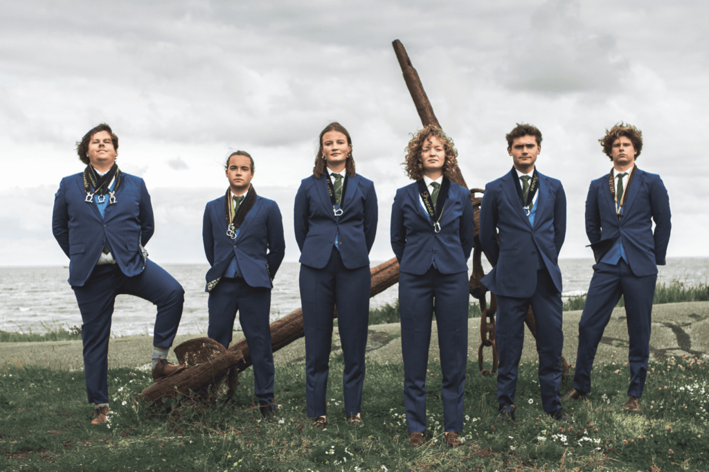
G.S.Z. Mayday (4)
Now this is how you make a statement — no theatrics, just a solid, well-balanced shot that gets everything right. The outfits add a perfect splash of colour, and the anchor in the background subtly reminds us that, yes, this is a sailing association, not just a group of well-dressed individuals who are establishing their dominance with their sheer aura. The editing is spot-on — rich colours without any of that over-the-top saturation nonsense. Even the classic gloomy Dutch weather somehow works in your favour, adding a bit of drama without fully plunging us into melancholy. The whole composition is clean, effortless, and simple in the best way. No oversized boats, no unnecessary props — just a group that looks like they could handle rough waters without breaking a sweat.
GHD Ubbo Emmius (3)
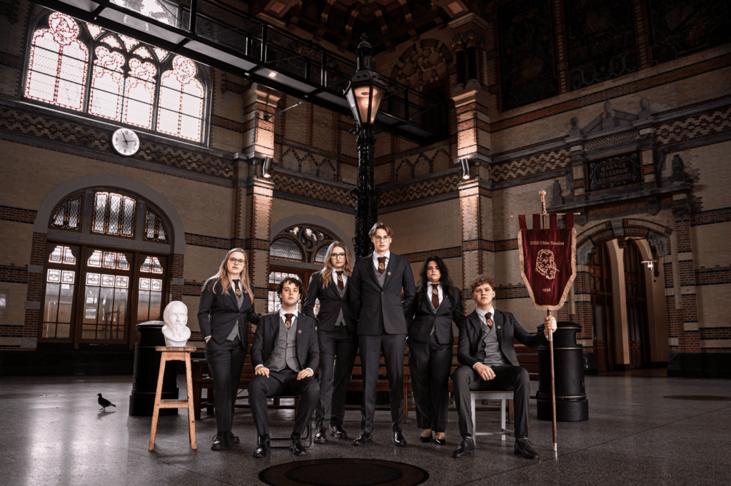
All aboard the Ubbo train! Absolute first-class use of Groningen’s main station! Since you guys nailed it, all who follow will pale in comparison – history is written by the victors, after all. In spite of the negative space somewhat shrinking you, we do appreciate the way you’ve framed the picture, allowing us to revel in this imposing feat of architecture, a true locomotive landmark. Not only is the matching attire phenomenal, but the picture is visually stunning, remarkably lit, and contains an instantly iconic, perfectly-placed pigeon, an essential passenger at the station. If we find out that he wasn’t compensated, though, you’re all done for! It’s the bare minimum, but we do also give major props for the continued inclusion of the bust and banner dedicated to your namesake, representing this famous Groningen historian in a historically significant building.
G.S.M.G. Bragi (2)
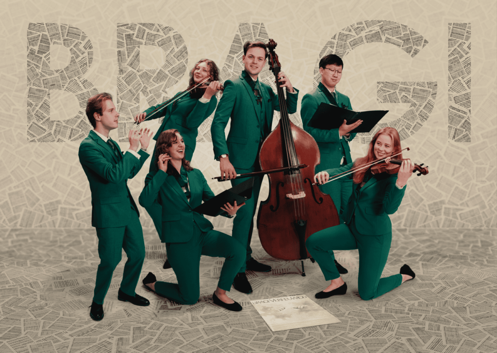
As usual, the overture is a stirring one from Bragi! We’re honestly just in awe of how you accomplished this – another rapturous performance all around. From the cello to the violin, from the vinyl record to the stunning green suits, everything works here! To the point that Bocelli himself would see its quality. The resolution is so crisp we could even read the notes on the floor (apologies for having to compress it!). You’ve executed yet another out-of-the-box idea brilliantly with phenomenally playful poses. The placement of your logo is a stroke of genius too; subtle enough to not scream “ADVERTISEMENT” in C#, but still representing your association well. A standing ovation once again for your blend of reality and artifice. You are well within your rights to take a bow!
Usva (1)
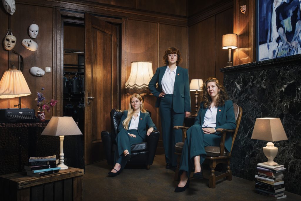
‘Excellent!’ we cried. ‘Elementary,’ said Usva. An astonishing work of art, a triumph of originality, words truly do not do this murder mystery-esque portrait justice! Usva is known to always deliver, but the asymmetrical composition of this picture is frankly unreal, pairing such great depth of view with marvelous mise-en-scène – the Us-vase and the array of eerie masks are particular standouts. And then there’s the triad of board members, dressed in chic yet laid-back dark teal suits, welcoming us into their cave of creativity. The utilization of both warm and cold colors, the peek behind the scenes with the open door, and even the six lampshades, curated in a medley of shapes, are welcome inclusions here. Every aspect of this picture was considered and executed to absolute perfection, which is why Usva has officially usurped Bragi’s throne. May your reign be as full of intrigue and artistry as your picture!